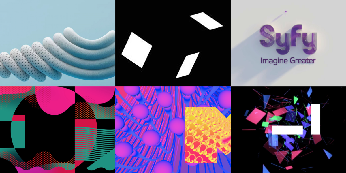
CHANNEL4
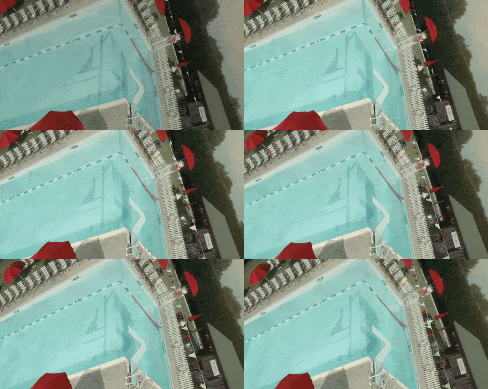
Channel4 is a British free-to-air television network that operates self-sufficiently as a content provider at zero cost to the taxpayer. For the introduction of their subsidiary channel, 4seven, they employed an innovative and logic-defying animation that represents a new direction.
Intended to present a new way of looking at Channel4, the animation for 4seven is all about perspective. A unique corner wrap technique gives the impression of a gravity-defying, rotating cube of scenes reminiscent of multiple worlds. The scenes are mundane – a grocery store, a public pool, a vegetable garden – yet engage the viewer by creating the effect that they are travelling around the cube, watching people go about their lives. Subtle animations of the distinctive 4seven logo are integrated into each scene, positioning the channel as placing a fresh lens on everyday life.
SYFY
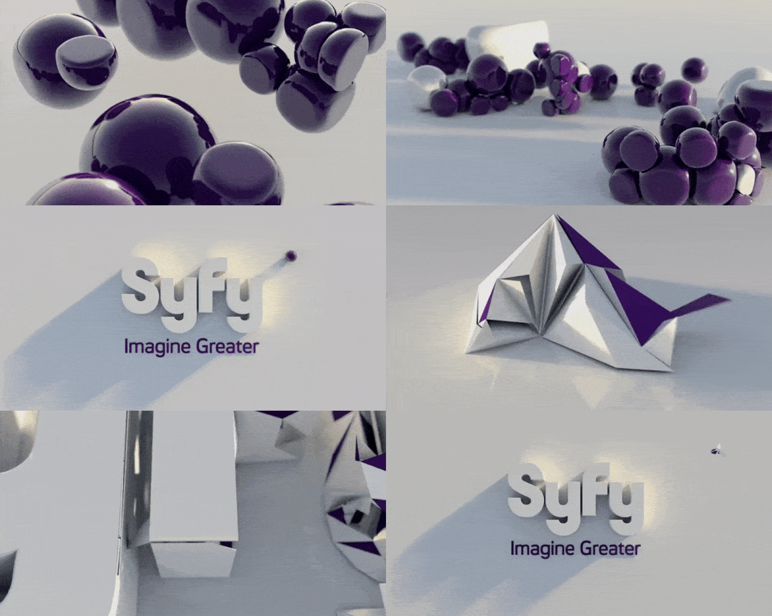
In 2009, the Sci Fi channel was relaunched and rebranded as SyFy. An American pay television channel, they sought a brand animation that was as mind-blowing as their genre namesake. The new brand identity includes the words ‘SyFy’ morphing and erupting in a manner that evokes the explosiveness of science fiction. One animation begins with realistically rendered purple bubbles similar to molecules, which jiggle and pop before revealing the SyFy logo. Other reactive elements include flowers, butterflies, and shapes that successfully appeal to a broader audience while embracing the imaginative nature of science fiction. The animation is incredibly innovative and realistic, begging a similar question as the entire sci-fi genre – could it actually be real?
XBOX
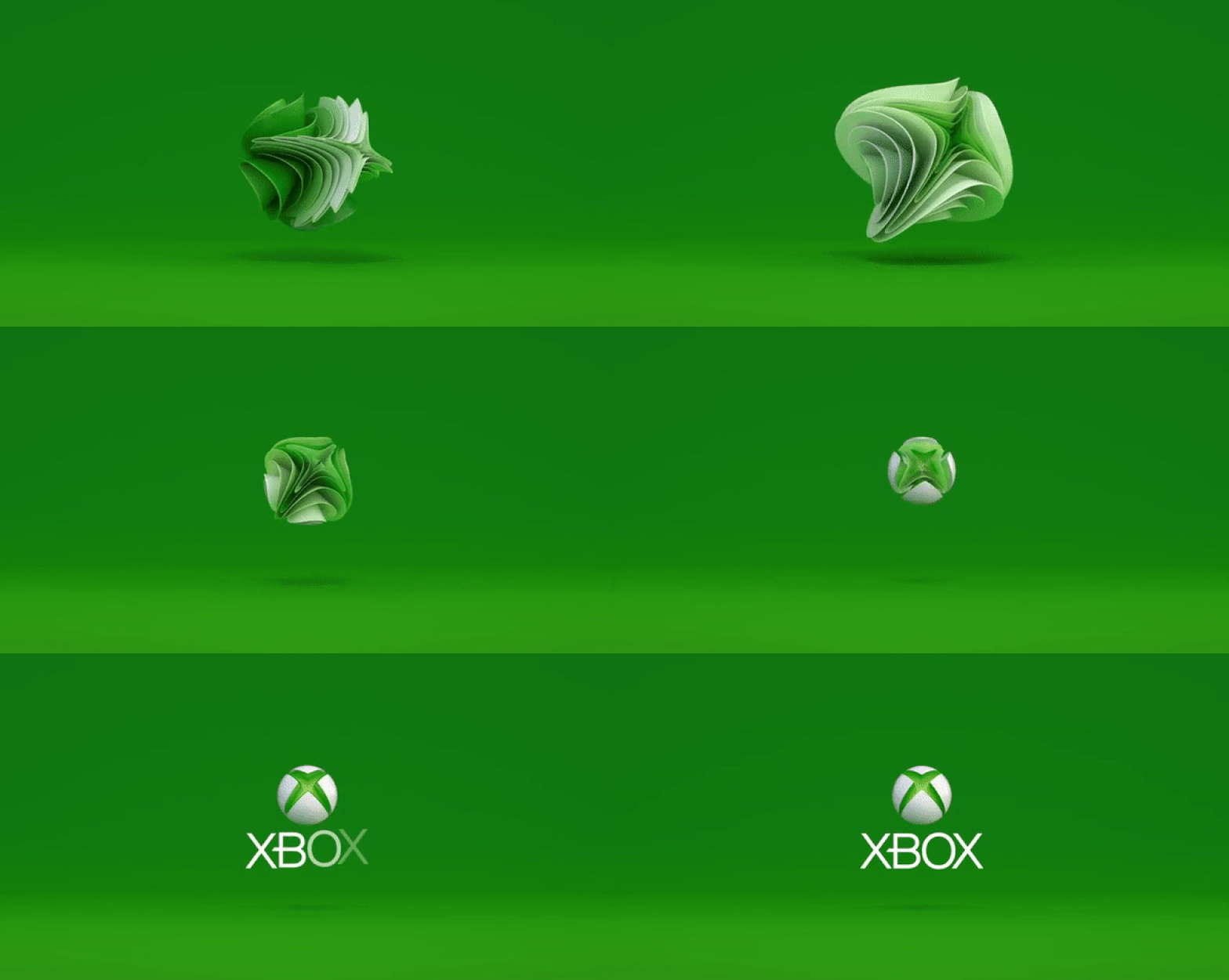
Microsoft’s launch of the Xbox One was accompanied by a similarly innovative motion brand identity. Their aim was to present Xbox as a premium entertainment experience, broadening their audience beyond gamers to encompass anyone that wants to enjoy their favourite movies, music, television, and apps. By translating their iconic logo into a new 3D animation, Xbox communicated their commitment to constant reinvention. The X pulses as it builds slowly from a spherical form, creating a story-like expression of the brand’s evolution. It is a hypnotic animation that instils the audience with a sense of calm whilst evoking the effortlessness of a premium brand experience.
ENEL

Enel is a leader in renewable energy production that has been manufacturing and distributing electricity and gas globally since 1962. In 2016, they decided to part with their conservative logo and embrace brand animation as a means of positioning themselves as a modern industry leader. Their new logo is a contemporary and easily recognisable word mark – but the animated version tells the real story. Each letterform is created by the movement of cursors (known as the core starting point of all energy), leaving behind vibrant trails of light. The result is aesthetically intriguing and a perfect expression of their brand principles – the cursor serves as an ‘iconic visual symbol that represents Open Power’ that informs their brand identity and creates a consistent design motif.
MTV
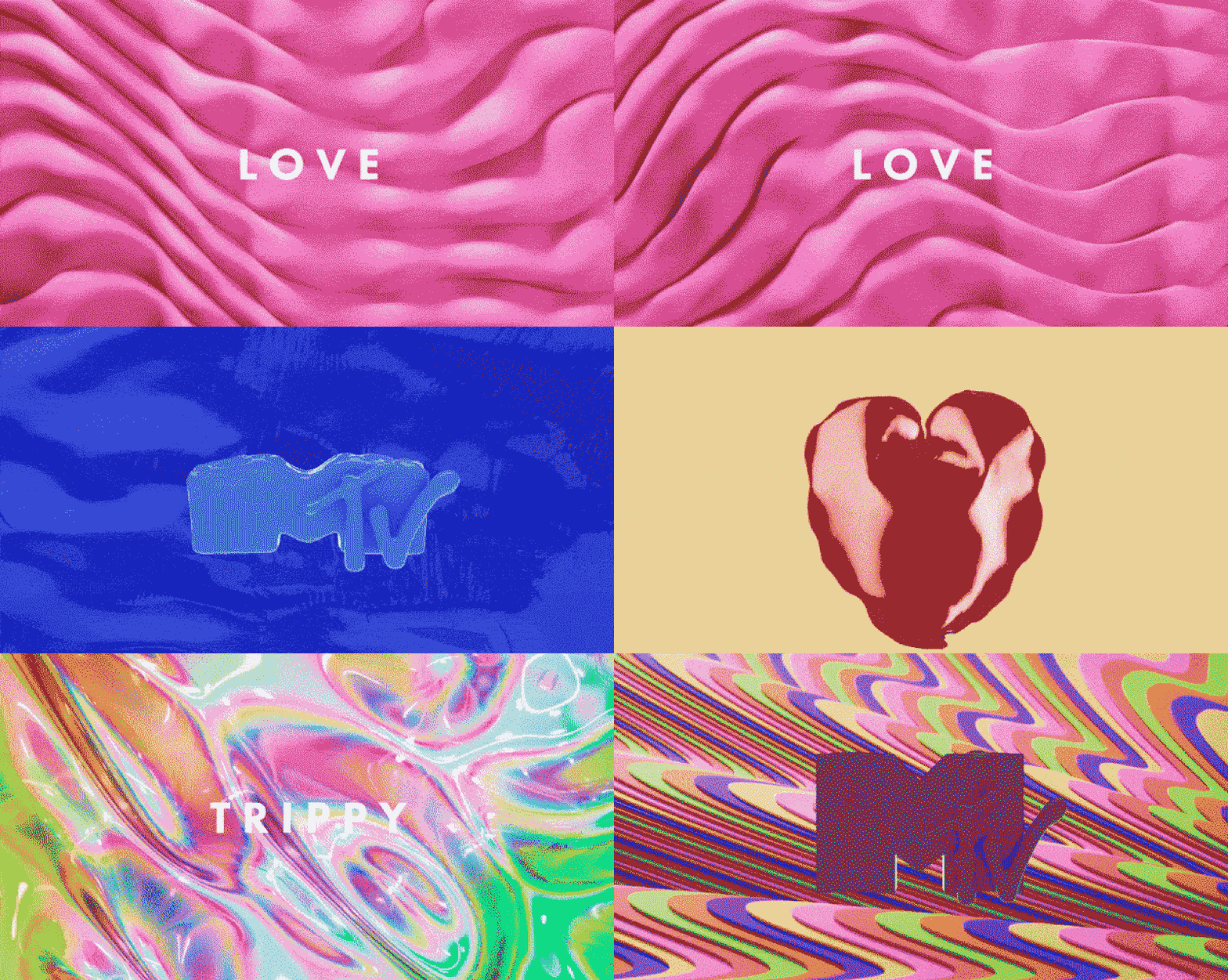
In 2018, the ever-changing MTV underwent a striking rebrand of their visual language on global television. The rebrand involved a frenetic montage of eye-catching backgrounds, morphing logos, and animated characters intended to depict the whole emotional spectrum. The theme of ‘Moodswing’ was chosen for flexibility, providing MTV with a toolkit of animations that could be repurposed depending on the mood of the program. In addition to being a fantastic way to engage audiences, it provides an accurate representation of the MTV brand – adaptable and constantly evolving based on advancements in technology, social change, and trends.
NIKE

Nike described their ‘Go Lighter, Go Longer’ campaign as a ‘metaphorical exploration of air and the negative space it occupies.’
Nike’s unique brand animation consists of ‘visual metaphors inspired by scenarios encountered on an everyday run’. The rapid-fire animation is texturally rich and incredibly engaging, offering a compelling exploration of the properties of air that brings the product and brand to life. In many ways, it could be perceived as a clever repackaging of a classic commercial trope – the depiction of a product enduring the elements. The best commercials make us think, and the rich visuals and textures implore the audience to consider and appreciate the power of air – and subsequently, the product.
AIGA
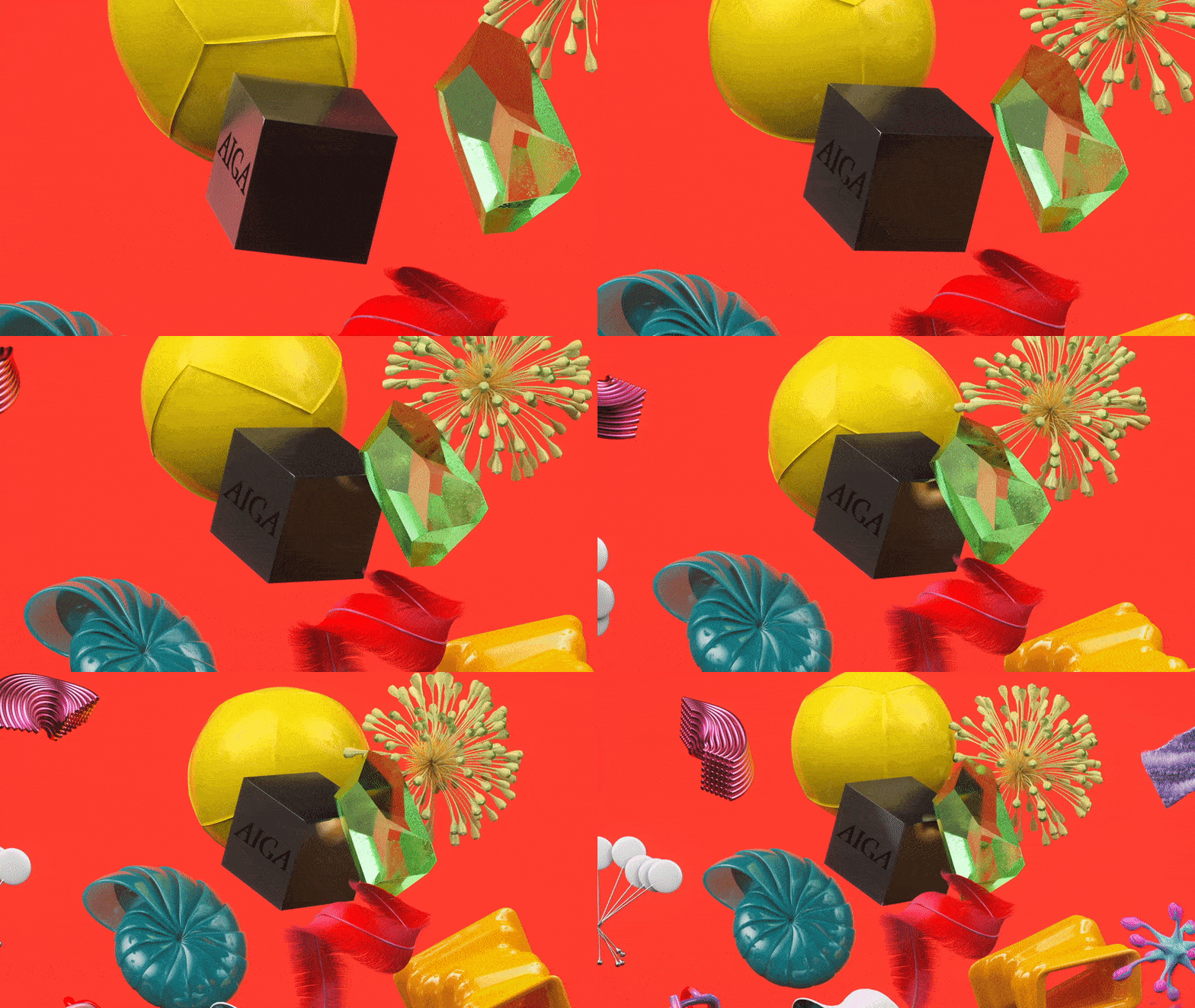
The American Institute for Graphic Arts (AIGA) is the nation’s largest professional design association, focused on advancing design as a professional craft, strategic advantage, and branding tool. In 2016, the organisation embarked on a rebrand aimed at fulfilling their vision of becoming a hub for ‘broader creative constituencies’. While their newly animated brand may not be as assertive as the others mentioned in this list, its impact and meaning are just as impressive. Titled the AIGA ‘cube’, it depicts 3D objects floating adrift before converging, representing the company’s mission to unify design disciplines. A simple, yet eye-catching metaphor for the collaborative process, it visualises the coming together of ideas at a magnetic centre – AIGA itself.
BOMA

BOMA is a contemporary electronic music label and event platform based in Brazil. For their launch in 2018, they chose animation as the format that would best facilitate a direct connection between their brand, projects, and audience. Their brand identity is comprised of a dynamic system of layered words and graphics, designed to be visually striking enough to communicate the excitement of their projects. With a custom typeface imbued with the intensity of electronic music and a variety of moving elements for viewers to interact with, the animation represents a brand that isn’t afraid to be defined by its audience.
SQUARESPACE
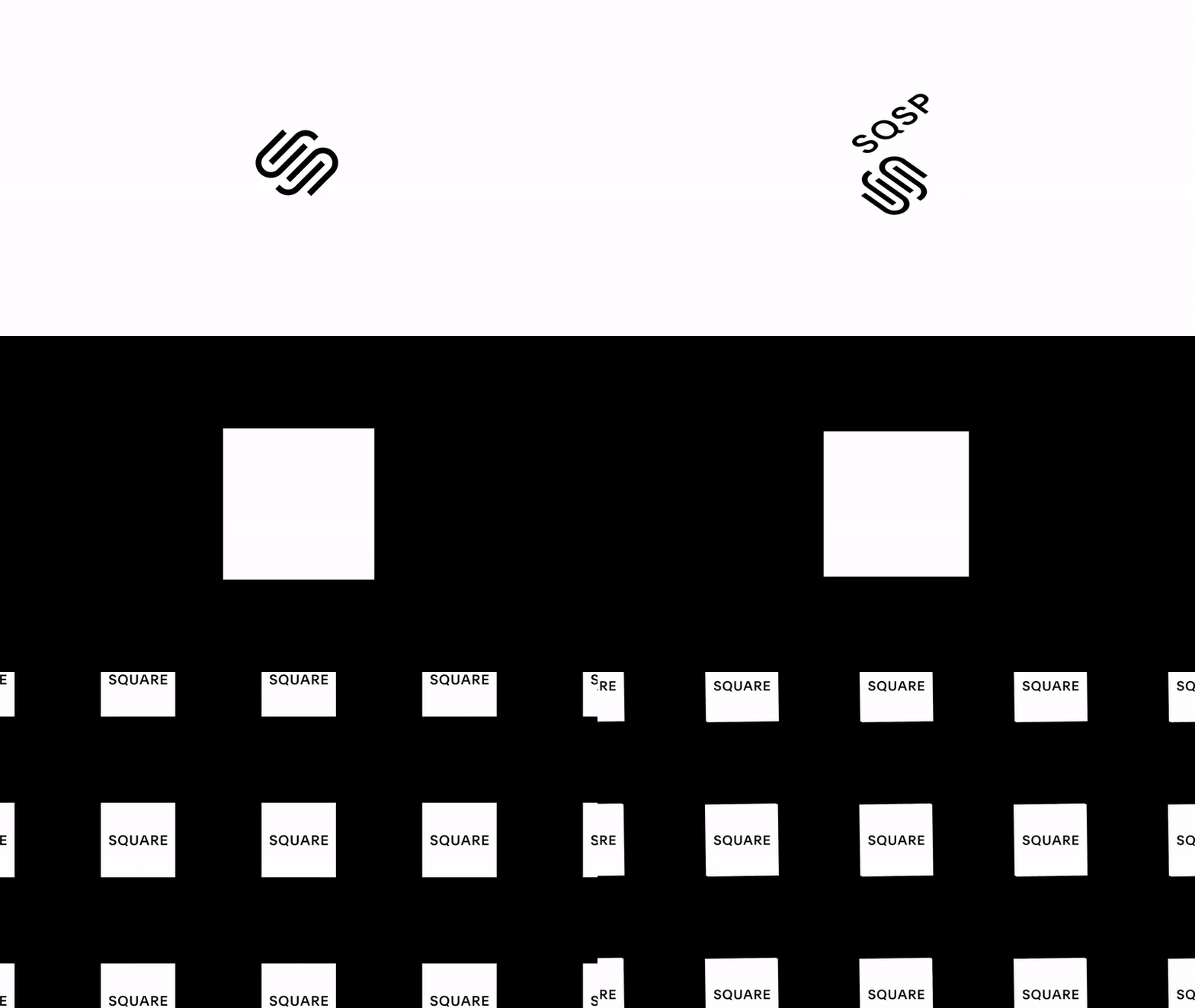
‘At Squarespace, we believe in democratizing good design for the ambitious entrepreneur.’
Squarespace is a website design platform seeking to inspire others to step outside of the box, and their recent rebrand effectively employs the qualities of animation to deliver a straightforward message in an impactful and on-brand way. Inspired by the boldness of their birthplace in New York, their animated visual brand is audacious and cutting edge – perfectly encapsulating their brand story. Each movement is purposeful, demanding the audience’s full attention and ensuring their message remains ingrained in our minds long after watching.
BBC RADIO 1
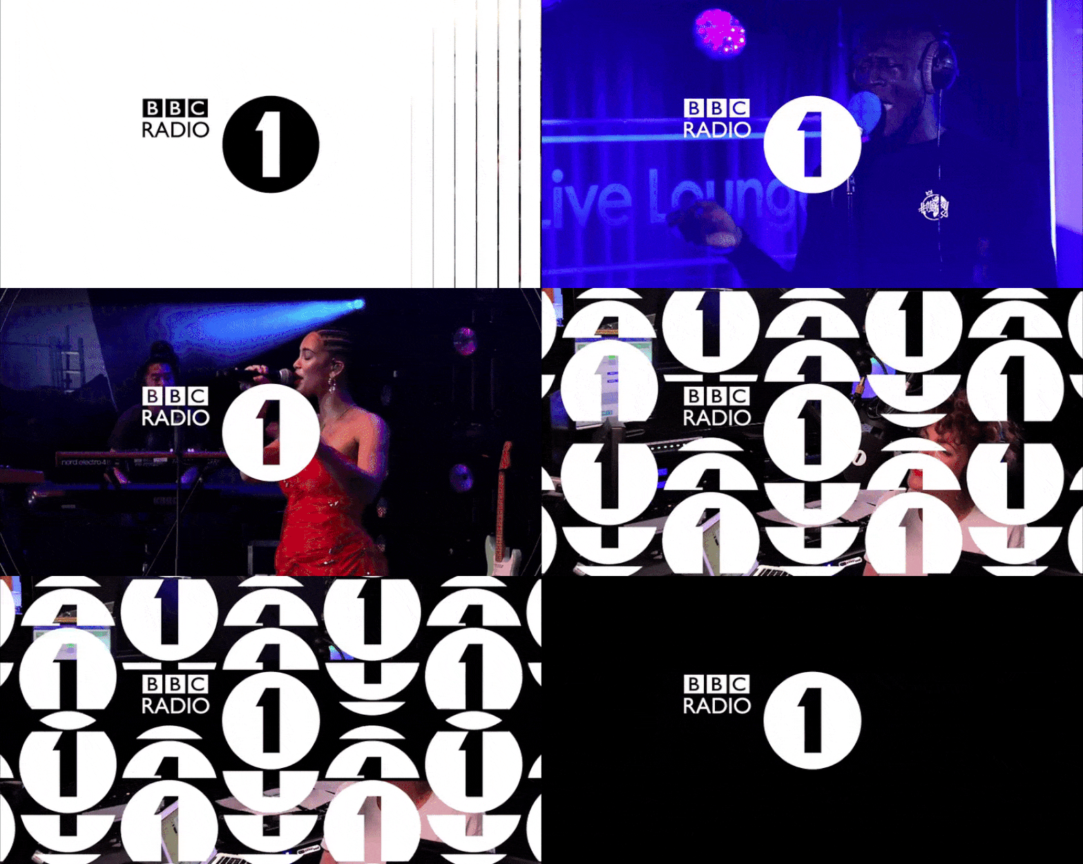
BBC Radio 1 has long enjoyed its position at the forefront of the UK’s youth music scene. Maintaining this position in an increasingly competitive industry requires a willingness to constantly evolve, and in 2018 they unveiled a rebrand that embraced the power of animation. A collection of punchy animations was designed to be adaptable to the station’s needs – perfect for adding a little brand personality to live video coverage, social media content, and video adverts. Many of the animations centred on the classic Radio 1 logo, made more dynamic to appeal to a youthful audience – it can often be seen falling from the screen, or radiating concentric circles designed to evoke soundwaves. It’s a fantastic example of animation bringing a brand to life and eliciting a stronger connection with its target audience.
WHY ANIMATE YOUR BRAND?
The compelling visual properties and digital affordances of brand animations make them an essential marketing tool to launch your brand into the future. The number of leading businesses that have invested in them as a brand story-telling mechanism has cemented them as an important marketing trend that we’re only going to see more of in the coming decade. Beyond their engaging visual qualities, animated brand identities are also a surefire way to boost digital performance through increased SEO, clicks, likes, and shares.
If you’re interested in taking your business to the next level with an animated brand identity or would simply like to learn more about them and how Davidson can help, hit the button below!
