Aviair Nexus Airlines
Multi-award winning Aviair is a regional airline and charter flight operator based in Western Australia. With the growing demand in the region, there was a need for a new airline carrier to be created to connect capital cities directly with the smaller rural hubs.
Their desire was to create an entirely new airline brand scalable into new regions and could stretch into complementary services, such as freight, leisure and accommodation sectors.
Furthermore, as a homegrown brand based in the Kimberley, they wanted to ensure that the community felt ownership of the brand and paid homage to its local roots.
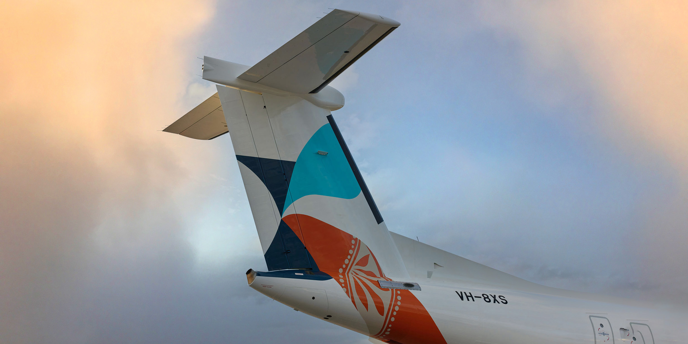
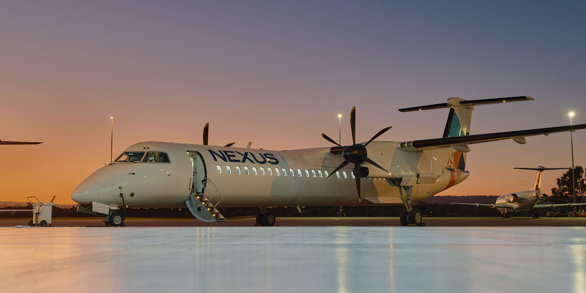
The Aviair team approached Davidson to help develop the positioning, naming, visual identity, aeroplane livery and guidelines for this exciting new brand.
The new brand needed to express the critical values of safety, quality, professionalism and sustainability, as well as be positioned as approachable, affordable and accessible.
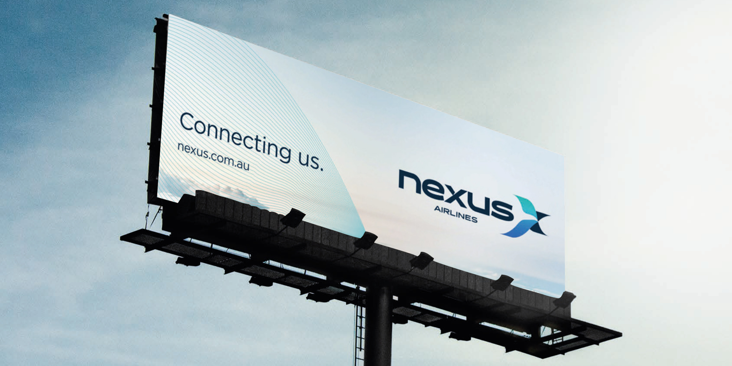
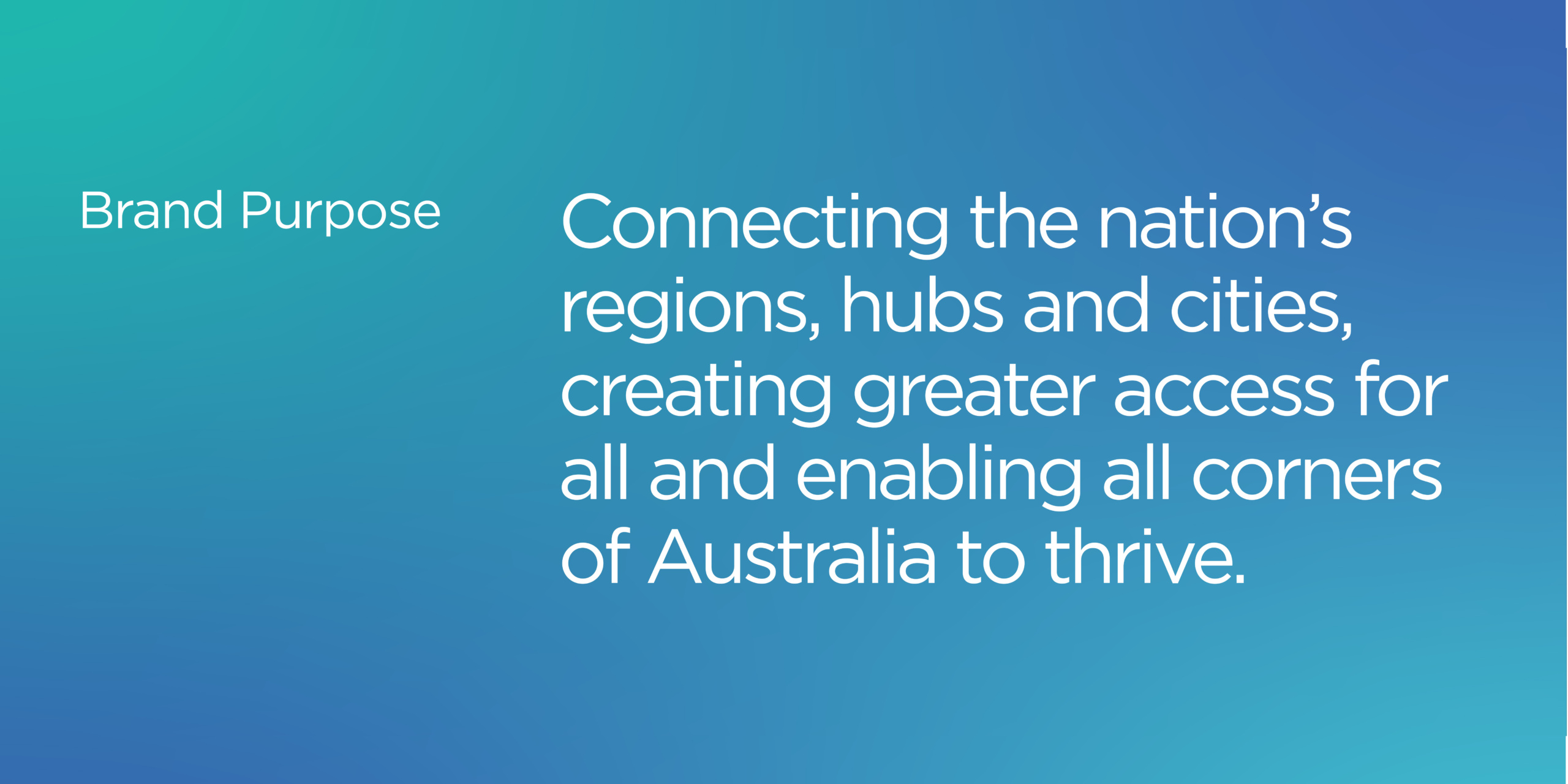
The brand positioning ‘connecting us’ was developed to express the theme of connecting the nation’s regions, hubs and cities, creating greater access for all and enabling all corners of Australia to thrive.
Davidson conducted a naming workshop to explore options that delivered on the airline’s vision, the brand’s positioning and its USPs: contemporary, reliable, sustainable and providing a next-generation service. ‘Nexus Airlines’ was selected to represent the series of connections the airline created between places, people and service expectations.
The Nexus brand features a stylised ‘X’ symbol that is made from converging shapes that connect together to represent the name ‘nexus’. They are aerodynamic forms inspired by aerofoils, capturing the idea of flight and seamless connections. This is complemented by the symbol of a bird flying forward that is created by the negative space.
The Nexus wordmark is bespoke sans serif font crafted with subtle rounded corners that harmonise with the aerodynamic shapes of the brand mark. The uppercase treatment communicates the brand with confidence and professionalism as an airline backed by 38 years of aviation experience.
The colour palette is inspired by the landscape of Broome—the primary location of where Nexus is based. A palette of blue and teal reference scenes of the water, coastline and clear skies. Paired with a deeper navy, the blue palette symbolises calmness, professionalism, freedom and stability. The colour is applied with gradient blends that is fluid, dynamic and contemporary.
“As we set out to launch a new regional airline in Western Australia, we engaged Davidson to partner with us in our brand development. Traditionally operating in the tourism space, we needed our brand to differentiate us as a fully-fledged airline and professional charter service operator, proudly WA owned and reliably connecting remote regions in Australia.
Davidson were great in their assistance in scoping, strategic direction, brand concept development and stakeholder engagement. They understood our brief and we found them to be very professional to deal with and responsive to feedback, always listening in order to refine the brand which resulted in a high quality suite of assets.
We would recommend Davidson as a reliable and trusted partner for any branding requirements.” – Michael McConachy, Managing Director
