BONDS Damn Dry
BONDS successfully launched into the absorbency market with Bloody Comfy Undies and was eager to expand in this category which aligned to their strategic purpose: ‘Making the Uncomfortable, Comfortable for Everybody’ by providing Women with sustainable solutions.
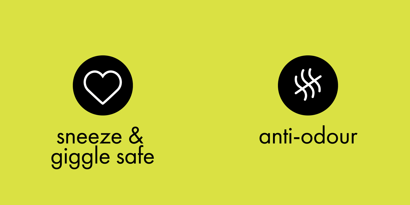
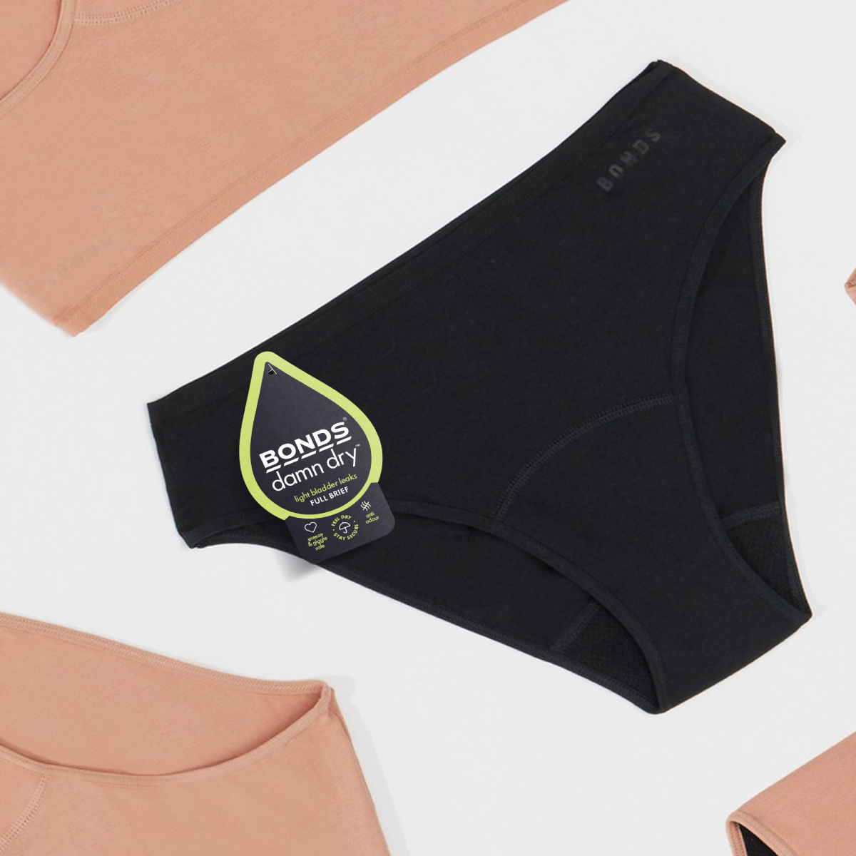
BONDS introduced their new product range, ‘BONDS Damn Dry’ – think Panty liners for all the drips and leaks she might find in her undies. BONDS Damn Dry products were to be positioned in the market as stay dry, anti-odour, leak-proof and comfy.
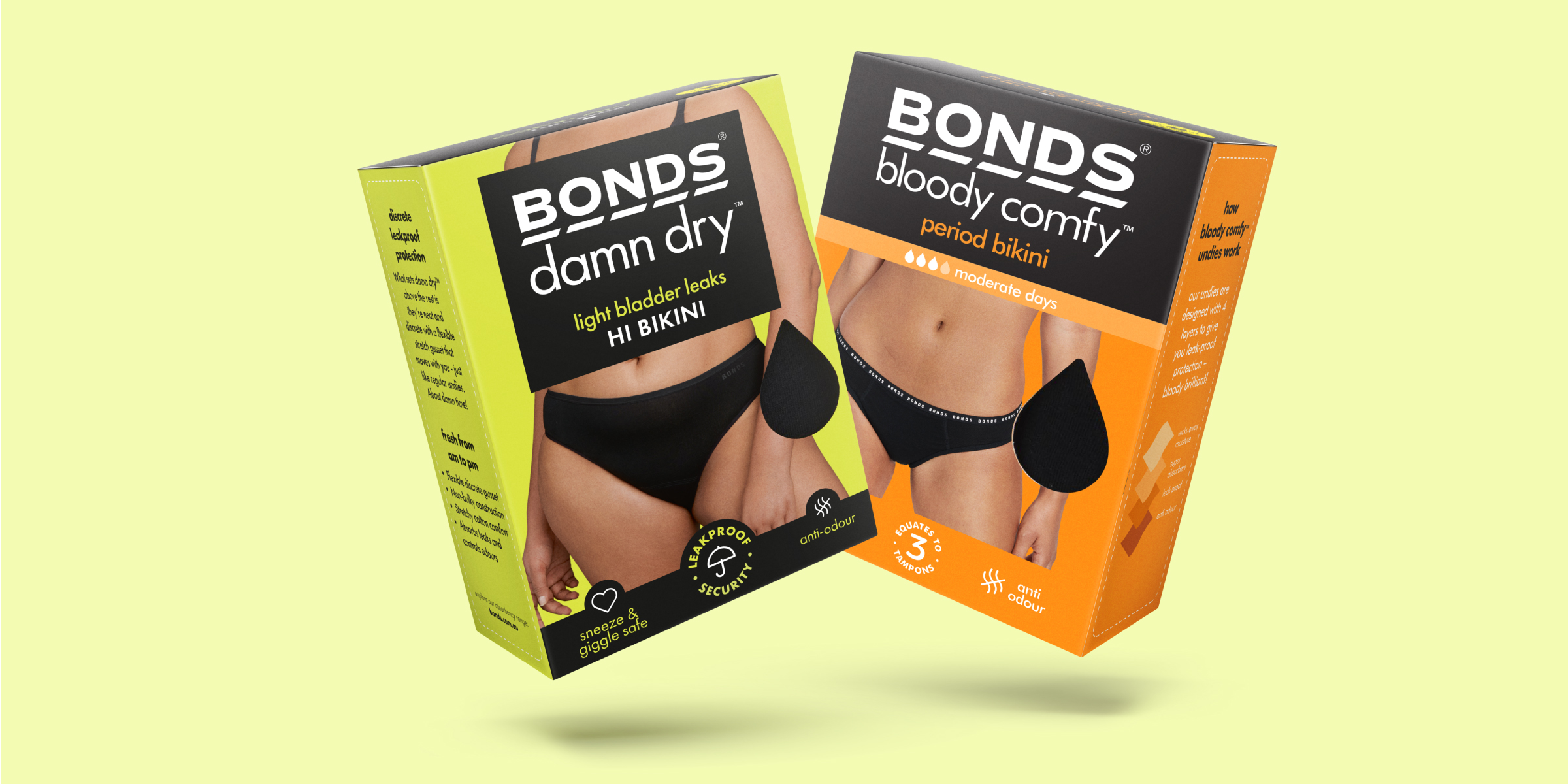
Davidson Branding was commissioned to develop bespoke packaging on new and existing dielines and was tasked with developing visual cues to differentiate the new range from the Bloody Comfy Undies, which align to the purpose and needs of the consumer – Comfort, Cotton Rich and Coverage. The packaging needed to support and educate the customer through the purchasing journey via communication of key product attributes and product tech – while leveraging the existing consumer trust and loyalty to the BONDS brand.
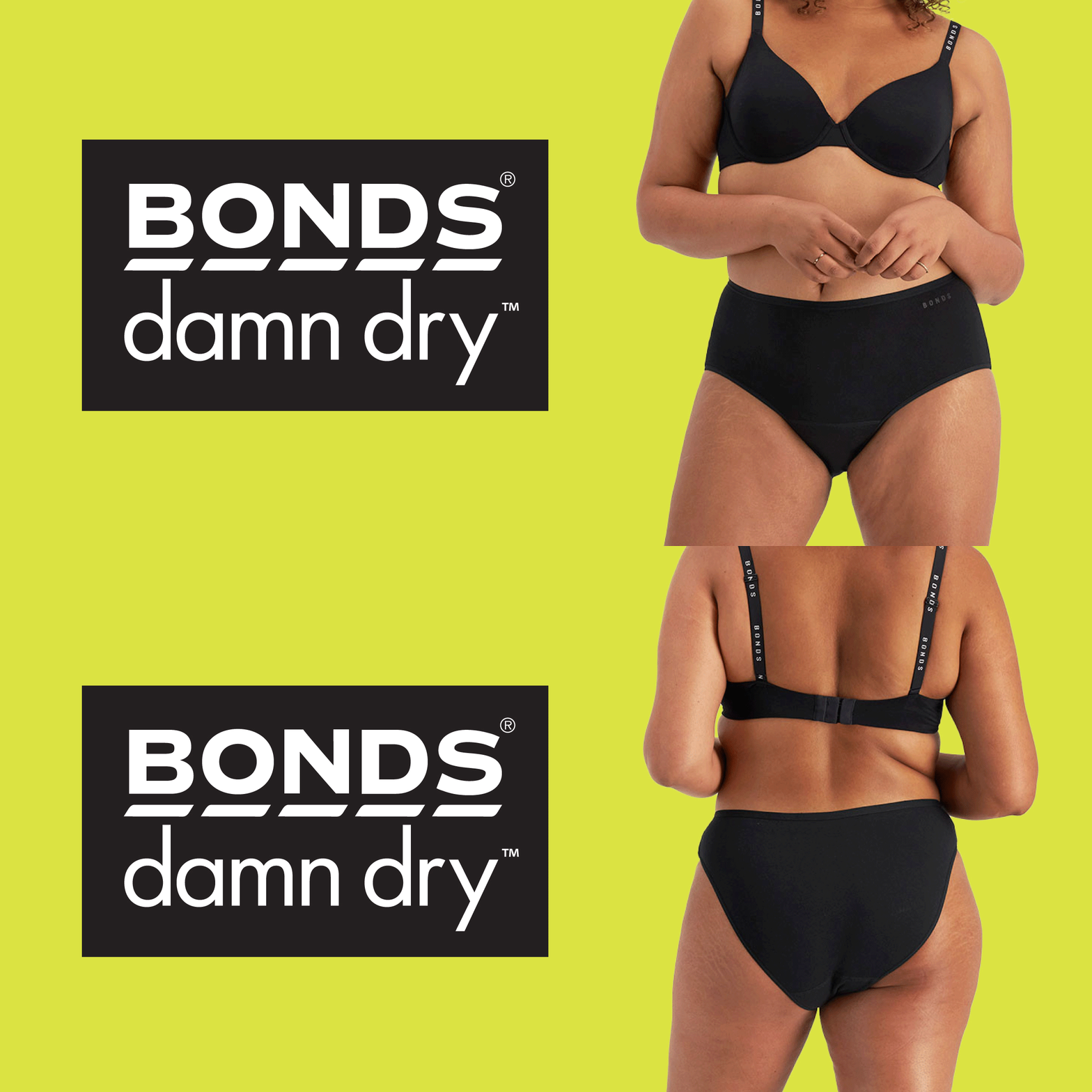
As the Damn Dry product is an extension of the widely successful Bloody Comfy Undies range, Davidson used clear claim messaging to communicate product benefits without overwhelming the consumer. The signature BONDS’ bold look and feel extends onto the own-able bright green — standing out on the shelf within a passive and dated market, commonly targeting older consumers.
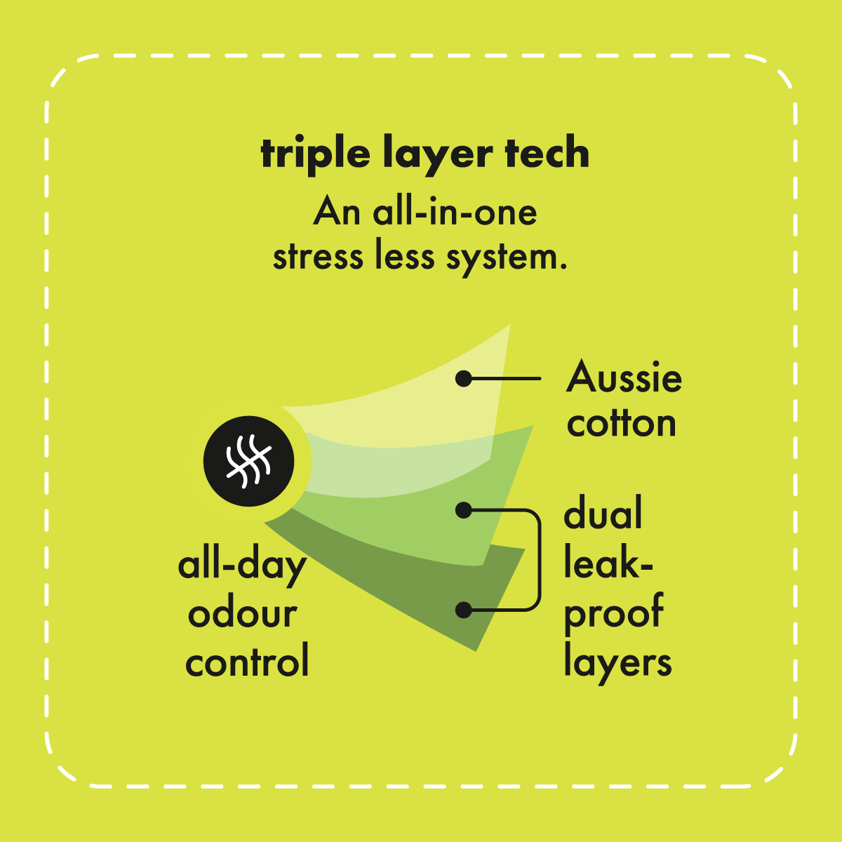
The hero product photography dominates the pack, helping showcase the product size, signature comfiness, shape and coverage. Like the BONDS Bloody Comfy Undies range, the unique product technology is communicated through a simple graphic diagram illustration, retaining BONDS’ down-to-earth tone of voice. Delighting consumers once again with their Damn Dry ditch-the-disposable range.
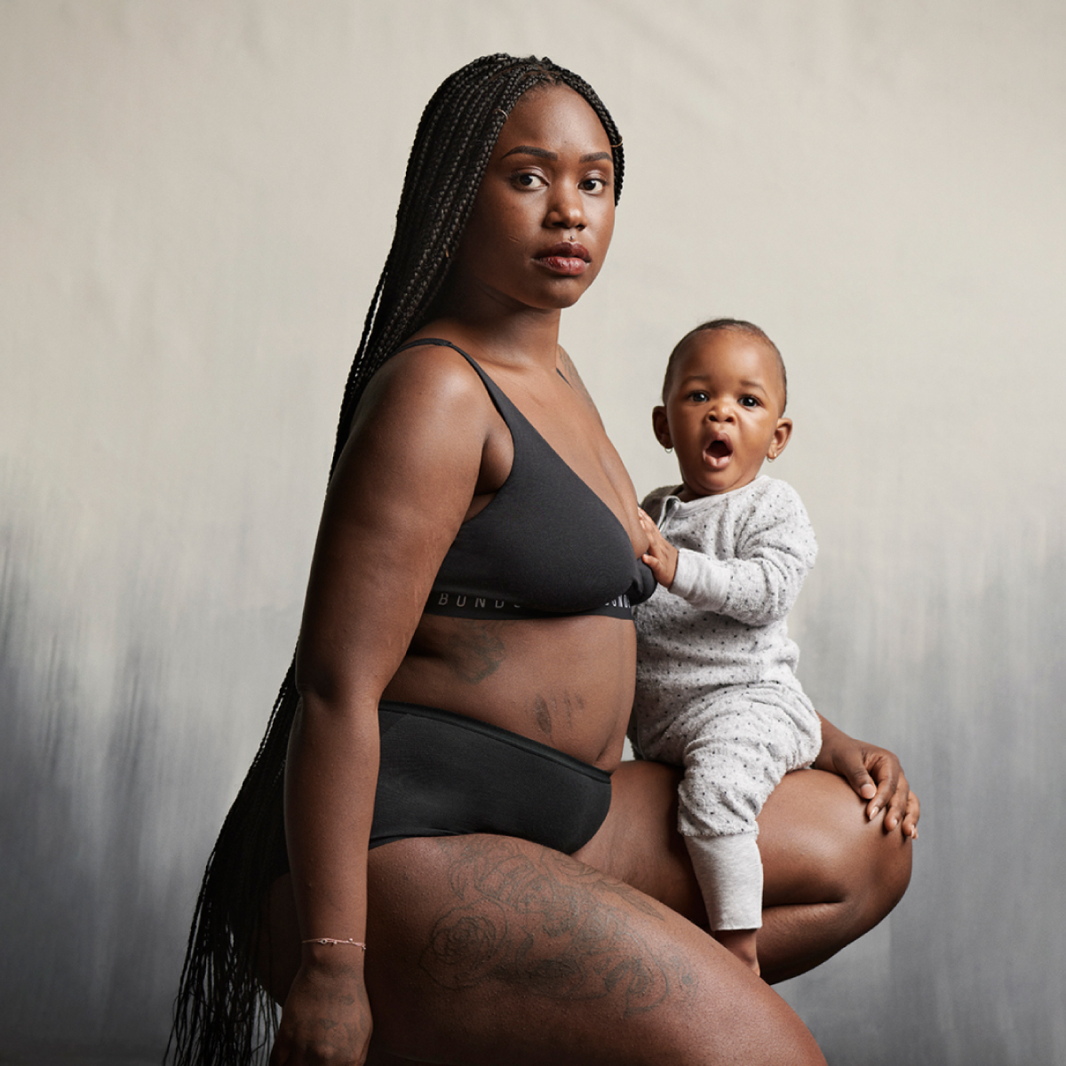
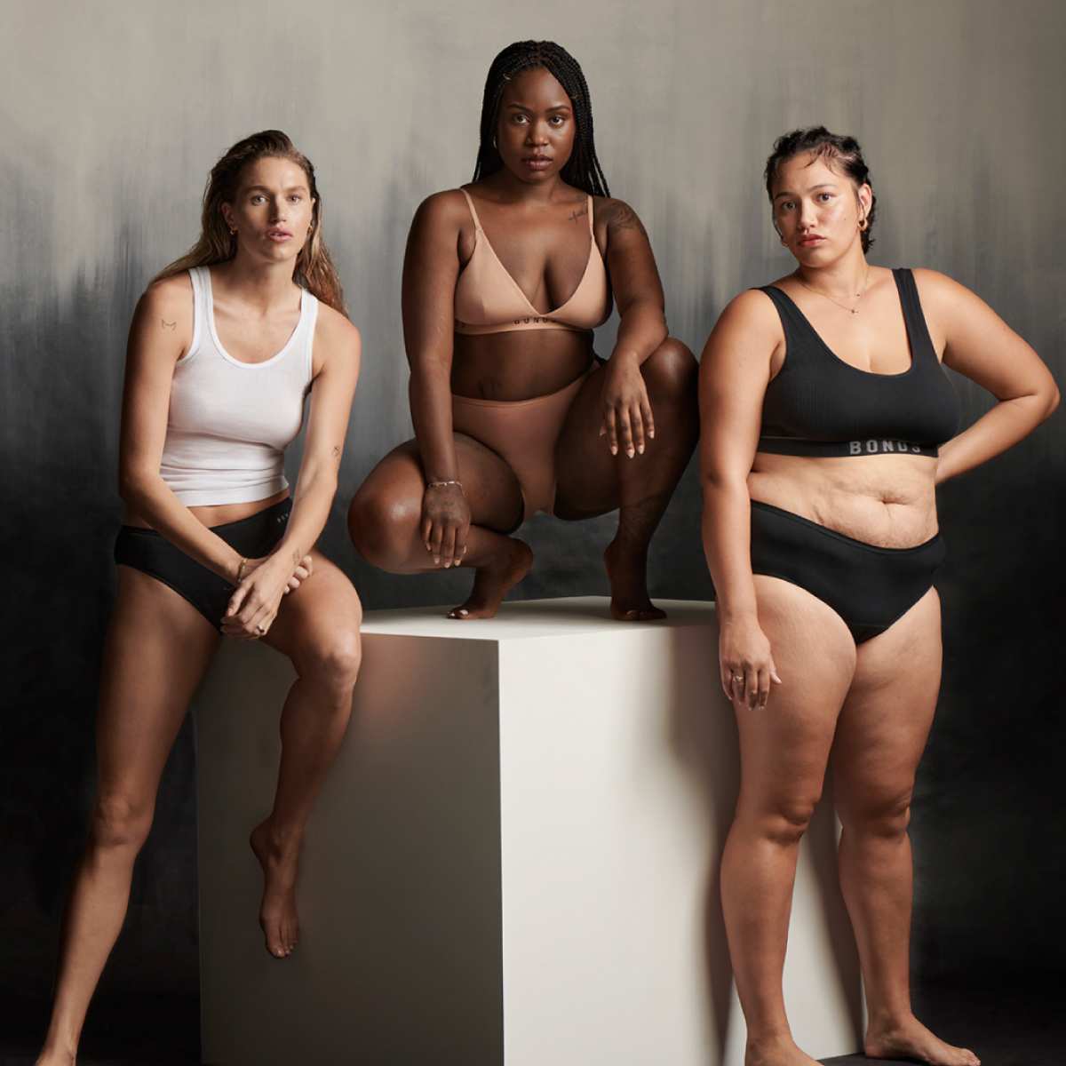
A new campaign accompanied the new product, ‘Damn Dry Undies for Damn Strong Mamas’ to eradicate the long-standing stigmas and empower new mothers with normal-looking undies for a normal part of motherhood.
