Bonds Explorer
When it comes to comfort and tough durability, the Bonds and Explorer brands have been the Aussie favourite for all things socks, underwear and apparel. In the true spirit of adventure, Bonds turned an exciting corner in 2021, uniting the two trailblazing brands to release the new cross-category range, Bonds Explorer. Merging innovative technology with contemporary style, Bonds Explorer is a range that offers something for every outdoor adventurer, confident and cool with a sense of humour and a bit of swagger. From tough trunks to genderless sweats to comfy socks, Bonds Explorer leverages the credibility of Explorer in the outdoor space with the cool style of the Bonds brand.
Davidson was commissioned to develop the identity and packaging for the newly formed Bonds Explorer brand. The design needed to highlight the tough, sustainable and cool qualities of the range in a way that appeals to the everyday Aussie adventurer. In particular, calling out the performance, longevity and recycled fabrics used to make Bonds Explorer products both comfortable and adaptable; for home to adventure, and everything in-between. The identity for the range needed to build on the equity of the much-loved Bonds brand whilst adding a unique ‘explorer’ touch that unifies the products in the range across the men’s, women’s and the newly formed kid’s category.
Davidson developed a new logo that captures the pinnacle of adventure whilst reinforcing the Bonds master brand. A stylised mountain symbol formed by the iconic stitch marks from the Bonds logo creates a unique yet familiar identity for the Bonds Explorer brand. Paired with the timeless black and white palette of Bonds and a utilitarian typeface, the identity is a contemporary symbol of both style and function but with an adventurous spin.
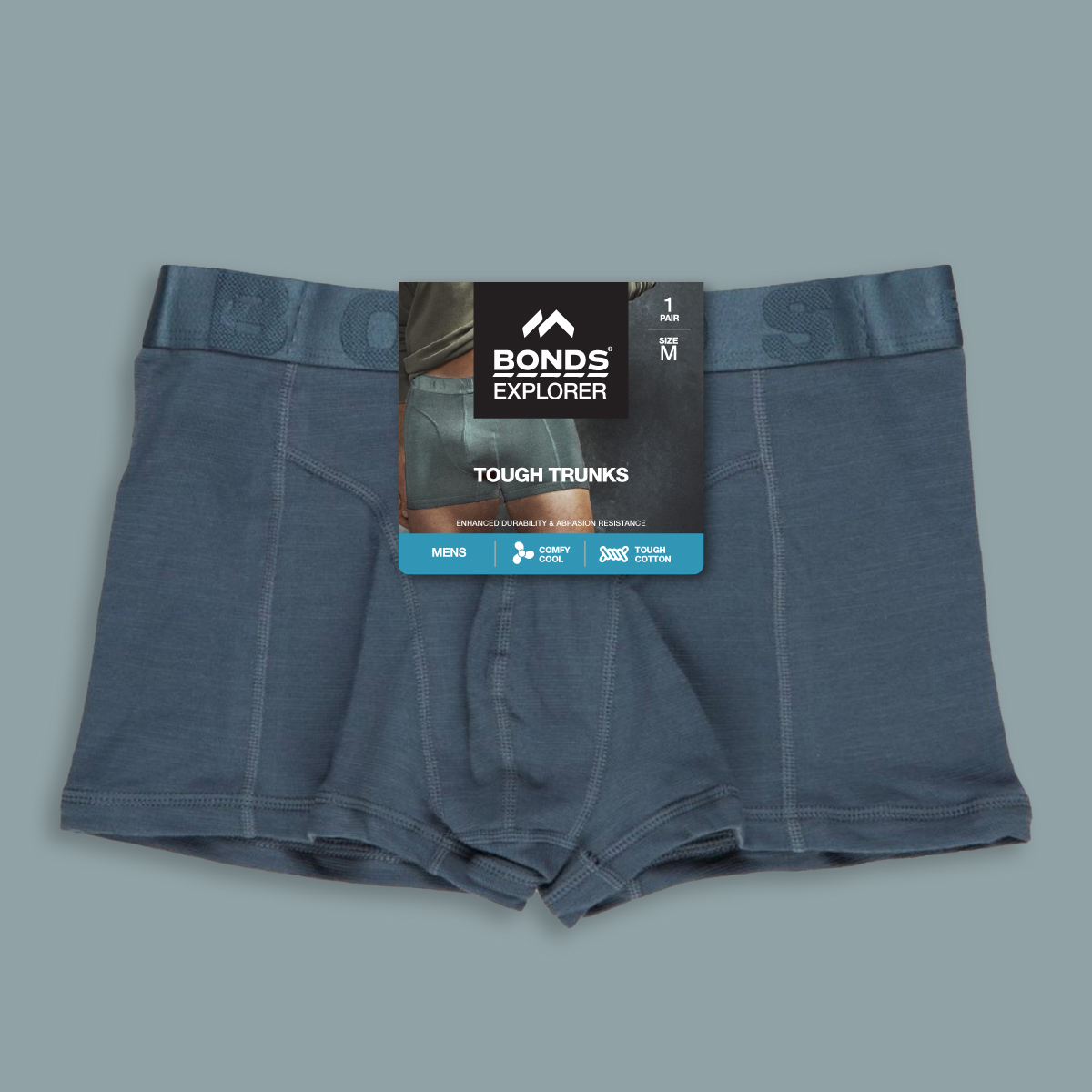
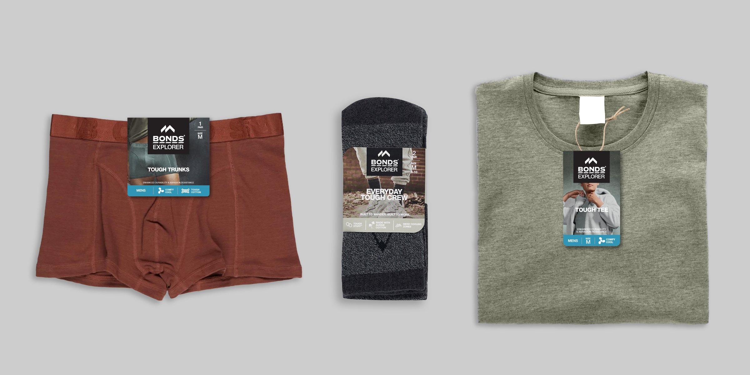
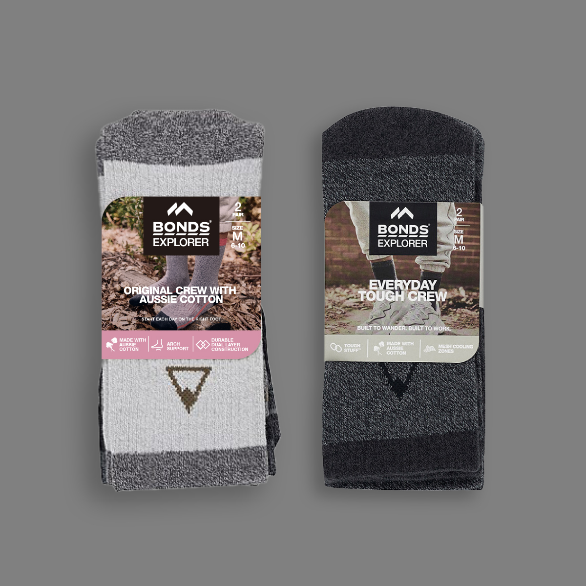
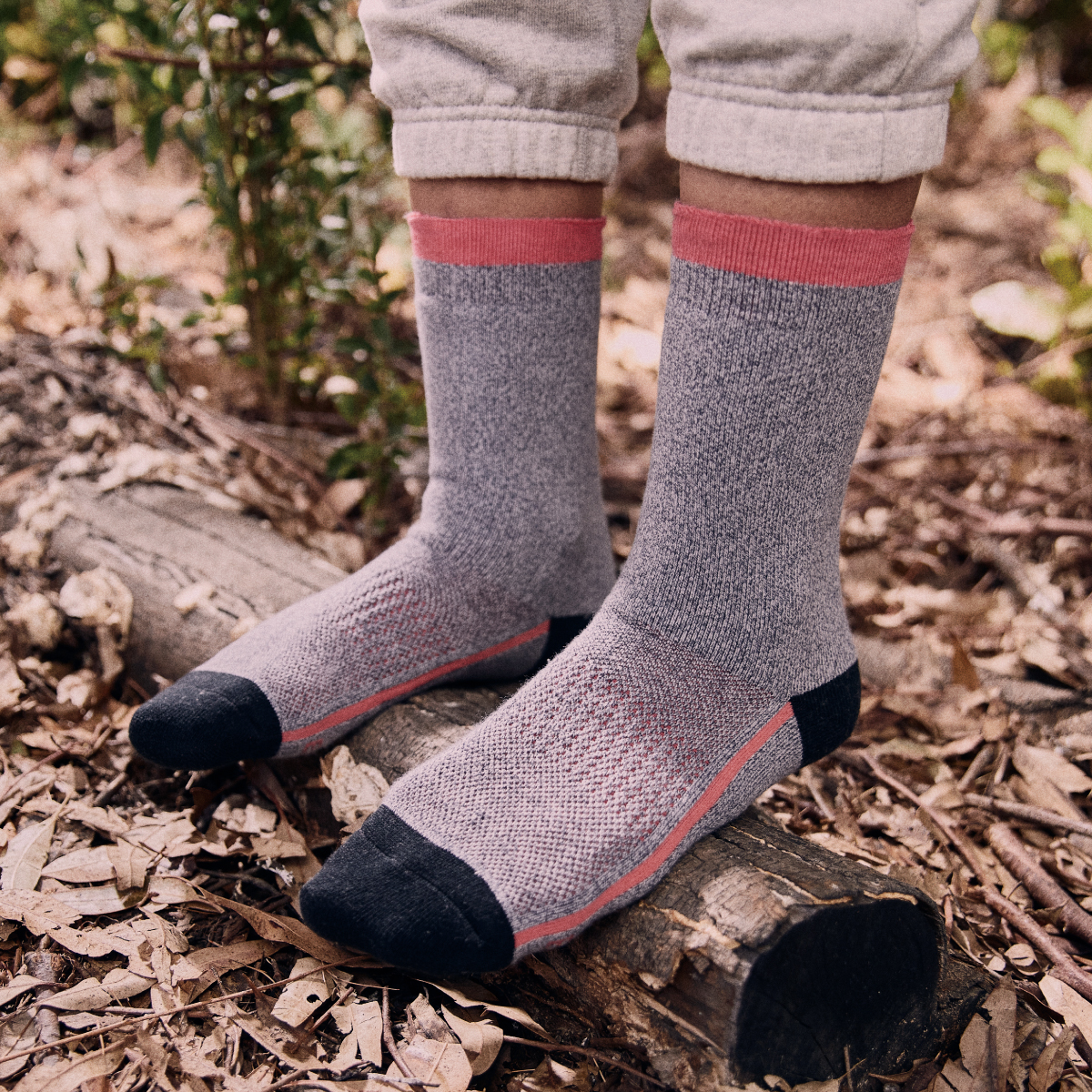
The look and feel of the brand was extended into a new packaging design system that combines the rich texture of the outdoors with a cool urban fashion feel. In classic Bonds style, the photography features a diverse selection of talent to tie with Bonds Explorer as a brand for every adventurer. The location and props reference the outdoors and help differentiate usage occasions; from everyday use workwear to outdoor adventure. A muted colour palette inspired by nature is used to identify products by gender: ocean blues for men’s and desert pink-reds for women’s. For the kids category, a palette of sand oranges matched with illustrative patterns add a sense of playfulness and vibrancy to separate from the adult ranges.


