Twenty5 King
Welcome to a living breathing workspace
Twenty5 King is currently the tallest and largest engineered-timber office building in Australia. A co-creation between Impact Investment Group and Aurecon in 2018, Twenty5 King is a world-class building representing the new breed of corporate workplaces of the future.
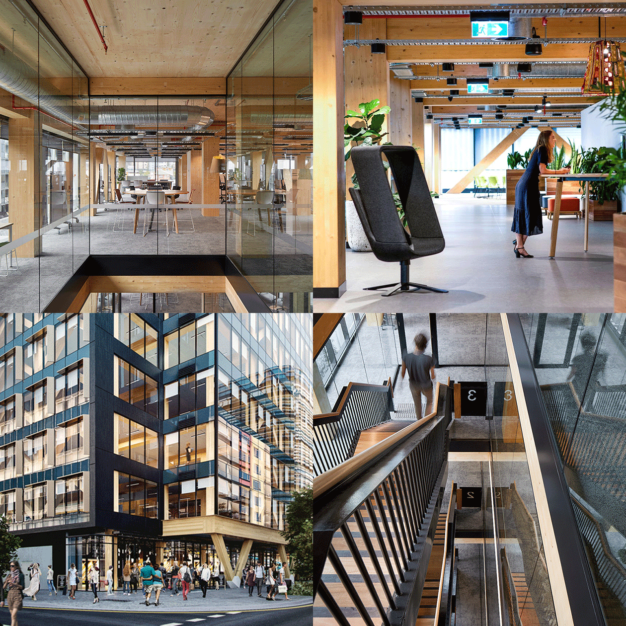
Inspired by timber’s environmental benefits and versatility, Twenty5 King uses revolutionary engineered cross-laminated timber in its construction, both internally in the office environment and externally on the building’s facade.
The developer wanted to be renowned globally as a sustainable benchmark for cutting-edge, sustainable offices.
Davidson was commissioned to develop the brand positioning, define the brand name, refresh the existing brand and develop the marketing communications to build its iconic reputation.
Extensive research with tenants, architects and developers, inspired the new brand positioning ‘Welcome to a living breathing workspace’. Touching on the natural soothing effects of the cross-laminated timber, biophilic design and the physical and physiological effects on employees that work on the building.
There was existing brand equity in the original address, ‘25 King St’, so Davidson built on the phonetic/numeral phrase to match the building’s contemporary feel and make it sounds more like a destination (Twenty5 King). Furthermore, this descriptive yet edgy name was paired with an emotive brand positioning tagline for maximum impact.
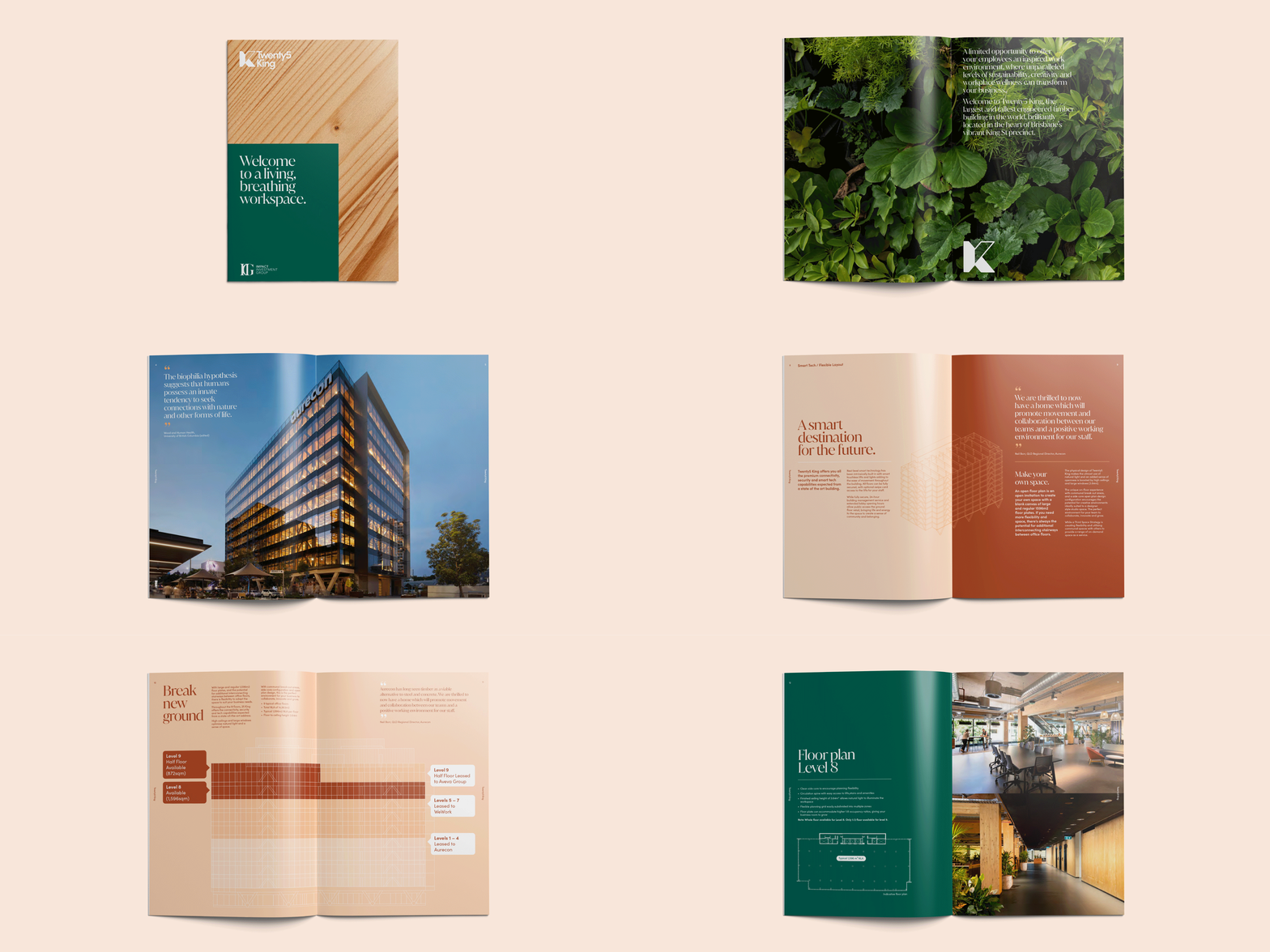
Directed by the design philosophy, the Twenty5 King brand identity is a monogram ‘K’ inspired by the angles of the building’s unique timber beam structure. Paired with a geometric sans serif typeface and a rich green colour, the Twenty5 King logo is modern, sophisticated and reflects the global stature of the development as a leading sustainable building.
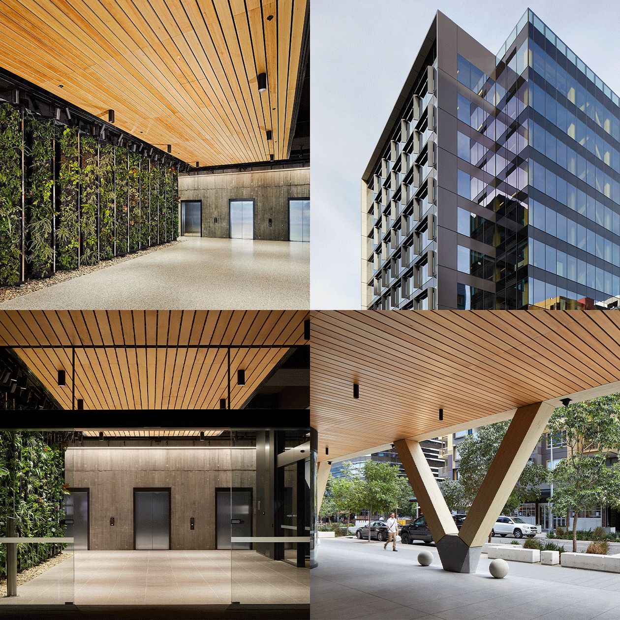
Vibrant, wide-angle photography of the exterior and interior of the building invites the viewer into the space, highlighting the unique architectural features and thriving work environment. This is supported by macro textural shots of the green wall and timber material that touch on biophilia—the innate connection between people and nature. These building materials also inspired the green and brown colour palette that feels natural and wholesome.
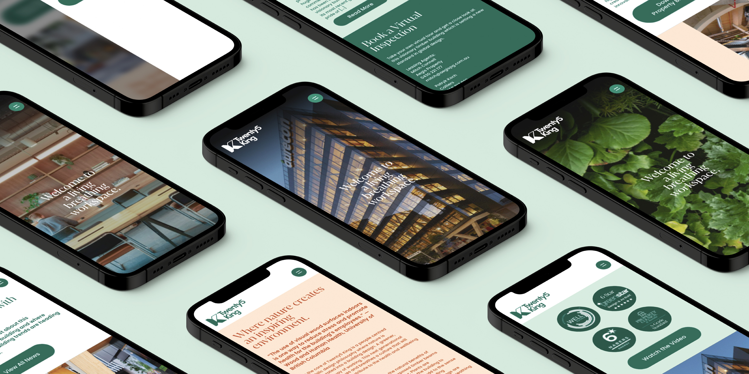
The brand rollout involved creating a beautiful, engaging website highlighting stunning building design and internal features through photography. A new brochure and video was designed to capture both the new brand design and tone of voice while also creating awareness for the opportunity to lease the available space. Davidson also developed a digital strategy to help build awareness and drive tenant enquiries.
Utilising the new brand language and tone of voice to reflect the new brand personality, we created articles to highlight the achievements of 2021.
