Enel’s vision: creating new partnerships and technologies, expansion and responses to global challenges.
Enel was founded in 1962, its beginnings humble and undifferentiated to other energy providers. Throughout time, as the world evolved and the Italian-based energy company’s capacity to power society grew, so did their interest in innovative technologies. Driven by the ever-growing global industry issues as a result of climate change, their purpose became quite clear; ‘to enable individuals, businesses and nations to thrive by being connected to gas, electricity and the right services that best suited their needs’. The digital revolution quickly became one of the cornerstones of the company’s industrial strategy and the tool which enabled it to develop groundbreaking services. Enel has impressively become the world’s largest producer of renewable energy and an innovator in its space running the only fully digitised energy grid; its achievements possible thanks to its continuous investments in new technologies which allow for its energy to be affordable, reliable and overall more sustainable.
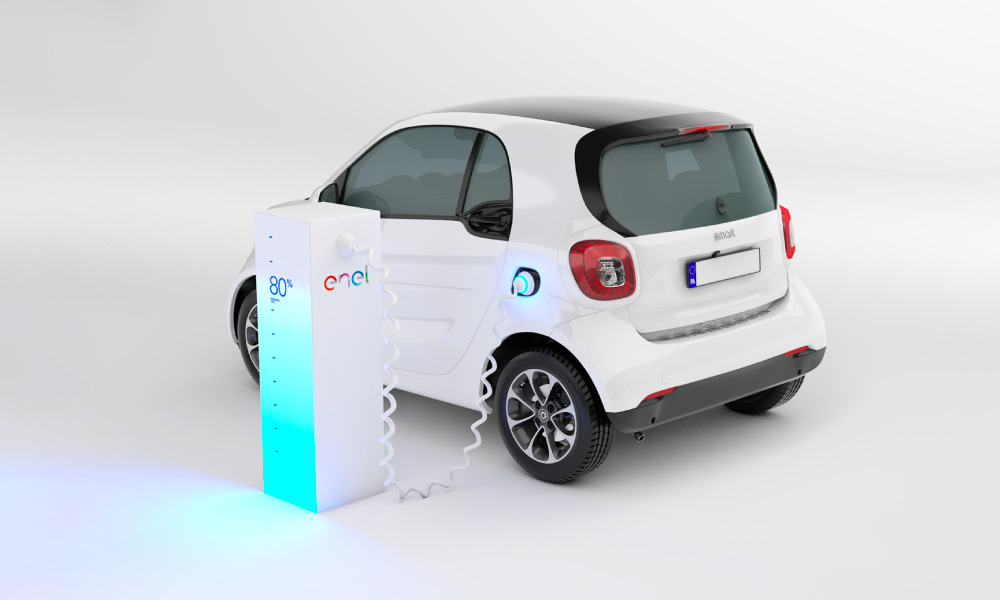
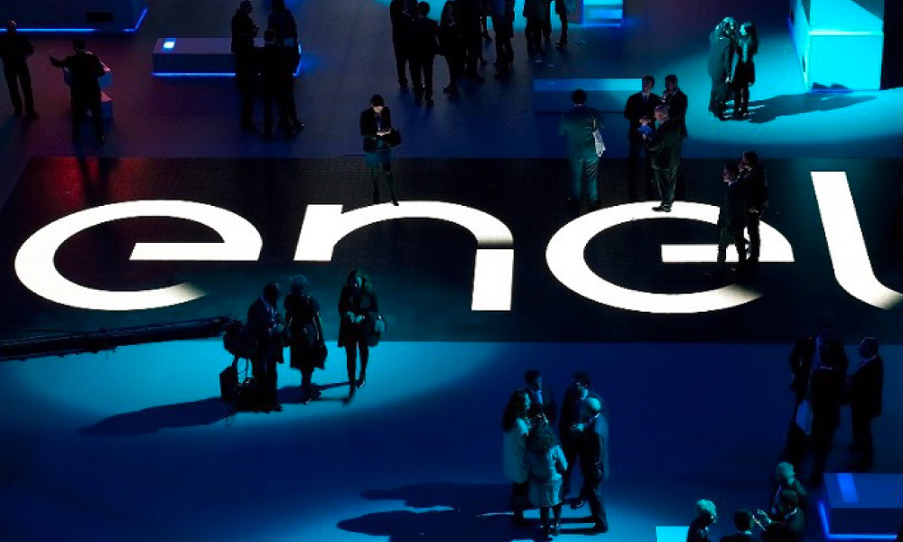
A pioneer of change in its industry; Enel partnered with smart in a first-of-its-kind project focusing on the development of electric mobility worldwide.
The company now finds itself at the beginning of a new era; one where everyone is connected and can get involved in helping to tackle the big challenges. The key feature of the strategy is “openness” – the vision being that of ensuring their services reach a growing number of countries, extending access to energy, and consequently boosting local economies. To improve the future, Enel believes one needs to develop a new approach that combines attention to sustainability with the best players in innovation. The brand’s ‘Open Power’ strategy challenges the ways we currently innovate, pushing the world to implement new ‘open’ ways of thinking that will truly disrupt the industry and develop much-needed solutions that can shake up the old markets. This new era for Enel required a new visual identity, one that best communicated their ambitious goals and new collaborative standing.
Vibrant Moving Energy
The new brandmark needed to help Enel shape and lead a new participatory era for the sector. Enel’s brand positioning – ‘Open Power’ – offers a clear call to unite the company and its subsidiaries to shift the entire energy sector from a conservative mindset that focuses on production, towards a people-centric philosophy that engages all stakeholders to be open to new opportunities. This philosophy was brought to life through a new vivacious brand identity.
![]()
The brand architecture was unified under a single brand identity, replacing the various sub-brand logos and names. Consistent storytelling ensured a better-alignment of the global organisation.
The new visual identity mimics the idea of “moving energy”. Cursors are used as the energy’s starting points, with experimentation and an open-mindedness informing the development of the dynamic wordmark. Each letter features a cursor, followed by a colourful trail of energy, visually echoing a light bulb filament. The chosen colour palette consists of a multitude of bright colours, replacing the old italicised, sans-serif, blue logotype with an orange tree icon. When applied digitally, the cursor moves and evolves, gradually forming words. When viewed as a static logo, the brand identity successfully captures the nuance of movement through transparency and the openness of the characters.
The new positioning was inspired by Enel’s success factor as defined by its customers: power that empowers – individuals, cities and national economies.

The distinctive visuals were used to build a versatile brand language; the unique typography of the distinct logo has been incorporated across Enel’s subsidiaries – Enel Green Power and Endesa – consequently ensuring the creation of a strong, consistent brand architecture. The experimental nature of the brand was intentional; the cursor can be used in unexpected new ways to create the endless interpretations of their brand strategy. Those inside and outside Enel can innovate and experiment with the cursor, reflecting the company’s vision of removing thinking boundaries in the pursuit of the “new”.
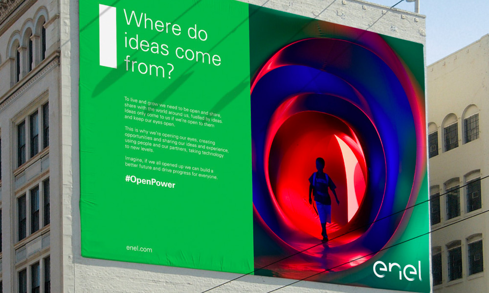
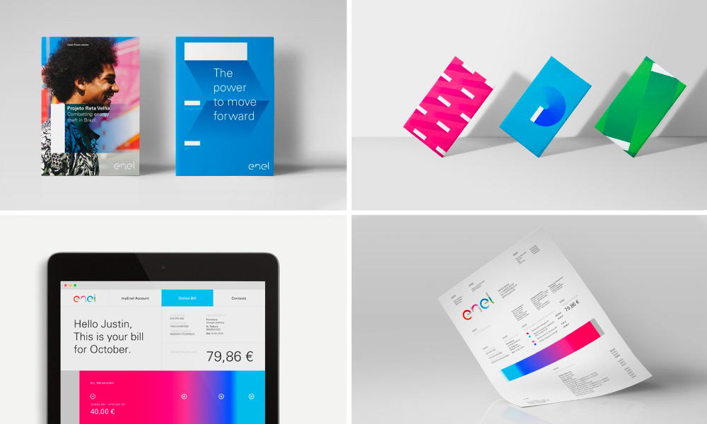
The group’s advertising has the same look and feel in all countries, adopting a focus on communicating Enel’s industrial and technology story.
The modern, vibrant and frankly progressive (for an energy company) look and feel of the rebrand have been successfully incorporated in Enel’s traditional advertisements, placed in a few of the 30 countries it operates in. Modernising the brand became a central focus in the rebrand to highlight Enel’s embracement of innovative technologies and people-centric philosophy. The multi-faceted nature and open character of the Enel Group are reflected across all touchpoints in a cohesive manner, including the digital sphere. As part of the rebranding, the energy company also restructured its corporate website, making it user-centric by adopting a mobile-first application.
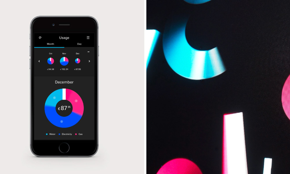
The previous digital ecosystem made of 179 touchpoints was streamlined, adopting a more lean and engaging approach.
Charging into the future
Enel’s rebranding has fully transformed the identity of the company, setting the leader apart in the utility space. The project not only has had a transformative impact uniting the group and its various product lines across 30 countries but has also prepared the organisation for the digital age. It has further inspired the brand to innovate for the future through experimentation, including the creation of the future-facing Enel X brand whose mission is to transform energy into a new power for businesses and people, globally. The group has reported a 53% increase of share price in the first two years since its rebranding, attributing the growth to the new vibrant and consumer-centric branding.
The visual experimentation was implemented across all touchpoints to strengthen the dynamic brand identity of the Enel Group.
Need Help?
If you need help creating a dynamic and engaging brand, we’d like to offer you a complimentary strategy call with our Managing Director and Head of Strategy, Grant Davidson. Having nearly 30 years of industry experience working with groundbreaking brands, Grant has the experience and knowledge necessary to identify your core brand strategy and communicate it effectively.