Where Covid-19 has wreaked havoc on the global economy and employment markets, it has also sparked a surge in desire among many to establish new businesses. During these unprecedented times, GoDaddy realised it had a greater role to play in assisting clients and potential customers in navigating the aftermath by transforming their physical offering into a digital one. With the spike in popularity, the American internet domain registrar and web hosting company saw the perfect opportunity to ditch the memorable mascot and create a new logo with a new brand message.

This welcomed rebrand entails a whole new direction for GoDaddy, which was previously working under a unique brand image, with a quirky personality yet a perplexing and confusing style.
The new logo focuses on the “Go” in “GoDaddy,” with an interlocking “G” and “O”, warm, curved heart-like shape. The sweeping arcs of the ‘GO’ were designed to reflect the tenacious spirit of entrepreneurs and is a subtle reference to their innovative and forward-thinking approach. Evoking a strong sense of emotion with the new GoDaddy shape.
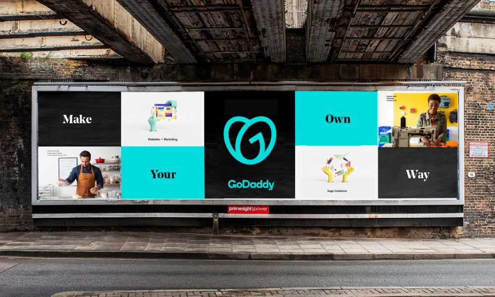
GoDaddy have placed their customers at the forefront of their marketing campaigns.
The GO’s continuous, overlapping stroke is a visual representation of the bond that all entrepreneurs have and its spacious interior can accommodate everyone – making entrepreneurship accessible to all. Supporting the core mission of enabling “ everyday entrepreneurs – individuals who are so often running a one-person or two-person shop and standing on their own two feet”, supported by the encouraging “do what you love” slogan.
GoDaddy aims to emphasise its devotion to GoDaddy consumers’ go-getter mentality by highlighting the word “Go” throughout the brand identity.
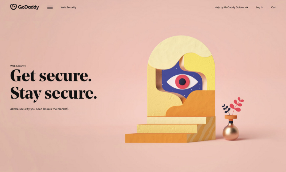
The heart-shaped monogram is elevated through a bright and dynamic colour palette. While the word “daddy” remains in the name, there was a shift to a more inclusive colour palette that appeals to individuals all around the world and supports diversity. GoDaddy utilises colour as a vessel to make the brand more joyful and connects to customers through reflecting their creativity. The new wide colour palette includes a bright teal that is eye-catching without being overpowering.
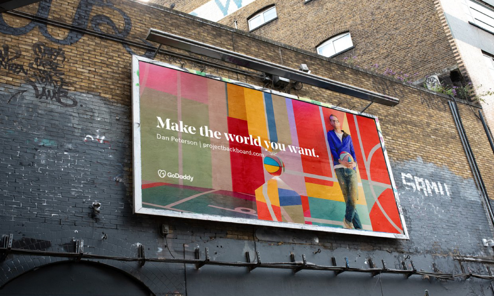
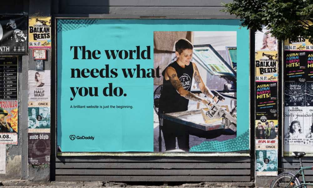
GoDaddy has been able to convey the individuality, independence, and excitement of its clients through photography, capturing entrepreneurs in the moment or portraying them as heroes.
The choice of a serif headline font is sleek and expressive, with a new, modern tone. With a touch of professionalism to it, giving the brand a distinctive look and feel whilst being able to clearly communicate information to customers and be digitally adaptable.
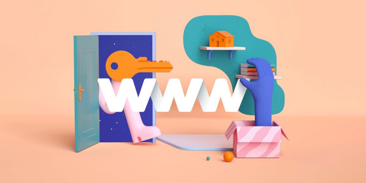
With the release of a new logo and identity also came a new and improved website and marketing campaign. The new advertising campaign, which includes real-life GoDaddy users narrating their experiences, is centred on the ‘everyday entrepreneurs’ featured in the brand slogan.
The new visual language emphasises everyone’s inclusion in all facets of life. The ‘GO’ is a powerful symbol of empowerment for entrepreneurs everywhere, encouraging them to “stand on their own two feet”.