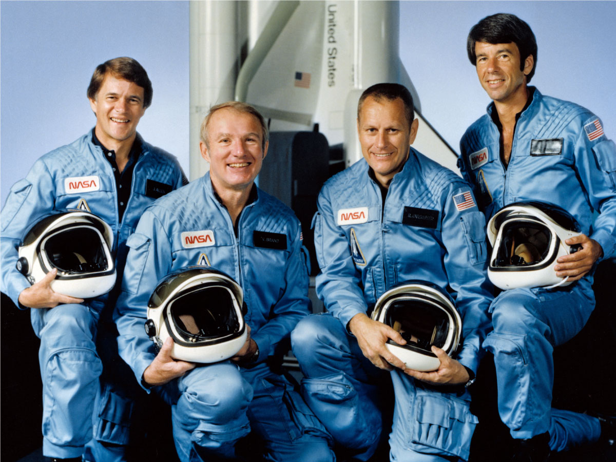
The National Advisory Committee for Aeronautics, or NASA, are leaders in technology and development. They have been at the helm of space and technological innovation, allowing us to explore the mysteries of the universe and human capabilities.
With the recent celebration of the 50th anniversary of the moon landing, we dove into our archives and pulled out NASA’s 1975 Graphics Standards Manual in order to understand the inner-workings of such an iconic brand.
Although the iconic NASA 1975 brand identity was only used for 17 years, it was at the helm of the most crucial years of space exploration at the height and close of the Cold war.
We’ve identified highlight 5 key principles modern brands can truly benefit in learning and implementing. Read on to discover what those lessons are.
1. A strong brand is driven by a strong vision
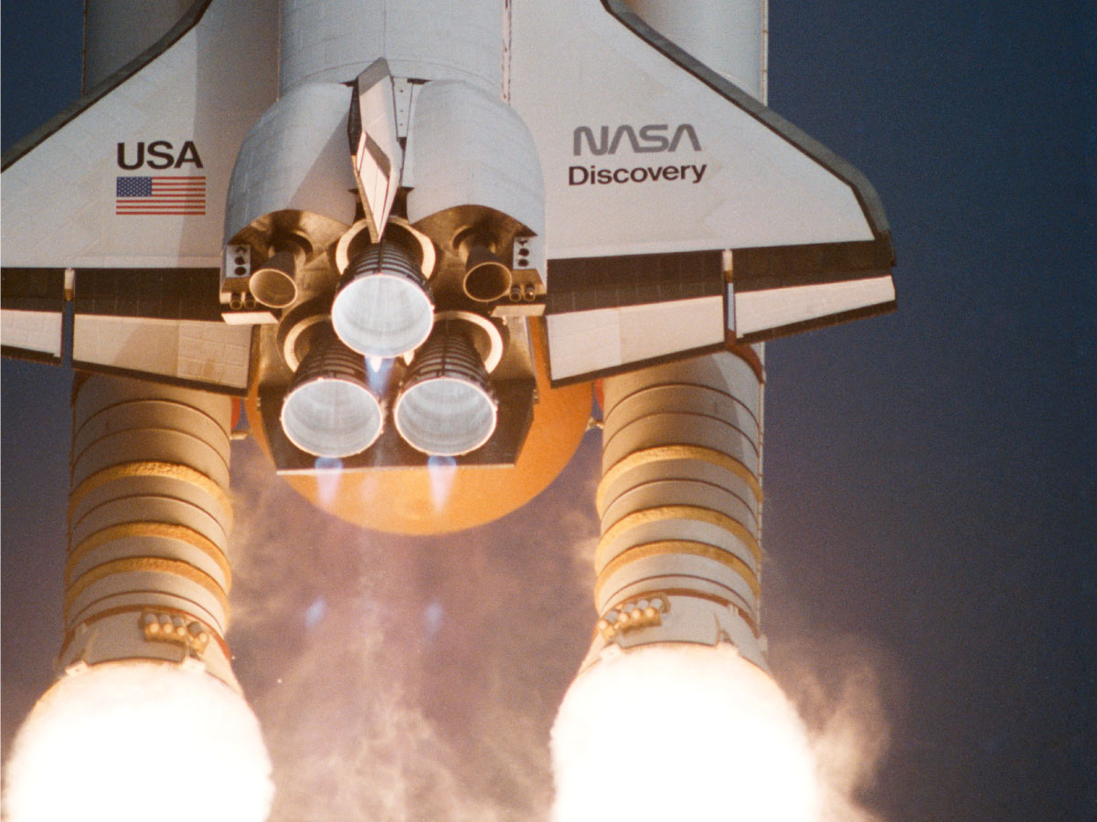
The subtleties in a logo’s form can create an overall impression or feeling of a brand’s vision, values and personality. Sharp, structured forms allude to a more authoritative organisation while curved, softer forms convey a more dynamic business.
“The new logotype is pleasing to the eye and gives a feeling of unity, technological precision, thrust and orientation toward the future. Unity, technology, pioneering achievement-that’s what NASA is all about.”
—Richard H. Truly, Nasa Administrator.
With NASA’s 1975 logo, the synergy between disciplined forms and fluid lines reflect and amplify NASA’s authority in their field as well as their focus on technological innovation and progress. This harmony between brand and vision created an identity that is memorable and unique. A brand should always be guided by a strong vision.
2. Even a ‘simple’ logo requires thought and consideration
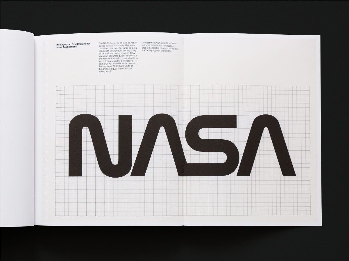
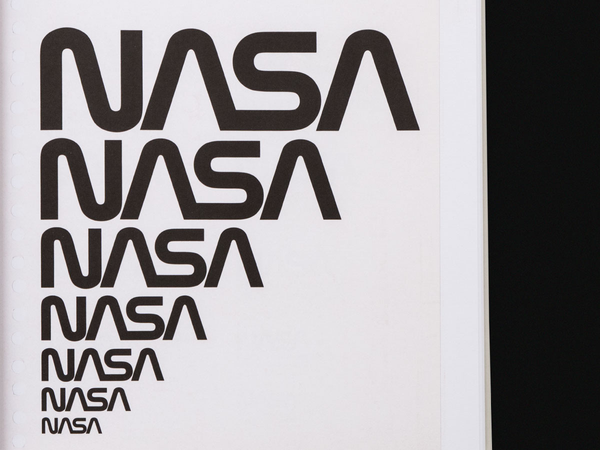
Simple logos are often the most successful and most difficult to craft. In an increasingly busy brand environment, a simple mark is key to cutting through the visual clutter. People are constantly bombarded with information from businesses marketing their products and services. In the battle for attention, a carefully crafted mark can communicate what makes your product or service unique.
3. A brand is more than just a logo – all modern brands need a strong visual language
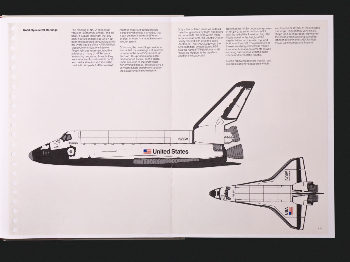
A successful brand is about more than just a logo. It is a complete, harmonious system of conceptual and visual elements working together to effectively portray your brand’s vision, values, purpose and personality. These elements include: the logo, colour palette, typography, grid layouts and photography. Together, these establish the basis of a strong brand visual language.
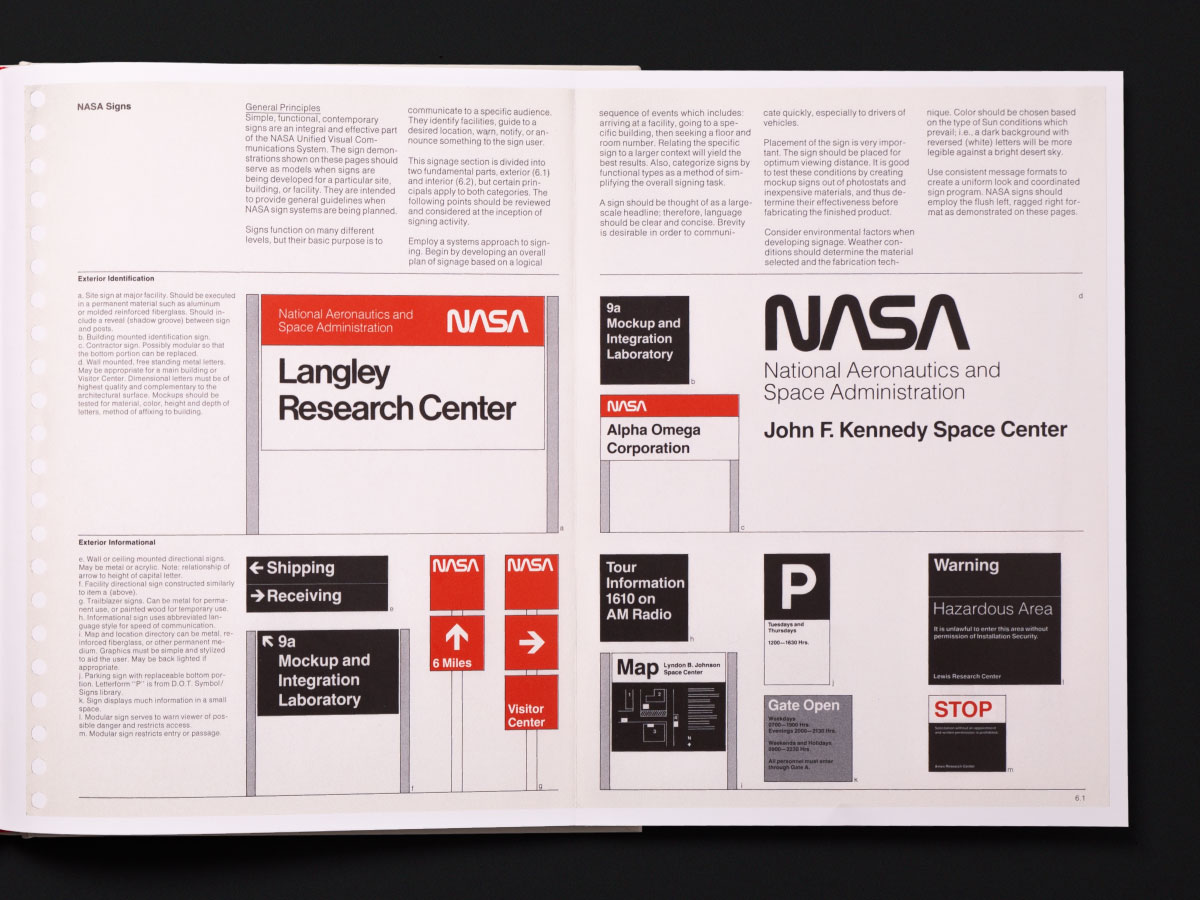
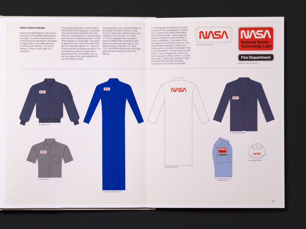
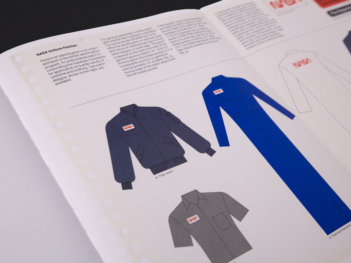
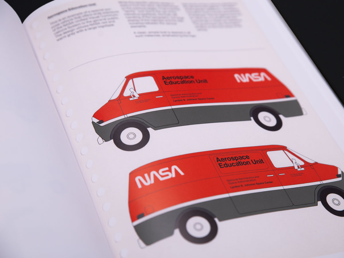
NASA’s Visual Standards Manual is a great example of how a modern brand’s visual language should work. The document defines all brand elements and their principles of usage to ensure consistency across all NASA communications. Examples of applications range from branded stationery, publication design, uniform design to vehicle livery and even branded spacecraft. In order to avoid consistency issues in the future, it is within a brand’s best interest to ensure that all touchpoints have been accounted for.
4. Defining the features of your brand – own a colour!
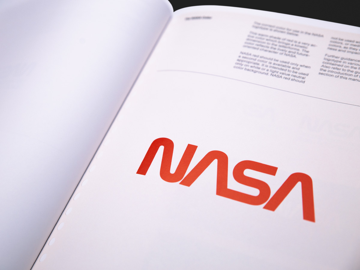
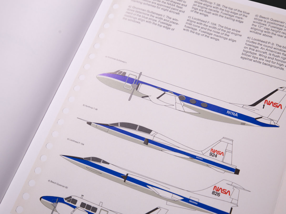
Apart from owning a unique product or service, owning a unique element in your brand is critical. ‘NASA Red’ was chosen by Danne & Blackburn as a ‘bold’ colour reflecting the character of NASA itself. Initially, blue was perceived to be ‘the colour of space’ and thus the appropriate colour to use. In a move to differentiate NASA from other space agencies, NASA Red was chosen. It is an assertive colour that pops, commands authority and confidence — especially as a detail on NASA aircrafts.
Similarly, retail heavyweight Target owns the colour red for their industry. Their simple effective brand mark, paired with their vibrant red makes their brand unmissable. Global logistics giant Toll also differentiates itself from competitors by owning ‘Toll Green’. The unique shade of green, standing out from competitors on the road — as NASA does in the skies.
5. Consistency is key
Danne & Blackburn’s NASA Visual Standards Manual effectively documents the brand visual language required to maintain the consistency of NASA’s brand. For the NASA design team, the manual provided a set of principles and rules to ensure NASA communications were visually coherent. The consistency ensured that the repetition of NASA’s visual cues, across all implementations, reinforced the same images and ideas. Faithfulness to a brand’s style can result in better recall; think of McDonalds’ golden arches or Cadbury’s signature royal purple.
Brand consistency is also a sign of professionalism, positioning your brand as credible and trustworthy.
