How to create a brand that stands out
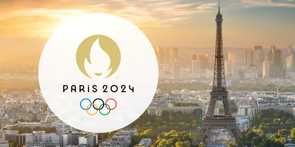
The Paris Olympics Logo presents a fantastic example of how to create a modern brand identity that stands out. The opportunity to create a brand identity for the Olympics would be both exciting and terrifying for almost any designer. At its core, is the Olympics not the most truly global brand in the world?
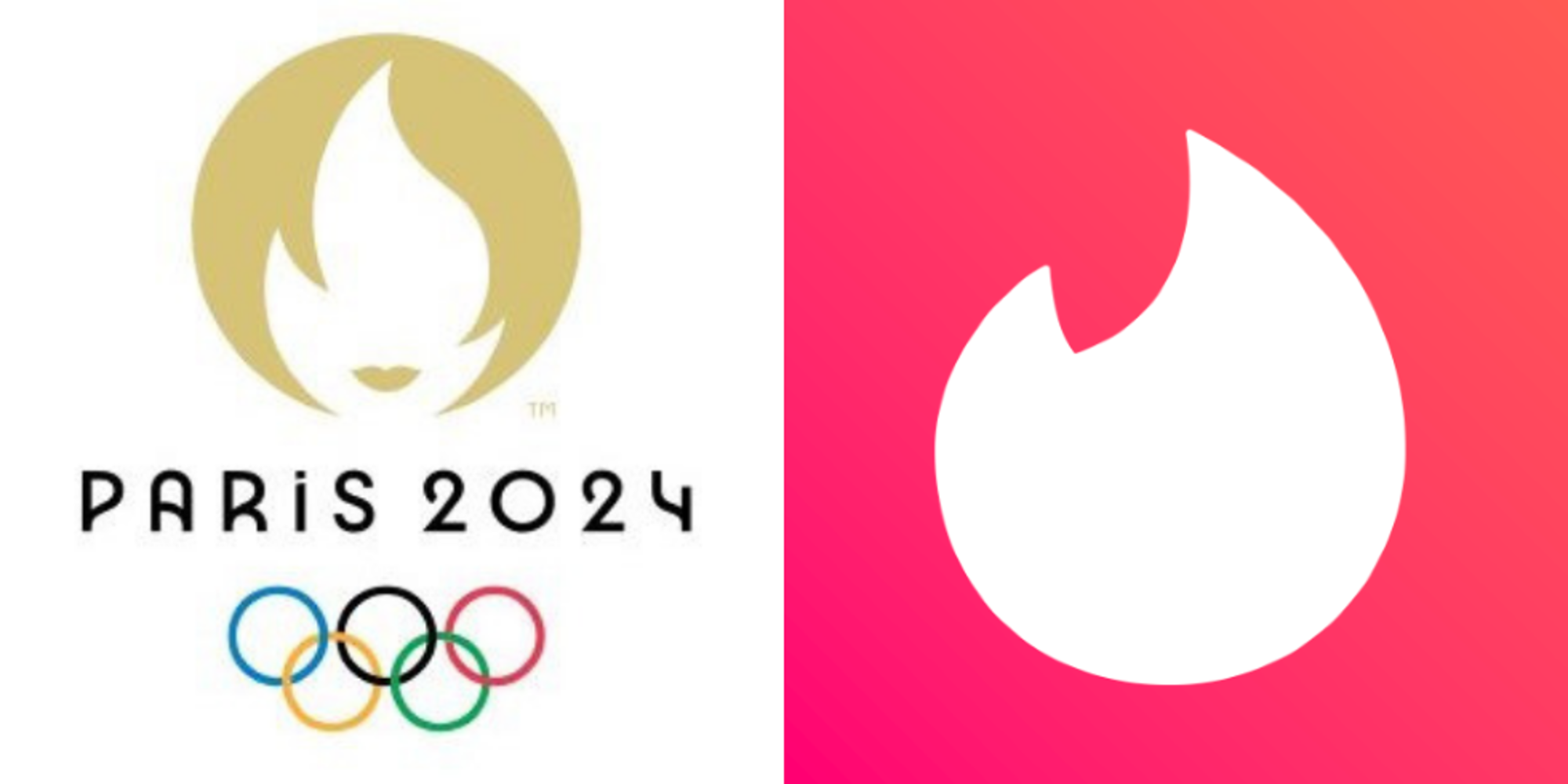
Despite mixed reviews, at the very least we can say that the design team did not shrink from the occasion. Previous Olympic logos have stirred similar controversy for the wrong reasons (hello, London 2012), but few have been so charged with meaning that they drive social debate. Some of the most popular terms being thrown around to describe this uniquely Parisian Olympic ‘brand’ include ‘raunchy’, ‘over-sexualised’, and ‘whimsical‘. Many observers have also compared it to the Tinder logo.
Looking at the logo immediately conjures the image of a woman. Commentary condemning an unnecessary or unwarranted sexualisation of the Olympic logo is not without merit. However, on a symbolic, brand-oriented level, the logo is a resounding success. The team behind it has created something truly unique that will likely spark discussion for years to come, without compromising its identity – no mean feat for an event that has been running since 1896. While the creators may have slightly misjudged the public reception, it grasps your attention and has set the internet ablaze with discussion – the modern barometer for an impactful brand.
How to create a brand that carries meaning
Despite its visual simplicity, the Paris Olympics logo is packed with meaning – setting another benchmark for strong brands. Initially appearing to represent a stylised female face, the logo can, in fact, be broken down into three different elements – each with its own distinct meaning.
The logo’s foremost allusion is to that of one of France’s most sacred symbols, Marianne. The ‘de facto goddess’ of France, Marianne is a historic personification of the French Republic who represents values of liberty, equality, and fraternity. Olympic organisers described the inclusion of her likeness in the logo as a ‘homage to female athletes and a nod to history, as it was in 1900 at the Olympics in Paris that women were first allowed to compete.’
Creating the impression of Marianne’s messy bob (another French staple) is the iconic flame of the Olympic torch, and rounding out the logo design is the obvious depiction of a gold medal. The seamless incorporation of traditional Olympic symbols with one of French cultural and historical relevance is impressive, and speaks to the ability of a strong logo in tying together brand elements into one cohesive identity.

The importance of a strong emotional value proposition
The foundation of a strong brand is a powerful emotional value proposition. While previous Olympic logos have effectively drawn on elements of their host cities culture or history (predominantly tourist attractions), rarely have they provoked strong emotions or set anything in the way of expectations. All critiques considered, has anyone ever attempted to brand the Olympics as sexy?
This logo positions the event in a new light. This Olympics, it says, will be daring, cheeky, stimulating – and unapologetically Parisian. Only time will tell whether it succeeds or not, but you have to admire their willingness to take such a risk on the largest international stage.
The logo also sets a tone of cultural significance and gives the event a powerful context. The committee has explicitly said that it was their intent to honour the first women to participate in the Olympics in Paris, 1900, who set a path for female athletes to continue to excel today. While some suggest that the unnecessary ‘sexiness’ of Marianne’s representation detracts from this proposition by perpetuating female objectification, the overall intent and message is one of female strength and empowerment that can resonate worldwide.
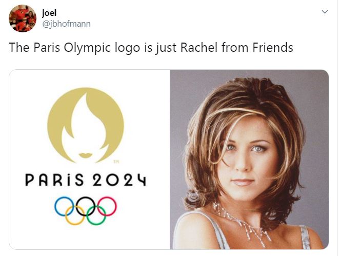
As Alexandra Whitaker of Cosmopolitan quipped, ‘Who knew a sports logo could carry so much history in its Rachel Green bangs?
How to create a memorable brand
Though public opinion may be split, one thing that is certain is that this logo will be remembered for a long time.
“I believe that this innovative design will be quickly recognised around the world and be a wonderful calling card for the Olympic Games Paris 2024’ stated Pierre-Olivier Beckers-Vieujant, chairman of the International Olympic Committee Coordination Commission.
This is the first Olympics logo to so clearly skew towards a single group in its representation. No doubt the committee hopes that it will be remembered as the first of its kind to explicitly champion the achievements of its female athletes and the women before them. However, it may also be the logo that most effectively captures the personality of its host city, beyond the tired incorporation of touristic symbols.
The Design Director of Cactus, Sarah Berkheimer, said in response to the logo “as a designer, I can only sympathize with the enormity of the challenge behind creating a mark that will be everything to everyone.” Funnily enough, this may be the first Olympic logo that shirks the expectation of being ‘everything to everyone’ in favour of appealing to the under catered few.
This is perhaps where its biggest lesson lies – you don’t have to please everyone, as long as you build a brand that resonates with a specific target audience.
Setting a precedent
Beckers-Vieujant told the BBC that the “combination of the gold medal, the Olympic flame and Marianne brings together the values, history and French touch that will make these Olympic Games truly special.” In the same manner, these elements – an emotional value proposition, cultural significance, and a recognisable symbol – also lay the foundations for a strong brand.
The Paris Olympics 2024 logo provides a fascinating example for brands looking to break the status quo by simultaneously standing out and standing for something. It also raises the bar for designers tasked with branding for future Olympics, perhaps setting a precedent for more daring and socially poignant logos in the future.
Overall, the Paris Olympics 2024 brand logo represents a clever and considered intersection of cultural symbols designed to transcend sport and make a global impact.
We’ve helped build strong and iconic brands for 28 years. Book a FREE strategy call with our leading brand strategists!