SKIMS recruited King & Partners to develop a brand refresh and site design after a successful initial launch. King & Partners refined the overall look and feel of the brand experience. With a growing assortment of product categories and new collections, it was critical for SKIMS to have a brand system that supports growing product lines and optimised product discovery.
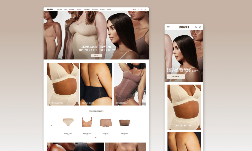
SKIMS brand identity is simple yet striking. With the addition of a secondary typeface and visual hierarchy, King & Partners was able to refine the developing brand whilst maintaining the original bubble-shaped typeface that Kanye West sketched out himself.
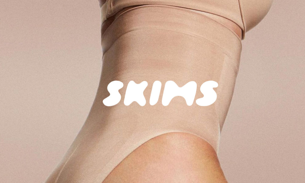
The brand name SKIMS is a hybrid of ‘skin’ and the founder’s name, Kim Kardashian. The body-positive shapewear is described as a “second skin”, which is clearly represented through the clever brand name.
The SKIMS site was minimal and bold, with the primary goal of showcasing the company and its first collection. King & Partners revamped the site to represent a refined and new brand. The development of a new structure that included categorisation and enhanced browsing, product detail, and branded content created an ideal shopping experience for customers.
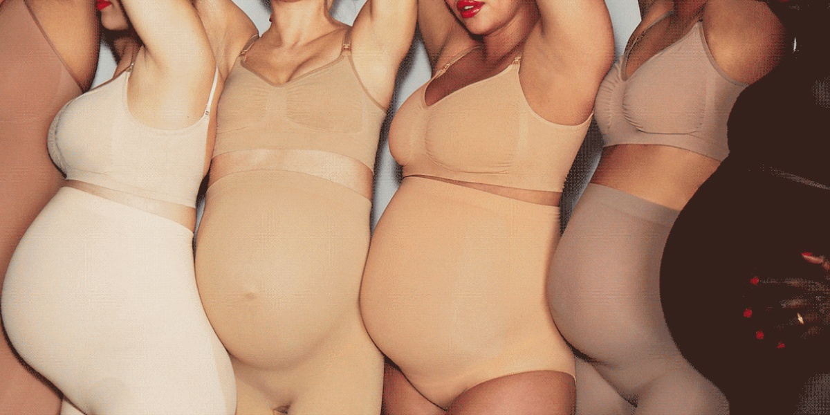
In the world of cosmetics, colour diversity has become a craze, but in the world of shapewear, it is yet to catch on. With shapewear typically only being offered in a nude and black colour, SKIMS offers nine colourways and features sizing from XXS to 5XL. The brand has launched in an exciting new age for shapewear. Kardashian West’s objective was to create shapewear that appears and feels like a second skin to women, which had previously been challenging due to a lack of colour options.
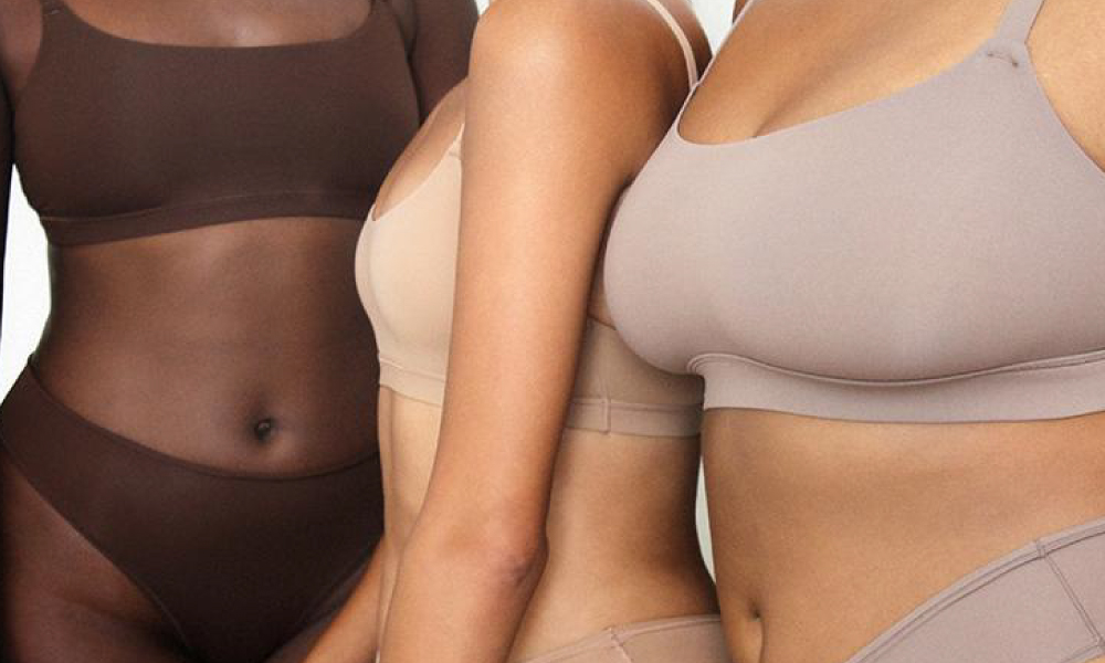
The most recent marketing photography shows models with a variety of shapes and sizes wearing the SKIMs shapewear.
SKIMS recently launched a unique pop-up shop in Paris. The glossy, beige-coloured walls and display units are at the heart of the store’s unique design. The entire concept is built on the notion that there are no sharp edges, that everything is rounded with soft edges, to create the appearance of bodily shapes and curves.
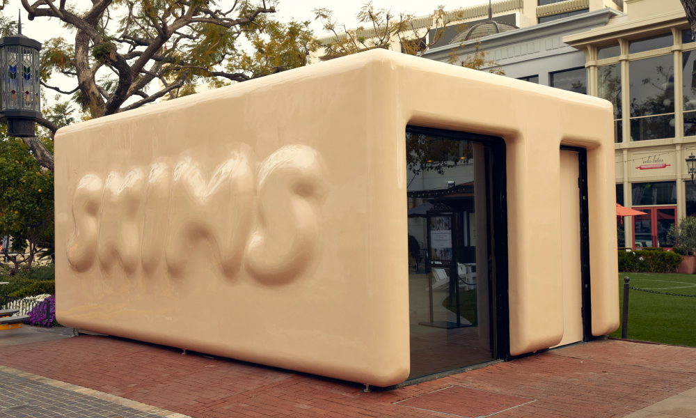
The colours for the pop-up store were chosen based on the Skims line and the colour palette they employ.
The concept of the underwear brand, which is devoted to offering an inclusive selection of sizes and shapes for all bodies, was the inspiration for the temporary SKIMS store.
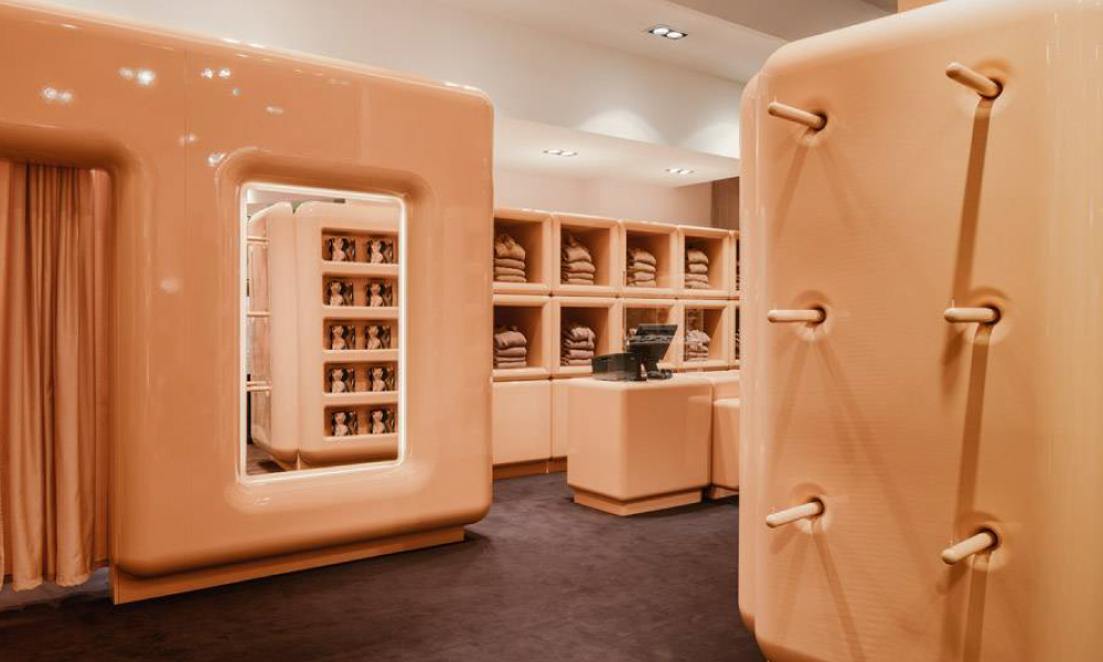
Underwear, shapewear and loungewear items are displayed inside chunky, beige cupboards fitted with hooks and built-in shelves for additional displays.
THE FUTURE OF RETAIL REPORT

We recently commissioned a report on global retail trends and the evolution of shopper behaviour to identify the essential strategies retailers need to implement to thrive in the coming decade. Download the free report below!