Depicting temperature change and CCC’s role; global warming heat temperature maps served as inspiration for the chosen colour palette.
Guiding the comprehensive brand strategy, and later the striking branding, was CCC’s strong commitment to helping combat climate change. The committee regularly consults the government on emission targets and provides reports that illustrate its progress in reducing greenhouse gas emissions. Recognising that climate change at first glance appears to exist solely on Instagram feeds and t-shirts, design studio Templo was driven by the desire to give this organisation an identity that matched its influence and ambitions; one that lifted the British committee above the noise and drew awareness and respect for its work.

CCC’s visual language is an extension of the striking brandmark; reinforcing the sense of honesty whilst avoiding being too alarmist in its approach.
GREAT DESIGN IS DISRUPTIVE
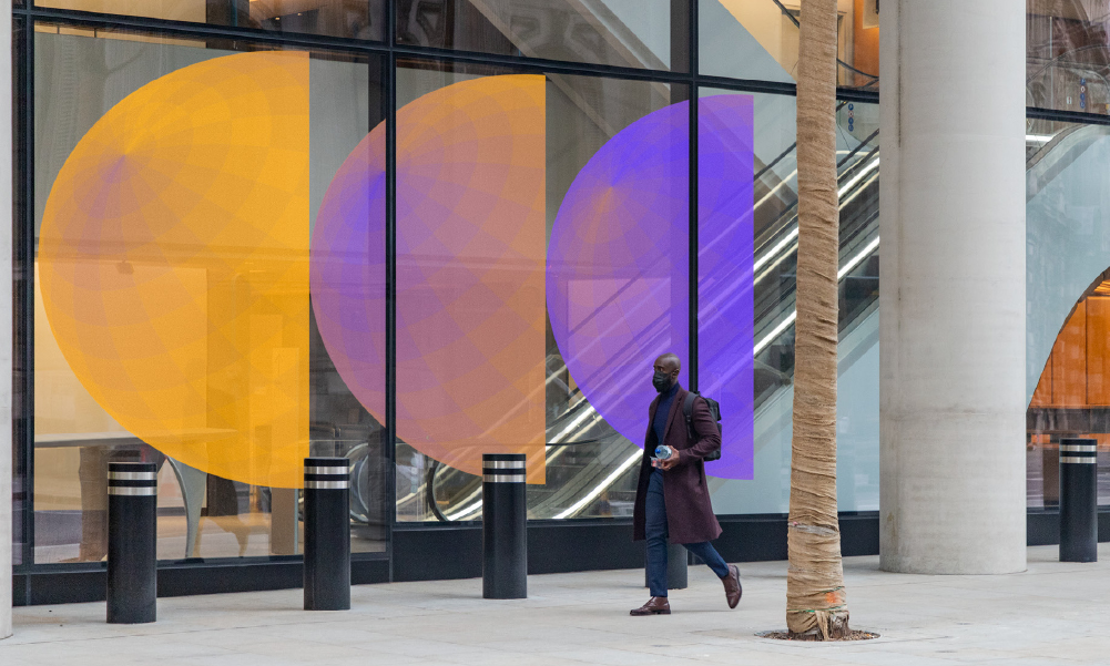
CCC’s new brand identity adopts an unusual and bold colour combination of purple and orange; making the British committee an outlier amongst competitors who predominantly rely on blues and earth greens, or “warning” reds and oranges. This way the organisation cleverly adds uniqueness to its branding and differentiates itself from competitors by occupying a gap in the spectrum; both chosen colours commonly used to depict temperature changes.
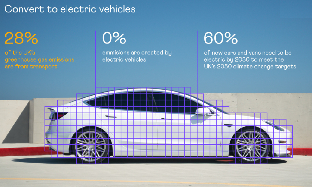
Targeting both data analysts and the general public; the graphics created across the identity use data visualisation in an impactful yet refreshing way.
A disruptor in its sector, the symbol is a contemporary expression of the earth symbol; adopting a less literal, more scientific angle that aligns with its world-class, excellence-seeking stature. Simple, yet iconic, the symbol is layered with meaning; reinforcing the CCC acronym and conveying its role in helping in the transition from an overheated to a cooler planet. The logo animation further brings the symbol to life; the sunrise motion created signifying progress and optimism, whilst the gradually-spinning hemispheres creating a sense of continuity.
Compelling communication of hard-data; the new visual identity serves as a tool for starting necessary discussions on the climate crisis and educating various audiences.
GREAT DESIGN CONSIDERS MULTIPLE TOUCHPOINTS
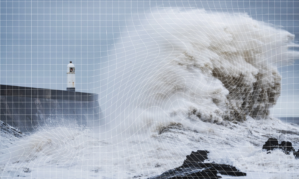
CCC’s visual identity presents a refreshingly ‘calm’ feel that was seamlessly applied in all its internal and promotional assets. CCC and Templo recognised that the climate change sector tends to be proliferated by misinformation, thus it was crucial for the rebrand to portray a “fact-based neutrality”. Aside from the three hemispheres in the logo being revealed by the orbiting of planet Earth around the sun, the 3D imagery similarly mimics or references natural physics. The spectacular imagery of nature and man-made machines used to tackle climate change further bring scale to the CCC brand.
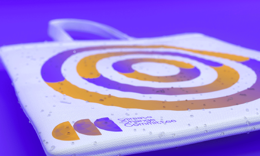
The visual identity was cohesively applied on multiple touchpoints, including the organisation’s platforms, social media posts, event materials, data reports and signage.
Seamlessly linking with the committee’s ‘fresh approach’ to data visualisation, quantum field grid images were developed; complementing the grid displayed within the logo. The ‘scientific’ style is carried through to graphs, charts and imagery; giving a clean, fresh style to the visualisation of the hard data, and playfulness to the spectacular 3D imagery.
NEED HELP?
If you need help creating a brand that pushes the creative boundaries, we’d like to offer you a complimentary strategy call with our Managing Director and Head of Strategy, Grant Davidson. Having nearly 30 years of industry experience working with groundbreaking brands, Grant has the experience and knowledge necessary to identify your core brand strategy and communicate it effectively.