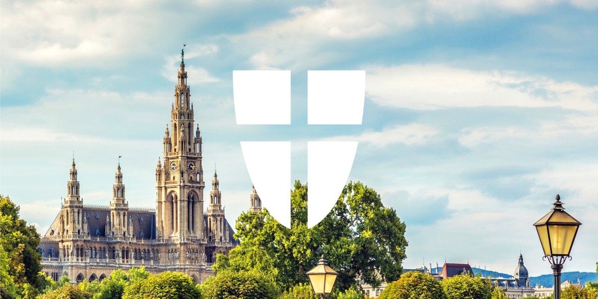
Vienna is a business hub and a tourist hotspot; crowned as the world’s most liveable city for ten years straight by The Economist.
Vibrant as ever, Vienna houses nearly two million people from 180 countries. The high living standard is provided with the help of the city’s 30,000 employees – making The City of Vienna one of Austria’s most essential and largest employers. Its previous positioning and inefficient execution of communications obscured the government’s role, leading to the city needing a rebrand that reinforced its modernity, united civil servants around a shared vision, and eased the identification and access of various city services.
GREAT DESTINATION BRANDING SPEAKS WITH A UNIFIED VOICE
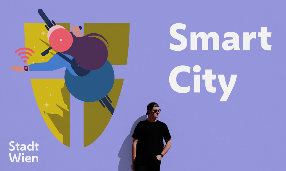
Masterfully reducing the current strategic and visual noise, the new brand architecture represents the municipality’s organisational units with clarity by replacing internal numbering of departments with simplified names, endorsed by the City of Vienna logotype. This allowed for effective service delivery, mode of operation and communications; successfully establishing The City of Vienna’s brand as a citizen-facing one whose ‘promise is kept daily by its 70-plus departments’.
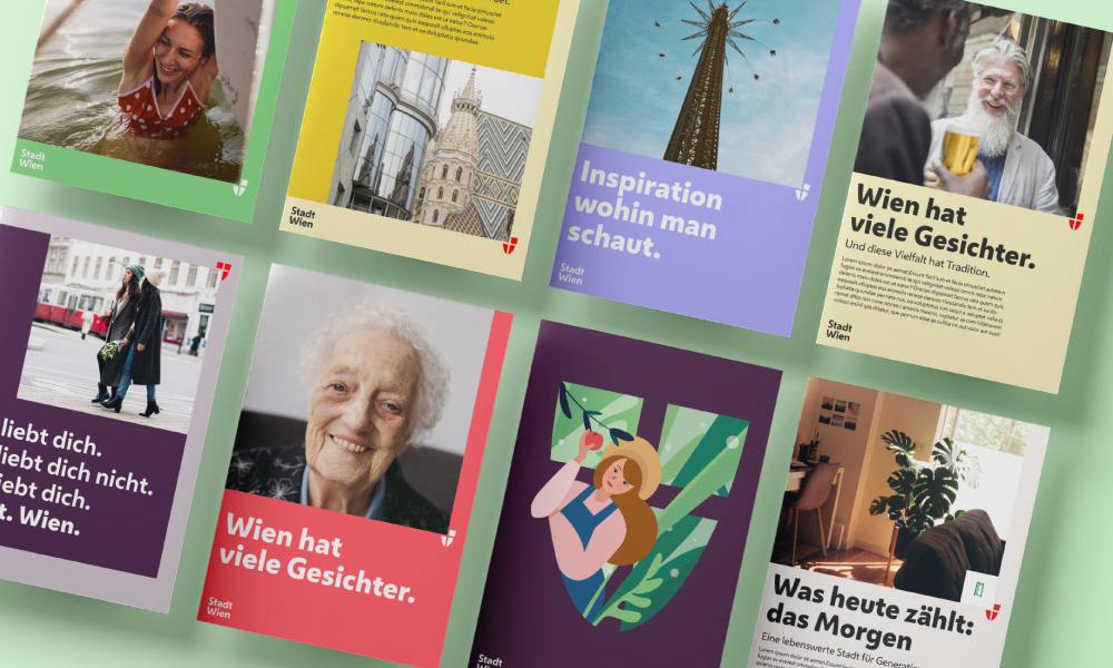
The visual identity masterfully maintains the personality of the city within the revised monolithic brand architecture.
Place branding can become a powerful tool that reinforces what makes the destination appealing and what it stands for; creating a unified voice that speaks to all facets of a place. The rebrand by Saffron presents the key themes that differentiate the Austrian capital from other European destinations, as identified by multiple stakeholders; the Viennese ethos guiding this project and all design decisions being: ‘operating at a human scale, with people in mind’.
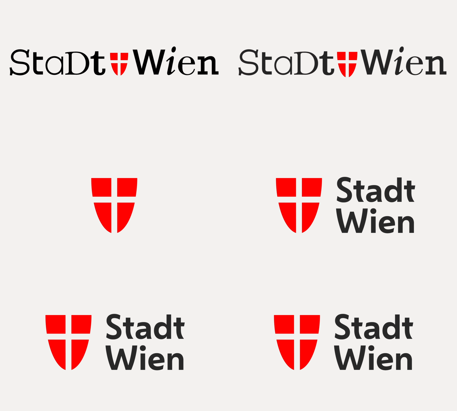
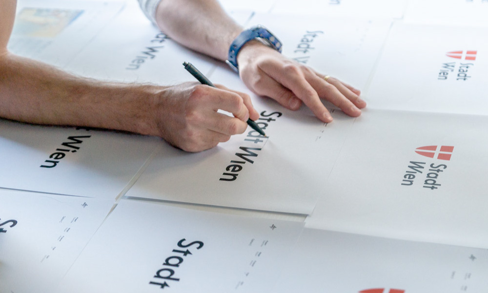
City of Vienna was given a unified tone of voice through a new Stadt Wien wordmark.
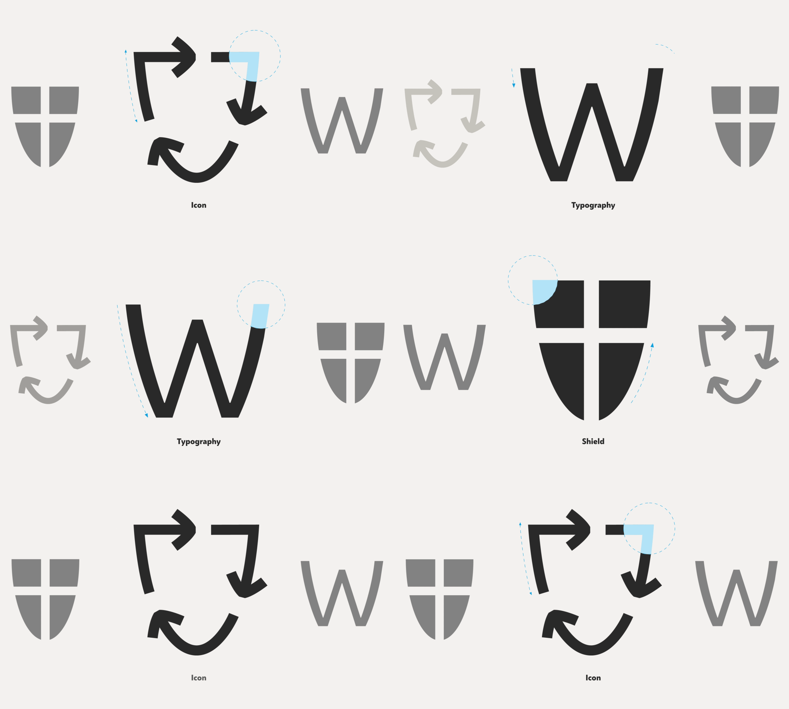
Recognising that typography is unarguably one of the most effective elements for a corporate design, Saffron designed an entirely new typeface. As resident communication was of central importance, a custom font family for Vienna was created; one that clearly reflected its brand and soul. One thing Saffron did not struggle with was finding inspiration. Rich in culture, the ornamental lettering on historic buildings and functional design of the city’s orientation systems inspired the typeface’s design language. Such elements found within the city reinforced the idea of incorporating the city’s historic shield at the core of the new approachable identity.
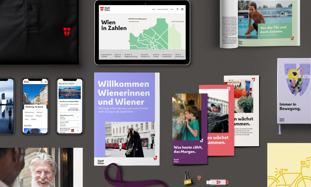
City of Vienna’s visual identity and brand strategy are tightly coordinated; the iconography, typography and imagery reflect its personality, the government’s efficiency and human centricity that characterises Vienna and its residents.
Named after the classic Viennese coffee, the new wordmark and font family – Wiener Melange – presents a clean and mature feel, whilst also embodying the humanity and diversity found in the Austrian capital and its residents; cleverly unifying the public services and the government. The design system and typeface work hand-in-hand, complementing one another and creating a consistent, distinctive identity for the city’s administration.
Inspired by the curves of the emblematic shield, the bespoke typeface draws on cultural assets of the city.
The rebrand was brought to life by employees who were crucial in the brand’s successful implementation. Employees working within the administration are now united under one primary goal: building a ‘city fit for the future that respects the culture of the past’. Amendments to the Employee Value Proposition provided the workforce with a clear standard to work by; one that was previously lacking. The fonts further empower the creation of impactful communication that share a unified voice; supporting every touchpoint and enabling the information shared to be useful, clear and distinctive for all residents.
Clarity, usefulness and relevance were a must; the new City of Vienna visual identity frames various essential touchpoints, becoming part of citizens’ day-to-day life.
7 STRATEGIES BEHIND THE WORLD’S MOST SUCCESSFUL DESTINATION BRANDS
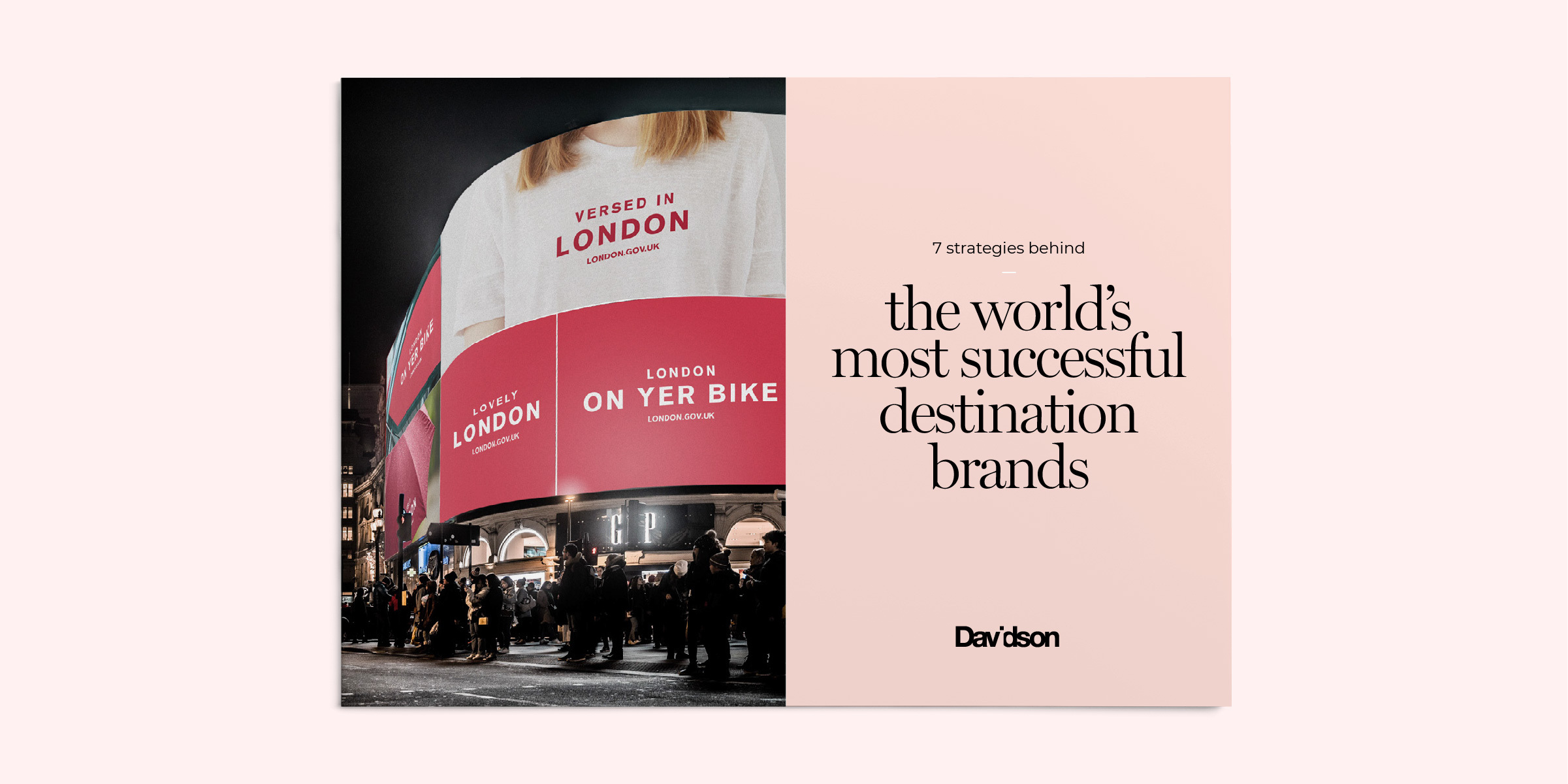
Drawing from a collection of case studies, research papers and expert insights from Harvard, we’ve curated a selection of the world’s leading destination brands and identified the seven strategies that position them as iconic places to live, work and visit.
NEED HELP?
If you need help positioning your destination at a competitive advantage to win new visitation and rebound financially, we’d like to offer you a complimentary strategy call with our Managing Director and Head of Strategy, Grant Davidson. Having nearly 30 years of industry experience working with groundbreaking brands, Grant has the experience and knowledge necessary to identify your core brand strategy and communicate it effectively.
