Living a Bloody Comfy Life with BONDS
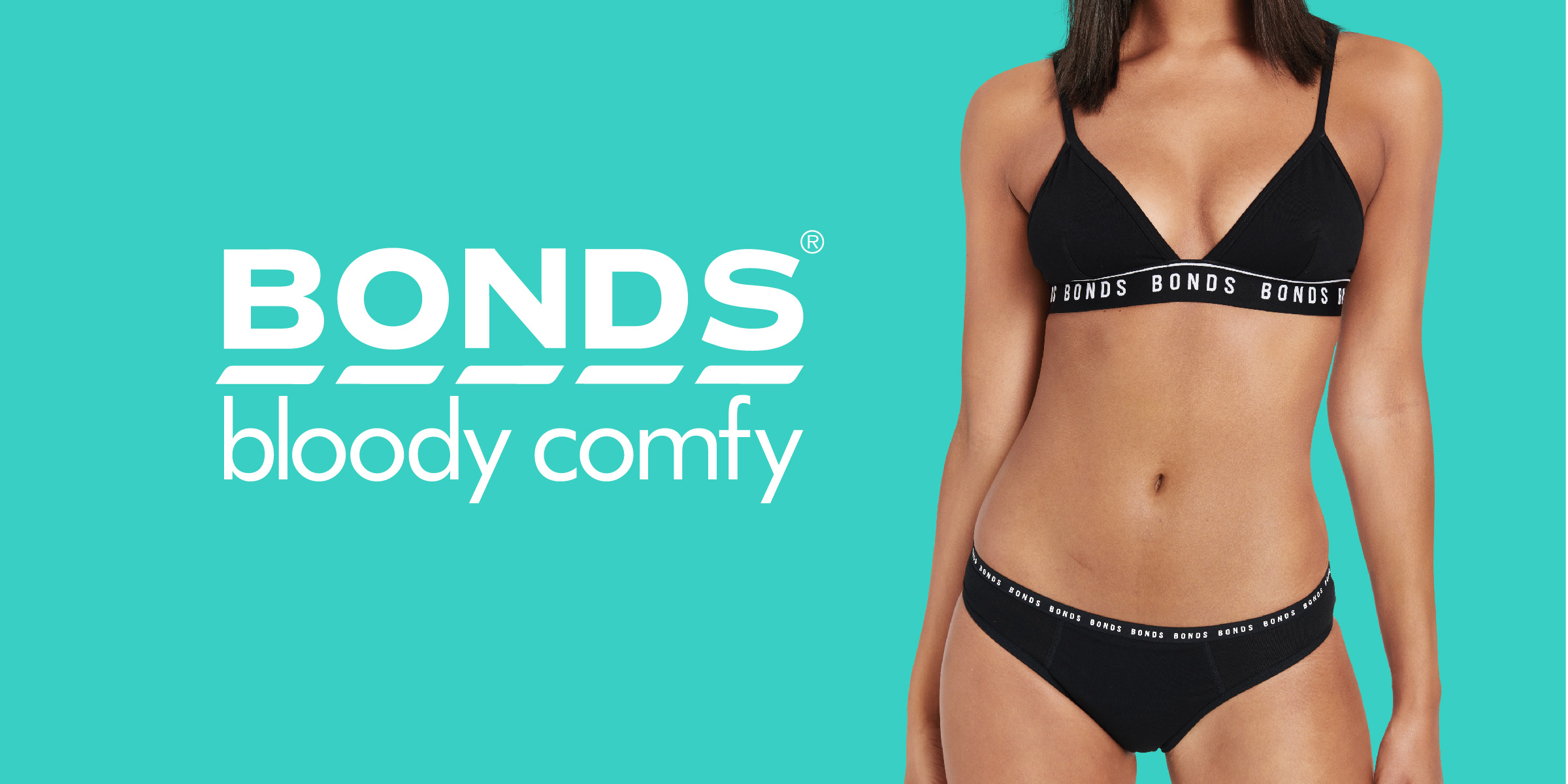
BONDS is bringing a new period in periods with their latest addition to the female underwear market – Bloody Comfy Period Undies. As an innovator in the retail space, the iconic Australian brand wanted to shake up the category by introducing a new reusable, leakproof, odour-proof way to periods.
BONDS envisioned entering the market by offering a variety of comfy undie shapes, with different absorbencies available so one could use them any day of their flow. The kicker: kinder for the environment as unlike disposable feminine hygiene products, the Bonds Bloody Comfy Period Undies are designed to be worn, again and again; reducing the heavy flow of single-use products going into landfill. The underwear market leader ultimately wanted to offer women of all ages a reusable option which would not compromise their comfort or the brand’s hipster-like aesthetic.
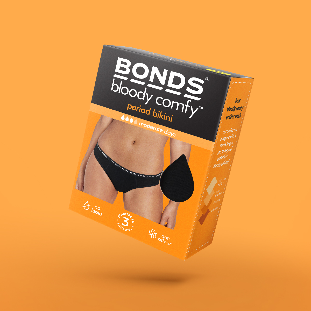
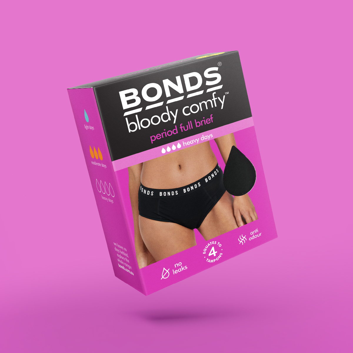
Davidson Branding was tasked with the exciting challenge of creating new product packaging for BONDS in the feminine hygiene undies category, that would consequently ensure shelf stand-out. We started by looking at the category, noting trends and identifying opportunities. The goal was to strategically utilise a hierarchy of visual communication tactics that would draw attention to the innovative product and create a compelling image for shoppers. An effective pack design hierarchy was developed to ensure the Bonds Bloody Comfy Period Undies’ story and unique selling proposition were highlighted and appropriately communicated to the customer.
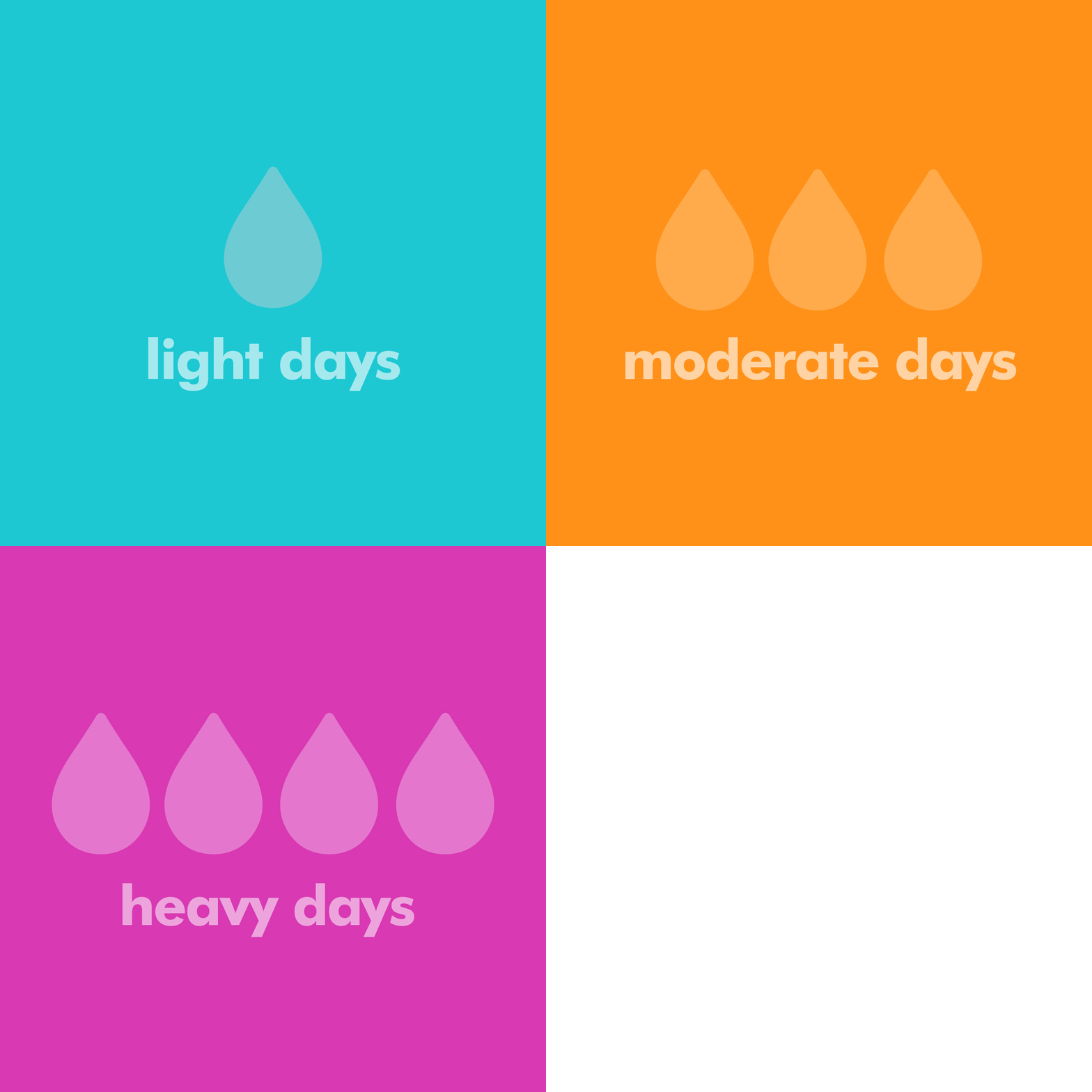
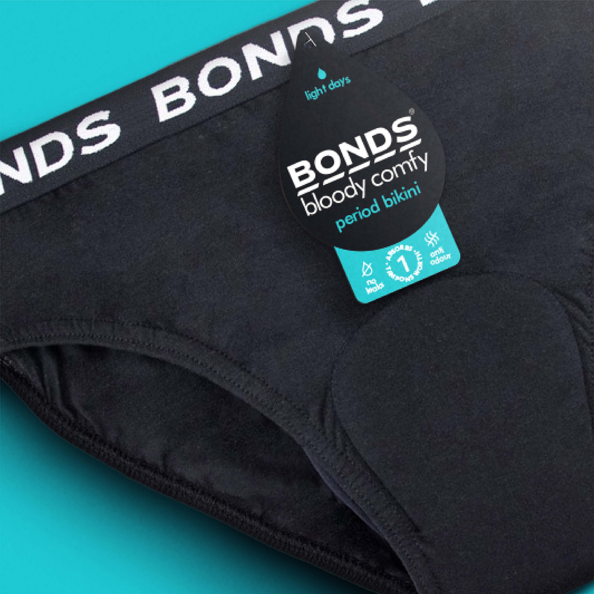
We looked at the competitor set in the market, noting how other brands used similar soft and feminine colours and designs on their packaging. As BONDS wanted to stand out and make a bold statement of living life leak-free and worry-free, we highlighted the brand in its iconic black and white colour palette that communicated the brand’s distinct look and feel. In addition to this, the colours denoting the absorbency were deliberately bold and bright, further differentiating the brand from similar offerings, not only ensuring product stand out, but also aiding consumer navigation. Davidson ensured that the key communication points were strategically ranked to guide the shoppers’ eye flow through the packaging face so they could best understand why this product was the right and best choice for them; consequently positively influencing the purchase decision.
Bloody Comfy Period Undies by BONDS hit the shelves in April, generating immense buzz and interest from consumers on social media; thousands of which now openly advocate for the product. The cheeky reminder to go with the flow and the new striking product packaging by Davidson intrigued those who were on the fence, driving trial of first-time buyers.
