Tuff Tonneaus
Founded in 1993, Tuff Tonneaus is the Australian leader in aftermarket design and manufacturing for tonneau covers and accessories; renowned for providing simple style and dependable performance to its customers.
To align the Tuff Tonneaus brand with its innovative products, the company entrusted Davidson with refreshing the brand by differentiating it as premium-priced. Recognising that their existing identity was dated and doing a disservice to the high-quality products, the rebrand presented a compelling opportunity to further elevate, innovate and ‘break through’ in both offline and online communication channels. Outdated in function and look and feel, the existing website’s complex organisation of information and lack of clear navigation was negatively affecting the user experience.
The strategy uncovered that the Tuff Tonneaus brand is about delivering quality and dependability. Organically, the brand story centred around the slogan “Performance fit” quickly came to life. It was crucial for the company to communicate its passion and design-driven approach to deliver ‘bloody clever’ solutions. A master in providing simple, dependable, yet innovative style – this is who Tuff Tonneaus is.
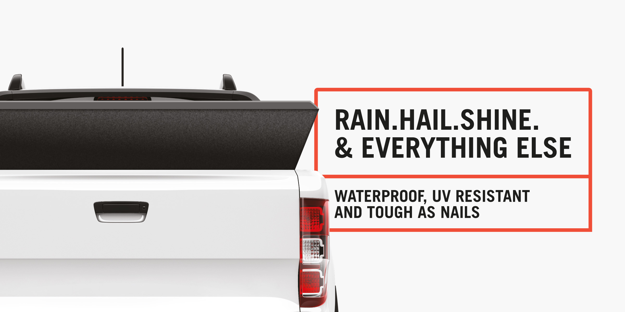
Sleek yet cheeky; picking up on the language used by the brand’s core male audience, the new clean identity creatively communicates Tuff’s passion for smart-design solutions by adopting a larrikin tone of voice. This not only allows for the brand to establish a connection with its target audience, but also successfully differentiates the company amongst a sea of sameness.
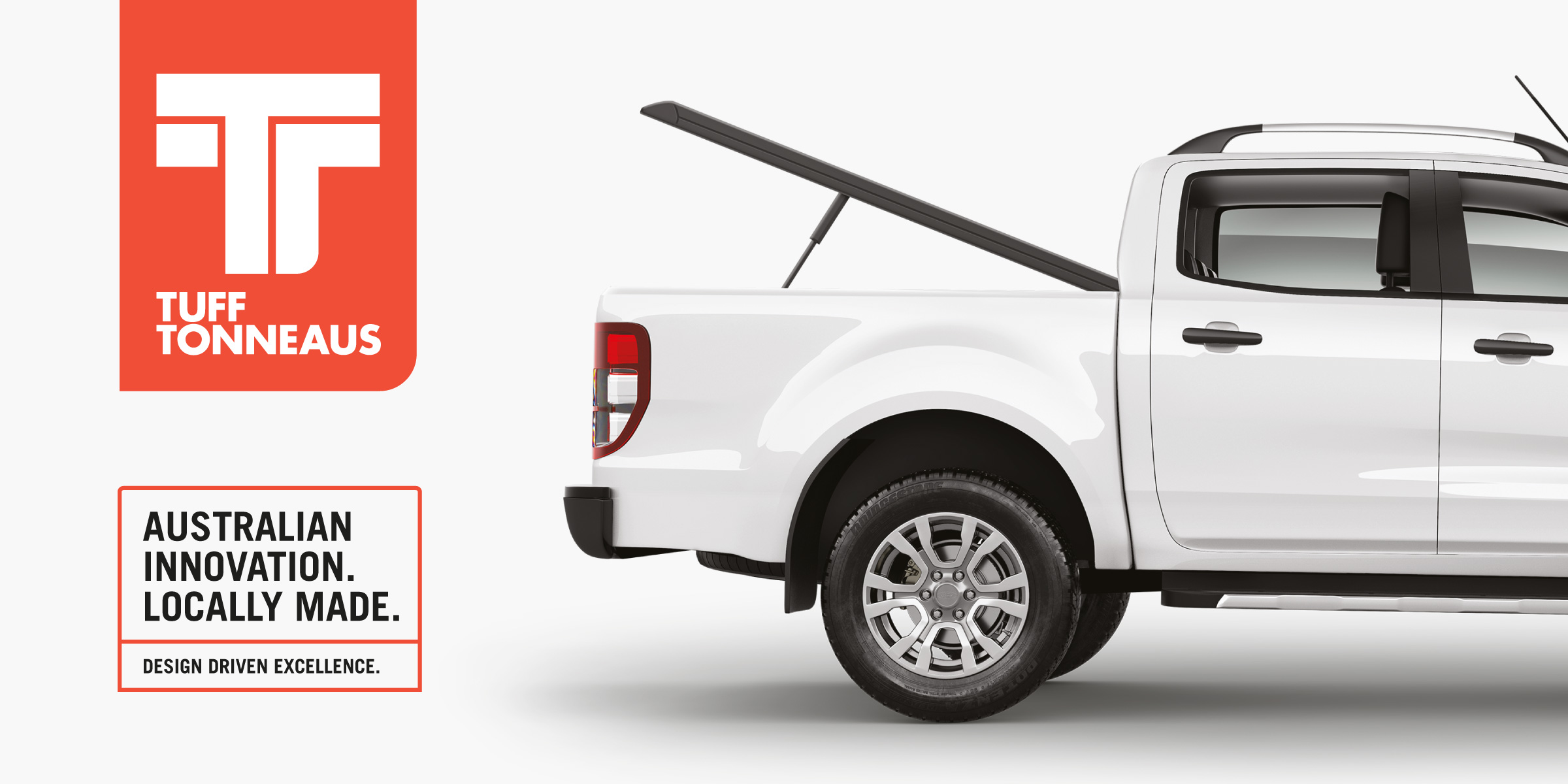
The newly-designed logo by Davidson is a monogram symbol made from two seamlessly-interlocked T letters; the crossbar of which reminisces a tonneau shielding the back of a ute. Bold and confident, the monogram is held in a tab device carrying through the red brand colour – becoming a trust mark of high quality, simple style and superior performance.
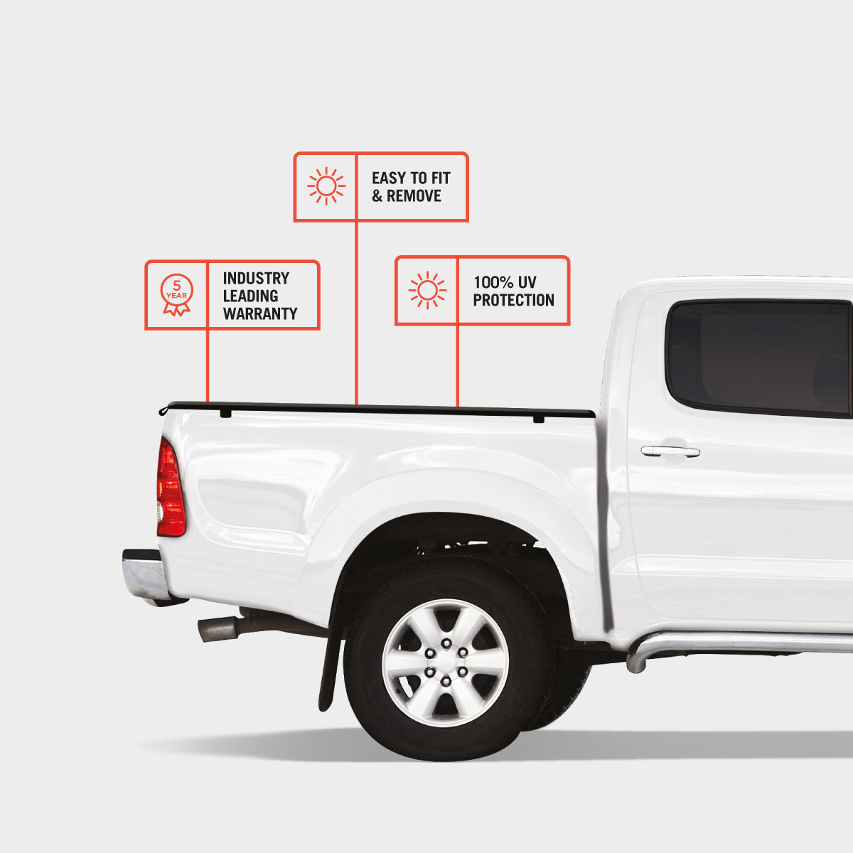
Tuff Tonneaus’ visual language is manifested in a keyline divider box that feels precise, technical and premium. The mono keyline iconography is deliberately drawn in a minimalist style to complement the brand’s simplicity, whilst its geometric forms best-capture the innovation that characterises its products. Carrying a contemporary look and feel, and a confident, bold tone of voice is the all-caps, condensed sans-serif typography.
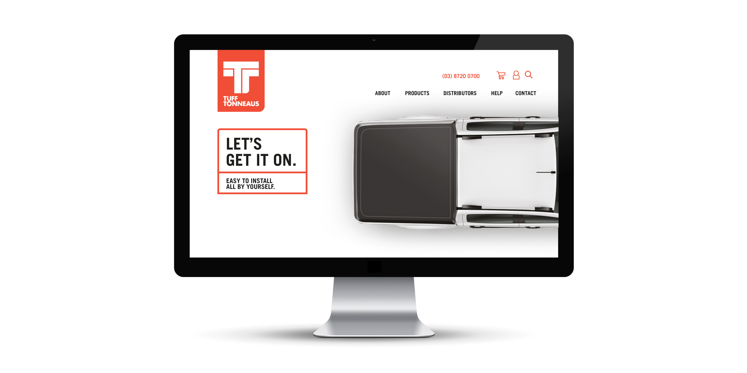
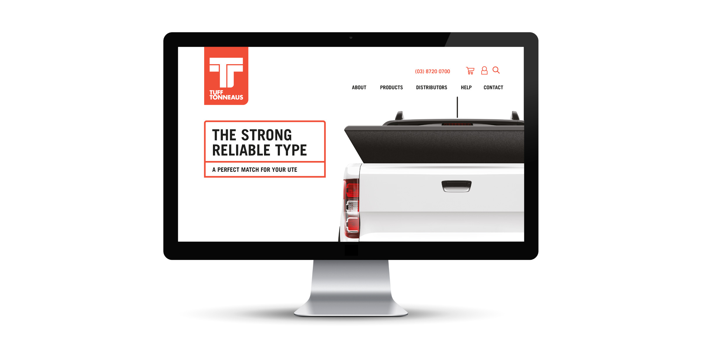
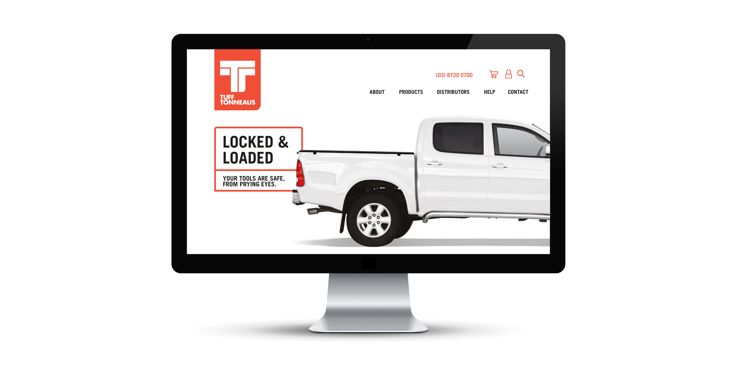
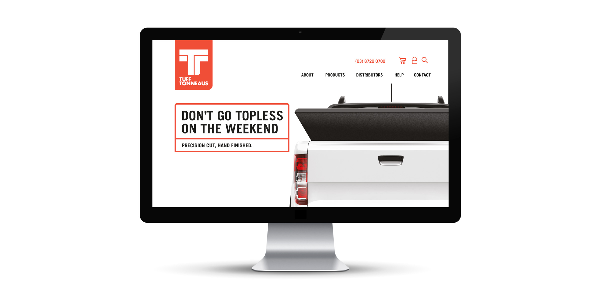
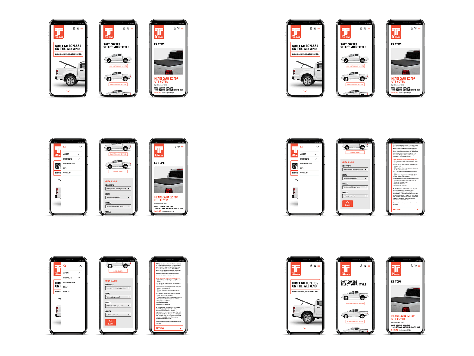
Davidson was enlisted to create a new website that would support and communicate the new brand story; reflecting Tuff Tonneaus as a leading innovator of tonneaus. Apart from aligning with the new minimalistic look and feel of the new brand, it was also crucial for the website to present an ease in navigation. We created a sitemap that simplified the user-journey; making it easier for visitors to find the products they were looking for. Further improving the online customer experience, Davidson included a dedicated search functionality that incorporates multiple filters which narrow down relevant products in a search.
Davidson’s scope of work included strategy, brand identity, design of packaging and photography. We then created a comprehensive style guide and extended the identity into the branded website, stationery and document templates.
