In a bid to differentiate Rolls-Royce Motor cars from the Rolls-Royce engineering company and create a clear purpose and vision for each, Rolls-Royce Motor cars have adopted a new strategy that repositions them as a luxury brand. Thus, transforming them from being known as the creator of the ‘Best Car in the World’ to the more aspirational vision and higher purpose of being the world’s leading House of Luxury.
GREAT BRANDING REPOSITIONS CORPORATIONS.
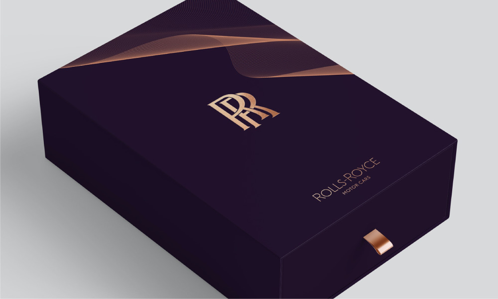
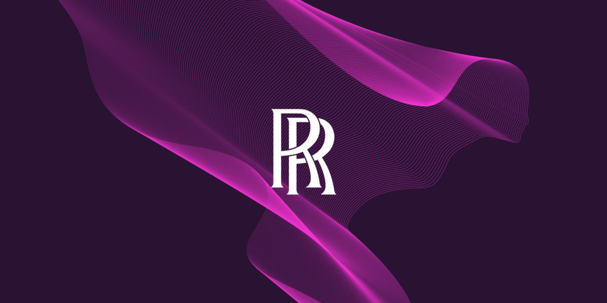
Rolls Royce leading logo has been refinded to be digital-ready. Reading clearly across multiple platforms, in print and digital.
The new strategy strikes a fine balance between heritage and modernity. It respects the brand’s history that existing loyal customers appreciate whilst also aspiring to a bright contemporary future relevant to their growing younger audience.
Rolls Royce recently unveiled a new visual brand identity aligned with the new strategy that echoes recent efforts to modernise the brand and appeal to a younger and more diverse clientele. Pentagram – a multi-disciplinary design studio, engaged Marina Willer to create an updated identity that would bring this new vision to life and convey the balance between the high degrees of technology and art.
The double ‘R’ Badge of Honour recognised worldwide as a symbol of engineering brilliance is now complemented by a spectacularly beautiful reinvented design as Pentagram puts the most iconic Rolls Royce asset to the forefront: the Spirit of Ecstasy symbol. Since 1911, the Spirit of Ecstasy has graced the front of Rolls-Royce cars, a historic symbol that is instantly recognisable, synonymous with British luxury, style and perfection. The symbol pays homage to the craft of the original mark whilst simplifying the forms to modernise the logo for a contemporary audience.
GREAT STRATEGY REINFORCED BY STRONG VISUAL LANGUAGE
The revised design saw a change in the direction of the iconic figurine, from left-facing to right-facing to reflect the brands new, forward-facing future. Its elegant and sophisticated feel now aligns with the strategy and higher purpose of leading the luxury space beyond just being an automotive manufacturer.
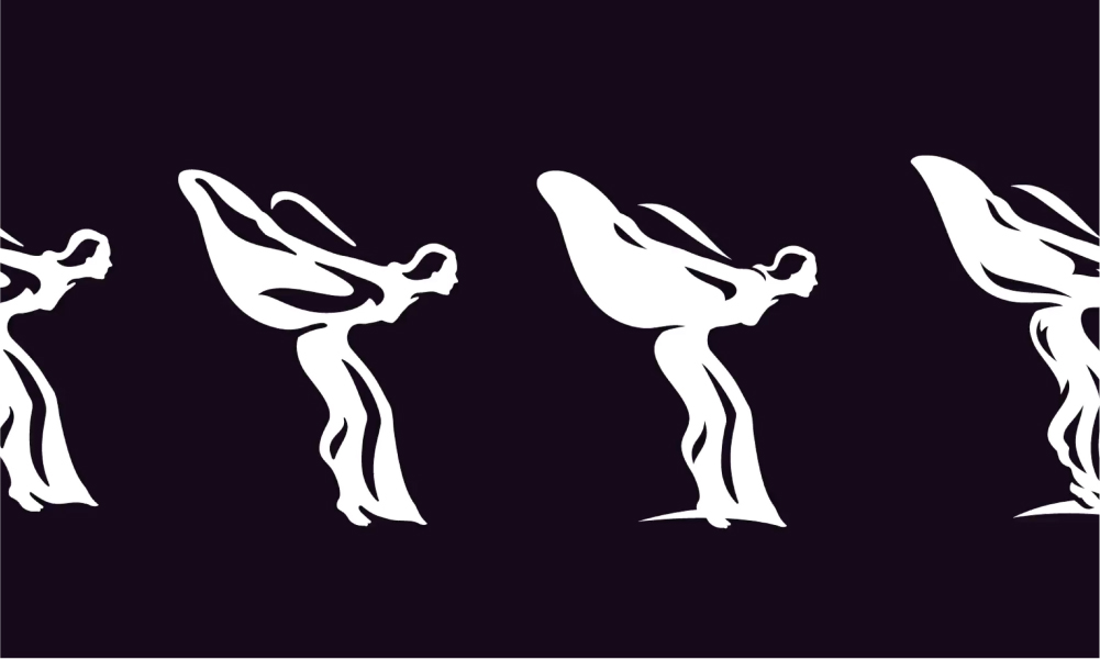
Rolls Royce Spirit of Ecstacy, created to represent “beauty, luxury, style, and perfection,” will now take its place as the company’s principal symbol.
Pentagram’s design team redrew the statuette, adding a thin base at the bottom of the design to separate it from a real person and extended the Spirit of Ecstasy symbol with a graphic that mimics silk fabric. The motion inherent in the graphic symbolises forward-thinking and is contemporary in appearance. Further supporting the concept of driving forward, the rebranding process included updating the typeface to a capitalised Rivera Nights. Similar font to the original Gills Sans but with a “sharper and more relevant” aesthetic and bevelled ends that give the illusion of movement.
Further building on the logo, Pentagram explored a broad range of colour palettes and landed one deeply expressive of the luxury Rolls Royce presents. The majestic purple hues denote wealth, perfectly complemented by an elegant choice of metallic rose gold lettering.
At the core, the rebrand highlights Rolls Royce as the ‘most precious marque in the world’, a claim that only Rolls Royce Motor Cars can make.
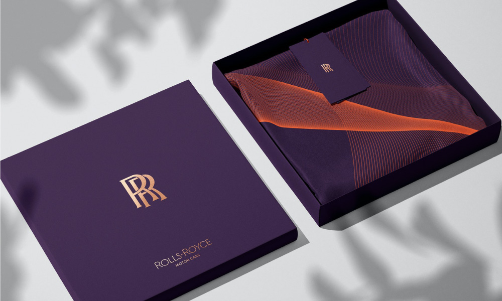
Rolls Royce left the Badge of Honour untouched throughout the design process as a nod to its incredible heritage
NEED HELP?
If you need help creating a brand that pushes creative boundaries and inspires change, we’d like to offer you a complimentary strategy call with our Managing Director and Head of Strategy, Grant Davidson. Having nearly 30 years of industry experience working with groundbreaking brands, Grant has the experience and knowledge necessary to identify your core brand strategy and communicate it effectively.
