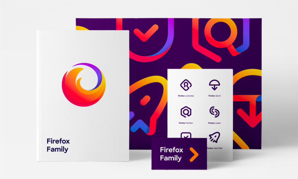
Their new design components, with a sans serif typography, bright gradients, and rounded friendly feel, serve to bring the brand into the current day.
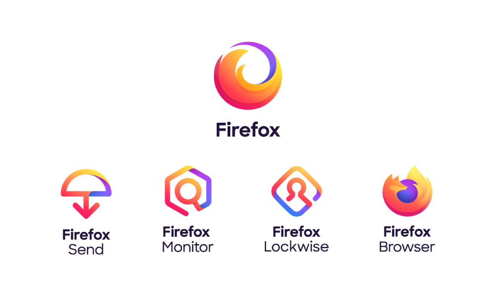
The Firefox iconic fox emblem recently received a makeover when Mozilla unveiled a bright and colourful new logo. The new browser icon became a more abstract fox wrapped around a blue and purple sphere, a little more fire and a little less fox.
Firefox required a design system for the master brand, which would house the Firefox browser as well as a number of other existing and emerging products. The major goal was to instil in the whole brand family the same sense of trust that Firefox Browser users have previously had.
In addition to the new logo and system, a new colour palette was introduced, that broadens the variety of options and allows for unique gradients. The new brand palette has eight core colours, one more than the traditional rainbow and is described as “the whole box of crayons”, all of which can be utilised as both solids and gradients.
Firefox now has a contemporary product mark typeface with a rounded look that mirrors the new icons.
This system starts with a new Firefox masterbrand symbol, which will serve as an umbrella for all of the new product lines. Firefox Lockwise, Firefox Send, and Firefox Monitor all have logos that use bright, vibrant gradients of orange, yellow, pink, blue, and purple hues to elevate the basic line drawings that emphasize what each service performs.
The suit of icons for the new apps and services indicate the product’s distinct role and function. These icons are linked to the masterbrand through colour and graphic treatment. Each symbol shape is unique, helping users to identify between options when they are displayed side by side on a screen.
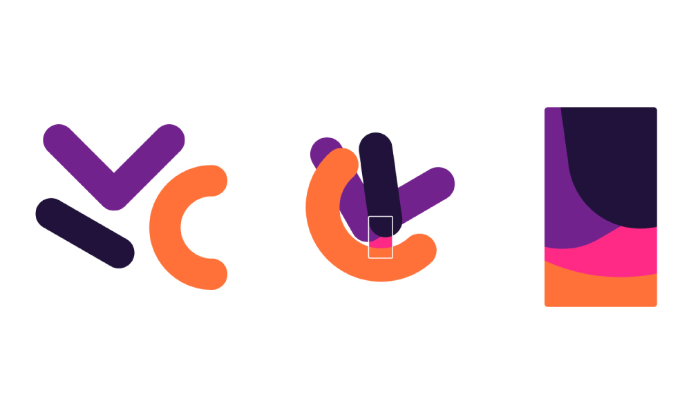
Captivating background patterns, motion graphics, and pictograms are created using a novel form system drawn from the geometry of the product logos.
The majority of critics believe the new visual identity is a replacement for the well-known Foxy logo, however, it is really an evolution of the whole Firefox brand. This new and innovative approach resembles those of major Internet companies such as Google and Instagram.
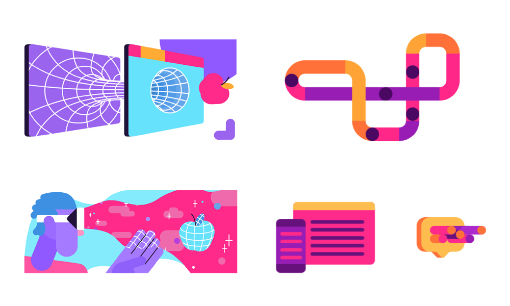
Mozilla used the rebranding as a chance to highlight the four pillars on which its new brand identity is built; Radical, Kind, Open, Opinionated.

