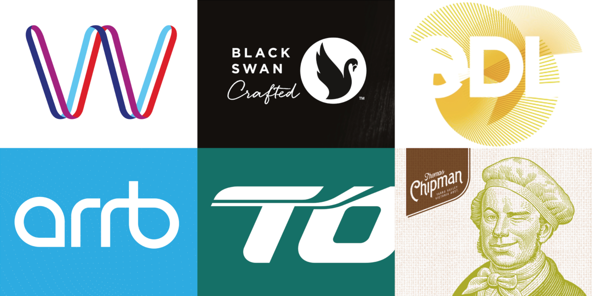
EDL

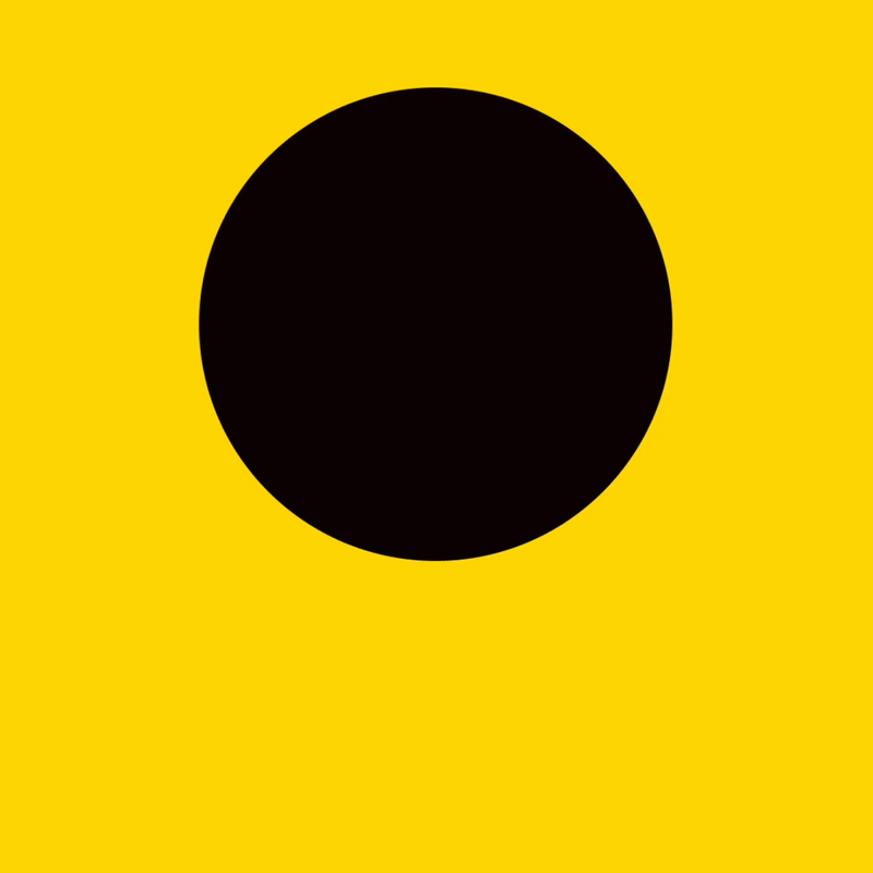
Since starting in Australia 30 years ago, EDL has become a leading global producer of sustainable energy that has expanded its operations across 5 countries and 3 continents. Fittingly, their new animated brand identity was inspired by the sun. Intersecting circles representing the three energy sources (wind, solar, and coal) rotate and overlap, creating a moire effect designed to evoke radiating energy rays. When the EDL logotype emerges from the rays, it adds an element of reveal before completing the formation of a full-circle. The dynamic motion of the vibrant yellow animation implies optimism about the future of sustainable energy while positioning EDL as a progressive and technologically advanced company. We were awarded gold at the 2019 Melbourne Design Awards for this brand identity.
BLACK SWAN

Black Swan originated in 1985 from a love of food and precious family recipes, first selling their dips at the South Melbourne Market. From those humble beginnings, Black Swan has grown to become Australia’s favourite dip, with sales of over 20 million dips in 2014. Suitably, we designed the logo to feature a contemporary swan icon and brought it to life with animation. The logo forms gradually, keeping the viewer engaged as the swan spreads its wings regally. The logotype is the last element to be revealed, fading-in to preserve the preciousness of the mark. The motion identity is smooth and sophisticated, speaking to the heritage of Black Swan’s brand story and products, and was awarded gold at the Melbourne Design Awards.
ARRB
The Australian Road Research Board (ARRB) is an independent source of expert transport knowledge, responsible for advising key decision-makers on our nation’s most important road-related challenges. The animated logo is inspired by transport pathways, locations, and connections, clearly communicating ARRB’s identity to the audience with pathway lines reminiscent of roads travelling, overlapping, and eventually converging to form the distinctive logotype. The animation is engaging and progressive, positioning ARRB as an agile brand directing the future of transport. Our brand identity for ARRB won gold at the Sydney Design Awards.
BOLTON CLARKE

Bolton Clarke is Australia’s most experienced not-for-profit provider of comprehensive living, health, and aged care services. We created a brand identity that represents an alignment of values, flexibility, and the full spectrum of their services. Their animated logo mimics a flower blossoming, with an uplifting motion symbolic of the ‘care’ that is at the heart of Bolton Clarke’s brand identity. This animation was a key element of the new identity system, brand guidelines, and art direction that constituted Davidson Branding’s scope of work for Bolton Clarke, and was awarded silver at the Melbourne Design Awards.
THOMAS CHIPMAN
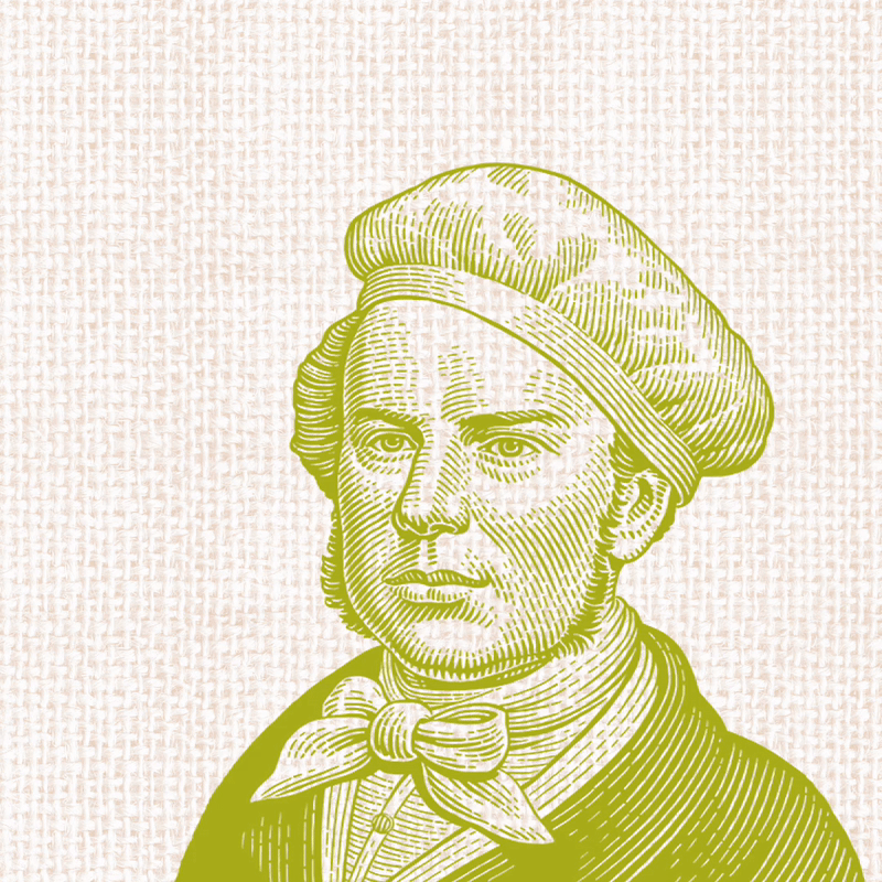
To satisfy the growing consumer demand for more natural snack food alternatives, Thomas Chipman Organic Corn Chips were launched in 2006. With a now-iconic range of potato, vegetable, and corn chips, they needed a memorable identity that accurately communicated their brand charisma. We used animation to make a subtle, yet incredibly effective adjustment to their classic Thomas Chipman brand character. Rather than sitting still as a static, lifeless image, Chipman now winks at the viewer – a cheeky quirk with an element of surprise that encourages them to look twice. This brand identity is a fantastic example of the power of animation in bringing a brand to life and engaging the audience. Davidson Branding was awarded gold at the Melbourne Design Awards for this animated brand identity.
MELANOMA RESEARCH VICTORIA

Originally founded as the Melbourne Melanoma Project (MMP) in 2010, Melanoma Research Victoria (MRV) was built on the belief that if researchers, patients, businesses, governments and communities, collaborate and push the boundaries every day, melanoma can be wiped out – for good. Our brand animation was intended to visualise their mission. The circular icon represents melanoma, and the peeling action indicates the beginning of their journey to beat cancer. It’s 3D qualities add visual depth and realism to a brand dedicated to an incredibly admirable cause, reiterating the authenticity of MRV’s brand narrative.
NAWIC
The National Association of Women in Construction is a not for profit organisation that helps champion and empower women in the construction and related industries to reach their full potential. The brand animation follows the motion of two ribbons, as they twist and turn in different directions before uniting at the end to form the NAWIC logo. This motion identity represents the many different pathways to success for women that NAWIC advocates, communicating their brand narrative in a manner that is succinct and engaging.
TOLL GROUP
Toll Group is a globally operating transport and logistics company. We used an italicised wordmark to bring their brand identity to life, integrating a speed line as a visual motif for transport. The animation is smooth and moves in one direction, representing the speed, dynamism, and forward motion characterised by the Toll brand. For a globally recognised company, consistency in the communication of brand identity is crucial. The robust and easily recognisable animation adds equity to their brand, standing in solidarity with their narrative of speed and reliability.
VISIT BALLARAT
Visit Ballarat is the destination brand for Ballarat, a modern and culturally vibrant city with a rich history. The logo consists of a multi-lined, gold ‘B’ held within a roundel – representative of the significance of the ‘gold rush’ in the city’s history. The logo animation builds the ‘B’ line-by-line, depicting the cultural diversity that makes Ballarat a destination city and the wonderful experience that awaits its visitors. The animation conveys strength in simplicity, with bold lines and colours that position Visit Ballarat as a contemporary brand.
WATERMARK
Founded in 1859, Watermark is Australia’s oldest intellectual property firm, renowned for delivering exceptional client care to match its peerless IP knowledge. Watermark wanted a modern brand identity that reflected the synergy between themselves and their clients. We designed their dynamic ‘W’ logo to highlight the centrality of collaboration to their brand identity. The animation depicts two lines travelling together to conjoin at the end, simultaneously forming a perfect ‘W’ and presenting a visual metaphor for Watermark and their clients working together towards a common goal. Our brand animation for Watermark positioned them as a forward-thinking company with a clear brand narrative, and was awarded gold at the Melbourne Design Awards.
CONCLUSION
As attention spans shorten and people become increasingly time-poor, quickly grabbing the consumer’s attention is more important than ever. This puts companies with an animated brand identity at an immediate advantage – not only will consumers be engaged and impressed, but they will develop a stronger emotional connection with your brand through the story-telling capacity of animation.
At Davidson, we drive sustainable growth by looking to the future. We’ve helped many brands embrace the power of animation and consequently position themselves as a forward-thinking company – one of the things that consumers want from brands in 2019 and beyond. In addition to visually wow-ing their audience, the brands we’ve worked with also experienced a noticeable boost in digital performance, conversion rate, and consumer recall. Our team of design and animation experts can help you create a compelling animated identity to communicate your brand story and grow your business.
Are you ready to separate yourself from the competition with an animated brand identity? Hit the button below to get in contact with the experts at Davidson Branding.
How much does an animated logo cost?
1 – BASIC
A simple version of a logo animation which includes:
– 2-dimensional animation
– Simple graphics only
– Maximum 2 elements animated i.e. type and logo only
– Very simple motion and transitions
Fees: $1,500*
2 – DYNAMIC
(Recommended!)
A more dynamic version of a logo animation which includes:
– 2-dimensional animation
– Multiple moving graphic elements as well as logo and type
– Simple motion and transitions
Fees: $3,900*
3 – INTRICATE
An intricate version of a logo animation which includes:
– 3-dimensional animation (3D modelling, perspective)
– Multiple moving graphic elements as well as logo and type
– Complex motions and transitions
Fees: $8,900*
+ GST. All fees subject to brief & storyboard.