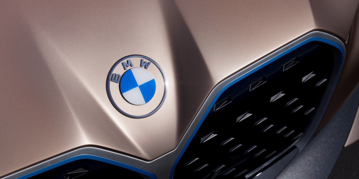
Typically, the first step in digital optimisation is making the typeface more screen-friendly. The evolved logo opts for a sleeker, flatter, and overall more modern typeface spelling out the BMW letters in the same position. In fact, the entire logo has been stripped of its 3D properties, representing the broader design trend of moving away from ‘materiality’ and towards a more minimal, two-dimensional appearance fit for phone and computer screens.
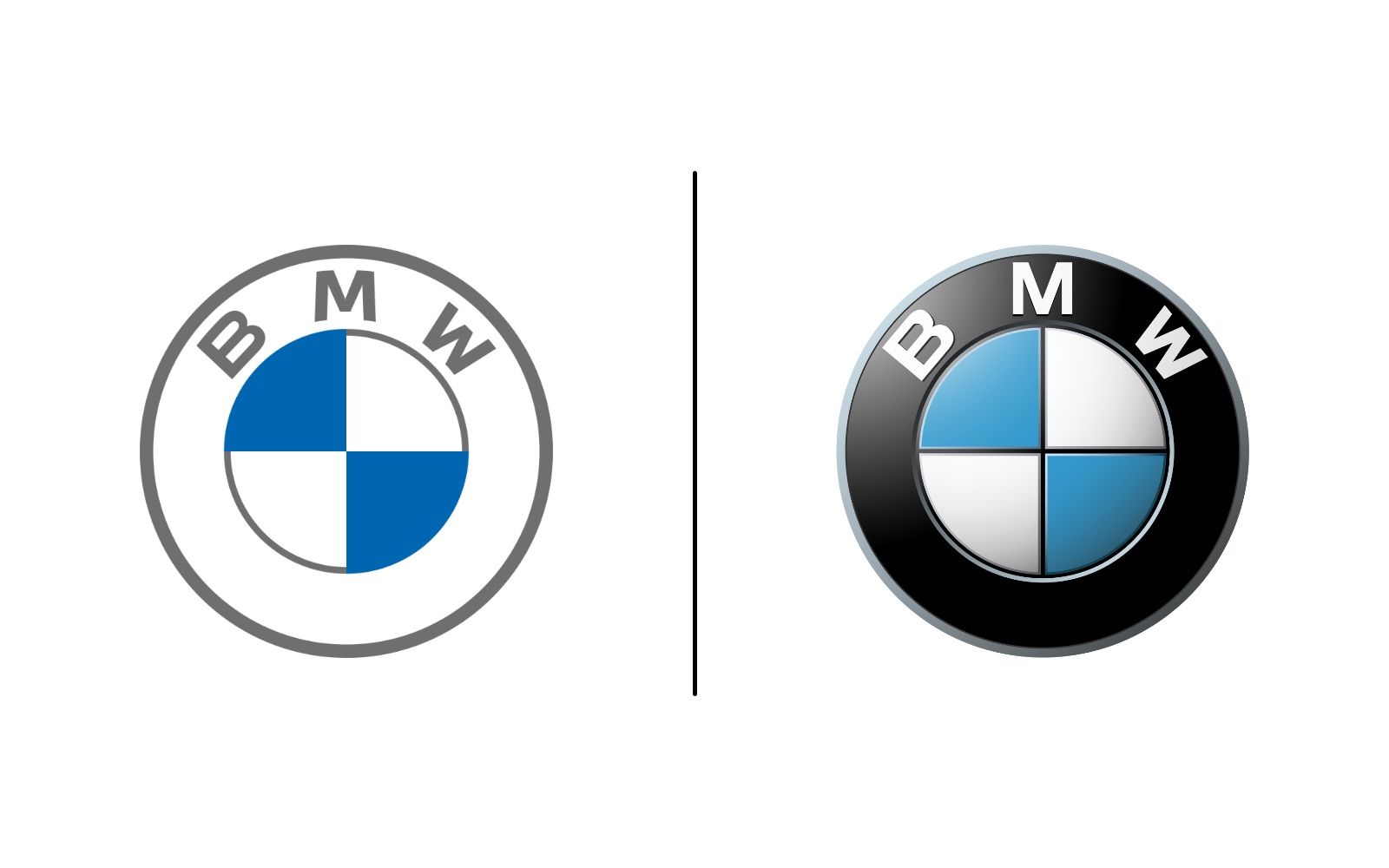
The most notable change is the complete removal of the black roundel. An iconic component of the original logo for over 100 years, this section is now transparent and designed to reveal whatever is underneath. As seen on the new campaign for the BMW Concept i4, this choice can have a stunning effect with the right application.
Jens Thiemer, Senior Vice President Customer & Brand, released a statement explaining the motivation behind their logo change:
“BMW is becoming a relationship brand. The old black ring was replaced, letting the new logo radiate more openness and clarity. We want to use this new transparent version to invite our customers, more than ever, to become part of the world of BMW. In addition, our new brand design is geared to the challenges and opportunities of digitalization for brands. With visual restraint and graphic flexibility, we are equipping ourselves for the vast variety of touchpoints in communication at which BMW will be present, online and offline, in the future. The new logo and brand design symbolize the brand’s significance and relevance for mobility and driving pleasure in the future.”
As stated by Thiemer, this renewed simplicity will serve them well in applying the new logo across multiple online touchpoints. While it can already be viewed on their website and social media, whether it will be featured on future car models is yet to be seen – at this stage, BMW has stated that they intend to use it only for branding and corporate communications.
