The leading cloud-based scheduling platform, Calendly, has unveiled its modernist makeover with a rebrand by Pentagram. The global platform has ditched its old identity in favour of a new striking yet clean design, ultimately expressing the simplicity of Calendly’s mission: providing users with easy ways to communicate with others and manage spaces in their calendars.
The convenient cloud-based scheduling platform is long beyond its humble beginnings of “a simple C, suspended in a light grey box that resembled a calendar”. The introduction of a new brand identity framework designed by Pentagram visually conveys the company’s “intelligent design, improved workflows and incredible ease of use.”

Pentagram designers successfully brought to life Calendly’s vision of an engaging, versatile and modern brand identity – conveying the brands core values and missions from a visual perspective.
GREAT BRANDING ALIGNS WITH WHAT THE COMPANY STANDS FOR
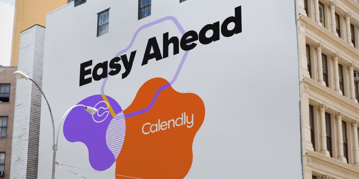
Coinciding with a period of growth, Calendly’s rebrand is the first significant update the platform has seen on the brands’ identity since its launch in 2013. It is visually reflective of the current innovation and future ambitions of the brand. The forward-thinking nature of Calendly is reinforced in the new marketing slogan, “Easy ahead,” a dynamic term that triumphs how the software makes connecting easy.
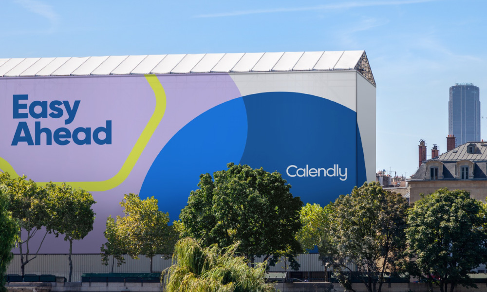
A distinctive Calendly blue colour emerged from the previous identities paler blue.
The refresh includes an updated brand strategy, a new brand logo, typography, iconography and a visual system that can be used offline and online. The new brand mark and logotype are an extension of previous designs with a more bold and current appearance that focuses on the concept of fluency.
The new framework highlights the versatility of the scheduling software by creating an often animated icon that can adapt to an array of forms and bright coloured shapes that are ever-changing. Such symbolism communicates the fluidity of the platform and the uniqueness of each day, just like most days, it never looks the same twice.
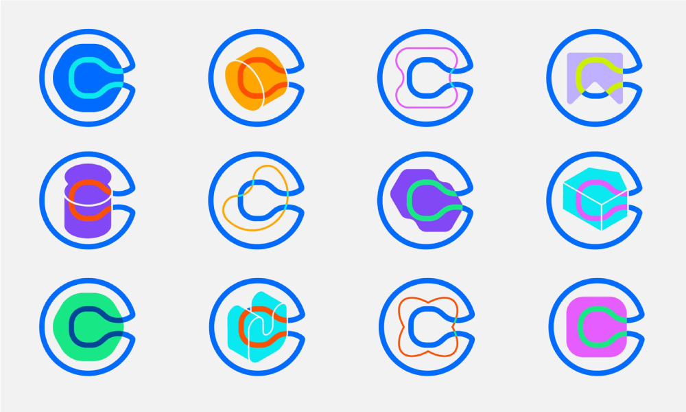
A distinct visual metaphor for creatively identifying schedule overlaps was created through the layering of colour, shapes and type as elements. “The overlapping intersections evoke the feeling of people coming together and creating something unique”, says CEO Awotona.

Pentagram has represented Calendly’s position in modern-day networking through a combination of modernist typography and geometric elements.
The new logotype is a bold ‘Gilroy’ with tightened letter-spacing which retains the original logo’s lowercase geometric sans, but with a capitalised “C” that celebrates the presence of the brand in accordance with its expansion. An extensive rich colour palette supports the wordmark with a recurring trademark colour, a characteristic Calendly blue.
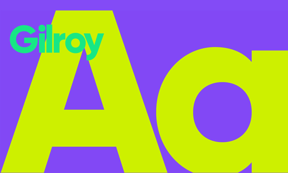
Calendly’s new logotype is a geometric sans serif created by Radomir Tinkov. A contemporary style that compliments the progressive colour pallette.
NEED HELP?
If you need help creating a brand that pushes creative boundaries and inspires change, we’d like to offer you a complimentary strategy call with our Managing Director and Head of Strategy, Grant Davidson. Having nearly 30 years of industry experience working with groundbreaking brands, Grant has the experience and knowledge necessary to identify your core brand strategy and communicate it effectively.