Feeling Good with 4Legs
4Legs is a family-owned, Australian business that creates delicious and nutritious natural, chilled and gourmet dog food that is 100% free of preservatives. With pure meat and fresh veggies, they contain a complete supply of proteins, fats, minerals and vitamins.
The company recognised that in order to grow in an increasingly competitive category, they needed to refresh the brand. Davidson Branding was briefed with revitalising the brand and packaging. The brand needed a new positioning which would better reflect their vision, values and mission of helping dogs live a happier and healthier life. In turn, the refreshed packaging design needed to align with the new positioning and improve shelf stand-out.
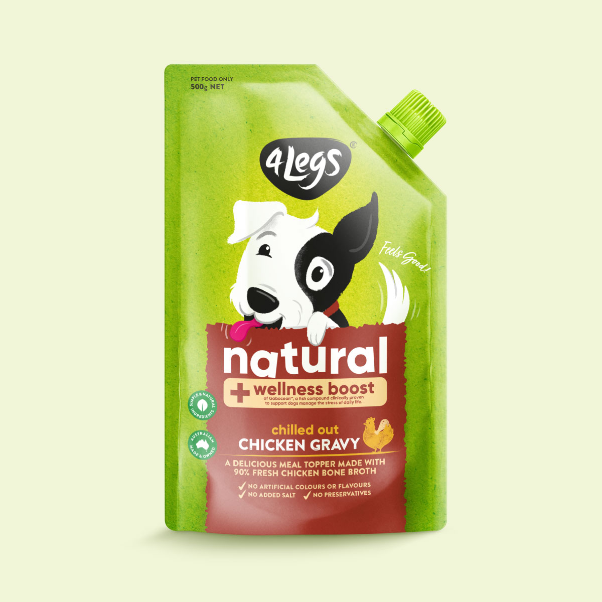
Upon analysing the competitive environment, Davidson identified two primary trends in the dog food category: brands positioning themselves either as science-based or natural. As 4Legs’ direct competitors in the natural space were using earthy green tones, we identified an opportunity to use a vibrant green to own a space in this category. Through extensive market research, we found that engaging imagery of dogs proved to be extremely successful on the shelf. Surprisingly, no other competitor was currently owning a character illustration; instead, they were relying solely on appetising human food cameos, similarly to 4Legs.
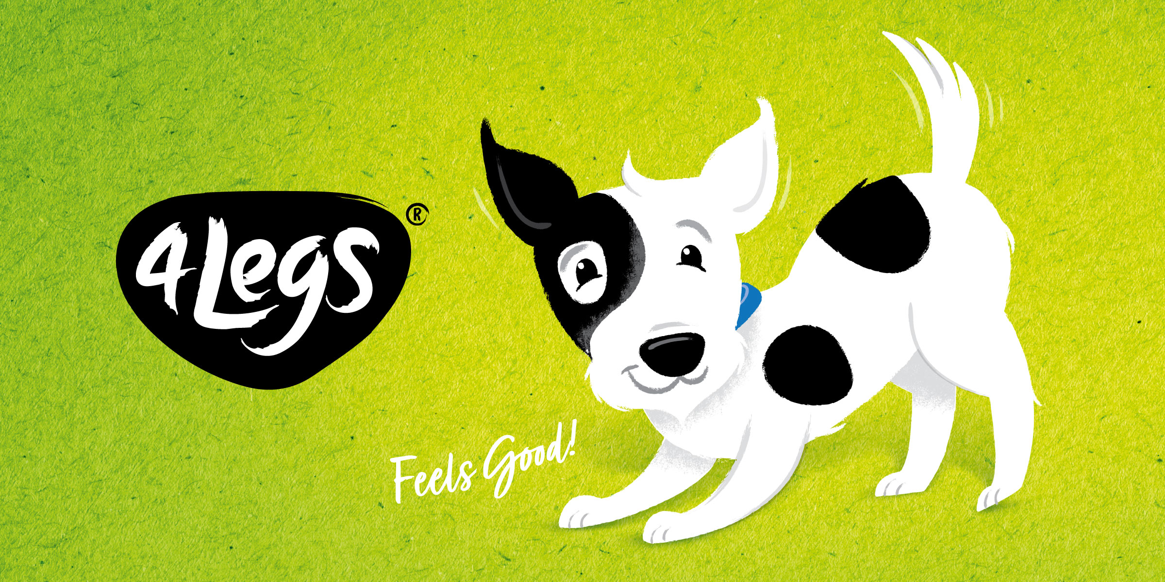
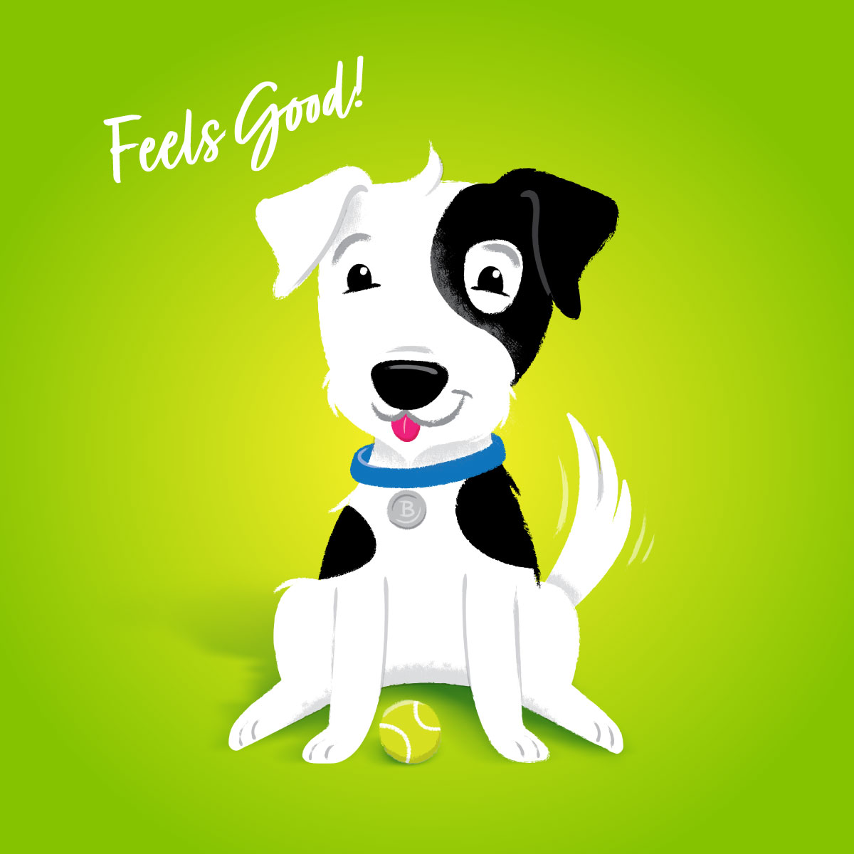
The strategy uncovered that the 4Legs brand was primarily about an owner’s relationship with a happy dog. Instead of focusing on the nutritional benefits and scientific research behind the recipes, we found that to be ahead of the curve 4Legs should instead concentrate on the emotional connection between owner and pooch. The health benefits would be consequently implied because a healthy dog is ultimately a happy, active and playful dog. Organically, the brand story centred around the slogan “4Legs: Feels Good” quickly came to life. According to Davidson, communicating this should be the main focus of the brands’ new look and feel.
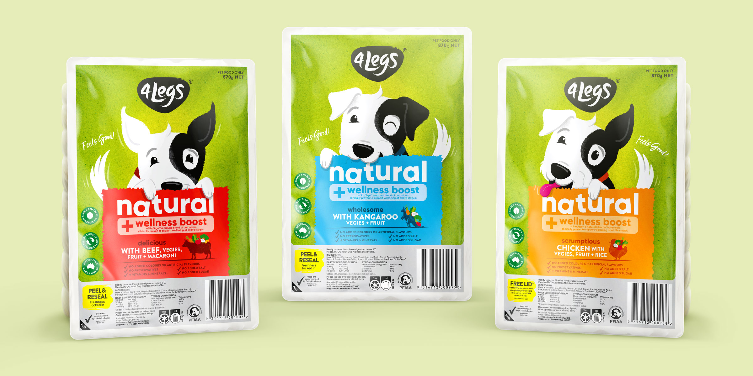
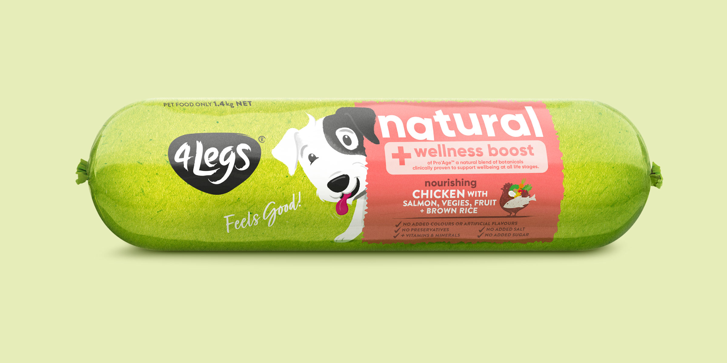
Davidson developed a new brand strategy, giving the packaging a fresh and contemporary look. The 4Legs logo was increased in size; the clear space around it, allowing it for better stand-out in the busy category. The clean and bright, fresh green packs differentiate the product from the competitors and create strong shelf blocking. Supported by vibrant variant colours, our chosen palette successfully communicates the fun and energy of the brand’s new positioning. The ‘natural’ call-out uses a clean, modern font with an imperfect ’tilt’, conveys a wholesome and playful feel of the product. The new 4Legs brand still features the bespoke Basil character illustration, which heroes the pack and playfully interacts with the panel in four different ways across the range. These illustrations are engaging and aim to evoke the connection between owner and pet. They are also perfect for the brand to use in other touchpoints so that Basil becomes synonymous with the 4Legs brand.
4Legs relaunched in September. Our scope of work included brand strategy and positioning, consumer research, competitive analysis, brand identity, packaging design, illustration, and finished art. The brand’s new striking packaging design envisioned by Davidson aligns with its new positioning and clearly communicates its vibrant personality. Ever since hitting the stores, 4Legs has successfully differentiated itself from its competitors in the market; the fresh packaging making the products easily recognisable on shelves and ensuring cut-through in a cluttered, undifferentiated category.
