Beautifully Healthy
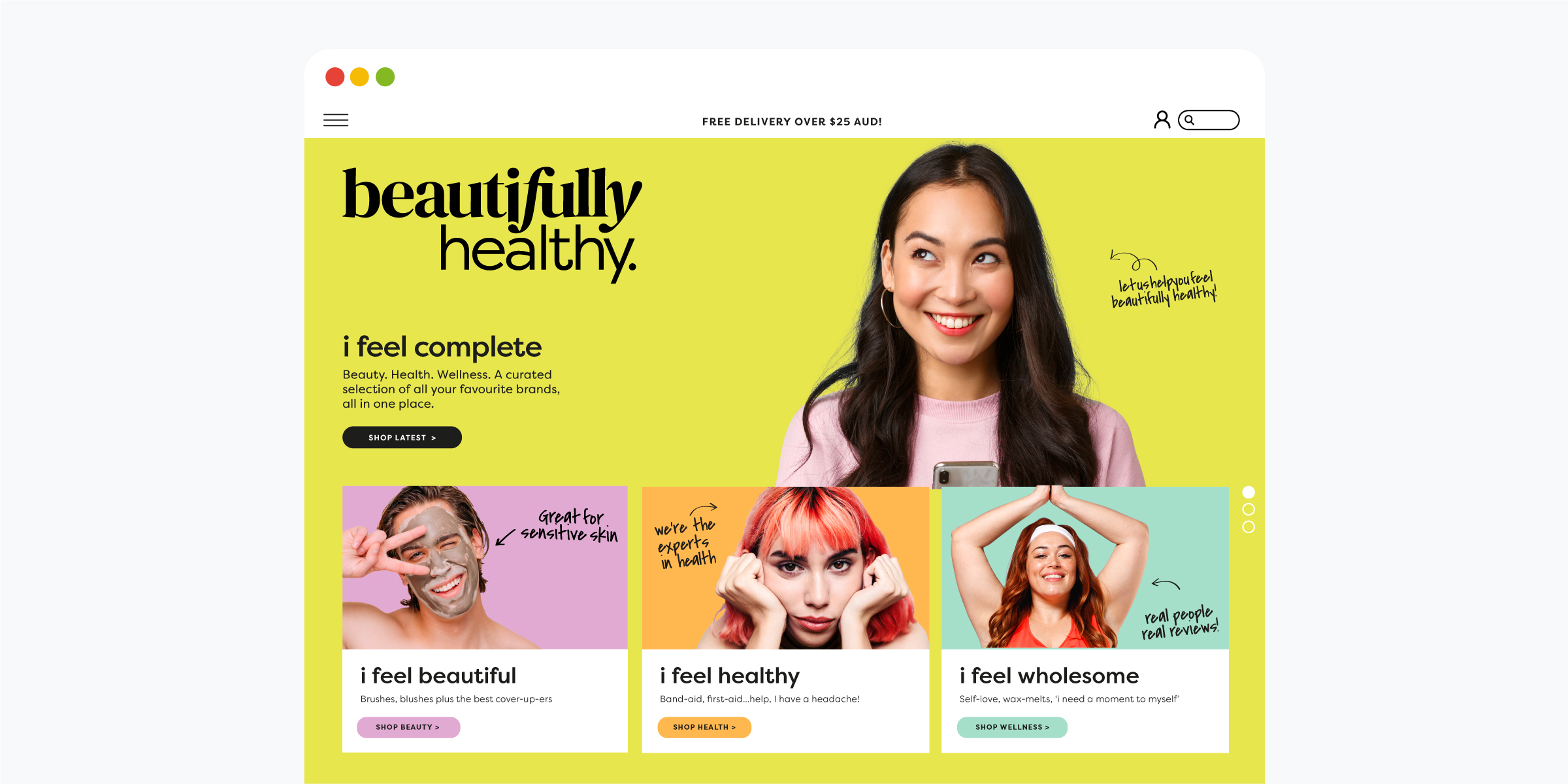
Australia’s newest destination for all things health, beauty and wellness. Beautifullyhealthy.com.au is a one-stop online shop offering on-trend brands and products in the health, beauty and wellness space, providing outstanding value to community members through a curated range of credible brands at affordable prices. Beautifullyhealthy.com.au offers an impressive array of rich content and instructional information to help you choose and use products that will have you looking and feeling amazing.
Due to the growth in online retail, the rising consumer acceptance of online shopping and the growth in the beauty and personal care market, a new online proposition has been developed in the Health, Beauty, Wellness and Nutrition space.
Davidson Branding was commissioned to create a new brand identity for the already registered brand name ‘Beautifully Healthy’. The name ‘Beautifully Healthy’ evokes a feeling that combines beauty with health via the flow of the words. The broader connection is based on the extent to which beauty and health have both internal and external benefits. It also influenced their product line, which will lean towards a healthier and more socially conscious outcome regardless of category.
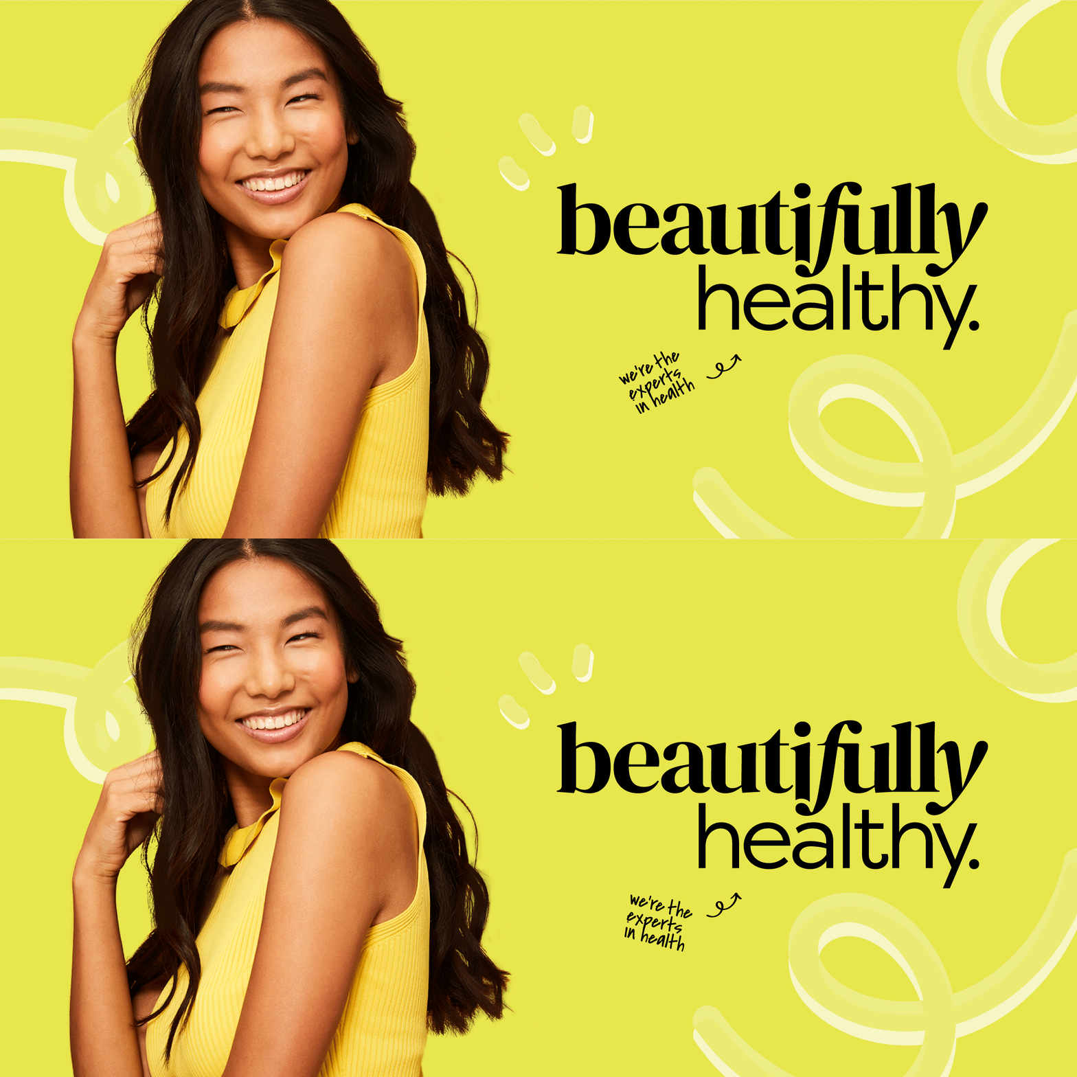
Davidson Branding delivered a brand identity for Beautifully Healthy that projects confidence in a friendly, fun and modern way. It captures the brand’s core mission – to provide a one-stop-shop full of the best brands curated to the individual consumer’s needs.
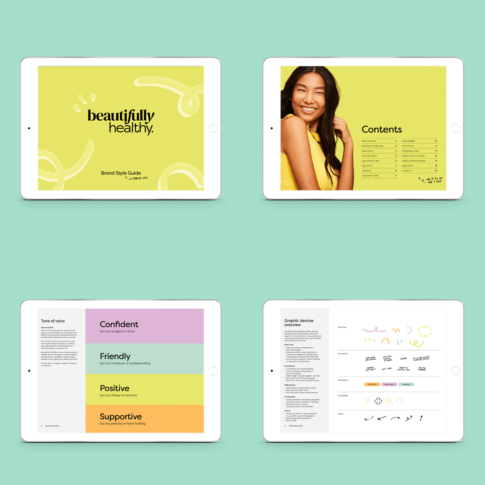
The Beautifully Healthy logo comprises two unique typefaces. ‘Beautifully’ is designed in an aesthetically modern yet elegant serif, capturing the uniqueness of each consumer’s interests and industry trends. The ‘Healthy’ typeface is a clean and friendly sans serif, mirroring the brand’s functional health and necessity product offerings. Together, these two form a memorable mark of quality and honesty.
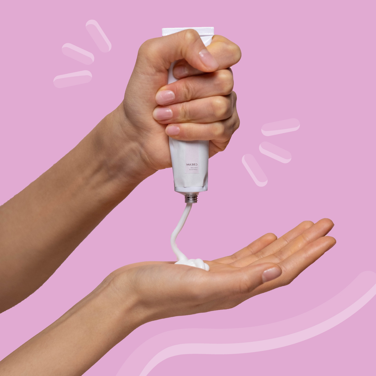
Davidson Branding created additional graphic devices that bring the brand personality to life. Bold, bright, fun and authentic, they embody the brand style and the approachable and friendly tone of voice, including a range of fun iconography that represents specific categories relating to products, blog topics, and a further tone of voice extension.
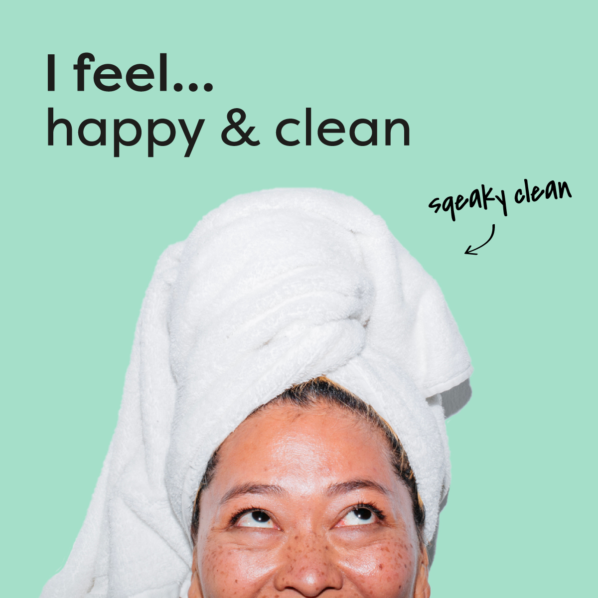
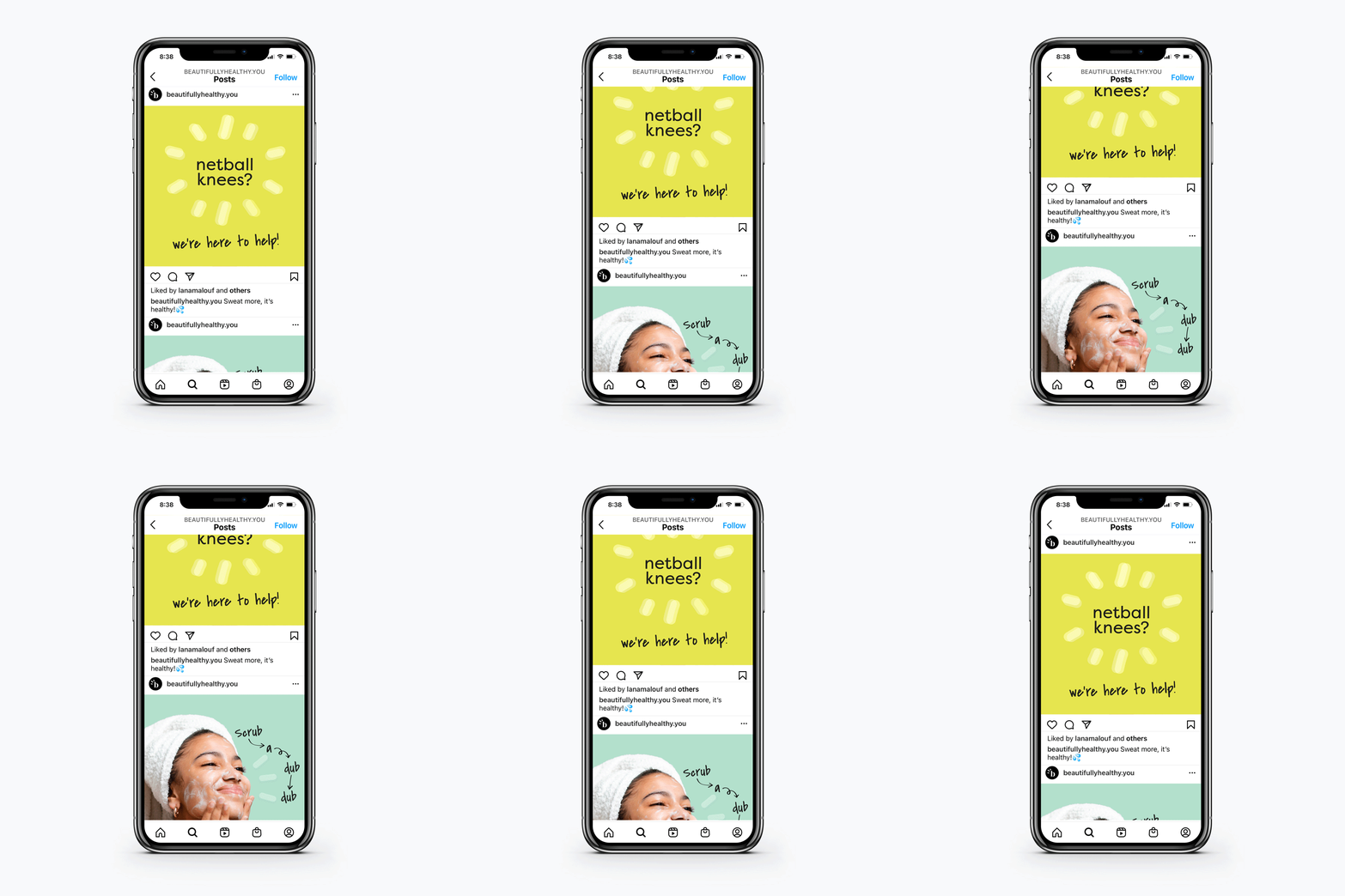
A unique handwritten typographic system was introduced. These handwritten annotations feature alongside people-focused photography in supporting promotional material, such as on social platforms and EDMs. Its organic and conversational style is an important representation of the brand, as it symbolises the approachable, witty and confident personality we have developed.
Going live in early September 2021, Beautifullyhealthy.com.au will be the leading online health, beauty and wellness community in Australasia.
“The team at Davidson were a pleasure to work with – they listened intently and delivered an outcome that was above our expectations. We have had strong feedback about the brand position and how it differentiates in the market.” Jeff Sher, CEO of Beautifully Healthy.
