BETA By STH BNK
STH BNK By Beulah is a revolutionary development in Melbourne. Transforming Southbank into a mini-metropolis, the $2 billion project will see the world’s tallest ‘greenscraper’ come to life in a stunning twin tower showcasing Australia’s highest sky garden. Rising 365m high, STH BNK By Beulah is home to state-of-the-art spaces that serve residential, commercial and retail functions, mixed with pocket parks and public green spaces that make it a truly multi-faceted destination. However, the vision of the development goes far beyond the building itself and into the placemaking of the broader Southbank precinct. STH BNK By Beulah will revitalise the precinct into a modern city with unparalleled experiences that explore the future of events, culture, dining, retail and recreation experiences.
To bring the precinct to life, a placemaking brand was created to serve as a ‘lab’ for the live experimentation of the future of physical space for retail. This would take shape in the form of a curated events program that delivers immersive experiences across the arts and culture, retail, food, technology, health and wellness and sustainability. Davidson was tasked with creating the name and identity of the placemaking brand. The brand plays an important role in the activation of events to engage various industries with the exciting future development of the precinct.
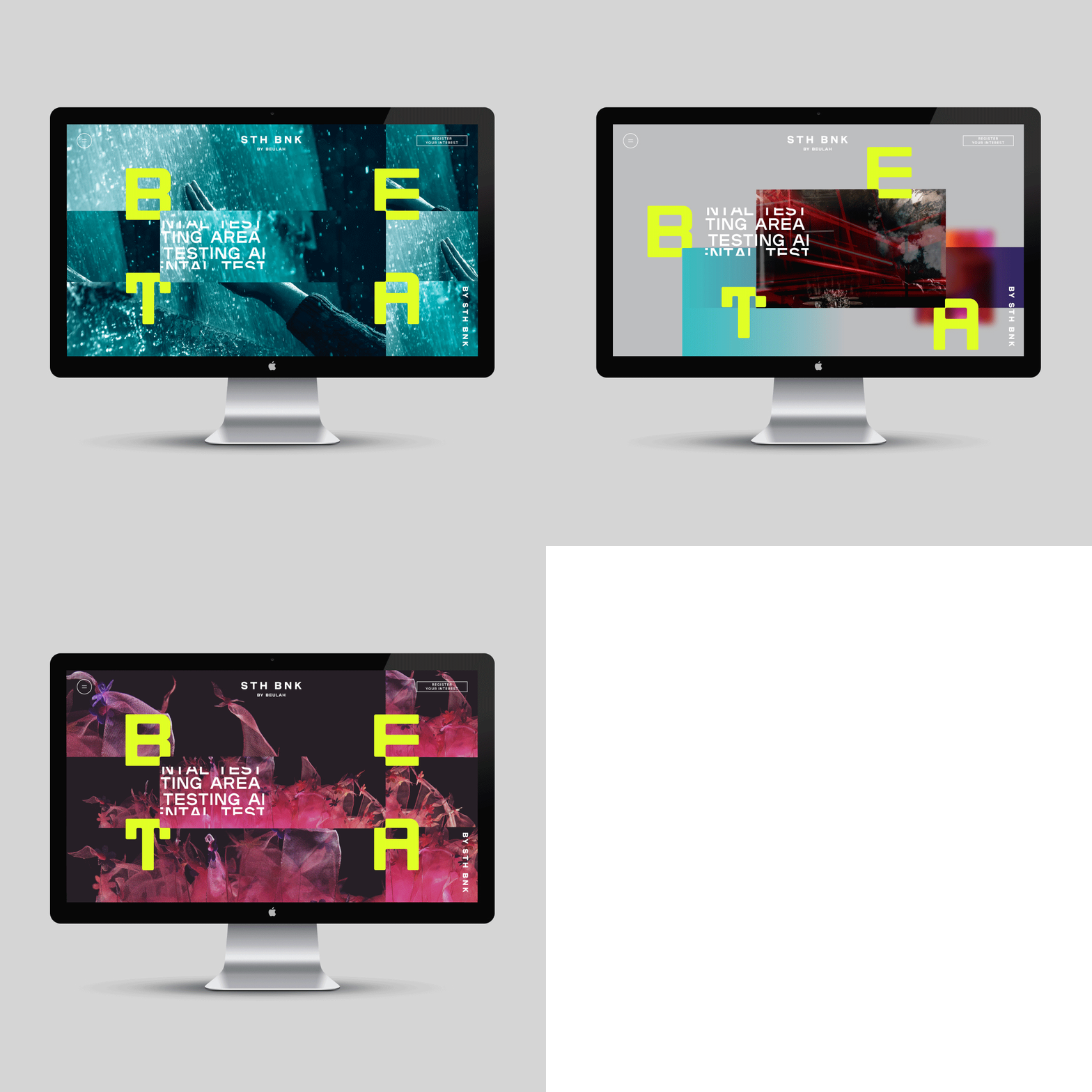
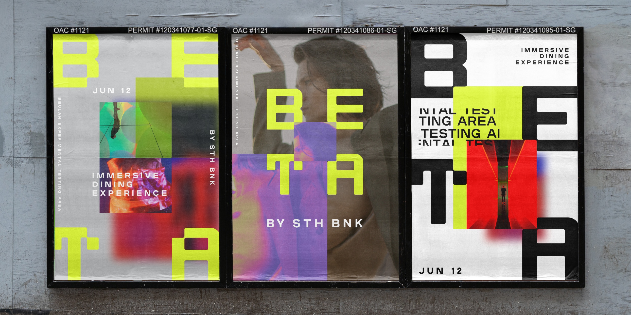
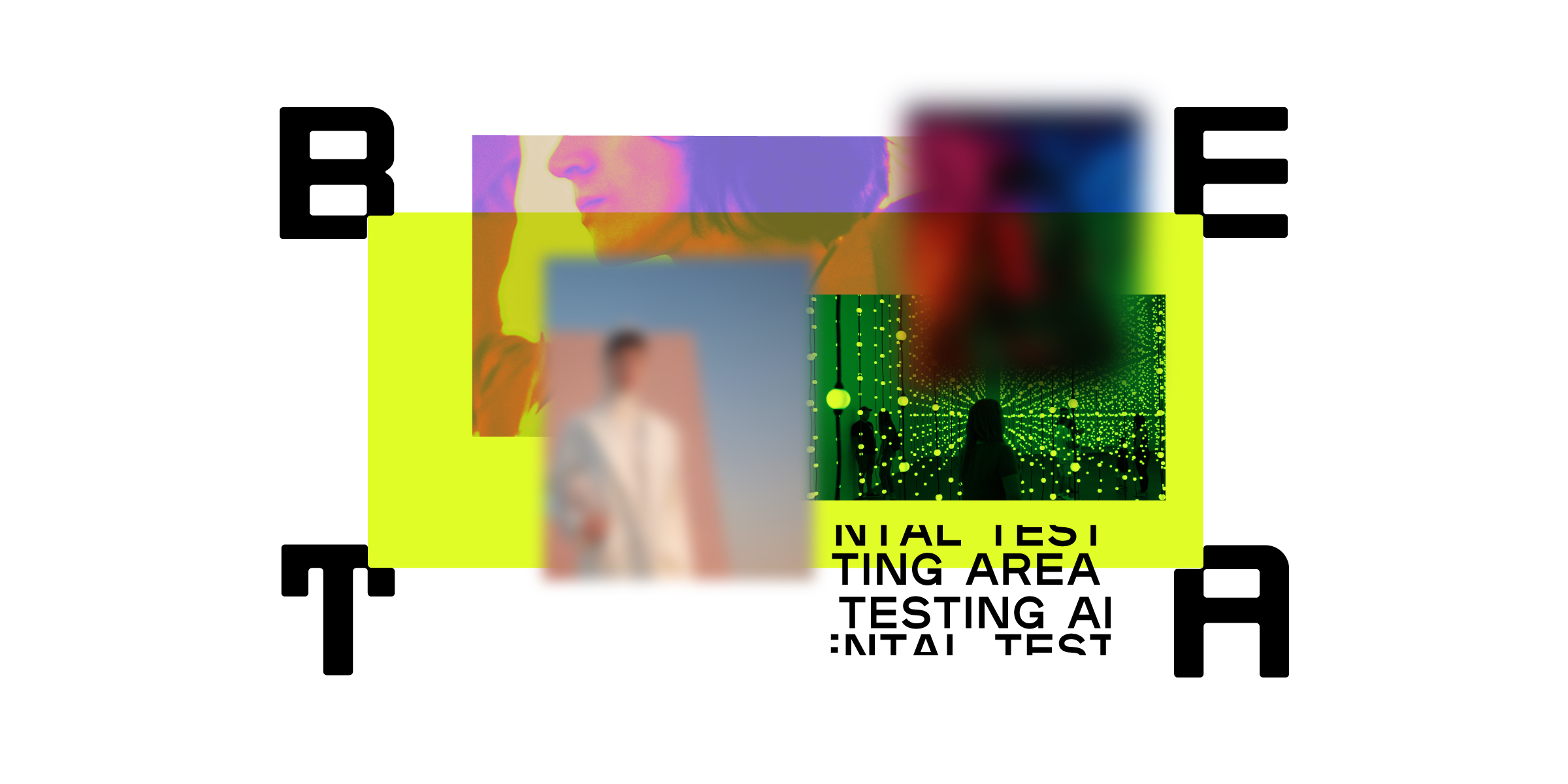
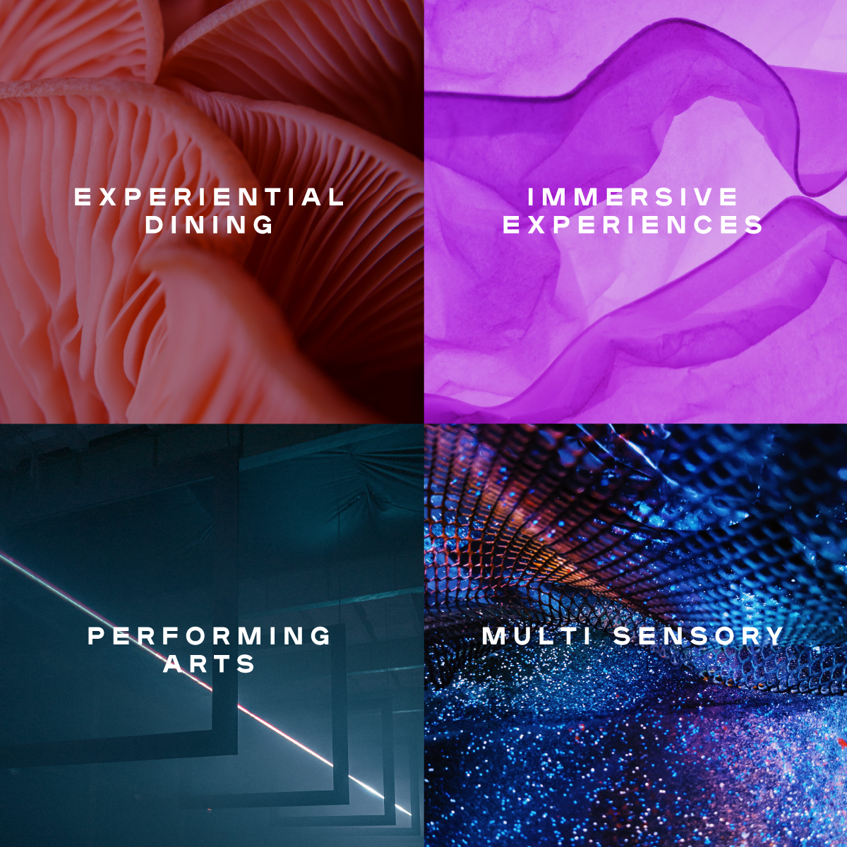
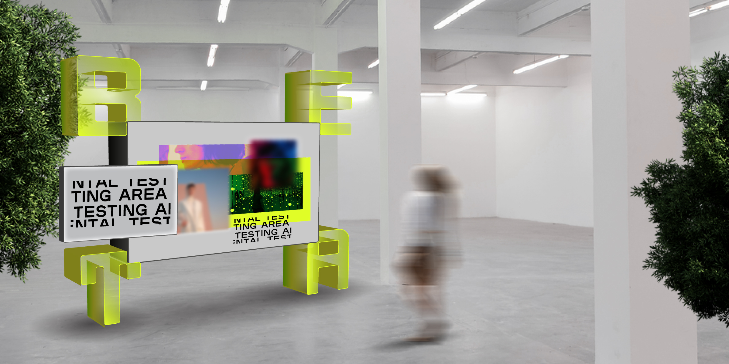
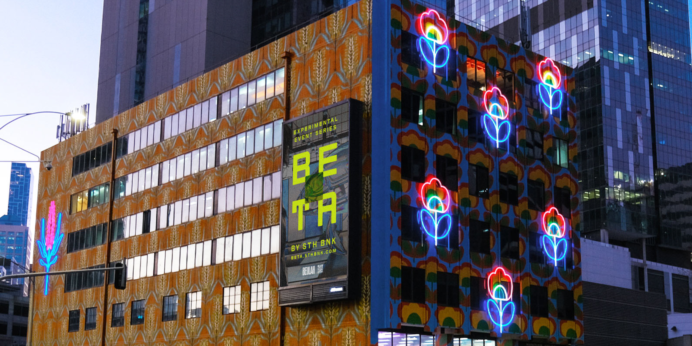
Inspired by the language of science, Davidson created the name ‘BETA’, an acronym for ‘Beulah Experimental Testing Area’. Referencing the ‘beta testing’ in the laboratory, the name is futuristic, technological and experimental. BETA is a think tank where future ideas and concepts can be tested and explored. Davidson created a brand identity that captures the experimental qualities of BETA at its core. A deliberate choice of a fluorescent yellow is energetic and futuristic. And using the same typeface, the word ‘BETA’ is arranged in a 2×2 grid. In this arrangement, the uniquely crafted letterforms create a negative space square that is the testing area of the brand. In application, it becomes a frame layered with content, ideas and imagery, fluidly expanding and contracting in animation to reflect the experimental nature of the BETA brand. The identity is complemented by curated photography inspired by the arts. Sculptural, immersive and hyper-real, the imagery is treated with an iridescent filter to elevate the visual language to a futuristic feel.
When the name and brand launched in May 2021 it received high praise and created intrigue for the events to come. The brand and visual language clearly communicated BETA as a testing area.
Check out What’s On for BETA here: BETA.STHBNK.COM
