BG Private Rebrand
BG Private (formerly Banks Group) is one of Australia’s leading accounting, audit and advisory firms. As an AFR Top 100 Accounting Firm nationally, they offer a fully integrated services with offices in both Melbourne and Sydney.
What sets them apart is their unique ability to provide all major financial services under one roof, ensuring comprehensive support for each client’s diverse needs and ambitions. They have been operating for over 45 years, have over 7000 clients, 100+ staff and 8 service lines.
With the previous name (Banks Group) and brand having been in the market for decades, they identified the opportunity to rename, reposition and rebrand to build a solid foundation for growth in the decades to come. The goal was to help attract a new generation of clients, whilst building loyalty with existing ones and attracting a high calibre of talent.
The objective for the rebrand was clear: to evoke the Big 4 in a way that would resonate with clients, partners, and staff alike. The revamped brand sought to convey a sense of trust, competence, and modernity. The ever-changing competitive landscape was also taken into account. They didn’t want to be left behind.
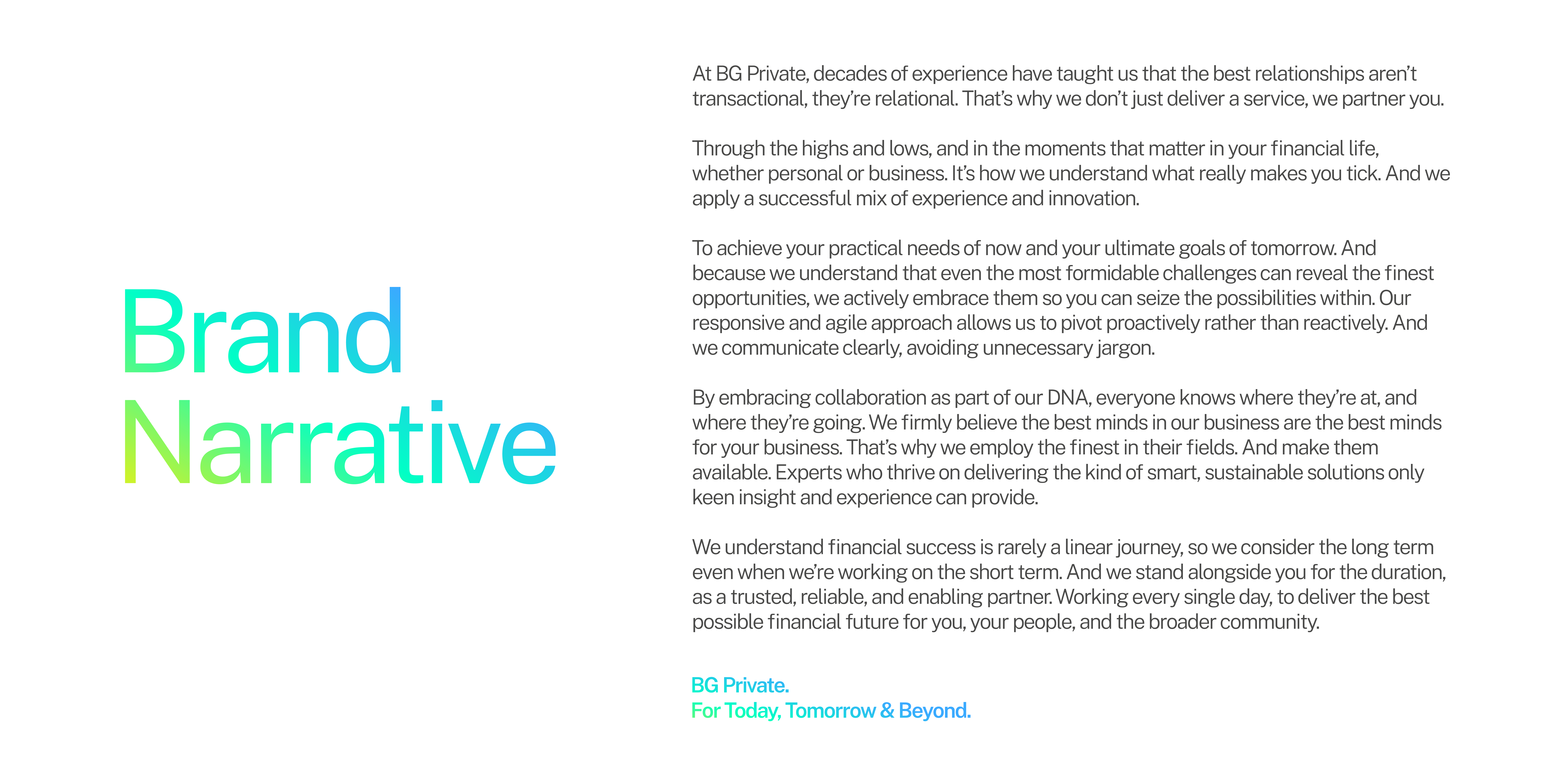
We workshopped with senior leadership, interviewed key stakeholders and commenced shaping the new positioning and brand narrative. The compelling positioning of ‘For Today, Tomorrow & Beyond.’ was established. It simply conveys their ambition to provide long-term advice and support to their client base. It also symbolises their promise to stand alongside their clients throughout the duration of their individual or business journey; meeting their needs of today but with an eye on the long term.
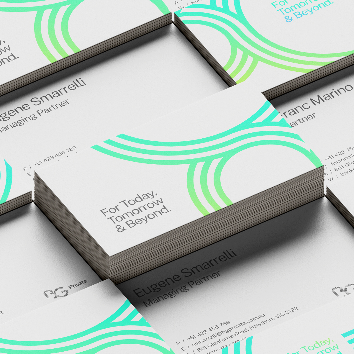
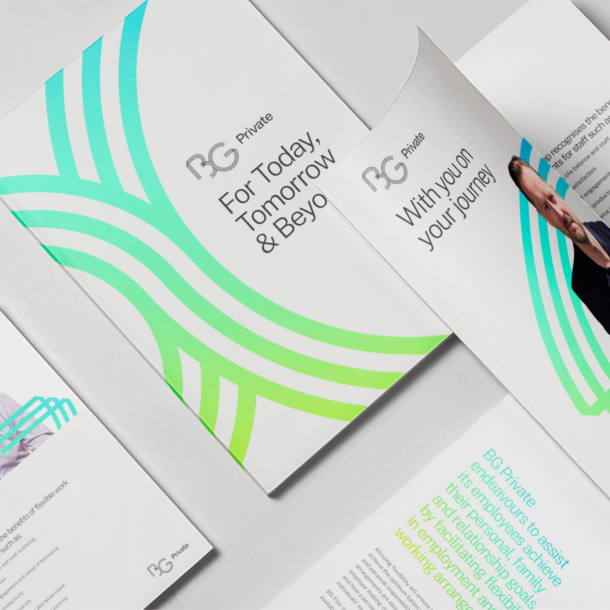
Continuing on, we developed a contemporary new identity that explored a refreshed logo, iconography, typography, colour palette and graphic elements. Once approved this was applied to a plethora of touchpoints including stationery, collateral, signage, website, social media, merchandise etc.
The new BG monogram in the logo visually represents the partnership BG Private has with their clients. The folds in the lines are symbolic of the twists and turns of each client’s financial journey. The three lines represent the collaboration between both clients and their other service lines so that they can provide holistic and seamless advice. A stylised infinity symbol found where the B and the G intersect symbolises the long-term nature of their close client relationships as well as the infinite ways in which they support them.
BG Private unveiled the rebrand in early April 2024. They communicated to their client base that the change reflects their ambitions for the future while honouring the past.
“Davidson did an absolutely fantastic rebrand and new website for us. They guided us through the entire process with a unique methodology that is designed to help get a big stakeholder group aligned around brand aspirations and the visual look of the new brand. All staff are inspired by the new brand, and the outcome went well above our wildest expectations”
Ildi Amon – Marketing Manager – BG Private


