Bonds & Co.
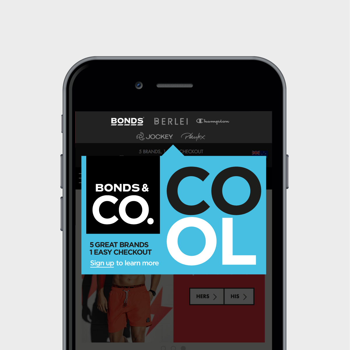
Bonds & Co. marks the beginning of an exciting new chapter for online retail in Australia. For the first time, Australians will have the chance to add multiple brands to one shopping cart. This includes big brands like Bonds, Berlei, Champion, Jockey and Playtex.
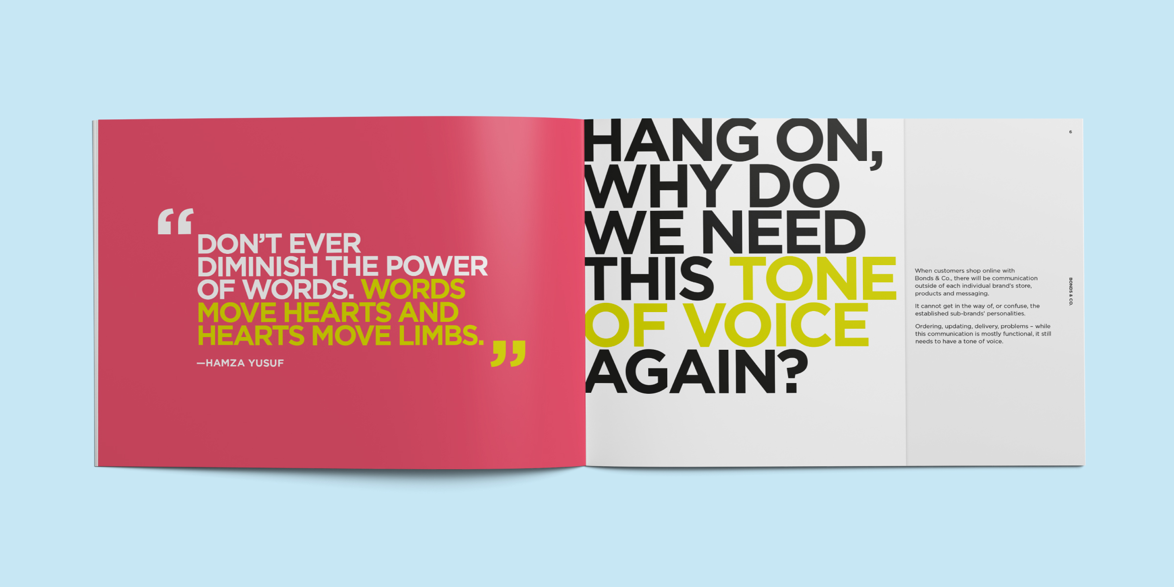
A new name, brand identity and tone of voice was required for this online multiple brand checkout. The challenge was creating a brand that can be developed individually, with its own personality, whilst housing the family of brands. The idea needed to be short, punchy and easy to remember, primarily targeting middle age mums who live an active lifestyle.
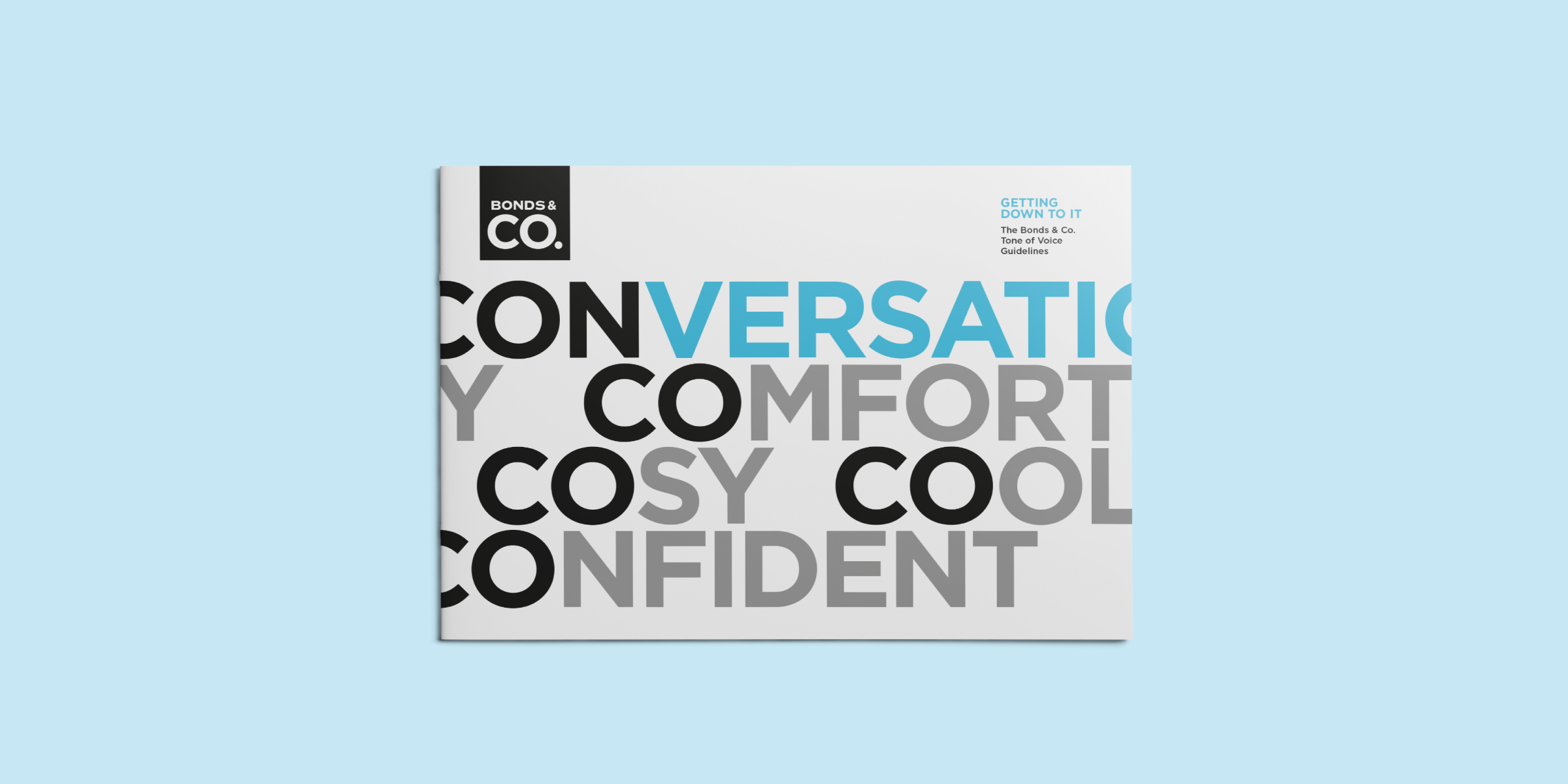
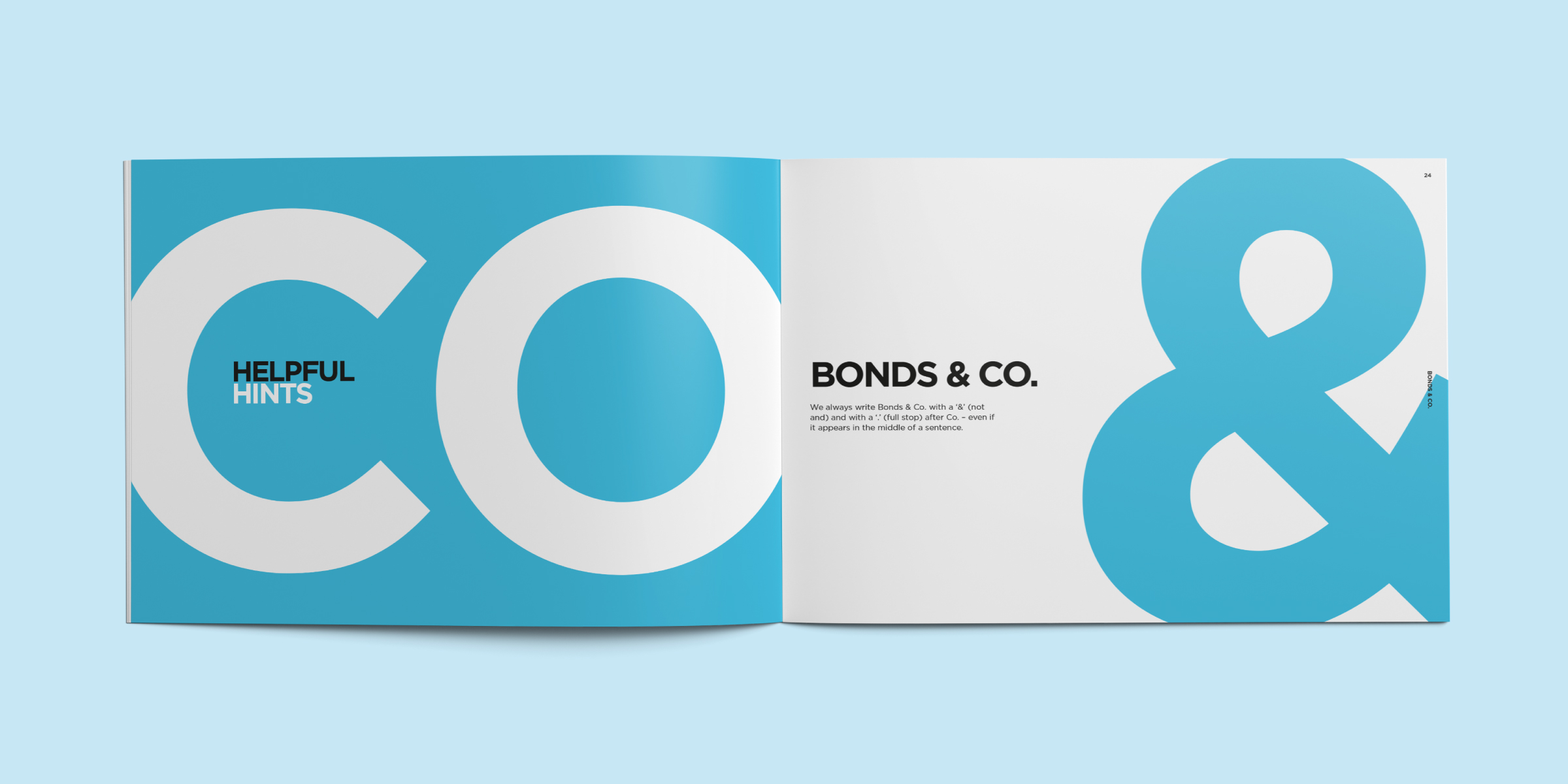
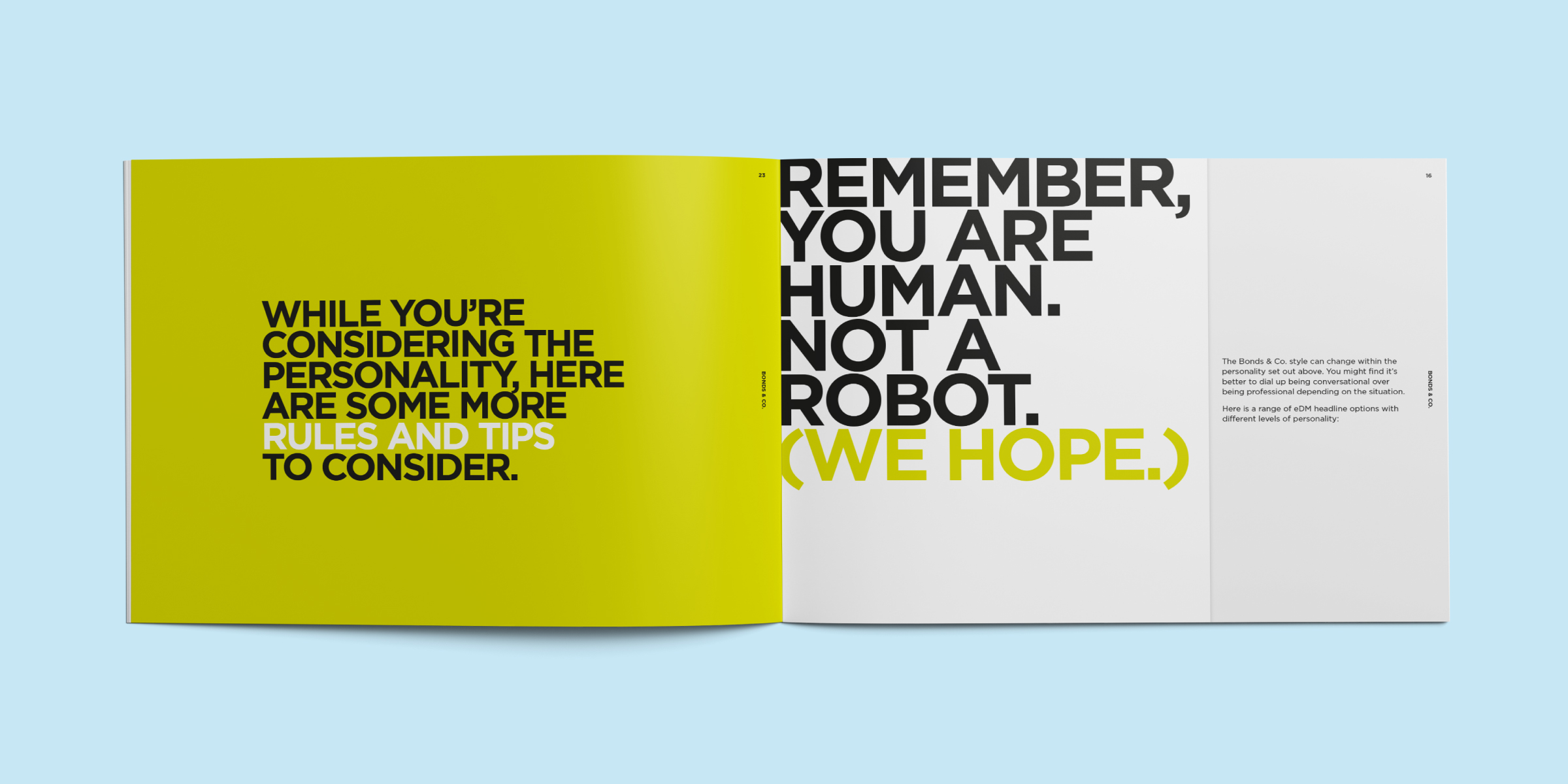
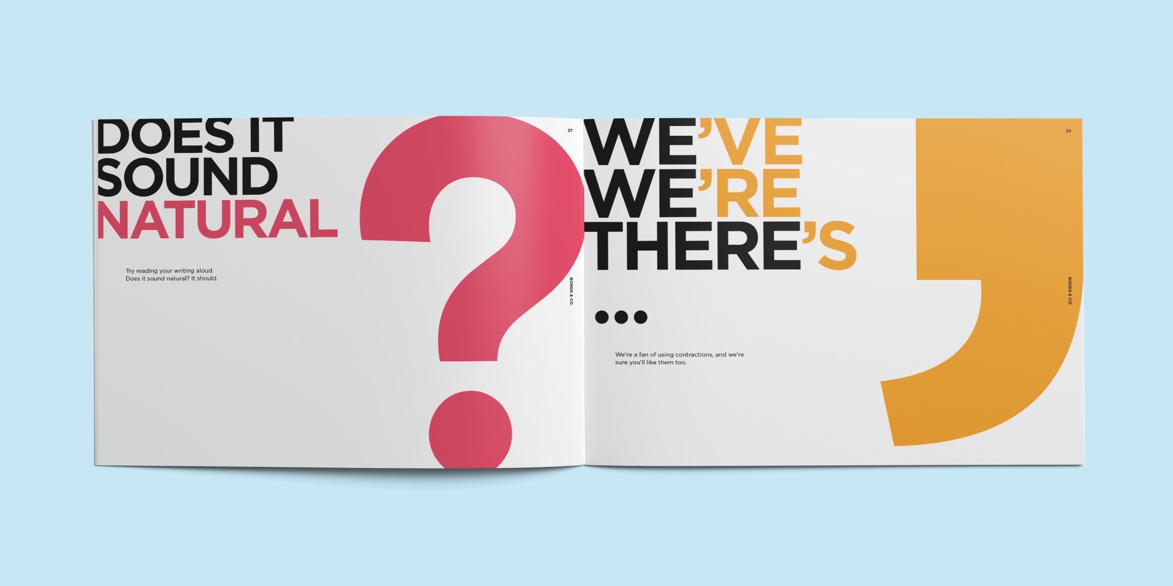
The name Bonds & Co. was created: the name ‘Bonds’ referencing the primary business and the word ‘Co.’ capturing the family of brands. The brand identity plays on the word ‘Co.’, used as a vehicle for bold brand messaging. Complemented by bold typography and a vibrant colour palette, the Bonds & Co. identity delivers on the confidence, cool and aspirational tone of voice we developed for the brand. The brand was rolled out across store collateral, the website and packaging.

