Brokenwood Twenty70
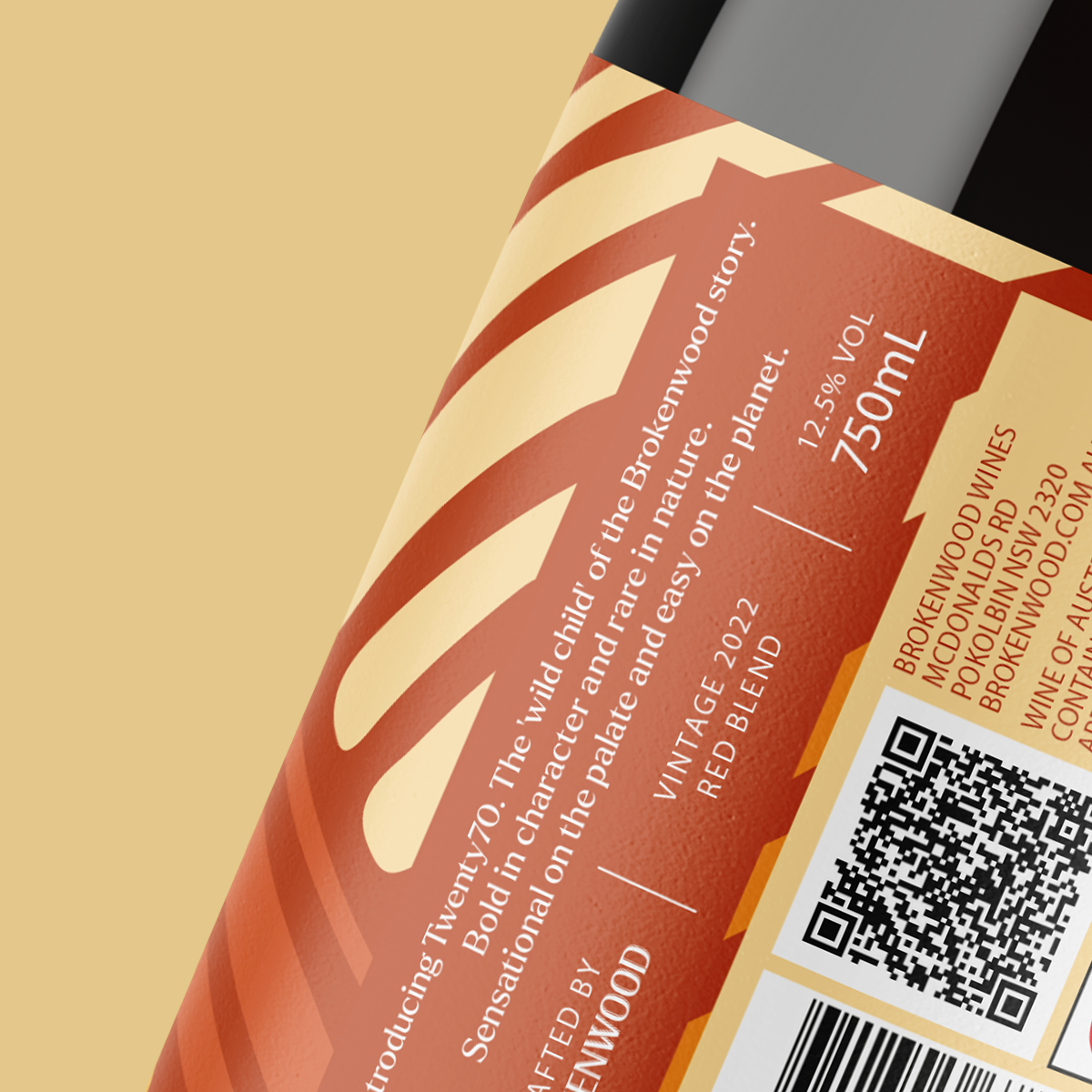
Introducing Twenty70. The ‘wild child’ of the Brokenwood story. Bold in character and rare in nature. Sensational on the palate and easy on the planet.
Established in 1970, Brokenwood Wines has earned its place as a highly reputable premium wine label in Australia. As a must-visit destination for wine enthusiasts in the Hunter Valley, they push the boundaries of tradition to create something extraordinary. Brokenwood Wines recently enlisted the help of Davidson Branding to develop a name, brand identity, and packaging design that captures the spirit of sustainability and appeals to a younger audience, particularly millennials.
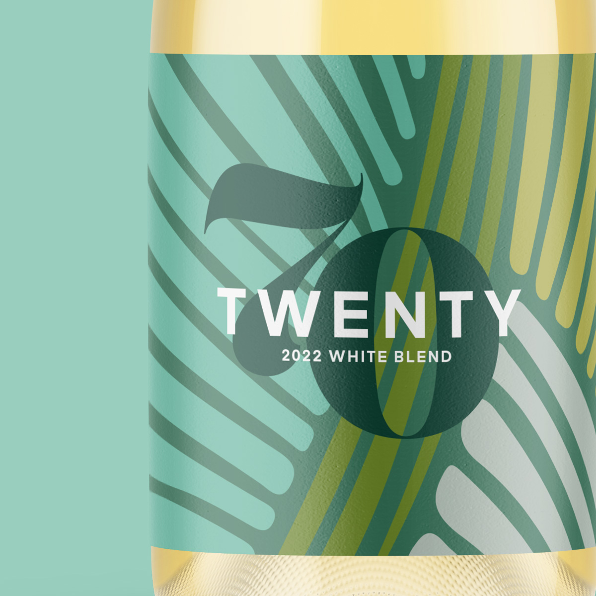
The name Twenty70 is a testament to their long-term sustainability approach, while embodying the youthful and modern personality they strive for. It cleverly combines the past (1970s) and the future (2070) of Brokenwood, symbolising their commitment to sustainability and innovation and its unique and modern personality.
To visually communicate this duality, Davidson Branding crafted a brandmark that seamlessly blends two distinct typefaces. The sans serif font of “twenty” exudes a contemporary feel, representing our modernity, while the crafted serif font of “70” pays homage to our heritage and illustrious past. Together, they form a sophisticated brandmark that captures the essence of the new range.
Davidson Branding explored various creative territories to encapsulate the brand personality and positioning before ultimately finding a direction that artfully combines their commitment to sustainability with the product origin story.
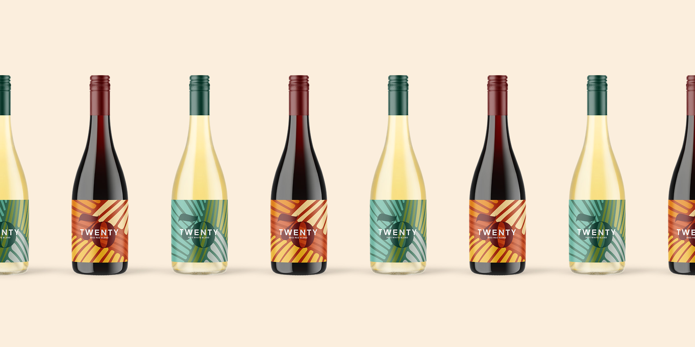
The packaging design employs a carefully curated palette of earthy colours, complementing each wine variant, reinforcing our sustainability positioning, and subtly nodding to the 70s era in a modern and youthful manner.
To evoke a sense of modernity and sophistication, organic shapes were meticulously crafted into an abstract vineyard illustration, mirroring an aerial view. This design choice not only emphasises the sustainable and natural origins of the products but also resonates with a younger and more contemporary audience.
Overall, the packaging design for the Twenty70 range effectively captures the essence of the Brokenwood brand while successfully appealing to a new and younger market. The brandmark, packaging design, and use of colours and shapes all work together to create a sophisticated and modern brand identity that communicates the long-term sustainability approach of the Brokenwood brand, while also highlighting its unique and modern personality.


