Defence Health
Defence Health is dedicated to the care and protection of Australian Defence Force (ADF) families as an independent organisation in the Private Health Insurance industry. With an intimate understanding of the unique pressures in their lives, Defence Health is a closed fund that specialises in providing healthcare funds to ADF families and communities.
Defence Health was facing increased competition in the ever-changing healthcare industry. Their existing brand did not appeal to the younger audience they wished to attract, nor reach the organisation’s aspirations to be positioned as a modern, innovative health fund provider.
There was opportunity to evolve the existing design into a contemporary, family and community-oriented brand that underpins Defence Health’s key point of difference—their unique link to the ADF as the only fund that truly understands the needs of ADF families and members.
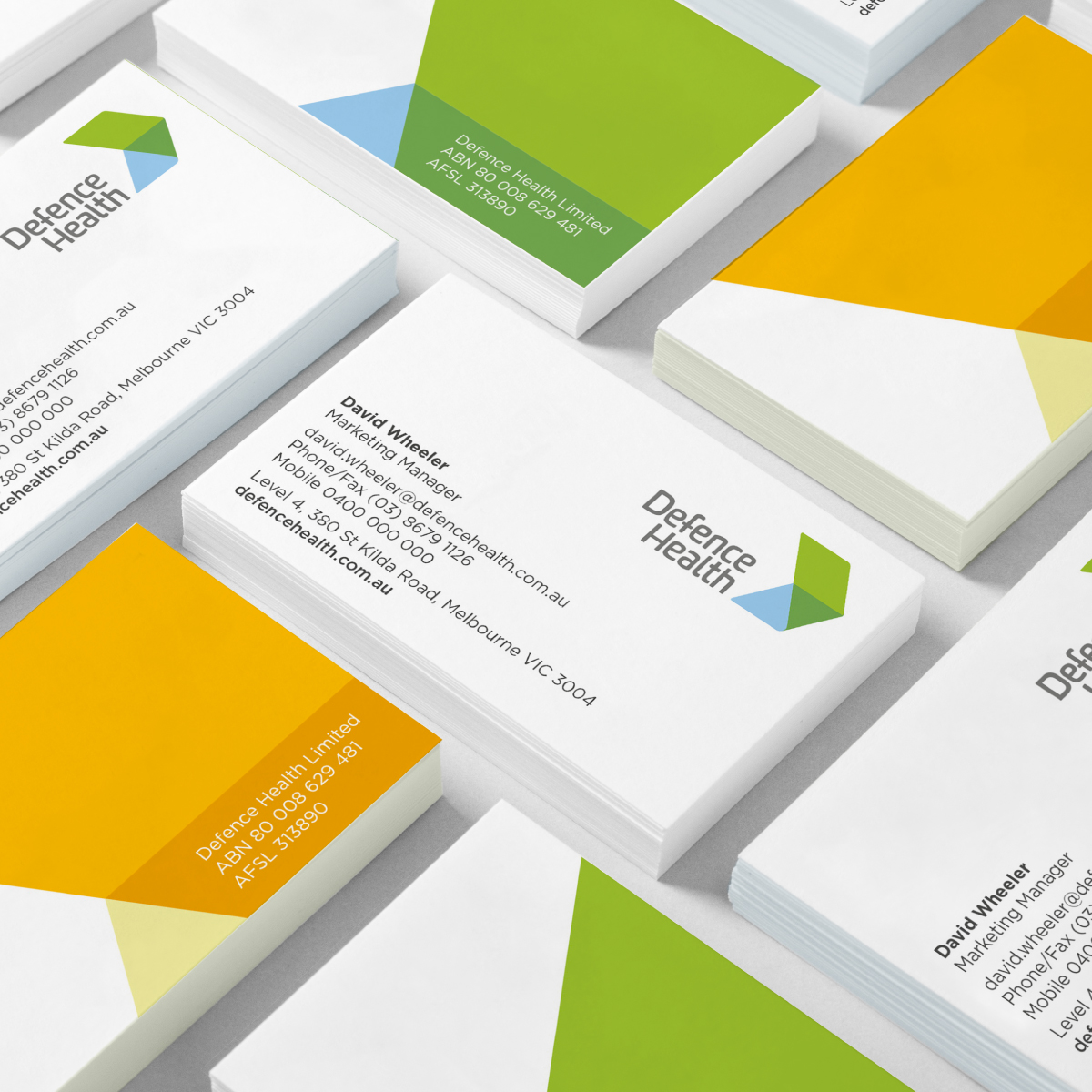
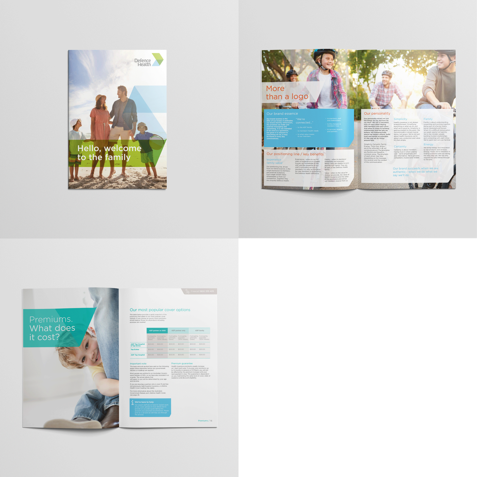
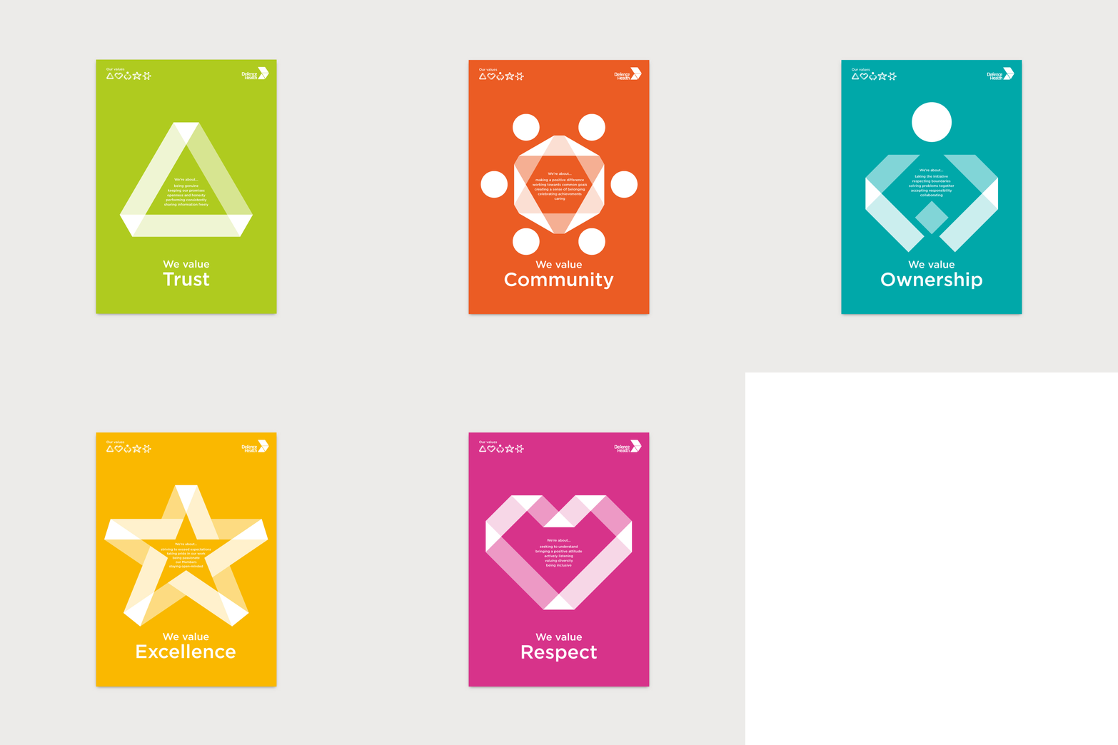
Through a series of brand strategy workshops identifying the present challenges and future vision of the organisation, the positioning, ‘Join the family’ was created. The new positioning is brought to life in the new brand mark as a forward-facing ribbon arrow representing the protection and progress of the brand, whilst also being inspired by a modern interpretation of the chevron insignia. The mark is extended into a graphic language utilising the ribbon as a device of care, trust and transparency that integrates with warm, bright photography. This is complemented by the primary palette of vibrant tones of blue and green capturing the optimistic and modern feel of the new brand.


