FareShare
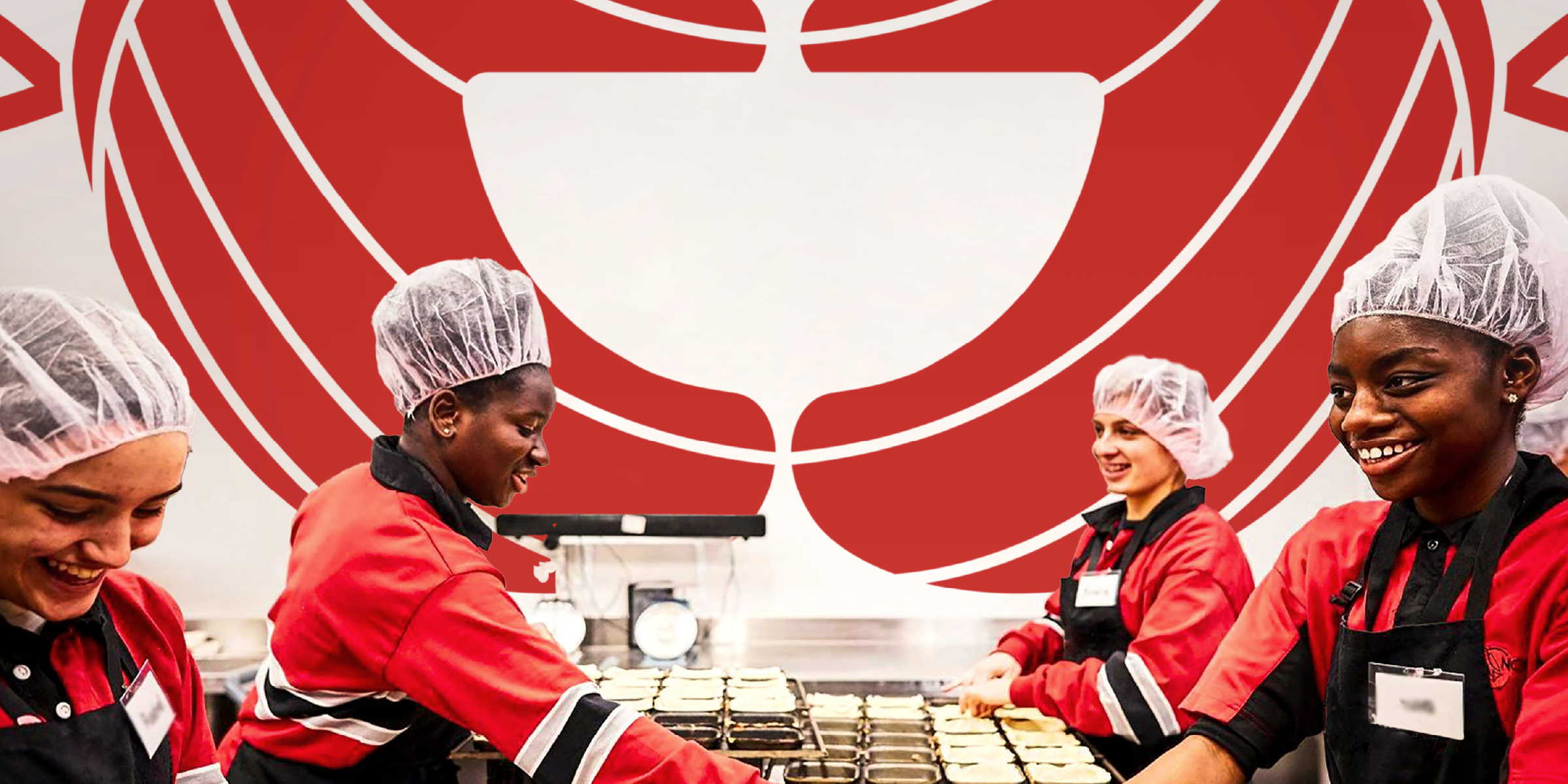
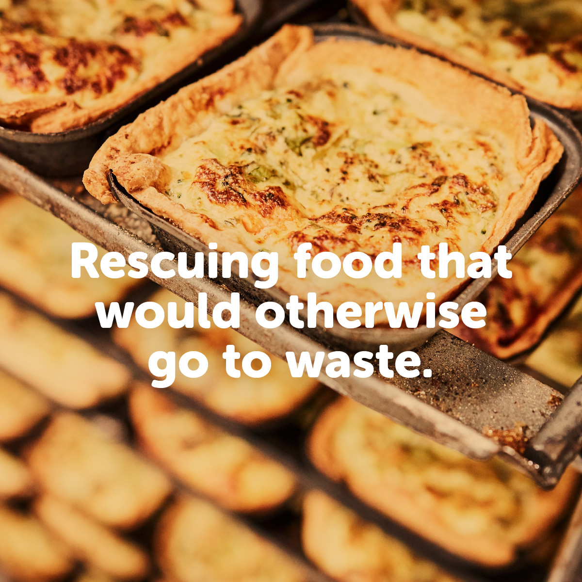
FareShare operates Australia’s largest charity kitchens cooking 15,000 meals every day for people in need with the support of more than 1,500 volunteers. Its mission is simple; rescuing food that would otherwise go to waste and cooking it into delicious, nutritious hot meals which are then distributed to frontline charities such as homeless shelters, soup vans, women’s refuges, disadvantaged schools and community food banks across Australia.
Davidson Branding was briefed with revitalising the FareShare brand and giving it a more contemporary feel ahead of its expansion to Queensland. The organisation recognised that it had low brand awareness, which presented a challenge to its ambitious vision of growing its operations inter-state. Its visual identity needed to also better-reflect the organisation’s key point of difference in its sector; its commitment to not only rescue food but more importantly to cook it into nutritious hot meals rather than simply redistribute it. This unique value-adding mission provided the creative direction to inform the positioning and identity of the new FareShare brand.
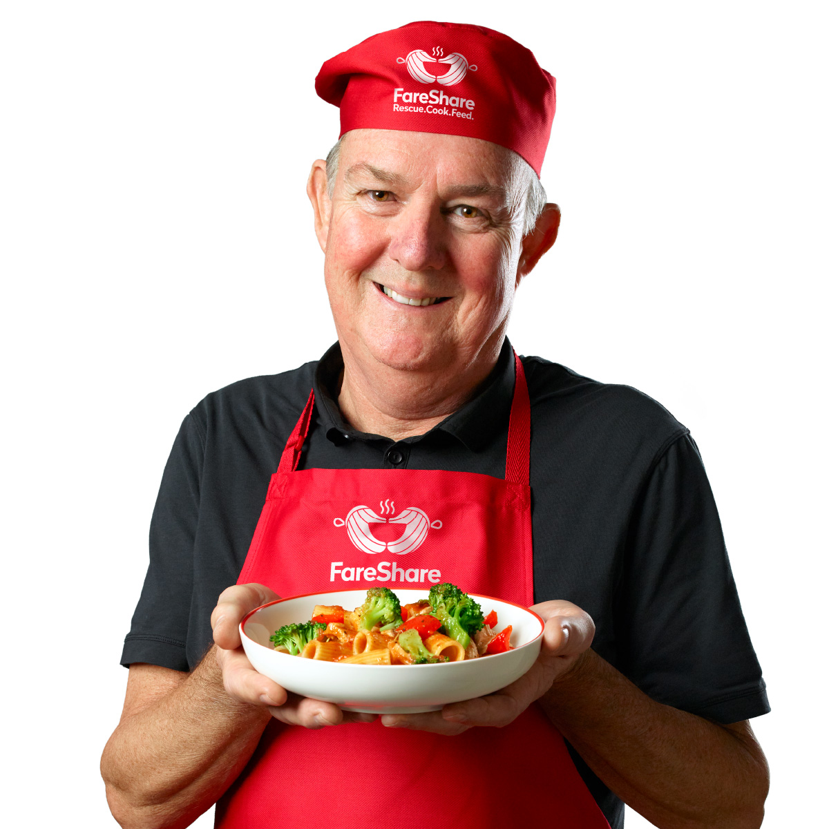
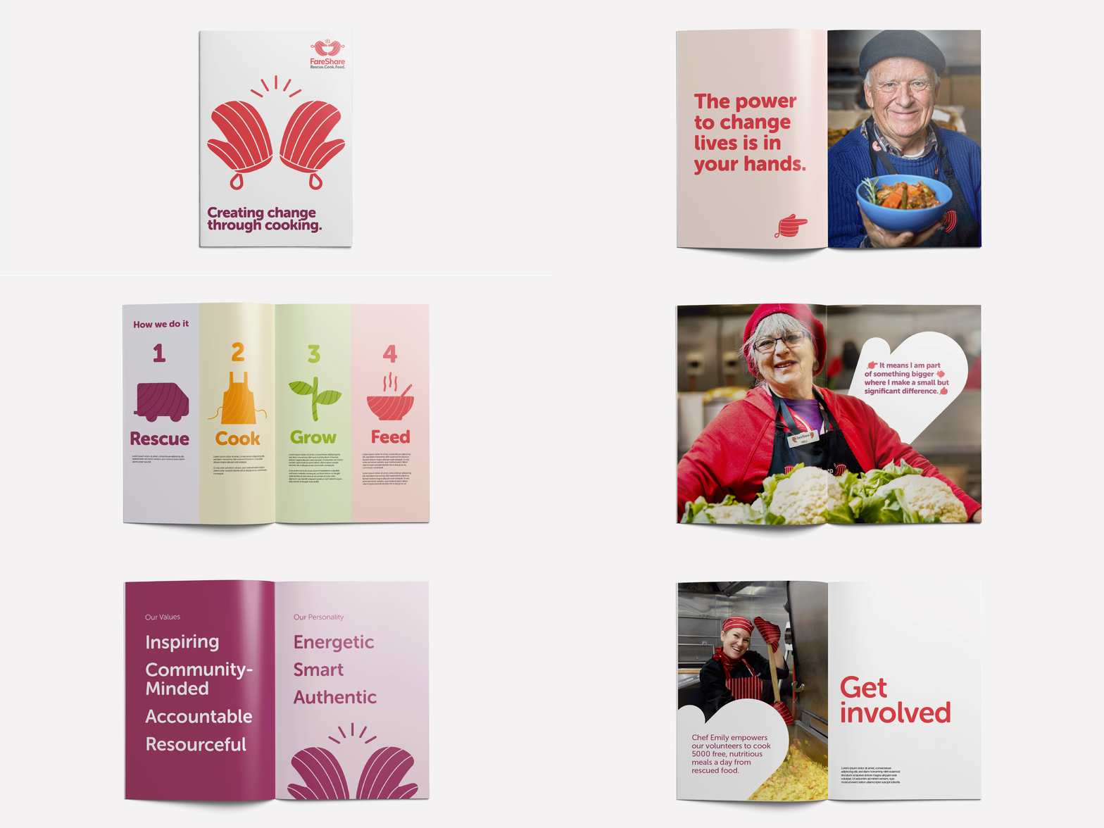
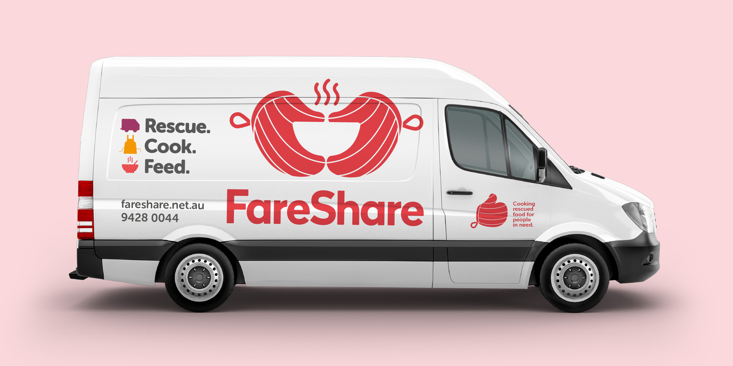
Building on the familiarity and equity of FareShare’s existing brand identity, we kept the iconic cooking mitts which capture the heart of the charity’s operational activities. It was important for the new logo to tell a story; one that emphasised not only FareShare’s highly-nutritious meals but also the care that the organisation and its volunteers put into the process. Thus, we refined the ‘tomato red’, white-striped mitts to create a smile that reflects the positivity and authenticity of the brand. With the steam lines added above the mitts, the symbol also doubles as a bowl of hearty, cooked food. Locked up with the new logo, is the tagline ‘Rescue. Cook. Feed.’ which succinctly sums up FareShare’s action-orientated vision to work towards a society where food is not wasted, and no one goes hungry’.
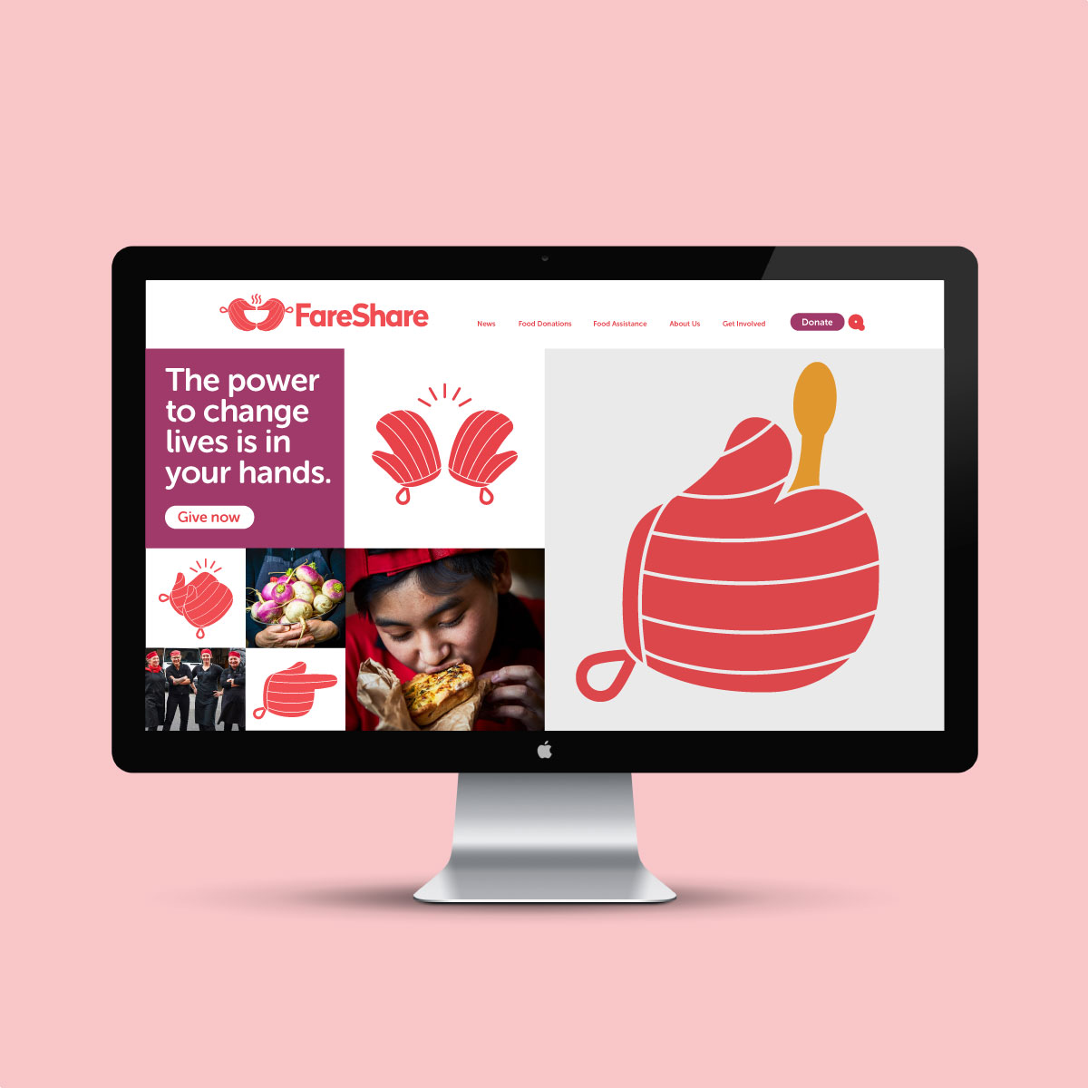
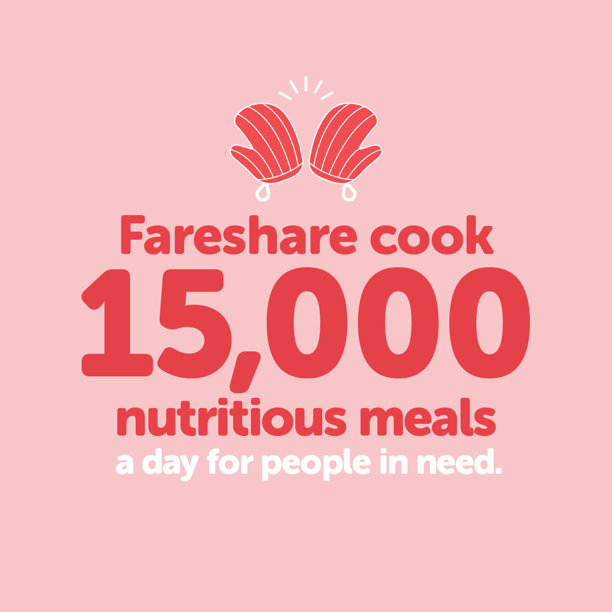
Living in a highly-digitised world, it was crucial to ensure that the new identity could be applied creatively across multiple platforms. Davidson further leveraged the iconic symbol of the cooking mitts by bringing to life mitt emoticons; adding a layer of animation that transformed the mitts to more interactive and personable hero elements.
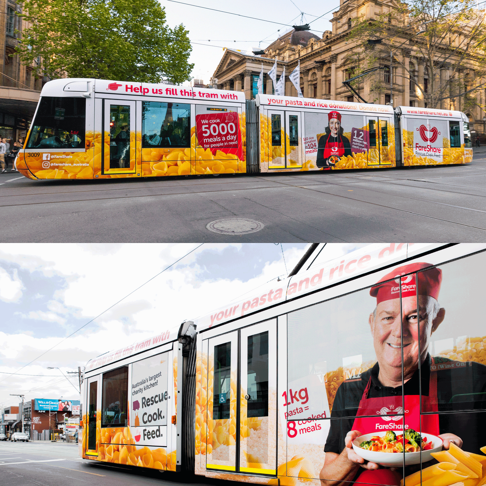
As part of the ongoing work, Davidson created a campaign for FareShare’s biggest food drive; a bid to collect 20,000 kg of rice and pasta. The message which was taken to Melbournians on the 109 tram through a full tram wrap donated by Yarra Trams, achieved the set goal of raising enough ingredients to add to 320,000 nutritious hot meals for those in need.
Davidson’s scope of work included positioning, brand identity, vehicle livery and style guide. The new FareShare brand clearly tells the organisation’s authentic yet inspiring story and its USP; highlighting its community-minded, accountable and inspiring values whilst best-reflecting its authentic and energetic personality.
Photographers: Adrian Lander and James Morgan
