Bringing Life to the JC’s Quality Foods Brand
JC’s Quality Foods are an Australian, family-owned business who pride themselves on providing consumers with deliciously healthy snack products, created from the freshest natural ingredients sourced from only the best growers and producers.
JC’s Quality Foods required a new strategic foundation that would unify the brand, provide a platform for further growth, and improve their relevance in order to appeal to new consumers. They wanted a refreshed brand that would allow their values of good health and quality ingredients to stand out on shelves.
Firstly, Davidson worked with JC’s to identify their vision of what the brand should stand for – high quality, wholesome, locally-grown foods. We leveraged our expertise in consumer insights to hone in on their target consumer – health-conscious, time-poor, and seeking healthy, easy snack options to support their lifestyle – and how to meet their needs.
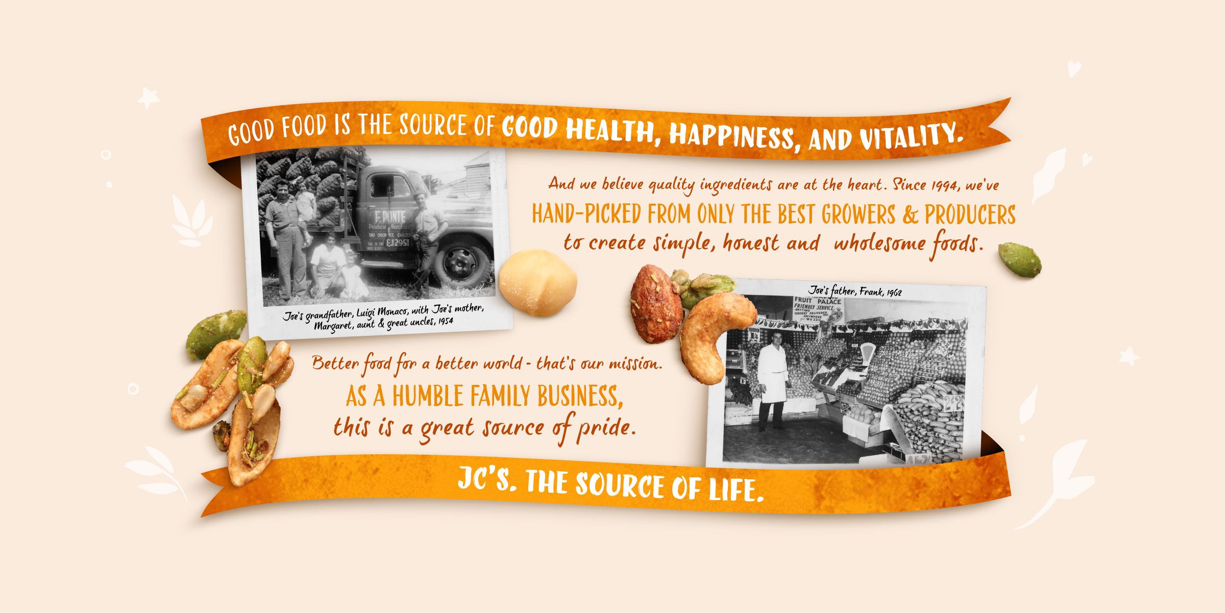
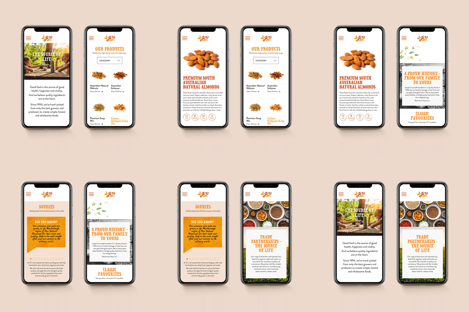
From this, we developed their brand positioning – “J.C.’s. The Source of Life.” This speaks to the brand being a source of energy and vitality, of fun and convenience, and of fresh, natural ingredients – everything our target consumer needs to live their life.
Davidson undertook market research to uncover the strengths and weaknesses of their competitors, and how JC’s could develop a unique point of difference. Our competitive analysis identified that while major players focused on rustic, from-the-farm imagery, our new positioning separated us from the pack by springboarding the brand in a new direction focused on vitality.
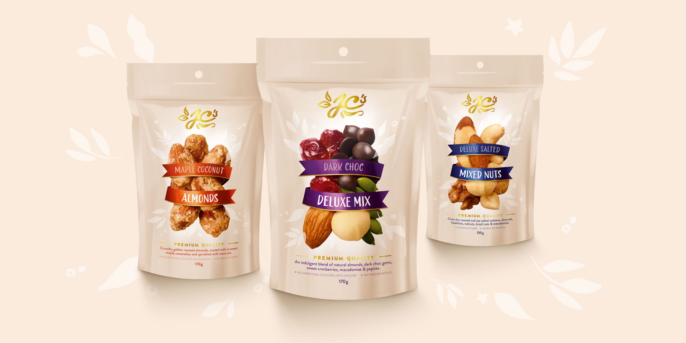
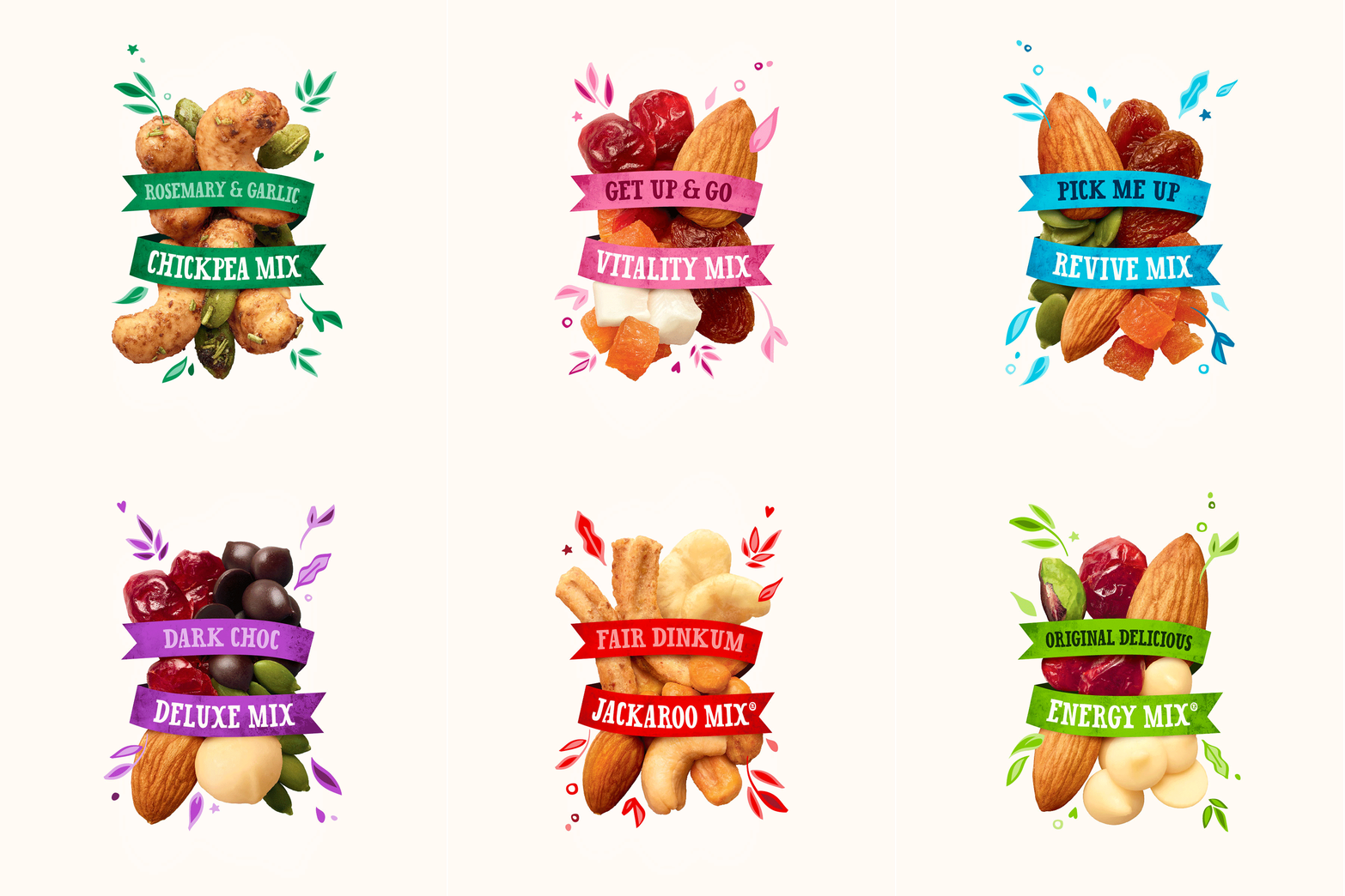
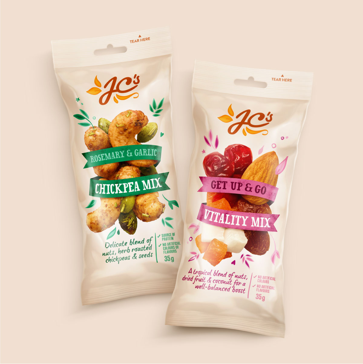
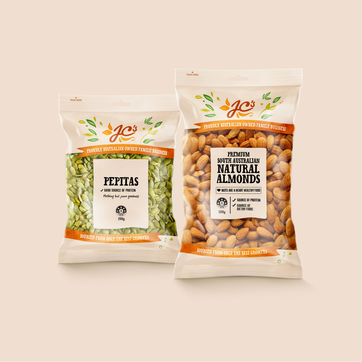
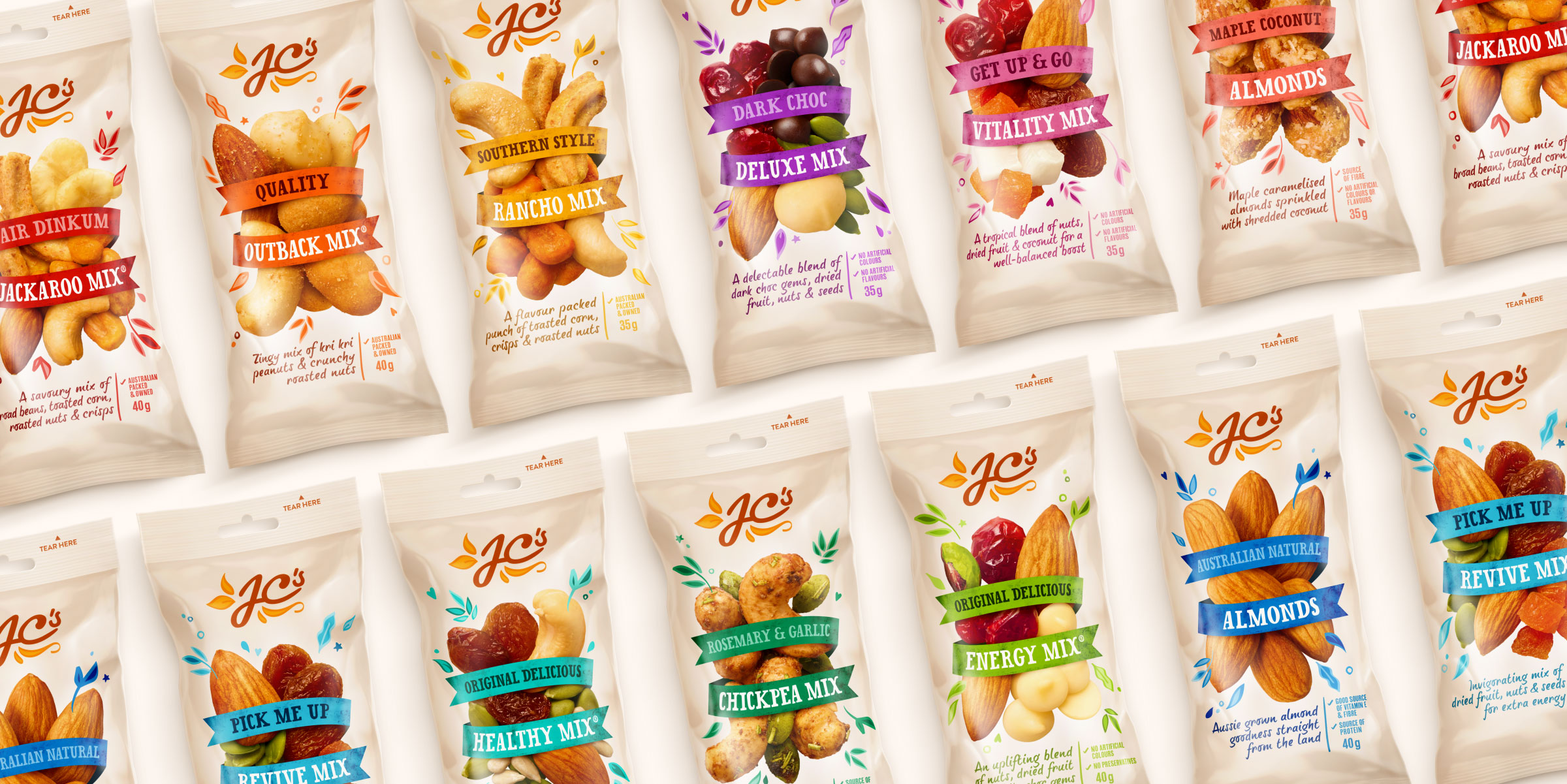
The evolved logo retains the heritage of Joe’s original signature, with additional hand-drawn flourishes that act as a brand motif throughout the design to evoke health and vitality. Similarly, the existing JC’s ribbon is employed more dynamically to wrap around the ingredients, which burst from the centre of the packaging to symbolise that quality ingredients are at the heart of the brand. The modernised brand colour palette contains vibrant, yet natural hues of orange on a crisp buff background to gain cut-through on shelves.
“I couldn’t be happier with the whole process… We identified that we are well received in the market but needed to align our logo and packaging across the different usage occasions to truly identify and convey what the J.C.’s brand represents. Davidson Branding has done an amazing job on the above and more. We are all excited about the next chapter for J.C.’s and look forward to an ongoing strong relationship with Davidson Branding in continuing to help us grow our brand awareness.”
Joe Cannatelli, Managing Director & Founder of J.C.’s Quality Foods.
