Melba Support Services
Melba Support Services is the only organisation in Australia (and one of seven in the world) to be accredited for person-centred excellence with distinction by the US-based Council on Quality and Leadership. A not-for-profit leader and registered NDIS provider, Melba’s purpose is to support and empower people with disabilities to live their lives to the fullest. Throughout their 45 years of operation, they have held a reputation as a progressive and innovative provider of the highest quality services for thousands of clients within Victoria.
Melba lacked a compelling brand architecture and positioning that could elevate them to the position of world-leading provider of disability support services. A convoluted brand identity system failed to represent the vibrancy of their community and the people involved. The colour palette was bright yet undefined, and a strong, recognisable graphic device that emotively conveyed their brand story was missing. Visiting the people behind Melba and their clients gave us an insight into their wonderful culture, and an exciting new direction for the brand began to take shape.
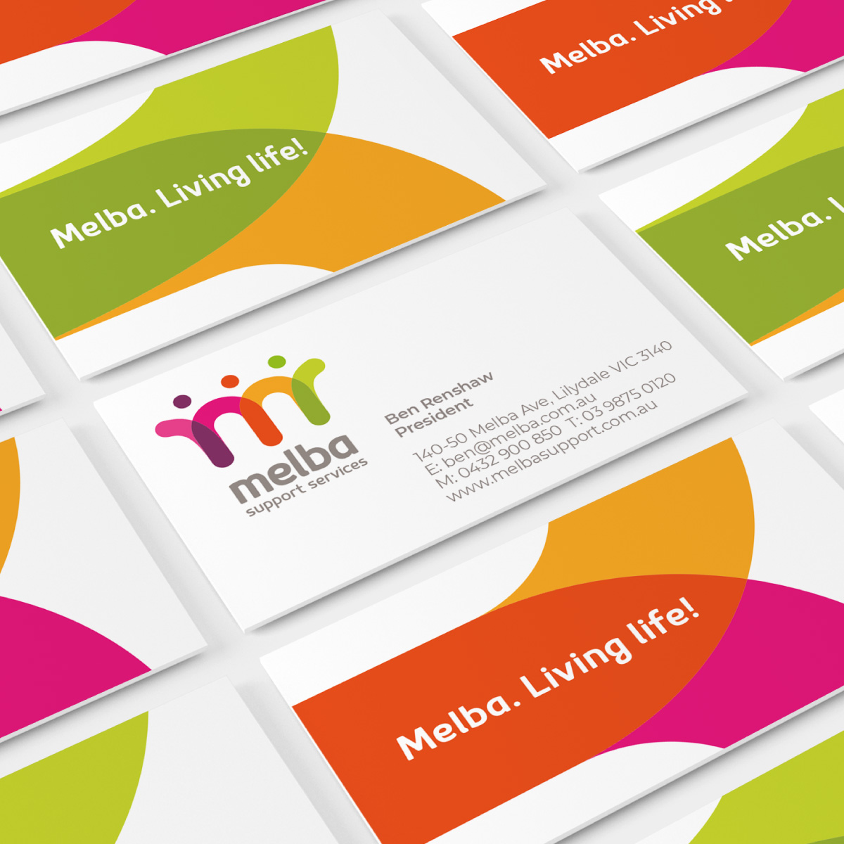
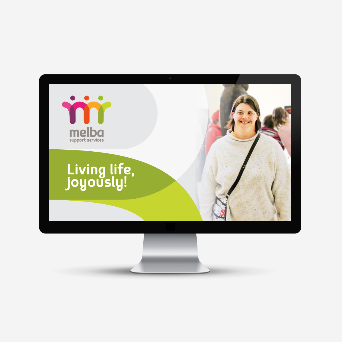
Communicating Melba’s inspiring mission required a revamped brand strategy, positioning, and identity. Davidson worked with key stakeholders to identify Melba’s unique customer value proposition and fun-loving tone of voice. From this, we developed the positioning ‘Melba. Living Life!’ as a punchy expression of their purpose that is easily adaptable to marketing materials.
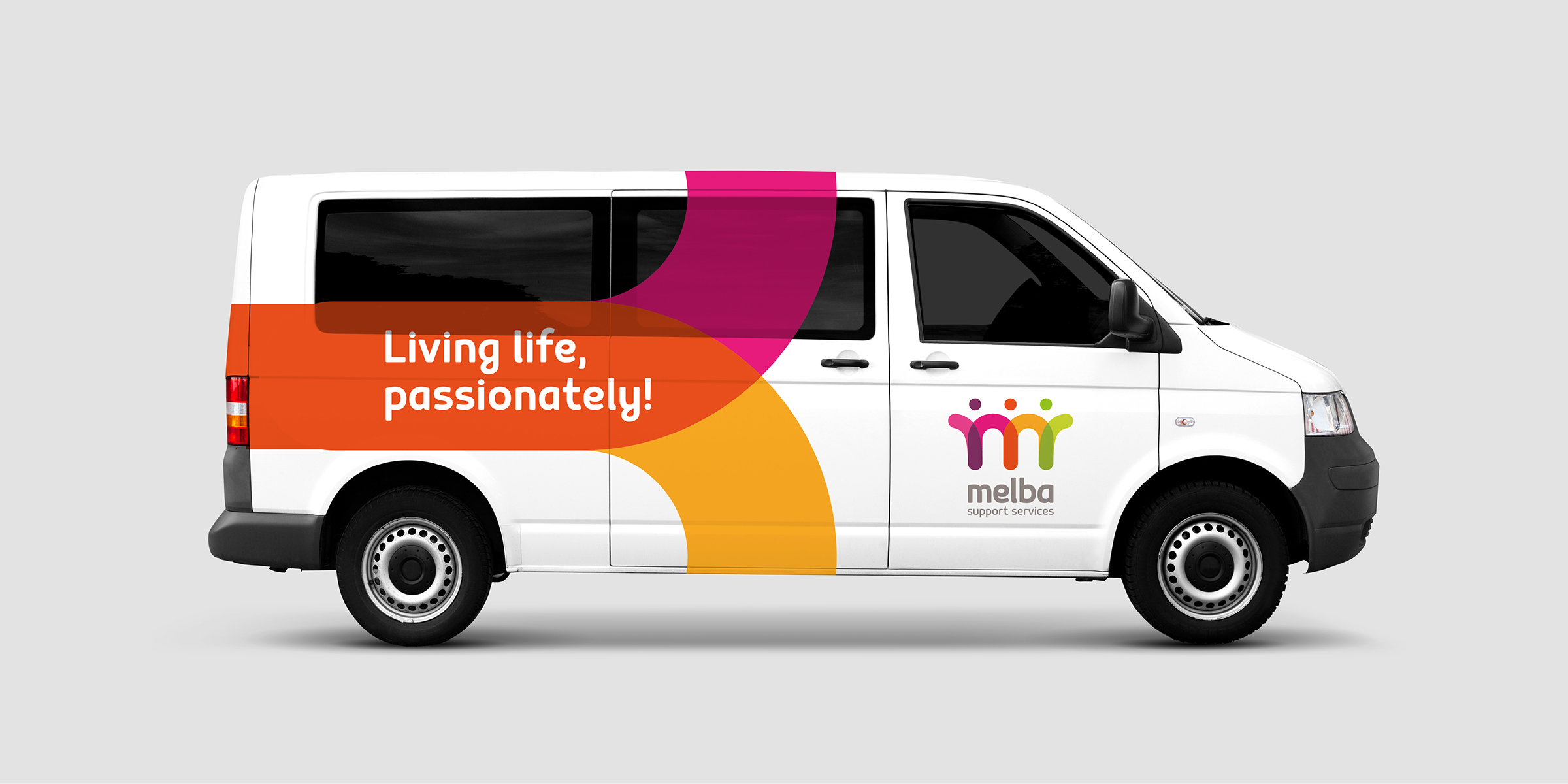
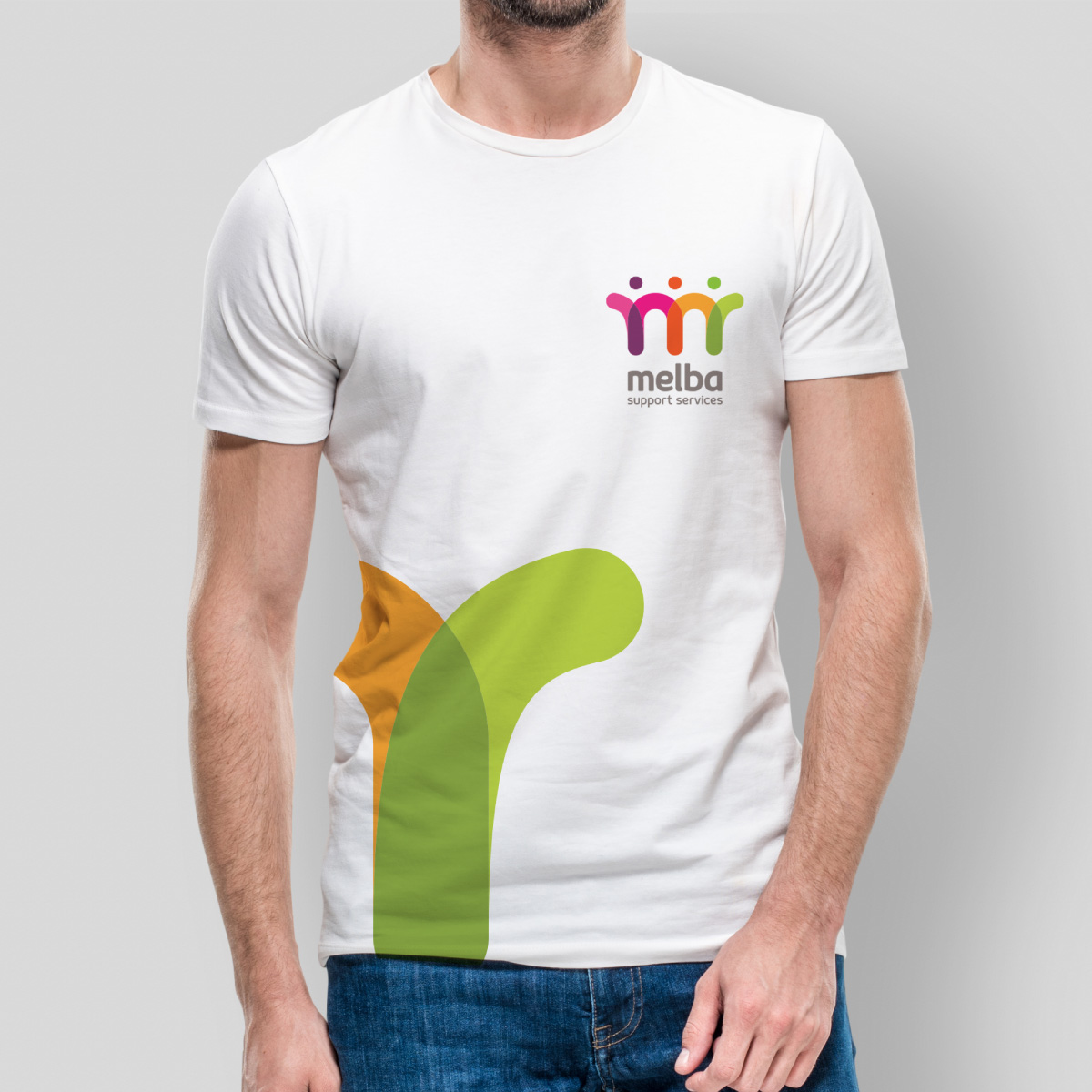
It was important to keep the iconic Melba ‘M’ at the foundation of their new brand identity. Its evolution depicts three conjoined ‘people’ representative of Melba’s community – staff, clients, and family – supporting each other arm in arm. In conjunction with a typeface that is friendlier while maintaining a sense of gravity, this new logo serves as a stronger graphic portrayal of their brand narrative. While the colours were previously undifferentiated, their refreshed brand sub-palette is ownable, inviting and reflective of the vibrant diversity of their community and positioning.
Melba’s refreshed brand strategy, positioning, and identity builds on and respects their proud history while representing their passion for supporting people to dream big, be happy, and live their lives to the fullest. Moreover, it positions Melba to achieve their goal of becoming a world leader in opening up opportunities for people with disabilities.
“The new brand helped us communicate to everyone who we are, what we stand for and where we are going.”
David Glazebrook, Innovation & Development General Manager.
“Our refreshed brand builds on and respects our proud history, while showcasing who we are… many have commented that it was wonderful to still see the ‘M’, but that they loved to see it presented in a bright and modern way.”
Glenn Foard, CEO.
