Pie Society
Ferguson Plarre Bakehouses are a fourth-generation family-run and operated bakery business. They have a long & proud history dating back to the 1800s and take great pride and pleasure in providing customers with the best range of sweet and savoury treats.
Inspired by the growing trend of crafted plant-based and meat products and the lack of good frozen pie offerings, Ferguson Plarre saw an opportunity to create a range of artisan pies that included a ‘meaty vegan’ pie with the fresh ingredients encased in their dreamy flaky pastry. Ferguson Plarres went on to develop a range of 11 new artisanal flavoured pies and approached Davidson Branding to help bring them to life.
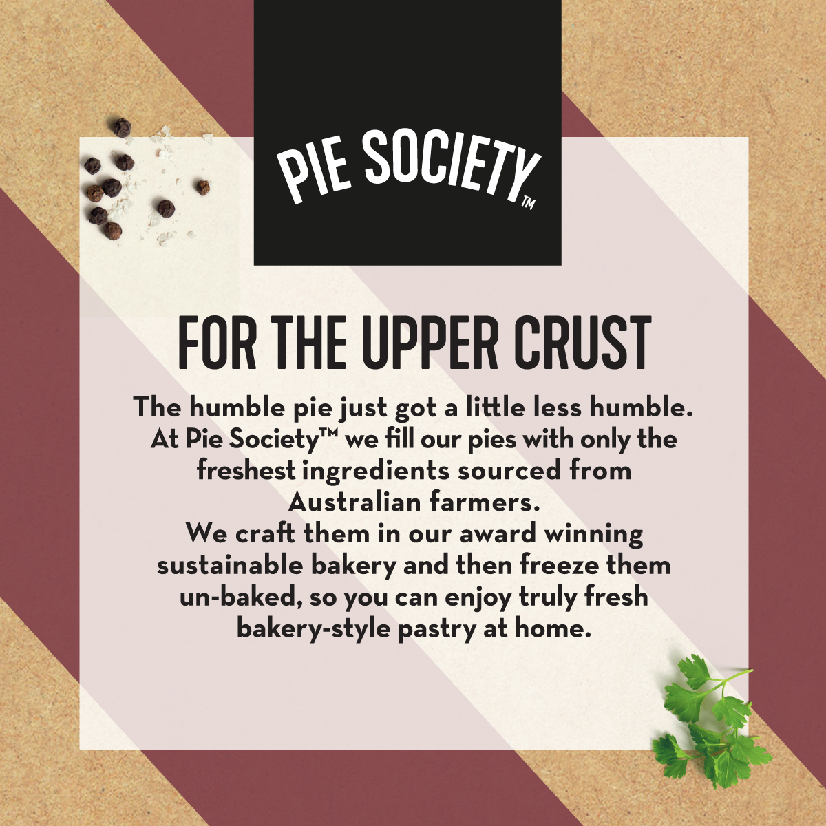
Their premium ‘baked at home’ range offers flaky textures and sensuous aromas, with the freshest ingredients sourced from Australian farmers. Providing the people with the essence of a humble pie; comfort, elevated.
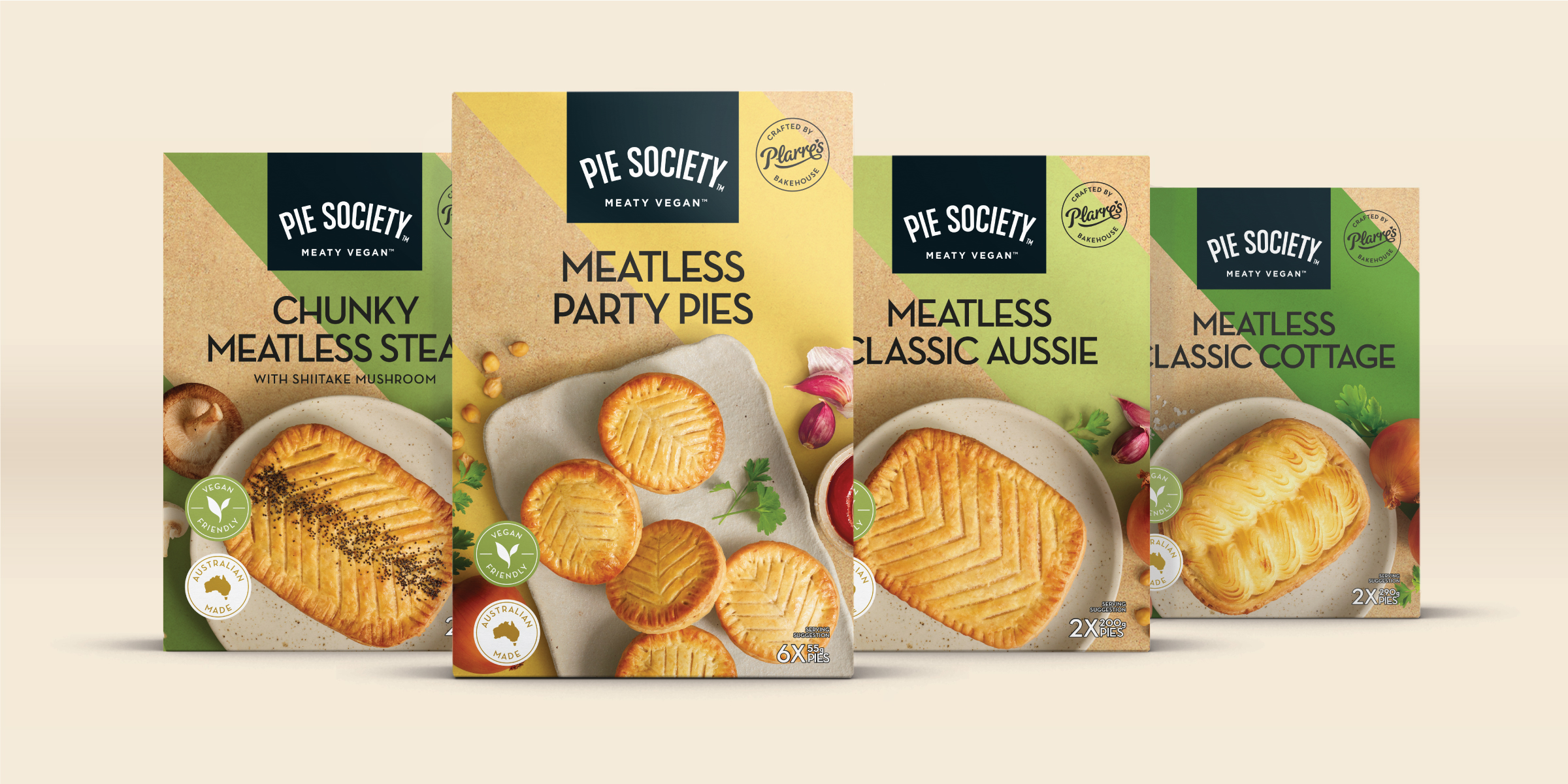
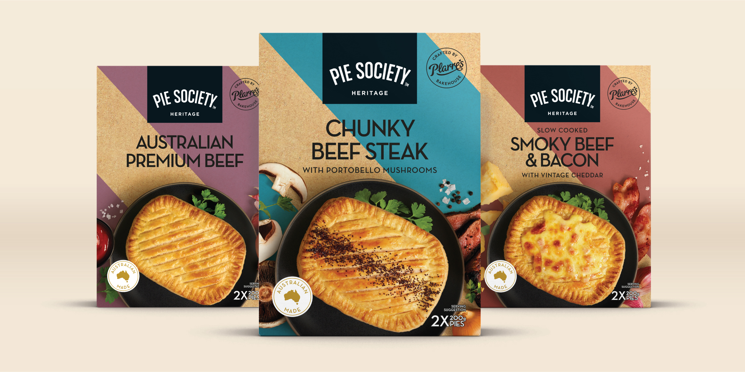
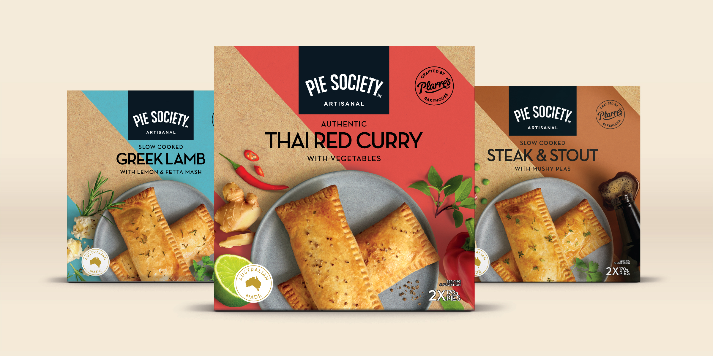
Davidson was commissioned to develop a name, brand and product packaging for Ferguson Plarre’s new range of frozen bake-at-home pies. The design needed to celebrate the much-loved Aussie staple whilst highlighting the premium qualities of the range. In particular, the packaging needed to call out the great tasting, sustainably sourced ingredients and vegan options for those wanting a no-animal product version. There were 3 sub-ranges: ‘The Artisanal Range’ – crafted hand pies crammed with creative fillings, ‘The Heritage Range’ – classic rich fillings packed with flavour and ‘The Meaty Vegan Range’ – delicious pies without the meat, no compromise classics made from fresh vegetables.
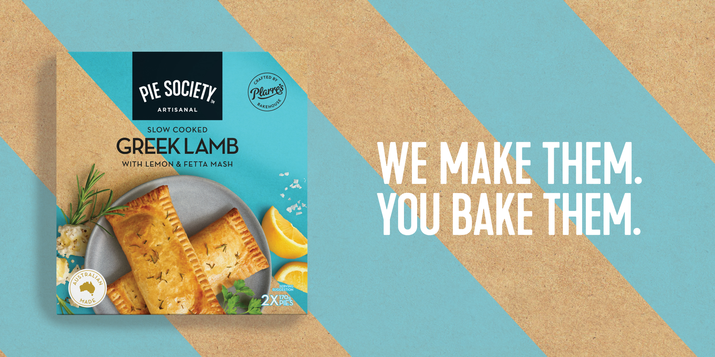
Davidson, in collaboration with the Ferguson Plarres team, created the range name ‘Pie Society’ – a name that reflects the crafted product but also feels inclusive and welcoming.
The ‘Pie Society’ brand mark is inspired by 1920’s sign-written typography (a nod to Ferguson Plarre’s baking expertise & heritage). It sits in a black ribbon on the packaging acting as a seal of quality.
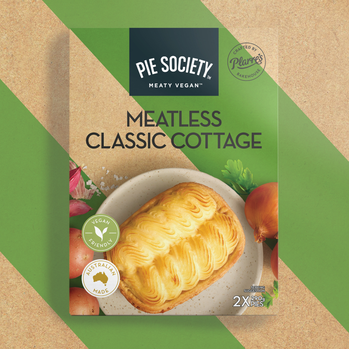
Inspired by foodie culture, the packaging design features bold, diagonal stripes overlaid onto craft paper reflecting the artisan, crafted nature of the pies. They are also a nod to Ferguson Plarre’s iconic red and white bakery stripes. The diagonal stripes create a unifying bold design that ensures shelf standout with the tones of the stripes changing to identify the three different ranges within Pie Society.
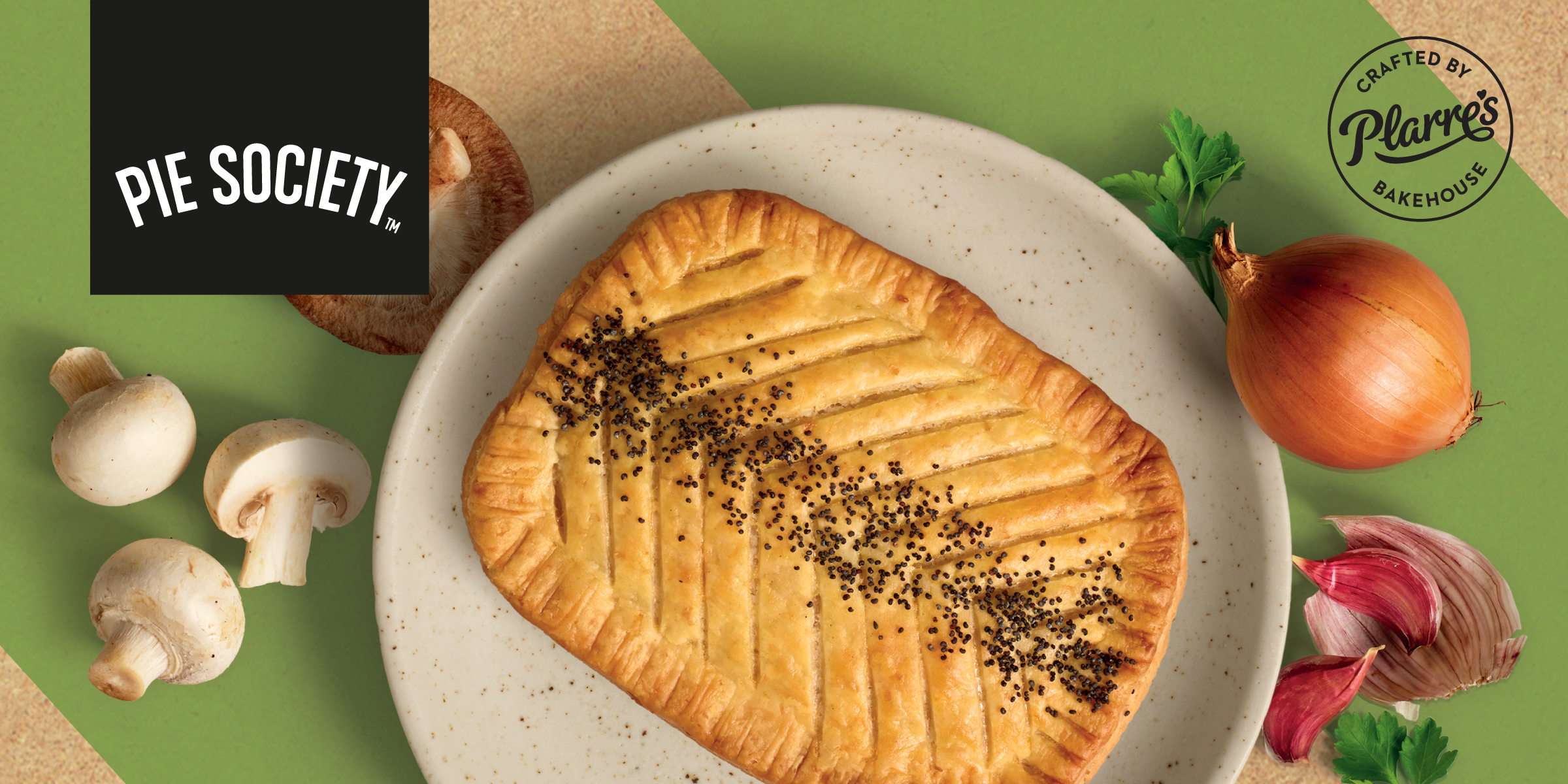
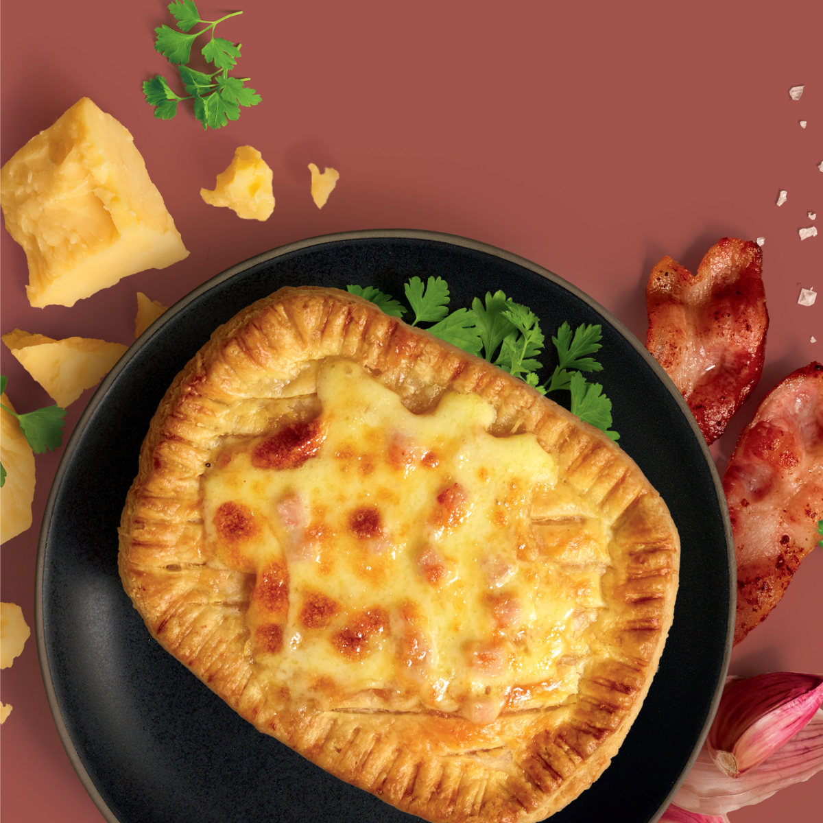
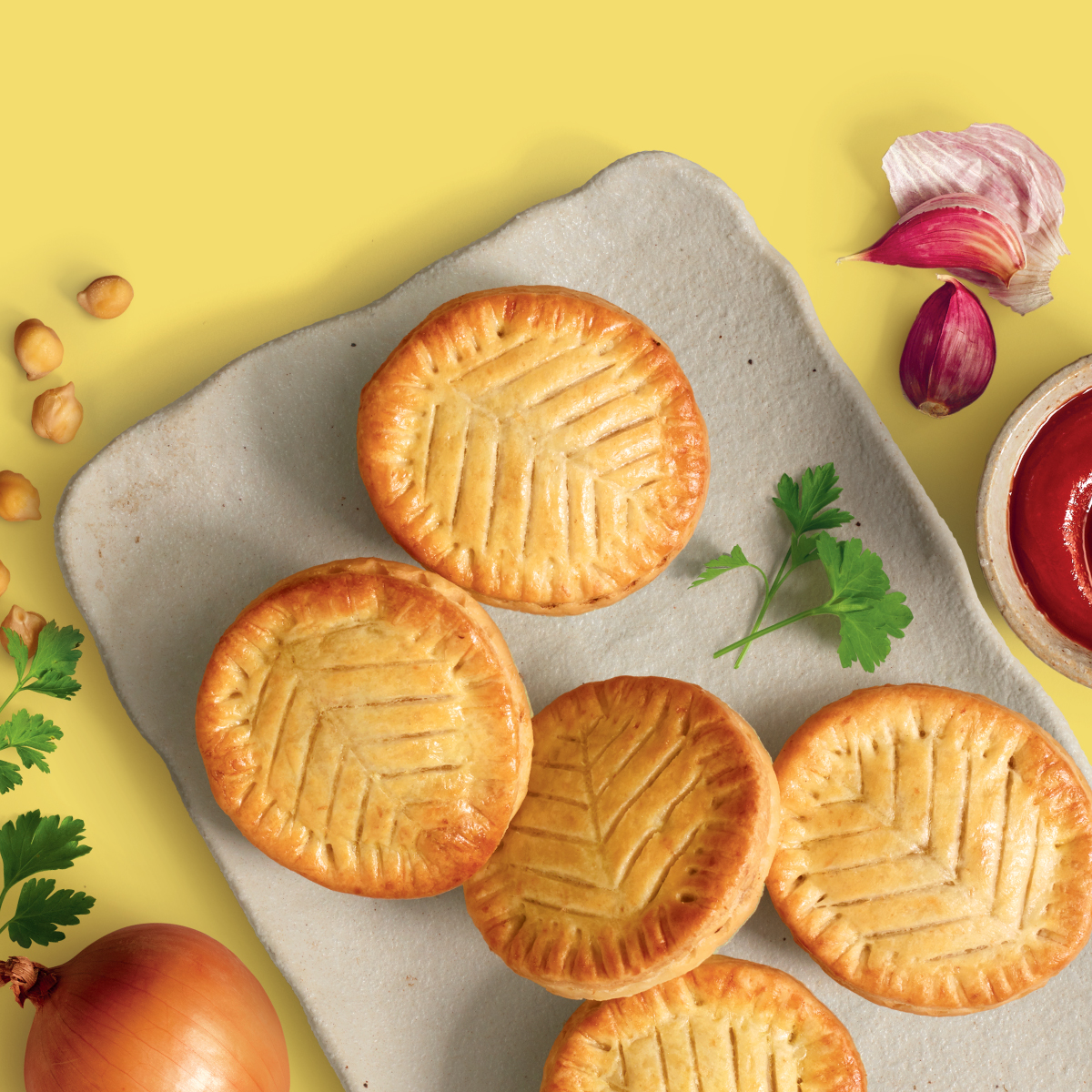
Photography of the pies is placed front and centre of the packaging showing the golden, light texture of the pastry. The pies are presented on carefully selected, handmade plates and surrounded with simple, wholesome natural ingredient cameos. Each pie is identified with different bakers marks – pastry scoring or a sprinkling of seeds – a unique feature that reflects the artisan nature of the pies and Ferguson Plarres baking heritage and expertise.
