Portarlington Grand Hotel Rebrand
Established in 1888, the Portarlington Grand Hotel on the Bellarine Peninsula is the perfect seaside retreat. The hotel is a perfect blend of the new and the old, the land and the sea, the city and the country. Rich in history, the region features Bellarine’s best local produce, where you’ll find rustic restaurants and renowned wineries mixed with beautiful beaches, family activities and holiday destinations.
In 2019, businessman Paul Little purchased the double-storey pub and guesthouse with a plan to revitalise and reposition the hotel as a modern destination whilst retaining its rich history. The $10 million refurbishment would see the hotel refitted to the highest of modern standards, set to recapture its former glory. As part of the redevelopment, the hotel needed a brand refresh that reflects the new direction of the hotel as a modern yet historic destination, enriched by scenic views and quality food and wine—making it a desirable destination for the perfect getaway. A place for all seasons.
Davidson was commissioned to develop the new brand positioning, refresh the brand identity, and create a brand identity system.
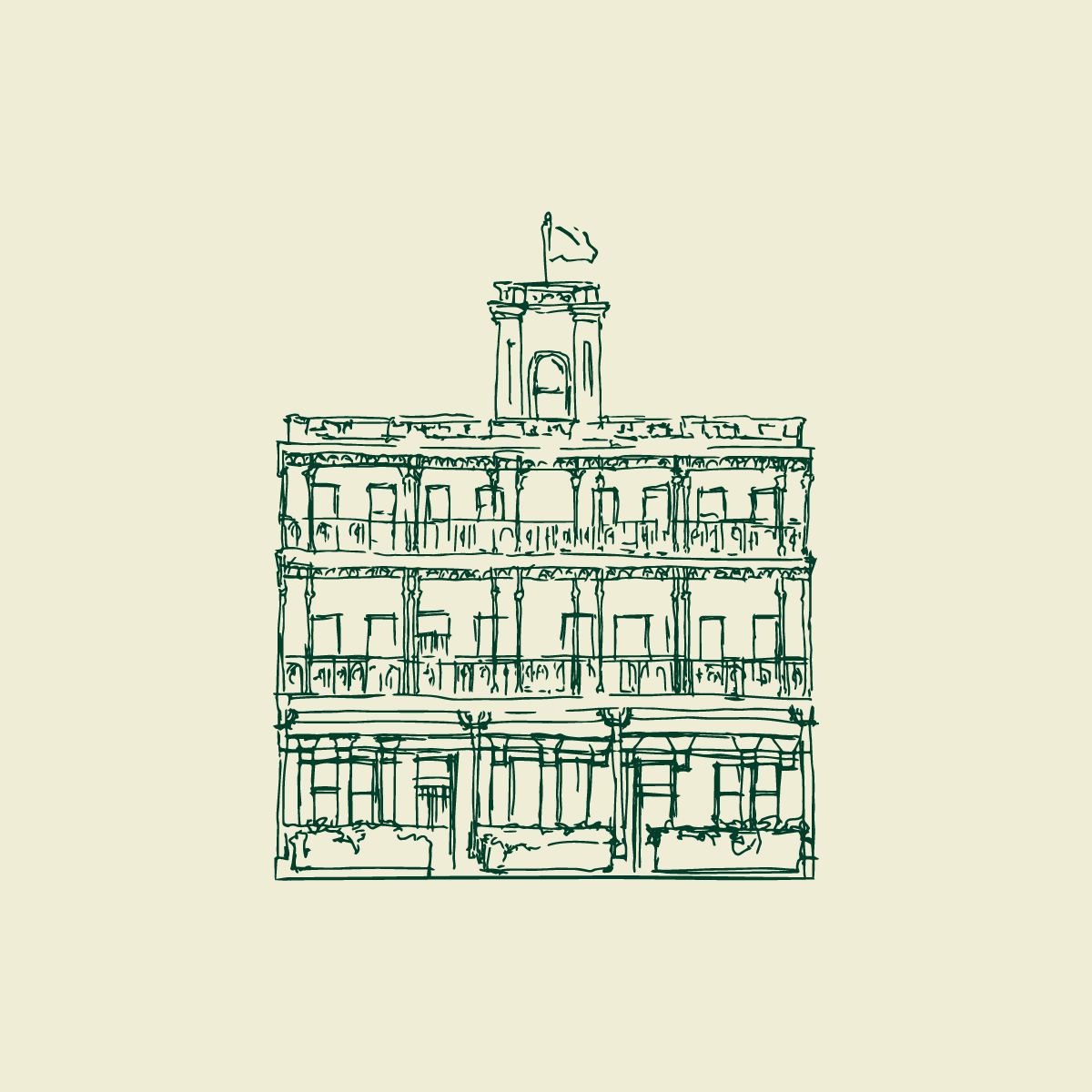
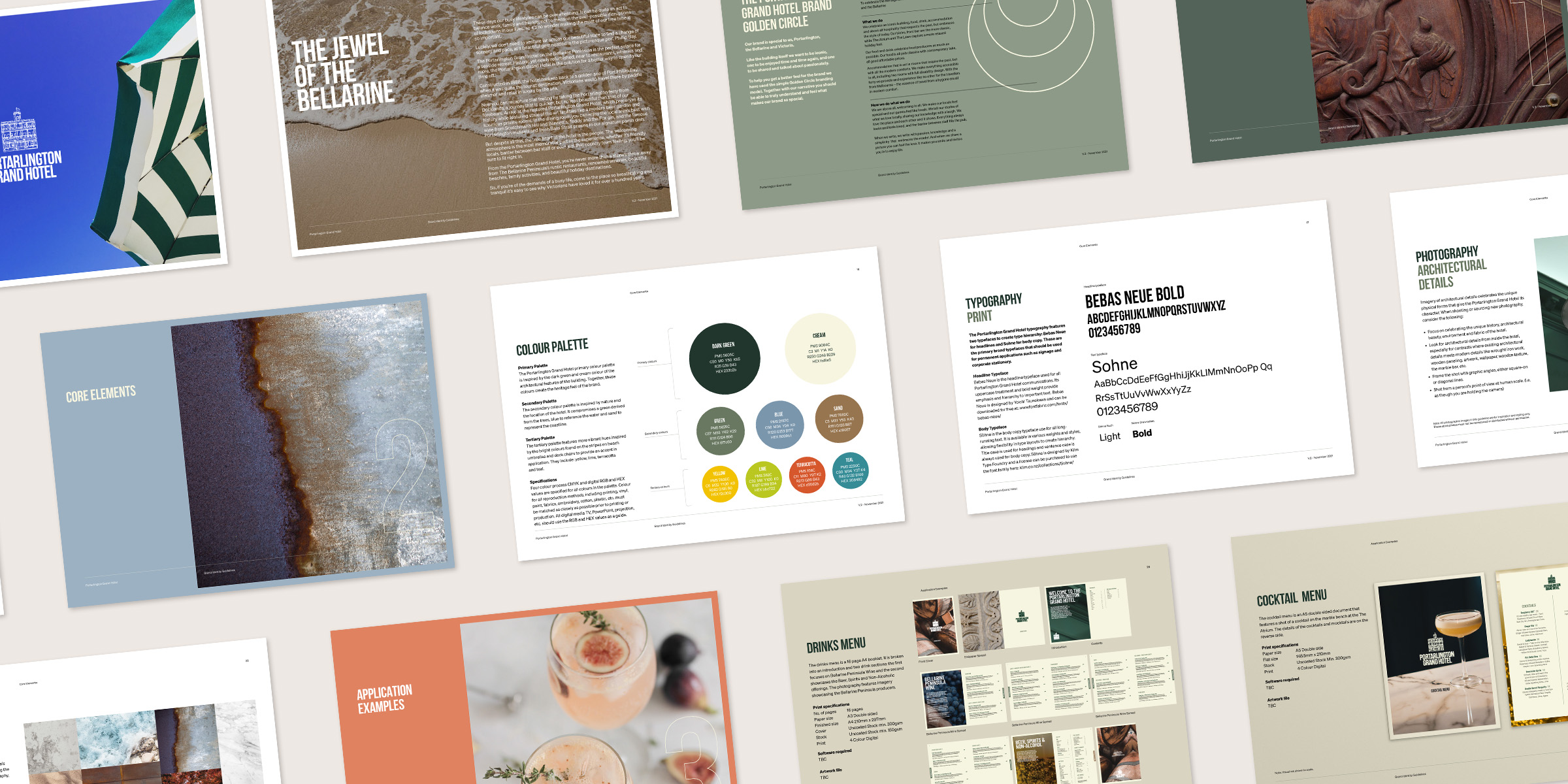
Davidson developed a Port Arlington Logo that comprised the wordmark and the stylised symbol of the iconic Portarlington Grand Hotel facade. Together, these elements create a memorable logo that captures the modernity and historical origins of the hotel. The Portarlington Grand Hotel symbol is a stylised illustration of the building’s facade, featuring the distinct architectural features that give the hotel its character. The loose, hand-drawn style creates an artistic touch that feels welcoming, celebrates locality and references the hotel’s long-standing heritage.
The Portarlington Grand Hotel wordmark is inspired by the signwriting used on the side of the hotel building in the past. The condensed typeface is confident and modern, with the crossbar in the letter ‘A’ dropped lower to reference the letterforms in the signwriting and give a unique touch.
A set of supporting illustrations inspired by the loose illustration style of the logo were developed to add extra character and personality to applications, including illustrations of champagne glasses, cutlery, etc.
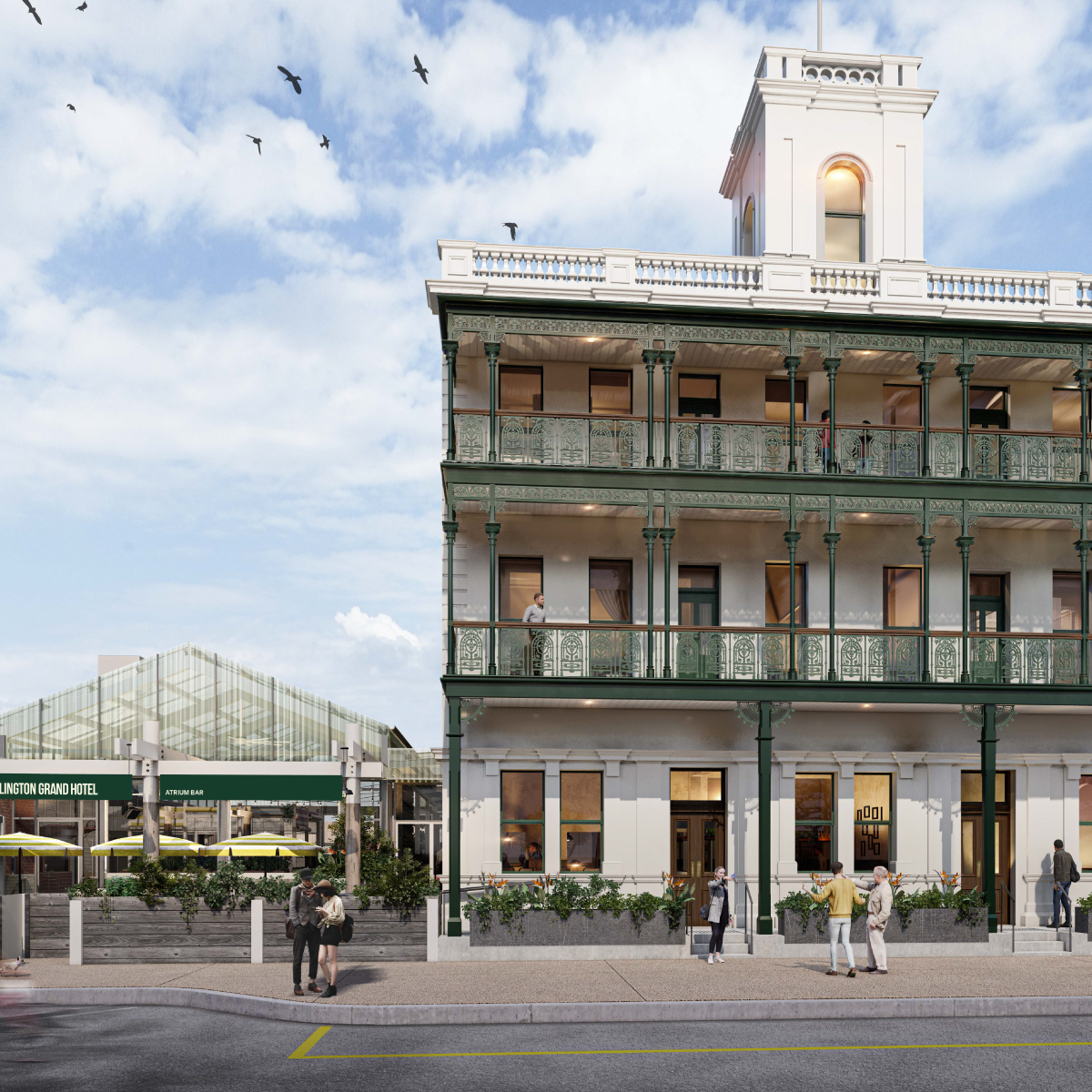
The brand identity was further supported by the development of the Portarlington Grand Hotel colour palette which was inspired by the dark green and cream colour of the architectural features of the building.The secondary colour palette is inspired by nature and the surroundings of the location of the hotel.
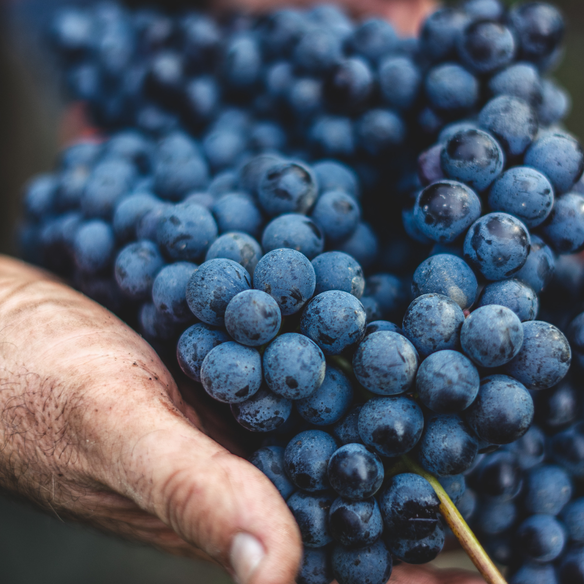
The photography celebrates the rich experiences of the Portarlington Grand hotel. Captured from a person’s point of view to immerse the viewer, they include images of: architectural details, textures, local produce, people and food and beverage.
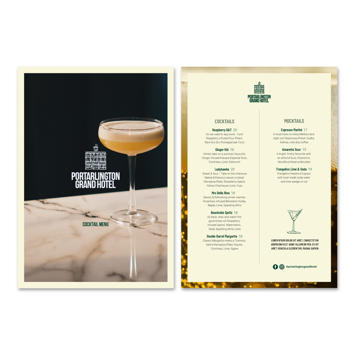
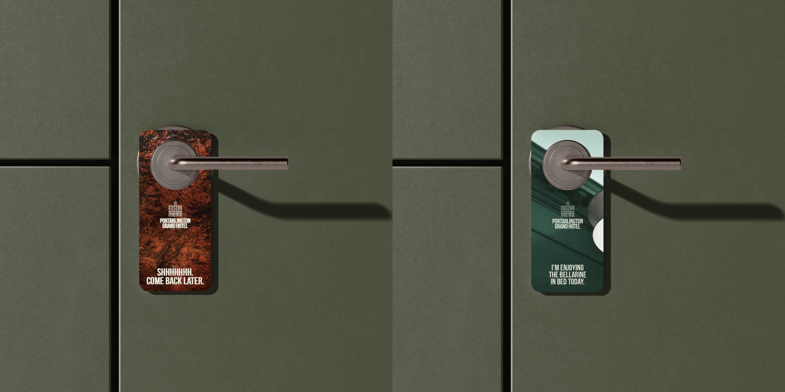
The new brand identity was rolled out across the food & drink menus, promotional posters, stationary, exterior and interior signage/wayfinding and more.

