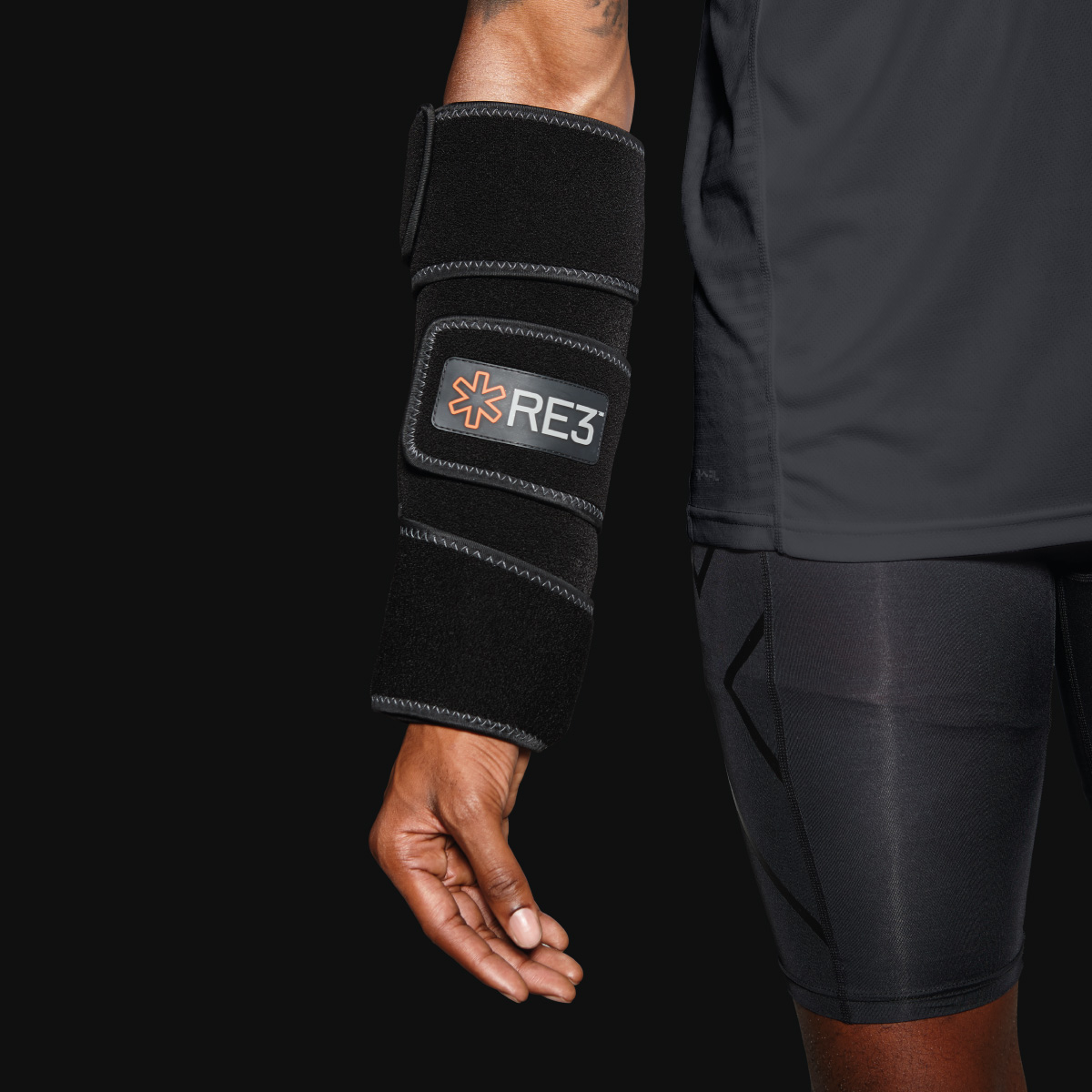
RE3 is the world’s most advanced ice compression system. It uses cryotherapy technology to target the most common sporting injuries obtained by professional and amateur athletes. The RE3 Ice Compression Pack consists of a compression brace, ice core blanket, and a travel case.
The RE3 Ice Compression System was developed out of the frustration with the existing icing options available on the market. The options for athletes were subpar, consisting of low-quality ice packs from the pharmacy that don’t stay cold for long, over-priced reusable icing bags that require having access to ice, or the basic home remedy of leaking ice in a plastic bag.
RE3 has an incredible point of difference and an objectively superior product to anything else on the market. Its patented technology allows the pack to stay cold out of the freezer for up to eight hours. For athletes and fitness addicts dealing with injuries, this will be a life-changing invention.
The brief was to create a brand strategy, develop a distinctive and iconic brand, help drive awareness and sales, and ultimately, create loyalty to the brand.
The research and insights conducted during the strategy phase identified the target audience as strong, fearless, and relentless athletes and fitness addicts who are always looking for the next challenge. They are high achievers who push their limits and don’t do “downtime.” This led to the brand’s positioning, “Embrace Pain.”
We focused on dialling up the science and technology behind the Ice Compression System on all touchpoints. The hero messaging communicates a superior and effective icing solution that minimizes downtime and therefore, enables athletes to get back in the game and back to achieving their personal best. The RE3 name was inspired by the product’s essence, “Recover from injury, revive your body and return to form.”
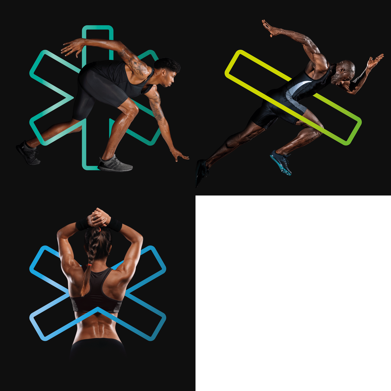
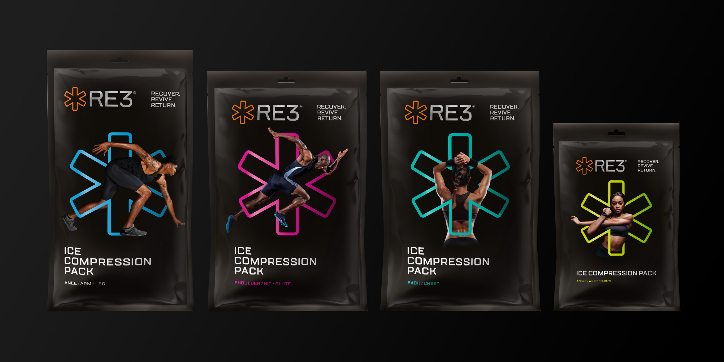
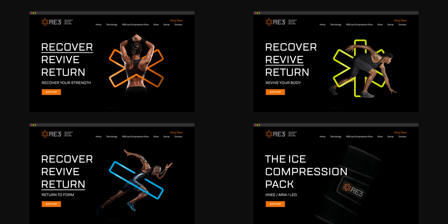
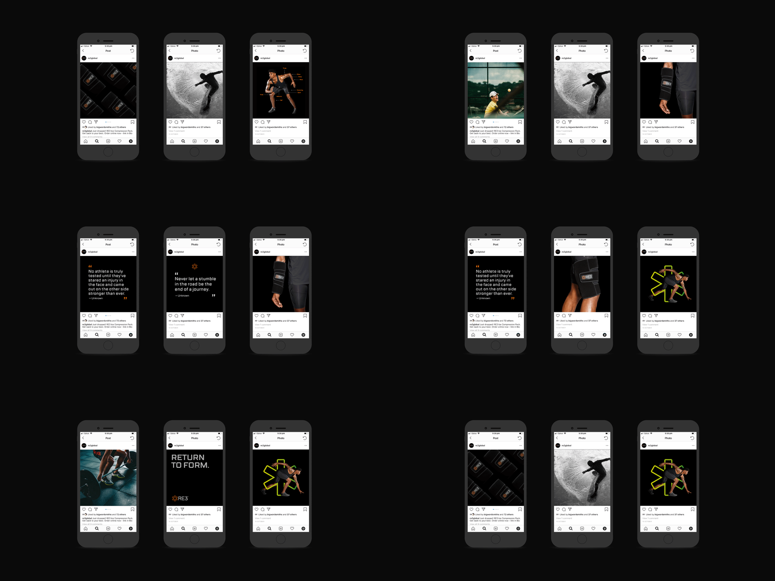
The development of a brand icon was a critical strategy to help build instant brand recognition and deliver the ‘cool factor’. From this, the orange asterisk was born. We developed a bold visual language consisting of iconic, vibrant coloured graphics that interact with powerful imagery of elite athletes emerging out of black. The visual language works stunningly across the RE3 product, website, and social media. The packaging design is an absolute stand out in the category, from its form to its surface graphics.
The RE3 brand launched in November 2018 and is already on track to become a global success story. RE3 has secured partnerships with major professional sports teams and has been endorsed by top surgeons and physicians in Victoria.
“The product, packaging, website and social media all reflect the core brand values that were identified in the strategy workshops. The strategy process not only identified the key aspects of the brand, but also created a road map of how to launch the product in the most efficient and powerful way. The RE3 brand identity reflects the elite nature of the market and has incredible cut-through in a noisy marketplace. I would recommend Davidson and hope they remain a long-term partner in my business.”
Belinda Voigt, Managing Director of RE3
Davidson won Gold at the 2019 Melbourne Design Awards for this brand identity.
