RDNS
Celebrating its 130th birthday in 2015, Royal District Nursing Service is Australia’s oldest provider of home nursing and health care services. Today, RDNS is a leader in providing quality clinical nursing and care services to people in Australia, New Zealand and Asia. In any given year, RDNS makes more than 2.7 million visits to over 103,000 people.
With Davidson’s already long term relationship with RDNS, a new CEO was appointed creating a catalyst for an inspiring new brand vision and values. Our brief was to create a new brand positioning and revitalised identity to underpin the friendly, caring, professional and inclusive brand experience RDNS delivers, at every stage of life.
Independent research with key stakeholders and staff ensured a comprehensive understanding of business direction, industry dynamics and the emotive drivers for the brand. With the promise to be ‘by the side’ of its stakeholders – hospitals, doctors, nurses, GP’s and patients – RDNS now reflects the progressive and energetic service they’ve become.
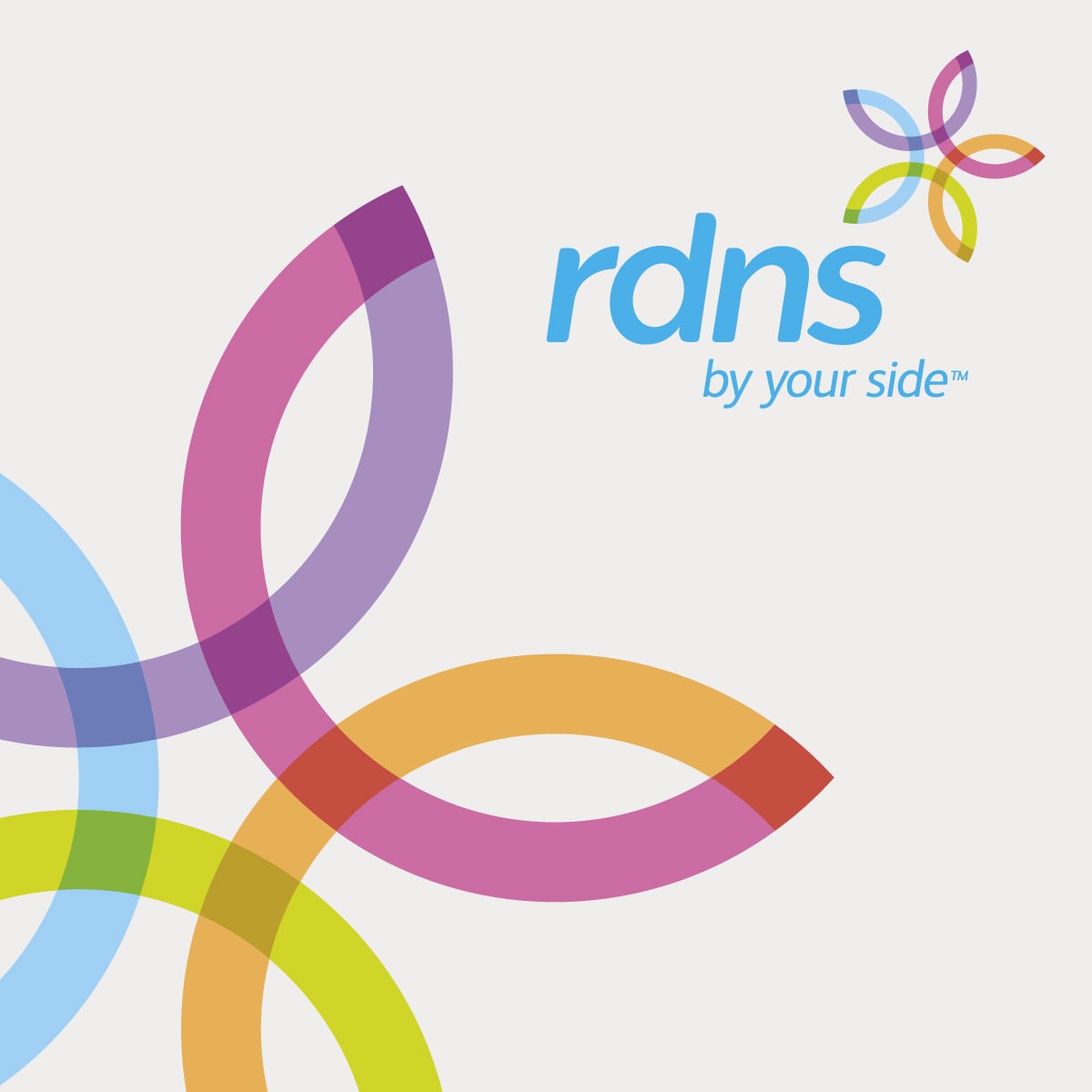
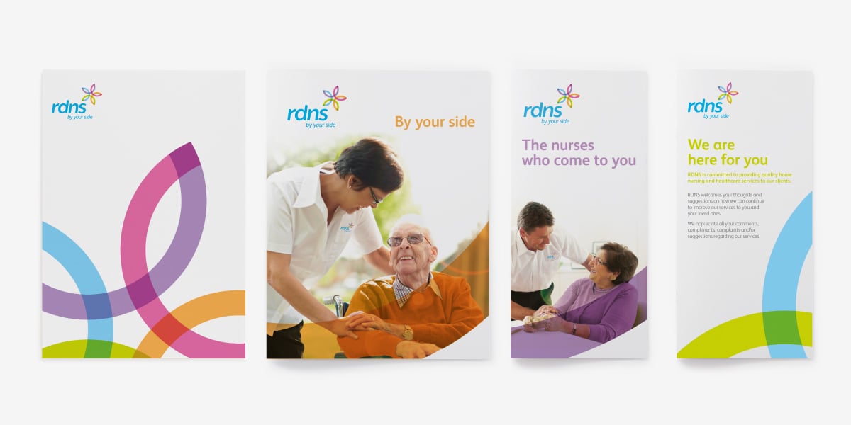
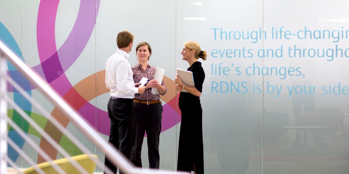
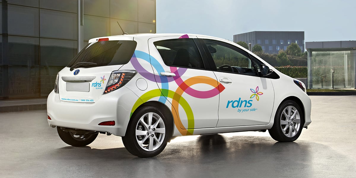
The inspiration for the brand mark, came from a common client reaction – “RDNS staff light up the room when they visit me. It’s the highlight of my day”. The new RDNS logo is a reflection of this – bright, positive and optimistic. It features lowercase ‘RDNS’ lettering that is modern and friendly and an interconnected coloured flower-like symbol conveying holistic health and wellbeing, inclusivity and partnerships. The ribbon shapes of the symbol represent life’s journey. The twists and turns of life’s changes and life changing events.
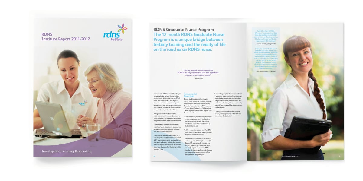
Photography is a key component of the RDNS brand, bringing to life the positioning, ‘by your side’. It always features clients and RDNS nurses or family members in light filled rooms creating an atmosphere that is warm, supportive and optimistic.
RDNS is now a highly respected business, turning over $160 million and one of the most trusted health provider brands in the region. With highly motivated staff, a growing referral base and expanding geographic footprint, RDNS cares for people more than ever – around Australia, NZ and now with joint venture partners throughout the Asia Pacific region.
In 2016, RDNS was awarded ‘best home care operator’ in Asia Pacific Eldercare Innovation Awards, Singapore; finalist at the Australia-China Achievements Awards and finalist at the Hesta ‘team innovator award’.

