Thomas Chipman Brand Strategy & Design
To satisfy the growing consumer demand for more natural snack food alternatives, Thomas Chipman Organic Corn Chips were launched in 2006. The range soon expanded to include potato and vegetable chips.
The unique selling proposition for the brand was its ‘certified organic’ status, yet this was overshadowed by other front of pack messaging. Over time, pack design had strayed in different directions making the range less cohesive and harder to shop. Yarra Valley Snack Foods also wanted to evolve the brand so that it could be sold in the Mainstream Snack category as well as the Health category.
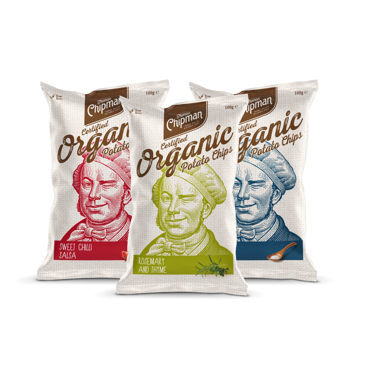
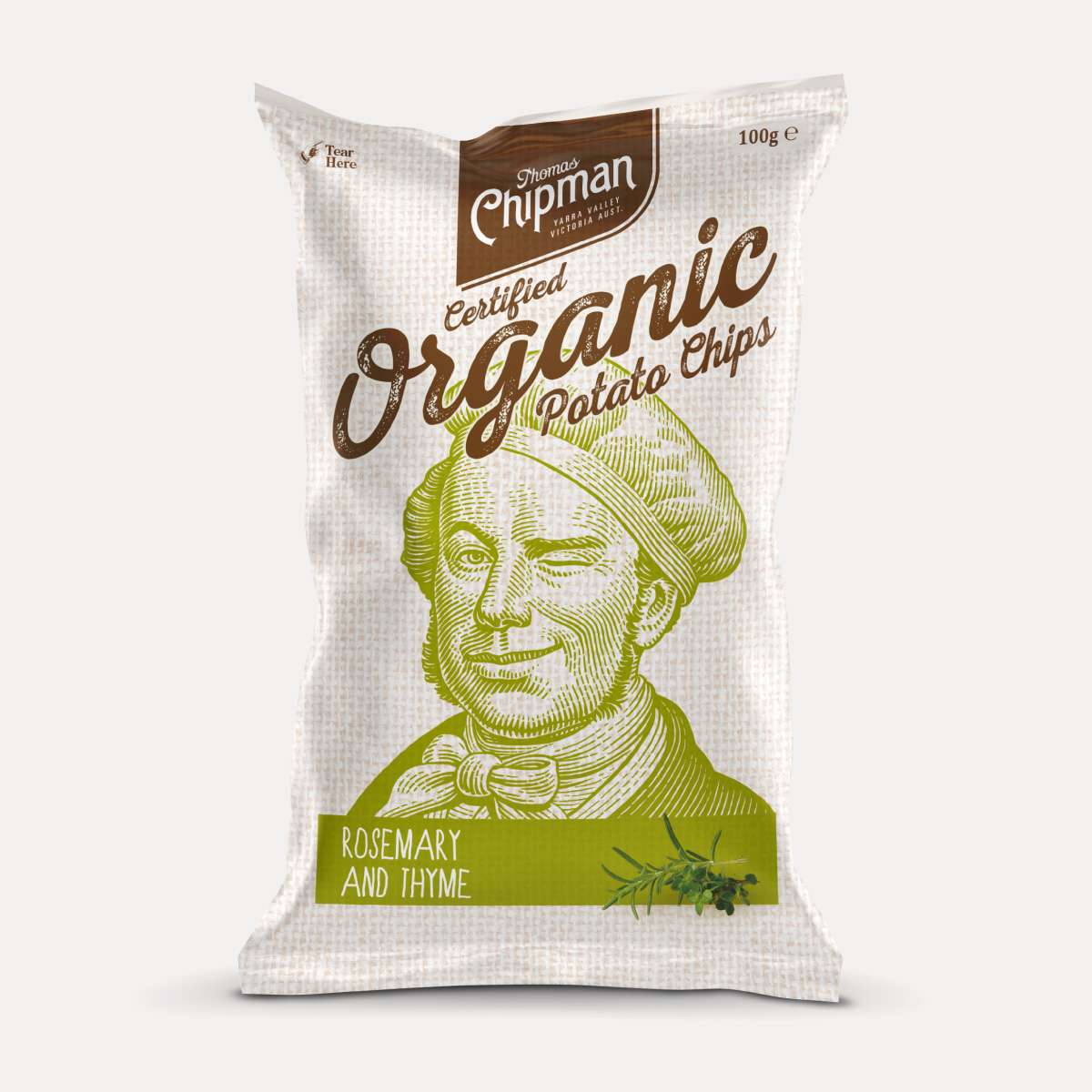
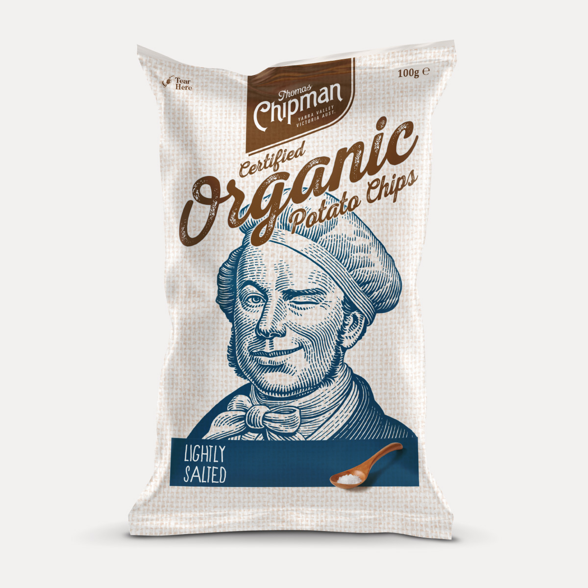
We developed a new design that very strongly calls out the brands organic credential and works cohesively across the range of corn, potato and vegetable chips. The new design was carefully crafted so that it could work successfully in the health and mainstream aisles. Using the Thomas Chipman portrait as a strong brand mnemonic vastly improved shelf stand out. This was achieved by ‘hero-ing our hero’ and making him more charismatic through a cheeky wink.
The new design rollout is not yet complete, but sales of products with the new pack design are up between 7.6 and 10% – a great result!
Davidson won Gold at the 2018 Melbourne Design Awards for this project.

