TRESemmé Packaging Refresh
Since 1948 TRESemmé has been creating salon quality hair care products to help women achieve their own unique look and style. TRESemmé is dedicated to developing salon-quality formulas and results without the salon price tag. Priding themselves on knowing how healthy, manageable hair can lead to great confidence.
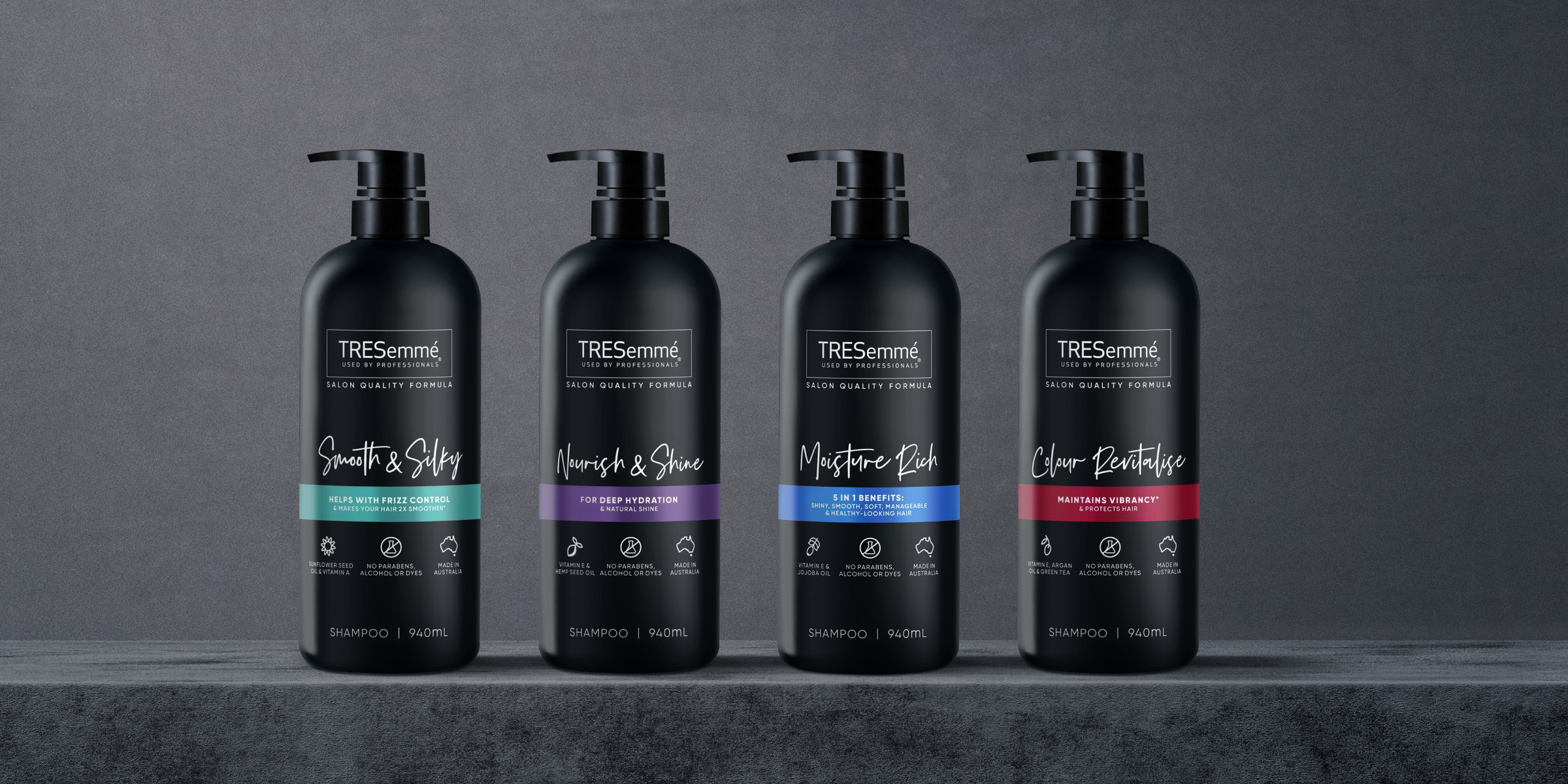
Davidson was engaged to re-establish the TRESemmé Core range as a modern, stylish salon-quality supermarket brand. The challenge; how to leverage the brands’ existing equity and credibility in an evolving, contemporary and health-conscious market. TRESemmé required a variety of concept directions that explored how to best highlight their premium and salon credentials yet hero variant specific key ingredients and benefits. As a first step, we worked across two master variants: Moisture Rich and Cleanse & Replenish.
Davidson began the process by delving into the competitive environment and analysing key trends, competitive advantages, gaps and opportunities within the hair care category and specifically, the supermarket space. Social-media trends expose consumer buying preferences towards the premium aesthetic cues of contemporary printing techniques, such as embossing, pump-style bottles, matte finishes, minimalistic packaging and bathroom shelf-worthy colours. Inspiration and reference were also drawn from the premium salon and international fashion brands, elevating the salon-inspired look and feel through metallic finishes, monochrome pairings and emphasis on product benefits.
Davidson brought these key learnings into their concept development stage, where over 60 concept variations were explored before 8 were selected, refined and presented. The preferred concepts were further developed before the TRESemmé team undertook rigorous research and consumer testing. During this stage, Davidson also developed and refined TRESemmé’s back-of-pack layout to align with their new look and feel.
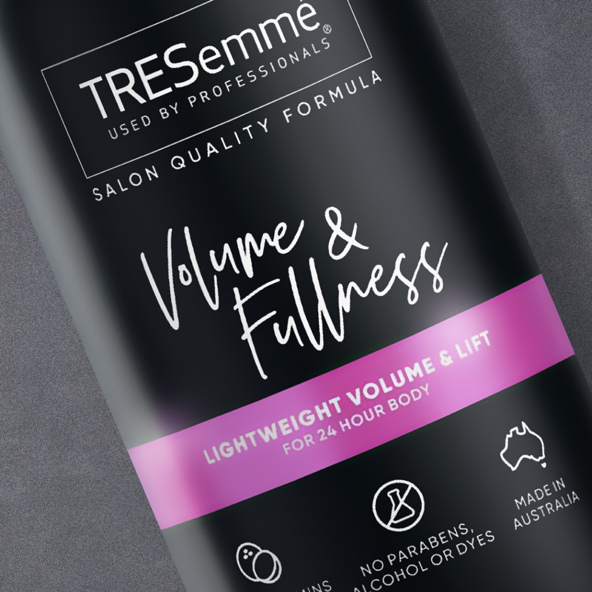
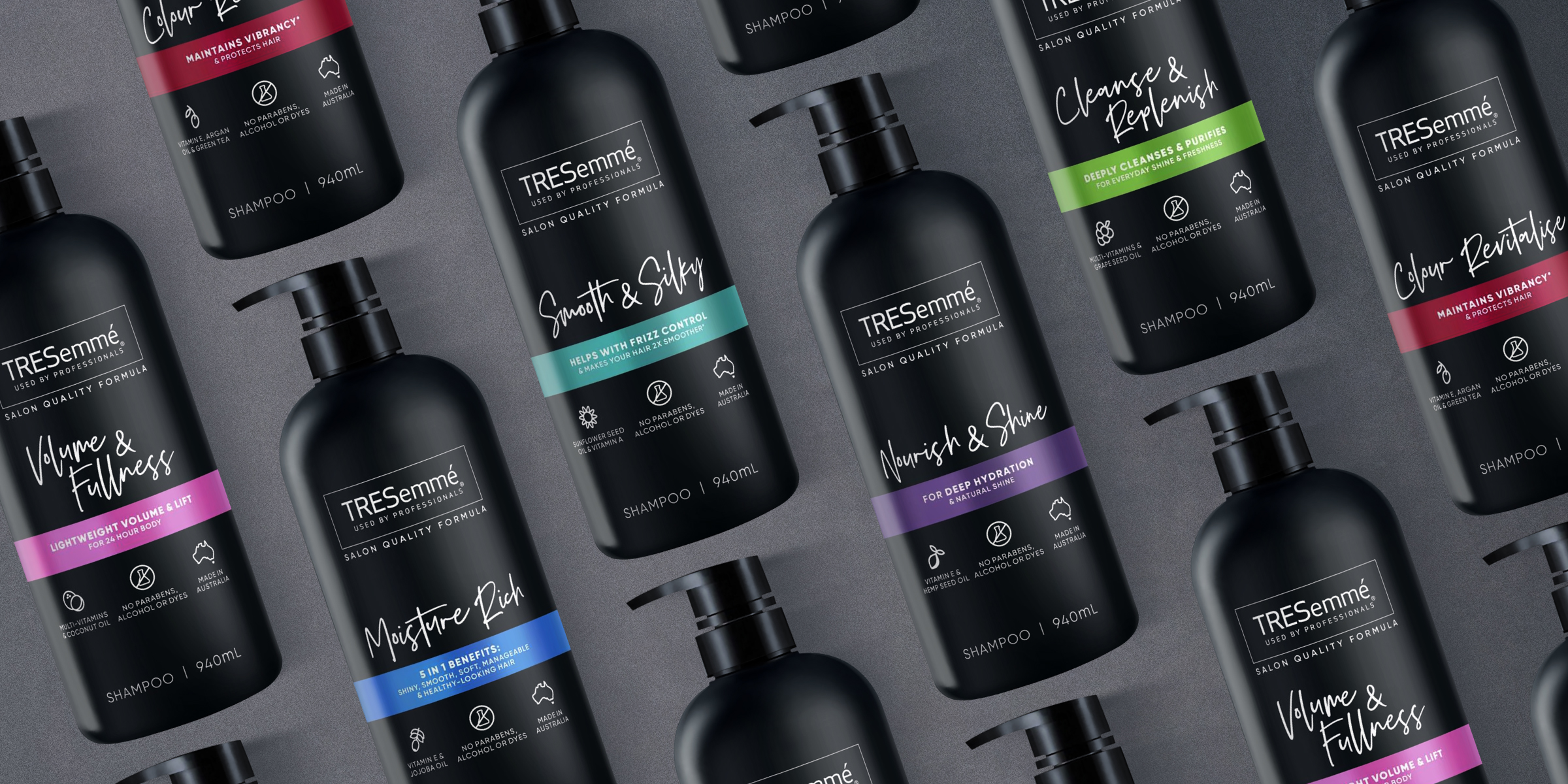
The final design featured a hand-script typography that Davidson crafted with meticulous detail, ensuring optimum aesthetic appeal and cohesiveness across the range. This was particularly important to ensure product variant recognition, strong stand out and brand blocking on the shelf, especially in the flooded category.


