Visit Ballarat Brand Strategy and Identity
The discovery of gold in 1857 transformed Ballarat into a major settlement. Today, Ballarat is Australia’s third largest inland city with a rich history and vibrant culture.
Visit Ballarat saw an exciting opportunity to reposition Ballarat as a modern, vibrant city with a rich history. The existing brand identity was too grounded in heritage to appeal to a new generation of residents, business owners and tourists.
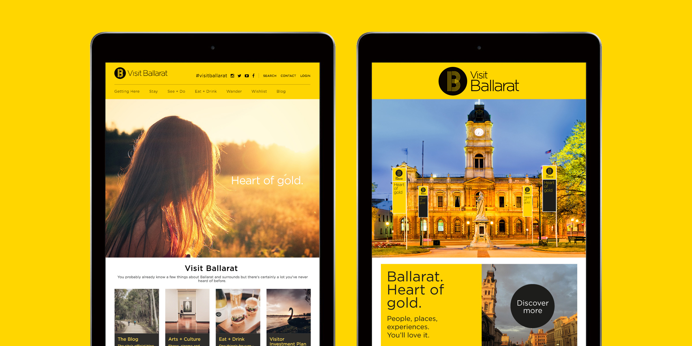
Over time, the level of visual consistency in the existing identity had also been seriously eroded making some communications ineffectual. As the small in-house marketing team was responsible for producing a large volume of communications in both digital and print mediums, it was also important that the new brand identity system was easy to implement.
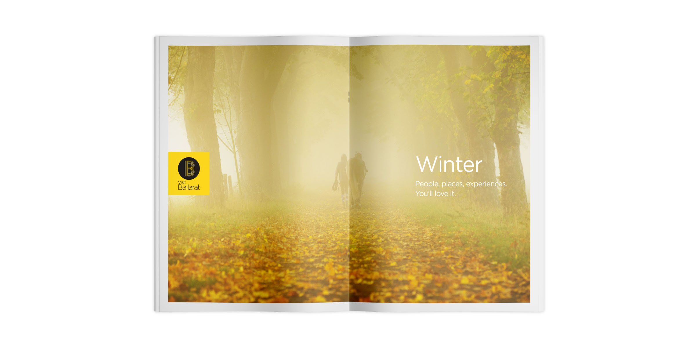
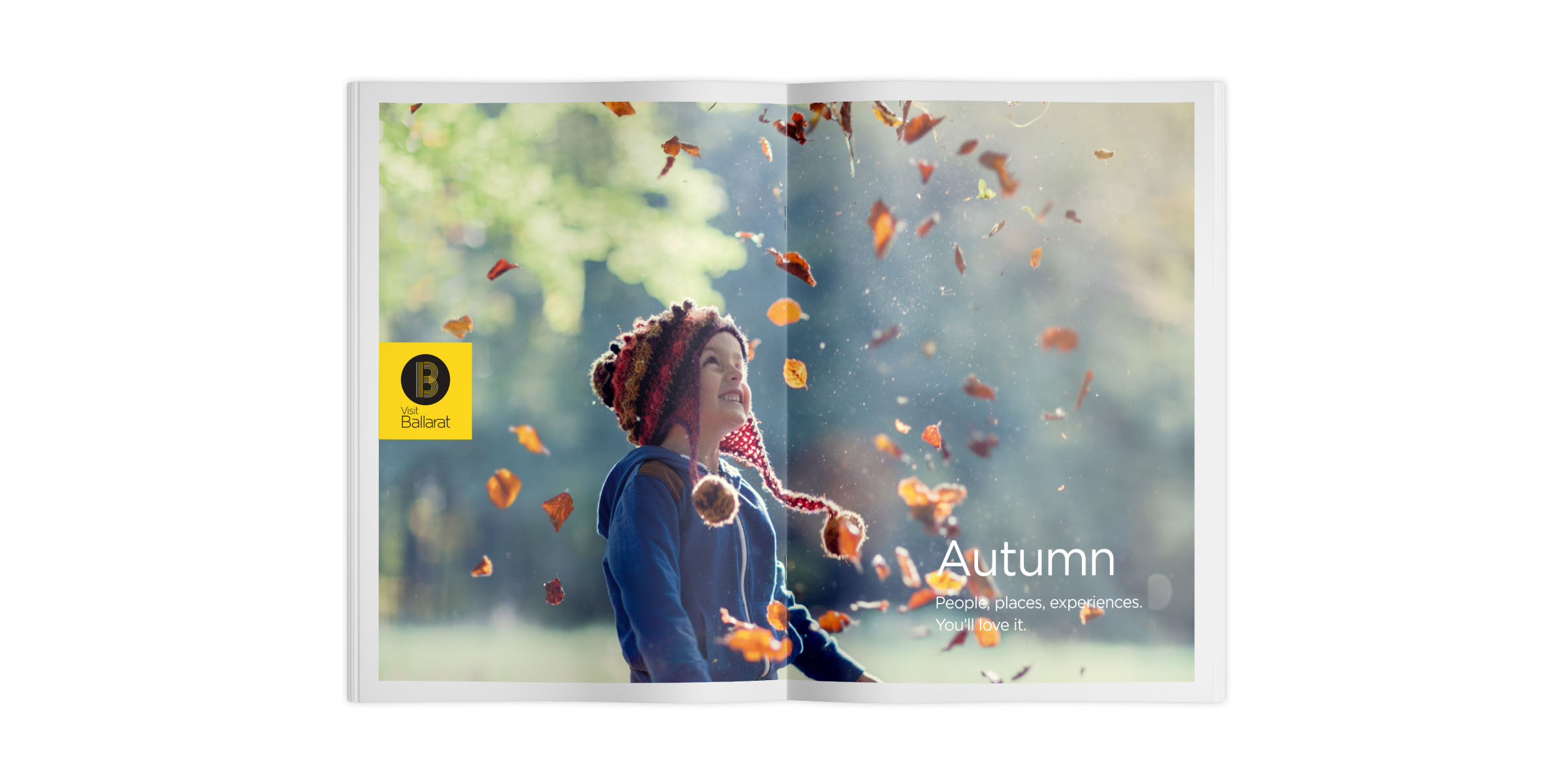
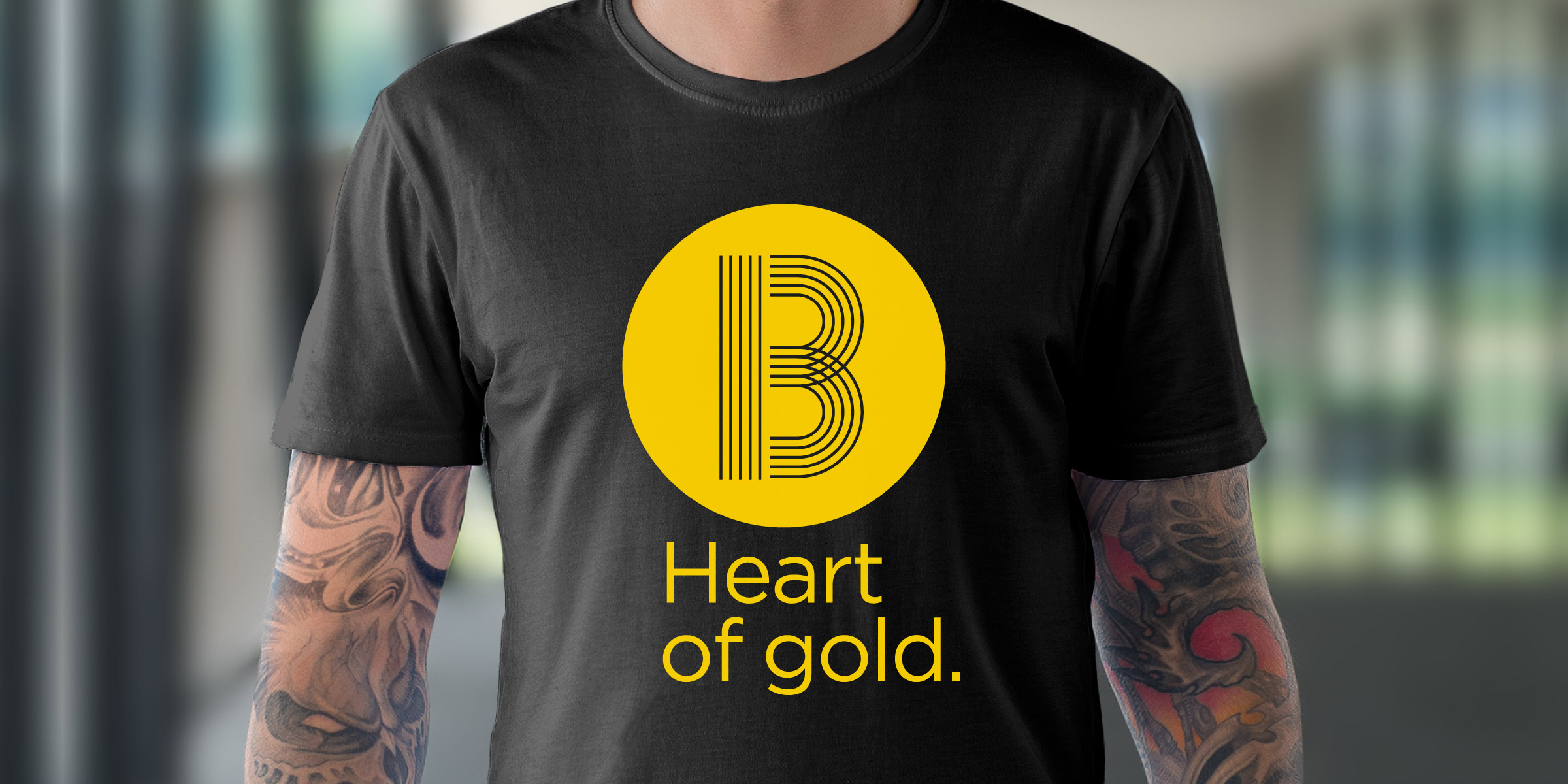
Our solution was to create a new logo with a brand symbol that celebrates the many, complementary facets of the city. With its double meaning, the brand strapline ‘Heart of Gold’ celebrates the city’s history, as well as the warm welcome you can expect when you visit. A strong, vibrant, yellow and black colour pallette and photography with warm hues visually bring this idea to life.
Scope of work included a stakeholders workshop, brand strategy, brand identity, visual standards manual and visitors guide.
In the 2015–16 financial year, Ballarat witnessed an almost 45% increase in international visitation while domestic overnight travel also increased by 3% in the year ending June 2017.

