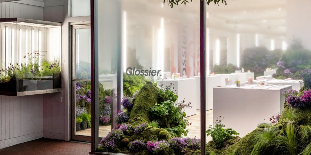
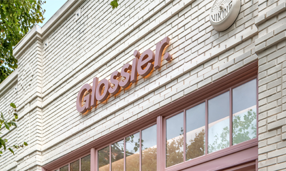
Glossier began as an online beauty brand back in 2012, soon after expanding into physical retail stores, all of which were shut last year due to the Covid-19 pandemic. Since then, Glossier has reentered the physical retail space with their store in Seattle. The fresh store was inspired by the 2019 landscape piece made for the pop-up shop in the city, designed by Lily Kwong. Which also included undulated plant-covered mounds and pink-purple natives which was situated just a few blocks away.
After closing all of its stores last year, the company has finally returned to traditional retail.
Having been forced to close all the Glossier stores, with the reentry to the retail space it was crucial to develop a new sort of shopping experience, according to senior design lead Kendall Latham, “one that encourages connection, stimulates curiosity and wonder, and allows consumers to engage in Glossier in 3D.”
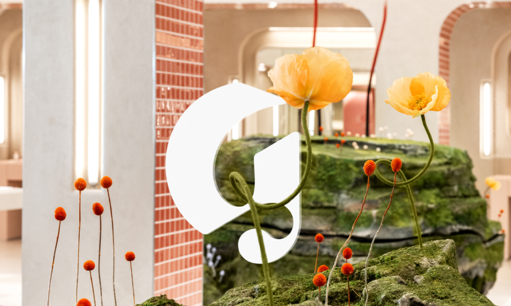
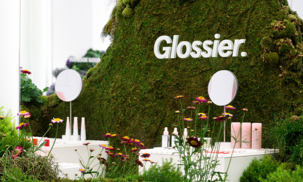 At the centre of the Glossier Seattle store is a boulder-like sculpture sprouting artificial mushrooms and flowers.
Glossier’s in-house creative team was inspired by local flora, notably the lush emerald trees of the Pacific Northwest and the unique features of mushrooms. Drawing on the fascinating qualities of Fungi, such as the “unique ability to grow and thrive in unlikely places” explains the lead designer.
The store’s idea is based around the community, and thanks to Glossier’s ingenuity, they’ve combined Seattle’s technological prowess with its natural environmental beauty to create a place that locals adore and visitors admire.
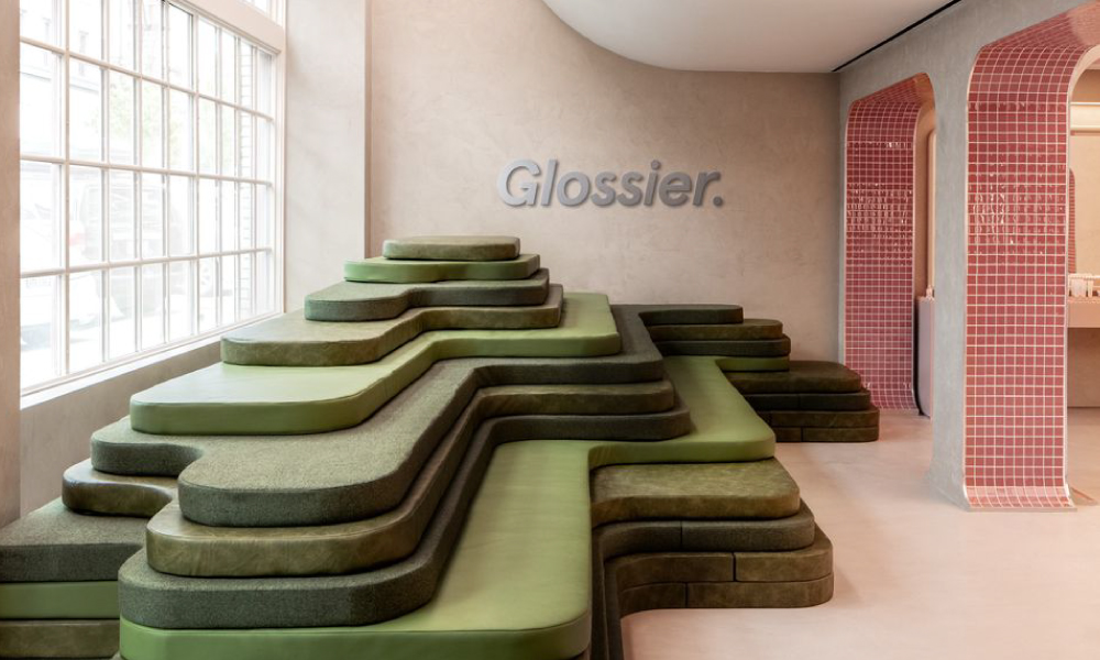
The Glossier Seattle retail store is known for its pale pink furniture and the large artificial rock, draped in fake moss and adorned with giant fake mushrooms that stands in the centre of the space. A stack of tiered thin cushions lined in various green fabrics and leathers mimics the form of a terraced hill and resembles natural typographies, a nod to Seattle’s lush greenery and urban beauty, doubling as the ideal waiting place for bored boyfriends/partners.
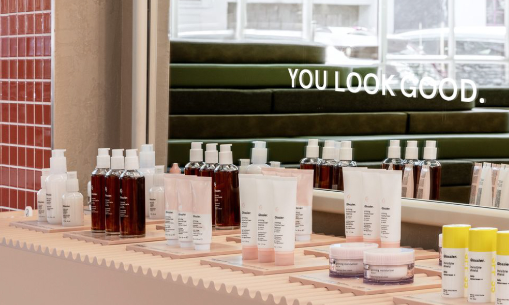
Products are displayed on wavy, milenial pink countertops.
The shiny Glossier beauty products are heavenly displayed on rippled countertops in front of wall to ceiling mirrors with ceiling lightboxes casting a pleasing PNW-inspired grey light over the store.
Glossier is set on expanding their beauty empire, launching bigger and better stores which are promised to be just as unique.
The store’s walls are completed in a light-toned textured plaster, beautifully complemented by beige and dusty pink checkerboard tiles. To align with the Glossier brand and contrast the buildings cream brickwork, the exterior doors and window trimmings are too painted the blush colour.
While the store’s aesthetics are important to the customer’s experience, so is the apparently simple auditory experience. Bird and natural sounds can be heard in addition to their Glossier-approved + region-specific playlist.
THE FUTURE OF RETAIL REPORT

We recently commissioned a report on global retail trends and the evolution of shopper behaviour to identify the essential strategies retailers need to implement to thrive in the coming decade. Download the free report below!
