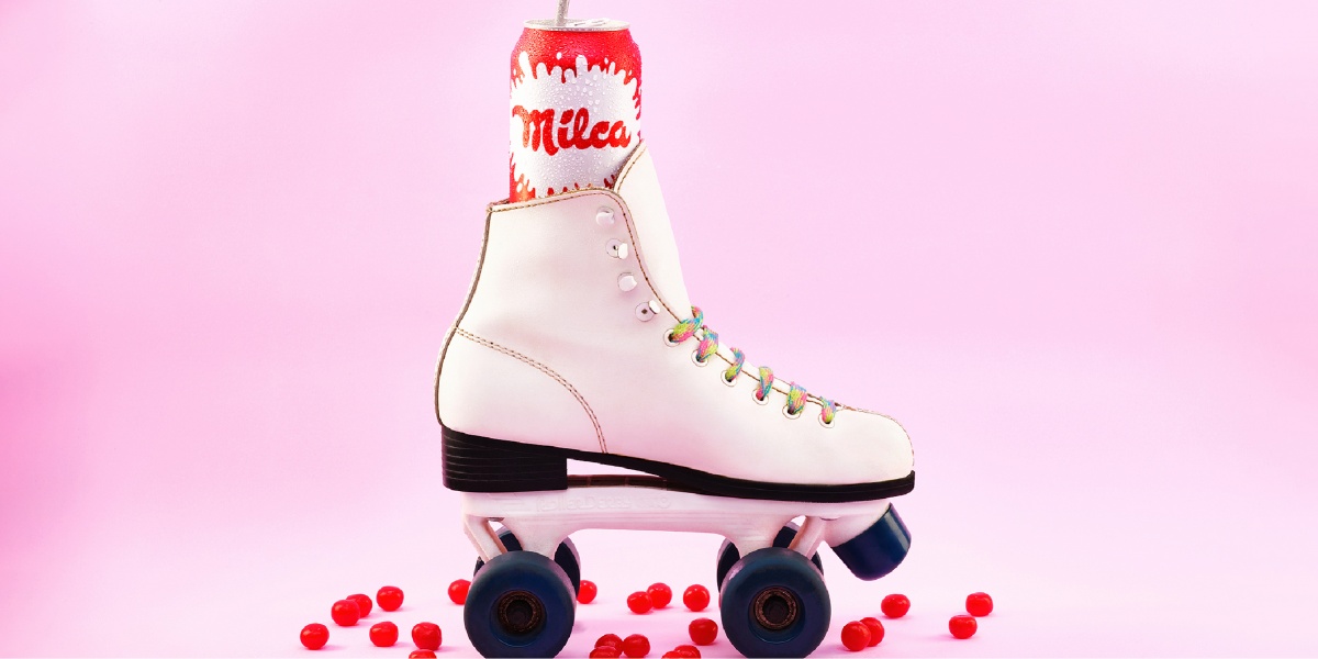
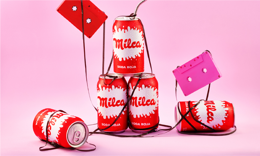
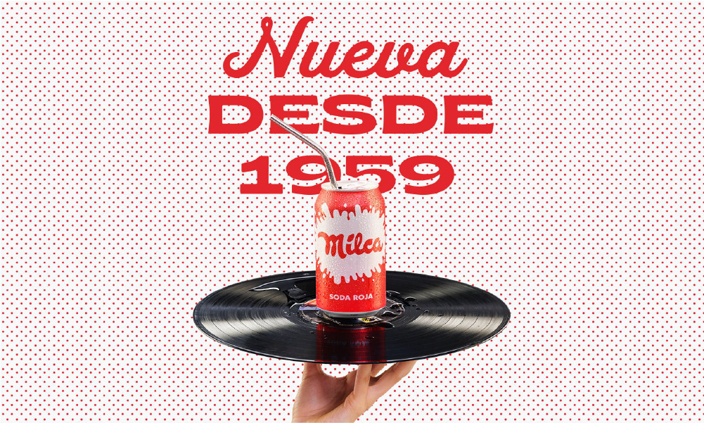
Milca’s campaign takes on a fun retro-modern aesthetic by incorporating music cassettes in the promotional imagery and relying on a vibrant colour palette.
Founded in 1959 in Nicaragua, Milca claims to be the first branded red soda in the region; unconventional yet original, the brand rose in popularity, becoming a household name and a go-to favourite for both kids and adults. Following the immigration wave under Ramiro Cardenal’s leadership and other socio-political developments in the late 90s, Milca ceased local operations and moved its headquarters to Miami which enabled it to be present in various grocery chains outside of its own soda shop and gain popularity in the United States.
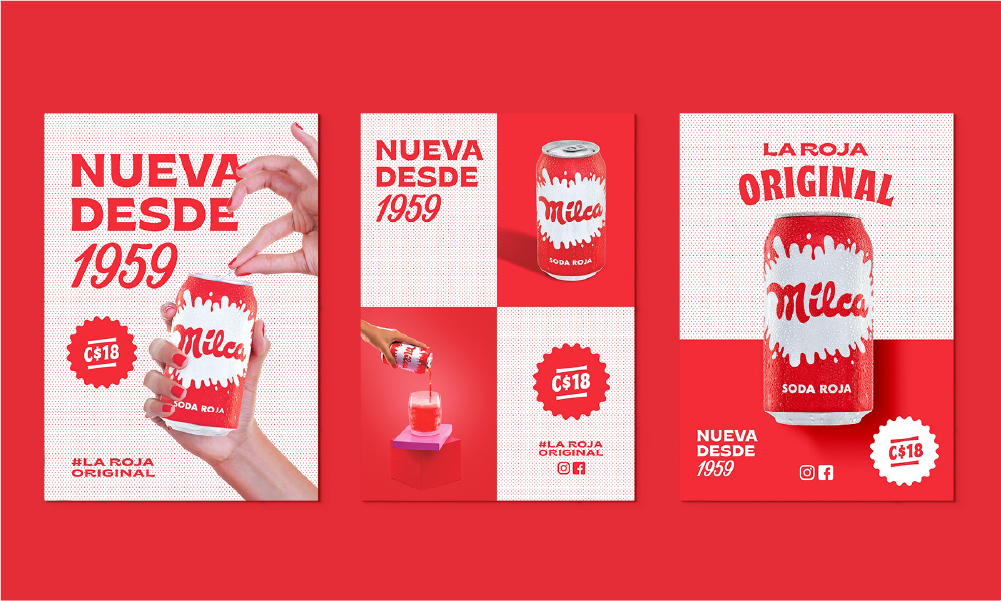
Milca sets itself apart from competitors by using clean, flat-coloured visuals to build a grid system that showcases the slogan, product, retail information, and social media accounts.
Remaining loyal to Don Manuel’s vision, his eldest great-grandson brought back the red drink to Nicaragua in time for its 60th anniversary; successfully ensuring its distribution in every supermarket, convenience store, bar, restaurant and grocery shop of the country. The irony of reintroducing a local heritage brand to a Nicaraguan audience that did not have any awareness of it became the backbone of Milca’s quirky positioning campaign and its brilliant messaging developed by Madre and Pupila.
GREAT STRATEGY HAS A CLEAR VISION
The relaunch and positioning campaign for Milca had one clear objective: ‘making Milca huge in Nicaragua, again’. By tapping into nostalgia marketing insights and eye-catching modern retro visuals, the brand aimed to appeal and resonate with both millennials and centennials. Despite it being well-recognised amongst the ‘oldies’ and expecting their support through old tales from when they enjoyed it back in their teenage years, the funky beverage brand recognised that it would be received as a new product by the local ‘youngsters’ who make up the majority of Nicaragua’s population.
‘New Since 1959’; Milca’s new quirky tagline communicates its unique positioning as the original red soda created in the 20s but officially founded in the 50s by Don Manuel Ignacio Lacayo Teran.
The duality of Milca being new to most of Nicaragua’s market, yet being a legacy brand, provided a paradox which was cleverly leveraged by the brand and summed up by the tagline: ‘new since 1959’; sparking curiosity amongst its target market and becoming a conversation starter. Organically, its unique positioning as ‘the original red soda’ that sets Milca apart from other competing soft drinks was masterfully integrated on social platforms through the hashtag #larojaoriginal.
Making a (red) splash; the campaign integrates the bold red brand colour that is reminiscent of Milca’s history since its creation in the 20s.
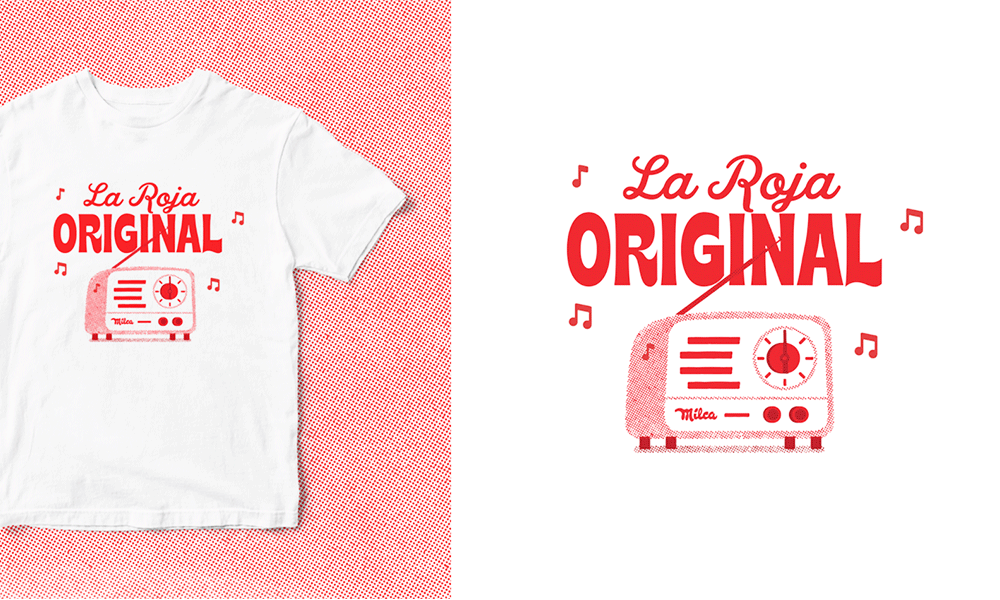
Whilst determined to bring the brand back to its Nicaraguan roots to fulfil its founder’s dream, Javier Cuadra quickly understood that to do so successfully he needed to rely on new advertising mediums and adapt to the highly-digitised world. A gift-kit was sent to selected influencers who shared their unboxing experience on various social platforms, ensuring maximum reach and successfully increasing brand awareness. When it came to its radio spots, the soda brand further relied on nostalgia by revisiting its vintage jingle; this time reproduced and modernised to match its rebrand for the relaunch.
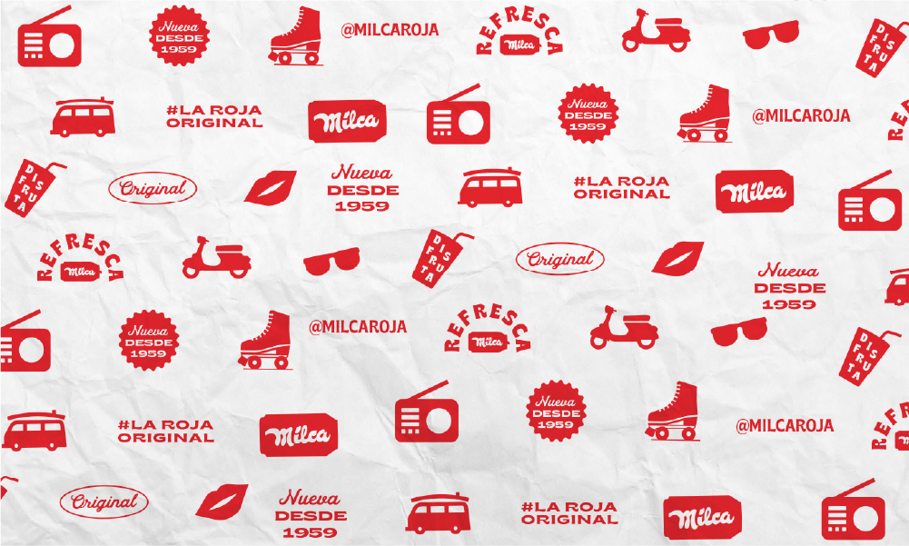
Cool, fun and retro; Milca gives a modern interpretation to popular visual tropes from the 50s and 60s.
GREAT PACKAGING CAPTURES THE BRAND STORY AUTHENTICALLY
The soda pop icon ensures strong shelf stand-out by using a bold red brand colour in its packaging that is reminiscent of the brand’s history in owning the legendary red-coloured beverage. Apart from being visually striking, the red Milca can also cleverly evokes a taste appeal by referencing the raspberry flavour of the drink.

Milca’s promotional shots distributed to the press to communicate its relaunch in Nicaragua aligned with the brand’s new vintage look and feel.
Whilst its simple claim of being a ‘red-coloured carbonated beverage’ has remained unchanged for decades, Milca decided to up its game in 2020 by not relying merely on its bright packaging. Taking on a retro-modern aesthetic that aligns with its new positioning and that resonates with its two target audiences, Milca makes use of visual cues from the 50s and 60s such as the halftone dot pattern, vintage typography and quirky illustrations; adding a cool yet nostalgic dimension to the fun brand. Further pushing the creative boundaries in the soft drinks category, the Nicaraguan soda brand challenges the typically-utilised overloaded graphics with clean, flat-coloured visuals which were then used to build a grid system. As practical as eye-catching, apart from the slogans and product images, the grid also features retail information.
NEED HELP?
If you need help creating a fun brand, we’d like to offer you a complimentary strategy call with our Managing Director and Head of Strategy, Grant Davidson. Having nearly 30 years of industry experience working with groundbreaking brands, Grant has the experience and knowledge necessary to identify your core brand strategy and communicate it effectively.