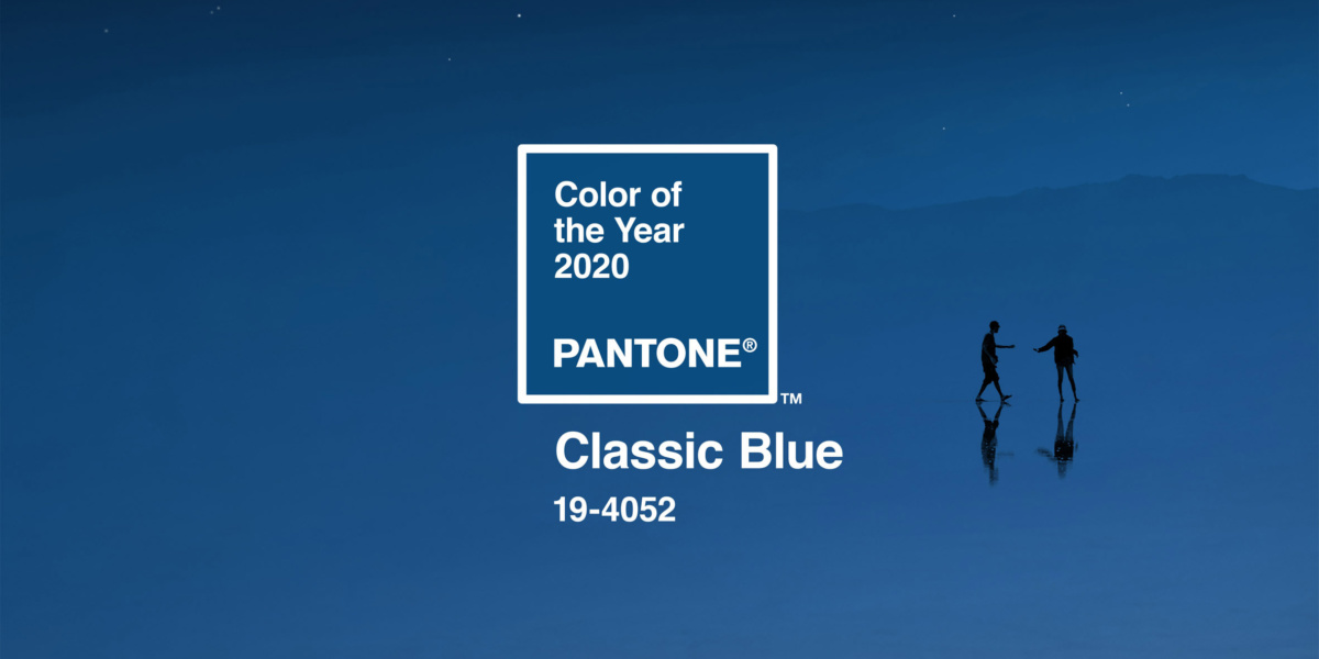
The Pantone Colour Institute studies trends in colour throughout the year to determine what colour will define the next – however, they also take into account movements in fashion, marketing, and politics. It should be unsurprising, then, that the Pantone Colour of the Year for 2020 is noticeably influenced by the ubiquity of social media and the current political climate.
Classic Blue is a timeless, deep blue evocative of the evening sky, offering a source of calm and stability in an era of sociopolitical anxiety. Pantone’s Executive Director Leatrice Eiseman offered some words on the timeliness and contextual relevance of Classic Blue in 2020:

The hue chosen as Color of the Year has become increasingly influential in the vast world of design and brand marketing. While rationalising their selection of Classic Blue, Pantone suggested that as technology continues to evolve rapidly, society will gravitate towards soothing, foundational colours for security. Laurie Pressman, Vice President of the Pantone Colour Institute, has encouraged brands to take this on board:
“As society continues to recognise colour as a critical form of communication, and a way to express and affect ideas and emotions, designers and brands should feel inspired to use colour to engage and connect.”
It’s safe to say that we can expect to see this colour popping up everywhere in the design world in the coming months. Historically, its been very popular in the corporate sector – some successful companies that already employ Classic Blue (or a similar colour) at the core of their brand identity include:

Overall, Classic Blue symbolises resilience and reflection as we leave the past decade behind and enter a new one.
Are you maximising the power of colour in your brand strategy? Book in a free call with our strategy experts below!
