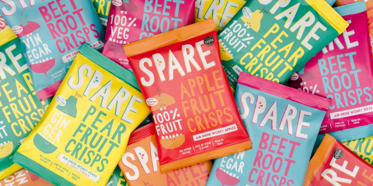
Six attention-grabbing, vibrant flavour variants were redesigned ahead of the Spare Snacks brand expansion across the UK.
A BOLD MISSION CALLS FOR BOLD PACKAGING
Spare Snacks is a British company founded in 2016 by Ben Whitehead soon after finding out that nearly 50% of perfectly edible veggies and fruits were being thrown away. After countless visits to the local market, he started transforming unwanted produce into high-quality, healthy snacks for the local cafes that would have them. Ever-since, the mission of using fresh and ‘wonderfully wonky’ produce has remained the same; the one difference being that now the brand’s numerous air-dried crisp offerings are being presented in dynamic packaging, as envisioned by The Clerkenwell Brothers.
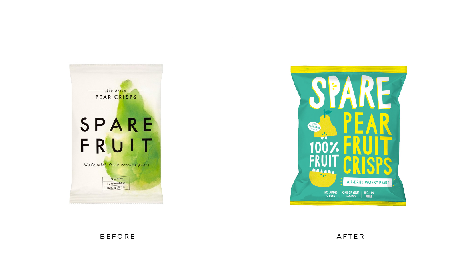
With a renewed packaging strategy, the ‘Spare Fruit’ brand evolved into ‘Spare Snacks’, transforming the previously geometric and minimalist aesthetic into an energetic, lively design.
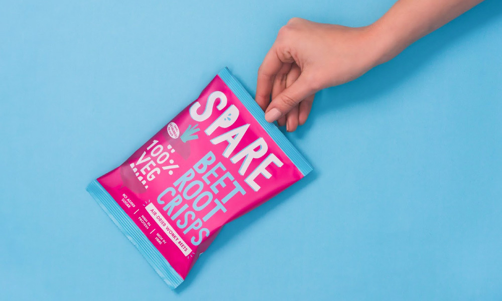
The sustainable snacks are made from air-dried fruits and vegetables with no added sugar, palm oil or artificial flavours; the brand’s mission of saving 5000 tonnes of fresh and ‘wonderfully wonky’ produce from landfill by turning it into healthy snacks. The packaging revamp sought to pump new life into the brand with the added challenge of turning an honest, wholesome snack brand into a modern and accessible product. The rebrand also needed to visually communicate Spare Snacks’ story; maintaining a sense of authenticity and connection to Whitehead’s sustainability-driven development of the brand.
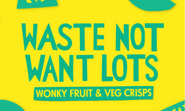
The brand positioning is cleverly captured in a short, punchy strapline. An authentic feel is achieved through the irregular, hand-made letters.
GREAT PACKAGING HIGHLIGHTS YOUR UNIQUE PROPOSITION
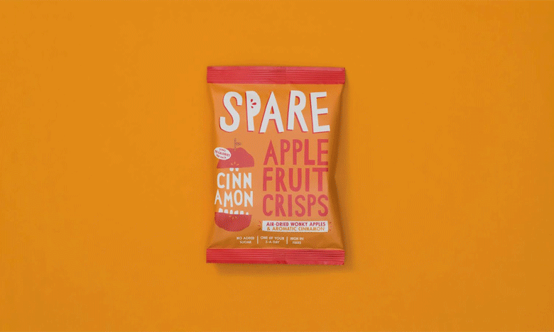
Spare Snacks is a playful and uplifting exploration of paper cutting and vibrant colour; the crafty experiment resulting in an array of quirky fruit, vegetables, and wonky lettering. The irregular fruit and vegetable cutouts evolved into characters for each flavour variant, cleverly representing the ‘crunchy’ texture of the crisps. The illustrations were further leveraged as text holders on the pack and were brought to life as playful animations; reinforcing the unique element that sets Spare Snacks apart from competitors – its positioning. Building on the crunchy characters, six vibrant colour combinations were used to signify each flavour variant. The bold, contrasting colours create a strong shelf presence and work to harmonise the range of flavours; evoking warmth, energy and punchy taste appeal through flavour cues.
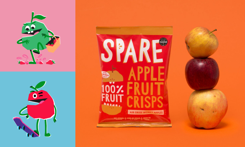
Flavour appeal and shelf stand out was enhanced through the crunchy characters and the vibrant, contrasting colours.
The typography was similarly developed using cut paper and resulted in a set of wonky, playful lettering. The capital letters embolden the product claims, with the imperfect and unique characters enhancing the authenticity of both the brand and the natural products. The lettering and comical characters work together on the ‘recycle ready’ packaging to create a compelling brand that not only engages with people around the issue of food waste in a fun way but is also a perfect blend of pop-art and childhood whimsy.
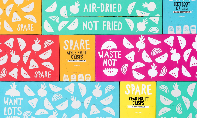
The suite of colourful and hand-made brand elements engages with the audience on the issue of food waste through a playful, whimsical blend of cut paper and pop-art.
A STRONG BRAND POSITIONING BUILDS A STRONG BRAND STRATEGY
The Spare Snacks rebrand was based on a packaging strategy with strong positioning; namely highlighting what is unique about the product and making a conscious effort to differentiate the brand from its competitors. The naming and brand positioning line – ‘Waste Not, Want Lots’ – clearly and succinctly communicate the Spare Snacks proposition, whilst the eye-catching packaging design further captures the natural essence of the brand through the quirky typography and fruit cutouts. The strategy heroes the distinctive product process; the transformation of ‘wonderfully wonky’ unwanted fruit and vegetables into air-dried crisps. By building on this whimsical feature of the brand, Spare Snacks are able to successfully stand apart from their competitors and ensure strong shelf stand-out.
Through a strong packaging strategy, the Spare Snacks brand evolved from a simple healthy snack into a brand inspiring a change in attitude towards food waste.
NEED HELP?
If you want to make a statement and improve life with your business through the adoption of more sustainable business practices, similar to Spare Snacks, we’d like to offer you a strategy call with our Head of Strategy, Grant Davidson. Having nearly 30 years in the industry working with sustainable brands, Grant has the experience and knowledge necessary to identify your core brand values, and how to communicate them effectively. Of course, this call will be free of charge.