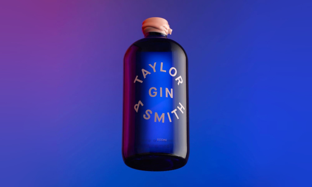
The award-winning brand appeals to creative drinkers looking to satisfy their unique taste buds with a rather strong female skew. Market research revealed that women were drinking whisky in greater numbers than expected. With this in mind, Taylor & Smith targeted those two demographics – encouraging female-leaning gin consumers to venture out to the whisky market and daring current whisky drinkers to try something new.
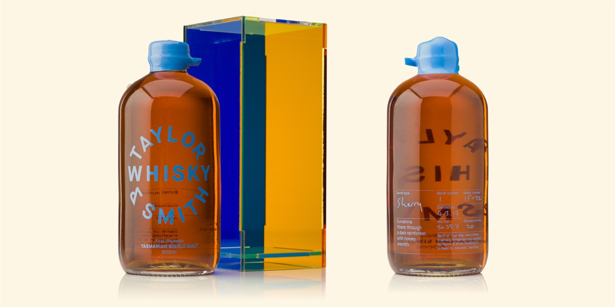
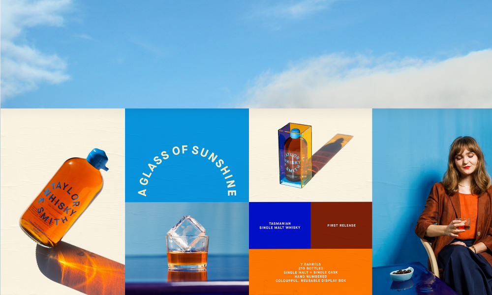
The main ingredients and their environmental effects are reflected in bold colours—a distinctive brand quality—including single malt barley, fresh glacier lake water, the sun, and the blue sky. Creating a distinctive brand quality by turning Tasmania’s picturesque landscape into award-winning spirits.
The first release of Taylor & Smith’s minimalist branded bottles are housed in a stunning, reusable display box that allows light to reflect, infiltrate, and illuminate the golden liquid inside. The hand waxed bottles and custom display cases allow for a unique and modern product positioning in the whisky sector.
The bottle’s simple and rounded appearance is further enhanced by the flawlessly contrasting light blue cap.
The bold idea of a totally transparent, amber and blue acrylic box for packaging was a clever solution that allowed the product was visible from all angles. Serving as a marketing tool, the box is designed to be displayed in pubs, bars and in the home like a tabletop book. With the environment and customers pockets in mind, the display cases are made to be refilled with fresh bottles.
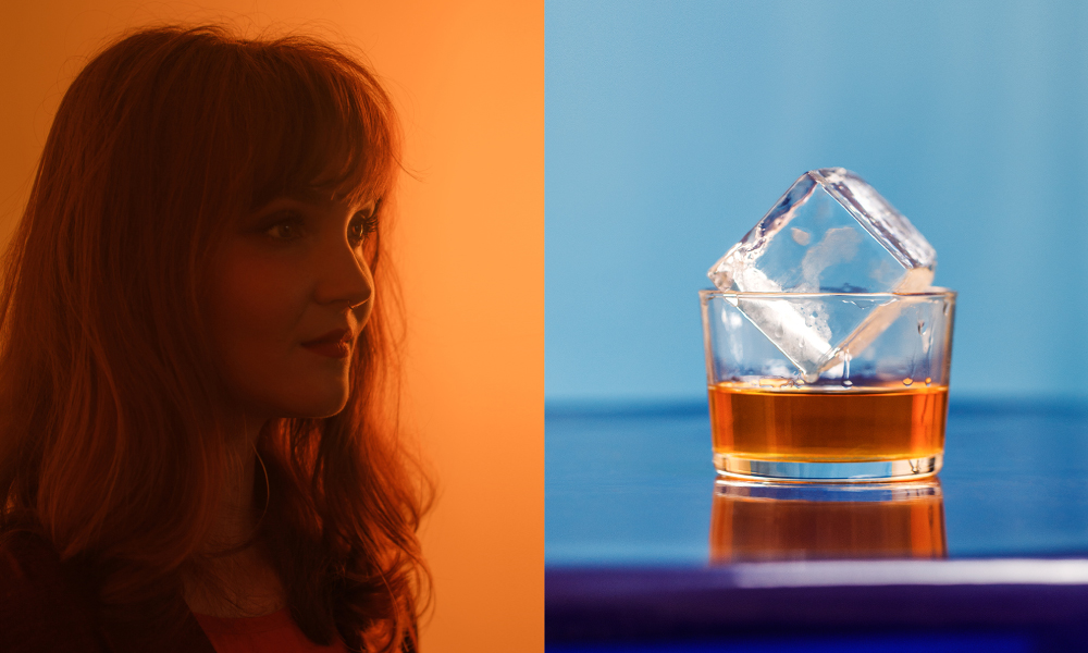
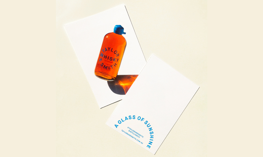
Sunshine is utilised as a metaphor for the “smooth, warming spirit”, and it is at the heart of a campaign that defies industry stereotypes. Taylor & Smiths launch material was shot in direct sunshine to spotlight and reflect the product as well as evoking the sense of wonder and awe that comes with being in nature. Natural patterns and shades were cast by movement and reflection of the sunlight.
Taylor & Smiths packaging is a clear nod to the sun’s historical literary relationship with whiskey.
Colour is used as the primary cue to express the Tasmianianlandscape and the product’s characteristics. As a result, hues like sky blues and sunny yellows are used in the campaign, all of which are influenced by the whisky and are a coincidentally colour representative of Tasmania.
Bold colour is implemented to enhance visibility and express the flavour strength of Tasmania’s botanicals.
The packaging hierarchy works to hero the distillery and reinforces its brand name. Perkins reflects the pure and natural elements suggested by the Taylor & Smith brand by juxtaposing strong text with gorgeous materials.
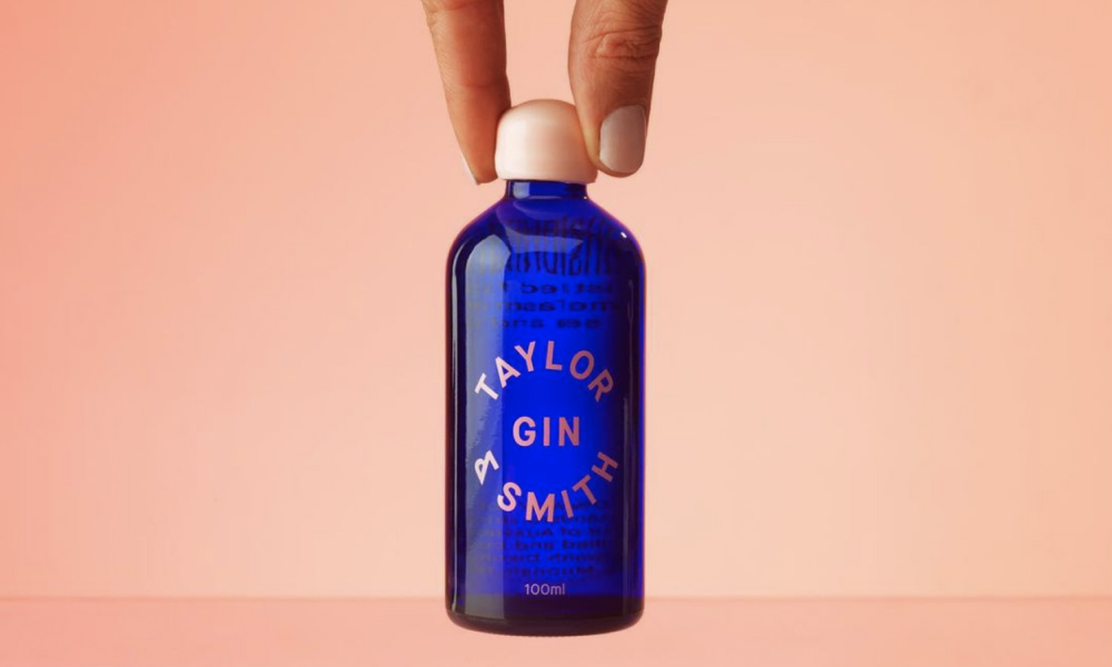
Megan Perkins drew on traditional spirit bottle typographic influences for the logo.
Taylor and Smith have brought something new to the whisky sector while avoiding the traditional macho connotations that are typically associated with this particular spirit.