
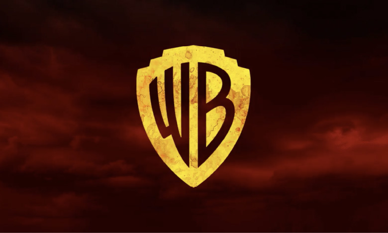
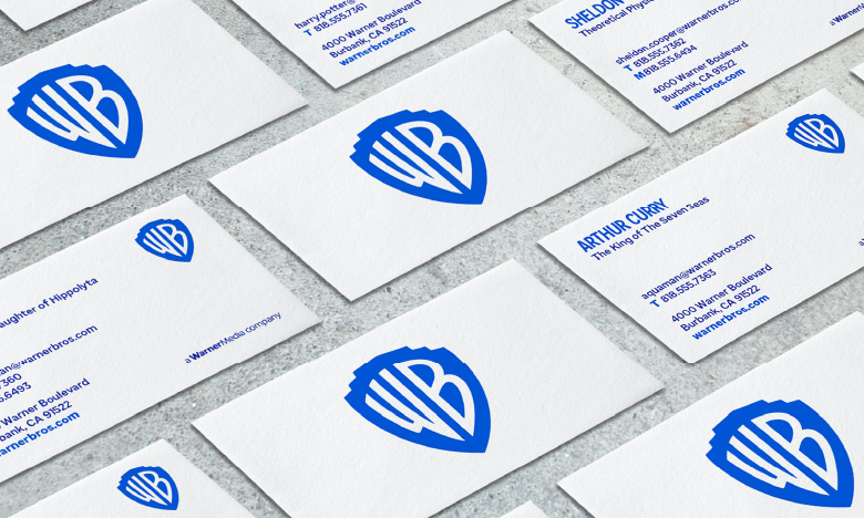
The updated Warner Bros. logo loses the iconic sash but maintains the quirkiness by modernising its key elements; the shield and monogram.
Warner Bros.’ productions range from movies to television, consumer products and interactive entertainment. Faced with change and increased tension between a highly technologically-dependent future and its brand heritage, the studio believed it was time for a reinvention; one that is marked by a contemporary brand reconfiguration and that is able to tell a multitude of stories, whilst adequately representing all the divisions that make up the American studio giant.
GREAT STRATEGIES CAPTURE THE HEART OF THE COMPANY
Pentagram, the creatives entrusted with the development of a new brand strategy and positioning, recognised that at the core of the company – its employees, writers, creative partners, filmmakers and so on – resides the simple desire of telling great stories. With storytelling in its DNA, the new snappy brand positioning – “We believe in the power of a story” – was created.
Wonder Woman meets the new Warner Bros. logo; the logo is easily customisable with different colour palettes and textures added to echo individual movies produced by the studio.
By aligning their strategy to the core of what they stand for, Warner Bros. has a clear purpose; one that defines their point of difference, unique identity and that profoundly resonates with their creative partners and global audience. Their modified mission statement simply encapsulates their unique identity and creative beliefs; “To be the world’s leading creator and distributor of extraordinary entertainment by partnering with the world’s most inspiring storytellers”.
GREAT DESIGN IS MARKED BY SIMPLICITY AND FLEXIBILITY
Undoubtedly, the original Warner Bros. logo is one of the most recognised and well-loved in the world. Building on its legacy, the studio has kept the iconic logo but redrawn it to give it a cleaner look, making it more functional than the 1993 version which was highly detailed and thus could not easily be used in a digital context. The gravitas of the brand was successfully retained in the redesign through the inclusion of the shield and monogram. Despite the elements being refined and simplified, their feature gives recognition to the long-standing history of the company.
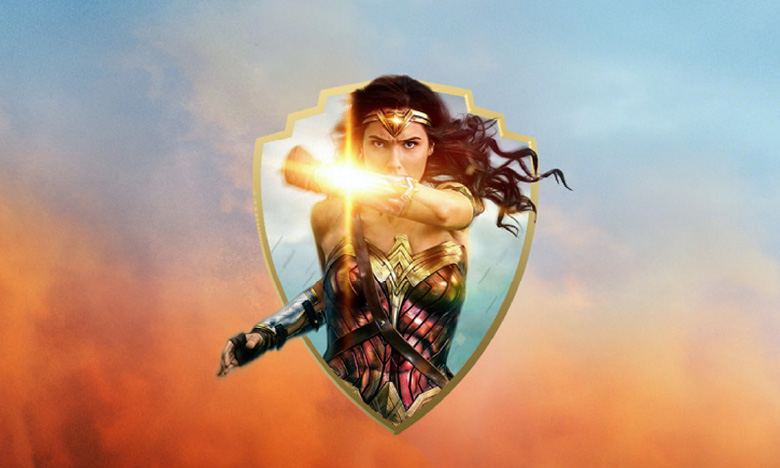
The modernised Warner Bros. logo functions as a window for imagery or movie sequences; with the edge of the shield becoming the frame.
The signature blue has been brightened offering a contemporary hue which contrasts beautifully with the contrasting slightly darker shade of the wordmark. The brighter colour palette and simplification of the logo form not only provide a more modernised look and feel but also mirror the confidence of the company leading the innovation in the entertainment industry.
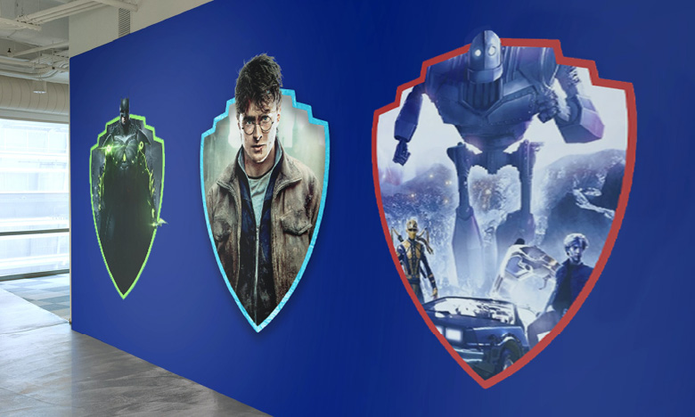
The Warner Bros. redesigned logo acts as a “sponge for any story”; some of the studio’s most iconic ones being: Green Lantern, Harry Potter and The Iron Giant.
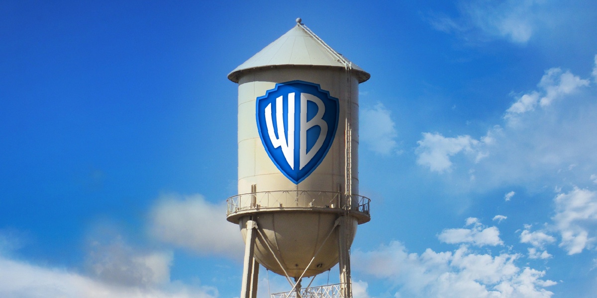
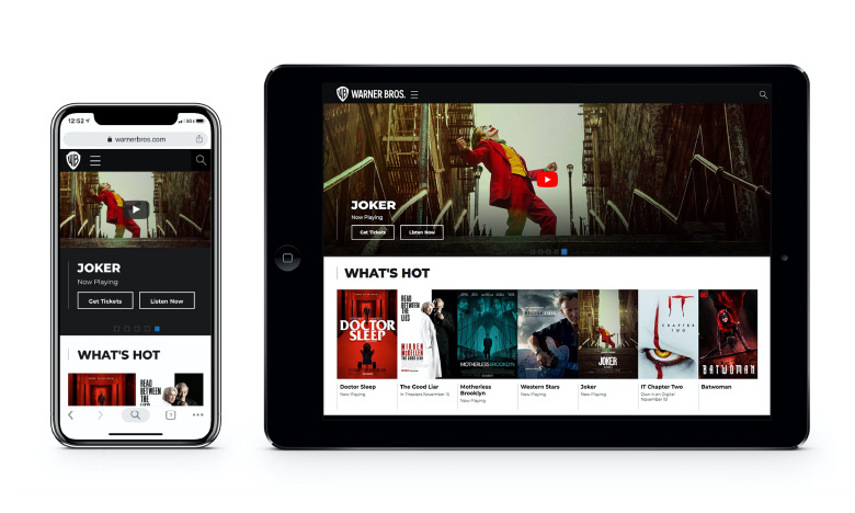
Unarguably, form must follow function. To respond to the limitations the original Warner Brothers logo faced in a highly-digitised environment, the new flexible mark was made for both beauty and function. It has been optimised to perform across different scales and platforms – from the installation of the iconic water tower on the studio lot to the small spaces that characterise and make up the digital world. The redesign enables the studio to use it across a wide range of content; the dimensional version created to be used exclusively for on-screen content has a depth that hints at the content experience.
The redesign resolves a significant issue encountered as of lately by Warner Bros.; with Netflix becoming increasingly popular and producing its own shows, the company needed a digital logo to represent its productions on streaming platforms.
The customisable element of the new logo reflects the brand’s strategy and resolves the issue of the studio not being able to feature its previous logo in most of its contemporary movies, thus not gaining recognition for its creations on various streaming platforms. The modernised logo acts as a graphic vehicle for any story the studio wants to tell the world as it allows Warner Bros. to feature it in the opening or closing sequences of its shows and movies. The modernization and versatility of the redesign enable the American giant to easily adapt to the diverse ways of consumer consumption, whether its streaming services, mobile or more traditionally cinema and TV.
Warner Bros. Condensed Bold; a custom typeface created from the distinctive monogram present in the iconic logo. The family of fonts has a unique look and feel, timelessly communicating the studio’s history.
The secondary version of the logo – a flat, monochrome 2D one – further allows the studio to suit different environments; the design simplicity making it versatile for various applications and scalable to different sizes. Staying true to their roots, the typeface was inspired by 1920 Art deco; non-coincidentally a style predominant when the studio was founded. Despite its iconic shield not being included across every touchpoint, the new cohesive brand image perfectly ties together the different branches and studio outputs; injecting a sense of balance that was previously lacking and that led to a mismatch in identity across the multiple departments.
NEED HELP ADAPTING?
If you need help adapting your brand to a highly-modernised, digitally-led world, we’d like to offer you a complimentary strategy call with our Managing Director and Head of Strategy, Grant Davidson to facilitate a brand performance review. Having nearly 30 years of industry experience working with groundbreaking brands, Grant has the experience and knowledge necessary to identify your core brand strategy and communicate it effectively.