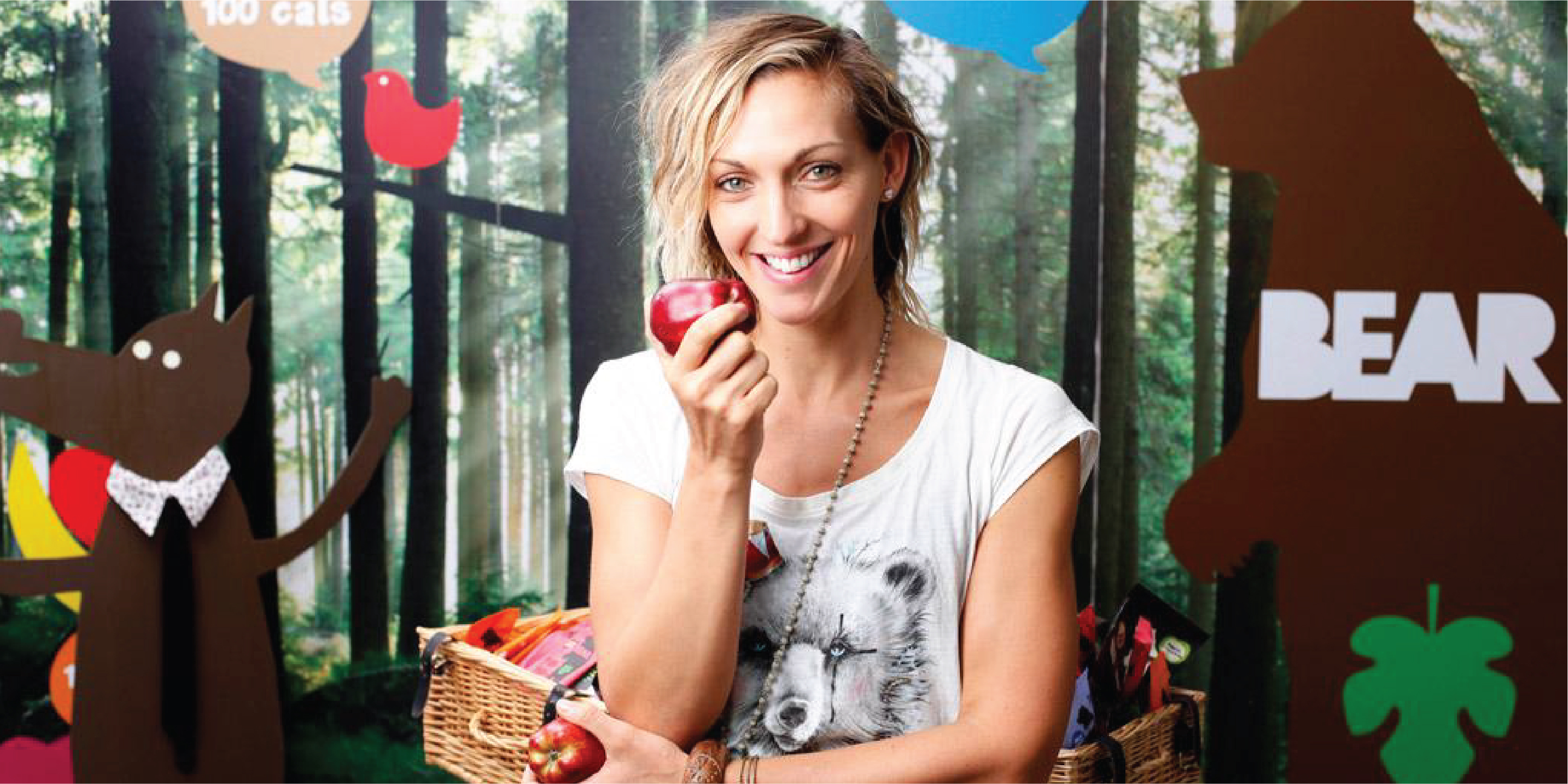
Bear Nibbles founder, Hayley Gait Goulding, was inspired to create the brand after reading an article on bears drifting into cities to forage in take-away restaurant bins.
These bears were found to be 30% fatter and 30% less active than their wild bear brothers who ate salmon and berries. Almost all of the unhealthy bears died by the age of 10 while over 60% of the healthy bears lived to 20.
This struck Hayley as a fantastic metaphor for humans and the food she saw being consumed around her. So, she launched a brand that aimed to help people live longer and healthier lives by getting back to eating as nature intended.
So what exactly makes this branding project so grrr-eat? It ticks all the boxes of an effective brand. Its got a compelling value proposition, a fantastic brand name, strong iconography, delicious packaging, engaging personality and a strong conscience. Keep reading to find out the specifics of each of these characteristics!
1. A compelling value proposition
The brand began with a ‘higher purpose’– to help people live longer and healthier lives by getting back to eating as nature intended. This purpose inspired everything from product development to branding and marketing. Keeping their sights on a very specific brand vision allowed the company to unify all of its processes, communications and outputs. The result is a compelling value proposition that is not only clear but also believable.
2. A fantastic brand name
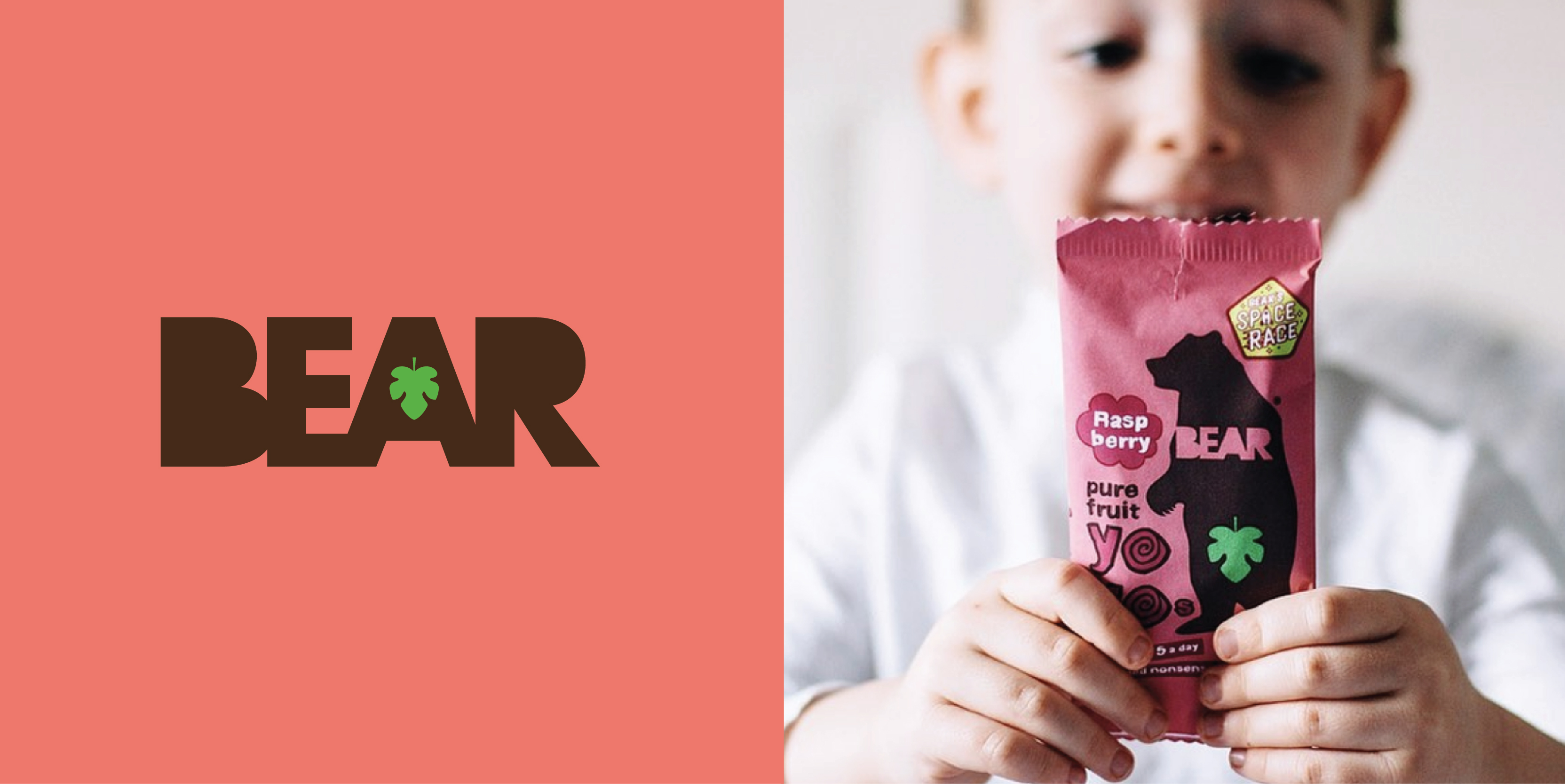
We believe that a great brand name must DRIVE your brand, which can be understood through the following acronym.
D– Describe your brand proposition. In some way, your brand name must link back to the core offering. Whether this is overt or explainable through a brand story, you will have to explain your choice in naming at some point, and the tighter your explanation, the more memorable the name.
R– Relevant to your target audience. What a name communicates may differ based on the segment you’re deciding to target. Choosing a name that communicates what you want starts with understanding to whom you are communicating.
I– Inspirational.
V– Visual – create an image in the mind. Through association, your brand name will always conjure images. You should make sure that it conjures up the image you intend.
E– Emotive – spark positive emotions. A name that sparks emotion will make recall easier and faster for the public.
The Bear Nibbles brand name scores well in each of these categories.
3. Strong iconography

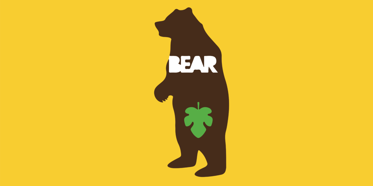
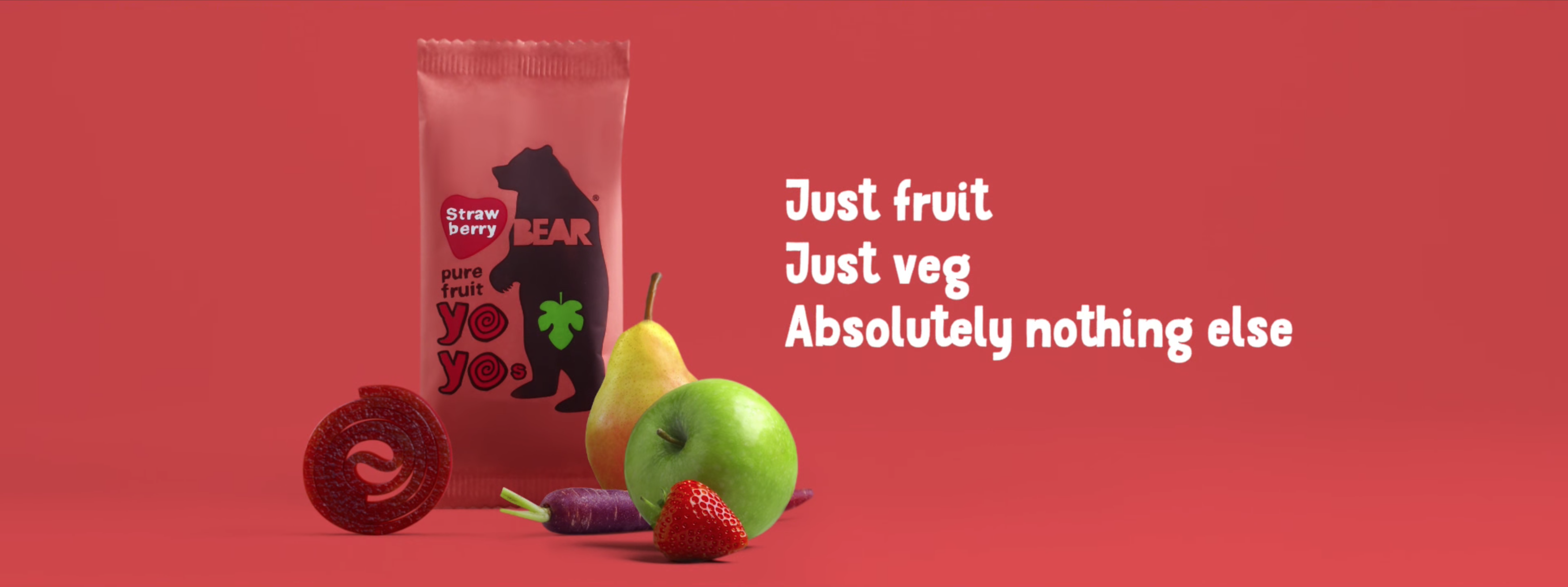
At the heart of the Bear Nibbles brand is, to no surprise, a bear. However the fig leaf adds a dimension in communicating the notion of getting back to nature in a fun and quirky way. The silhouette illustration style adds a modern and cool factor. And who says designers hate making the logo bigger? The Bear Nibbles logo stands tall and proud, occupying at least a third of the pack face thereby creating a powerful impactful brand helping gain cut-through and aiding memorability.
4. Absolutely delicious packaging
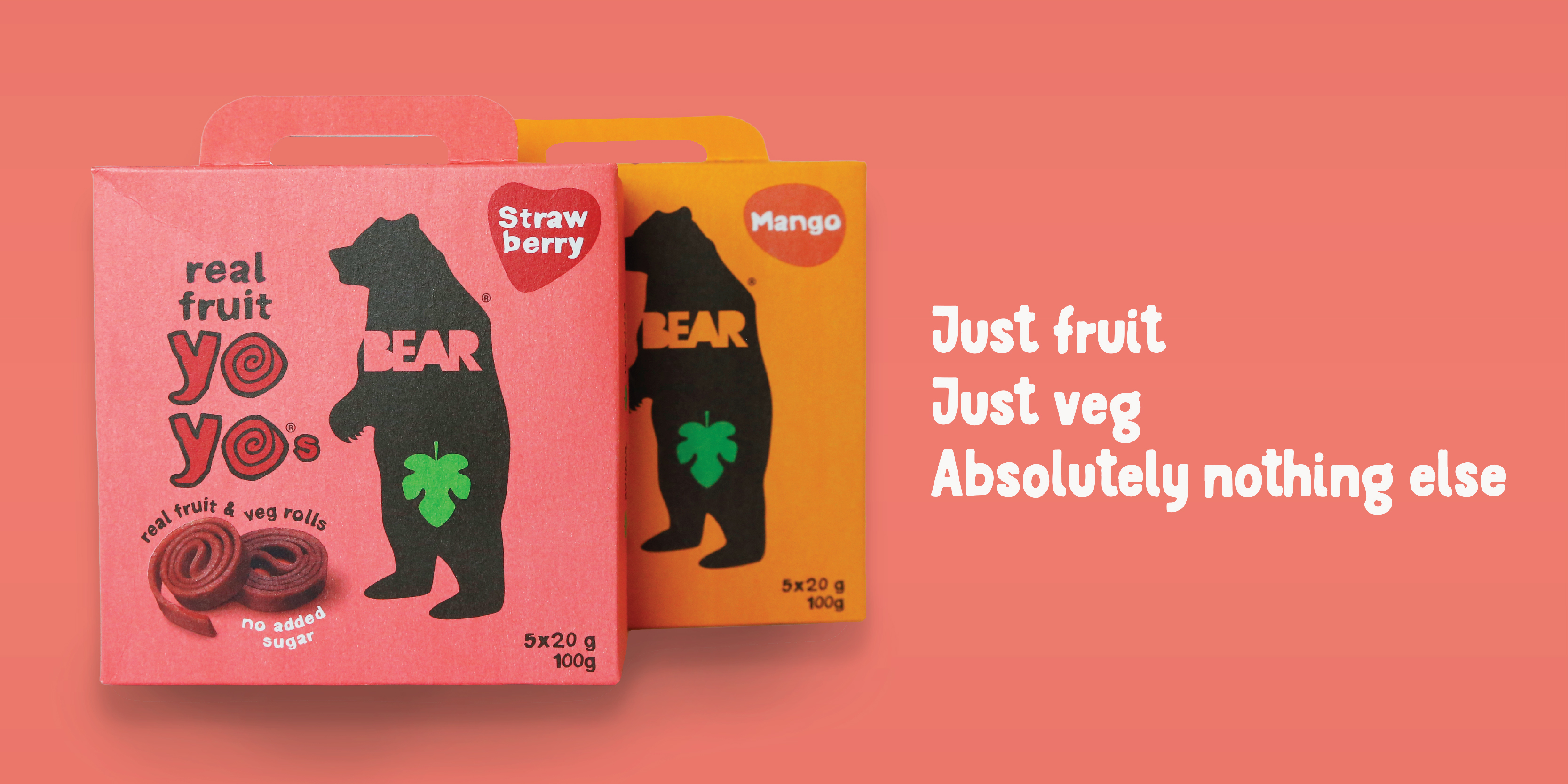
We always say that the food packaging must be edible. The organic graphic shapes and soft fruity colours printed on velvety cardboard makes them delicious to the eye. You can taste the friendly fruit flavours of the YoYo’s before even opening a pack. Images of the fruit rolls on the pack also help consumers to visually consume the snack and its imagined textures at first sight.
5. An engaging personality
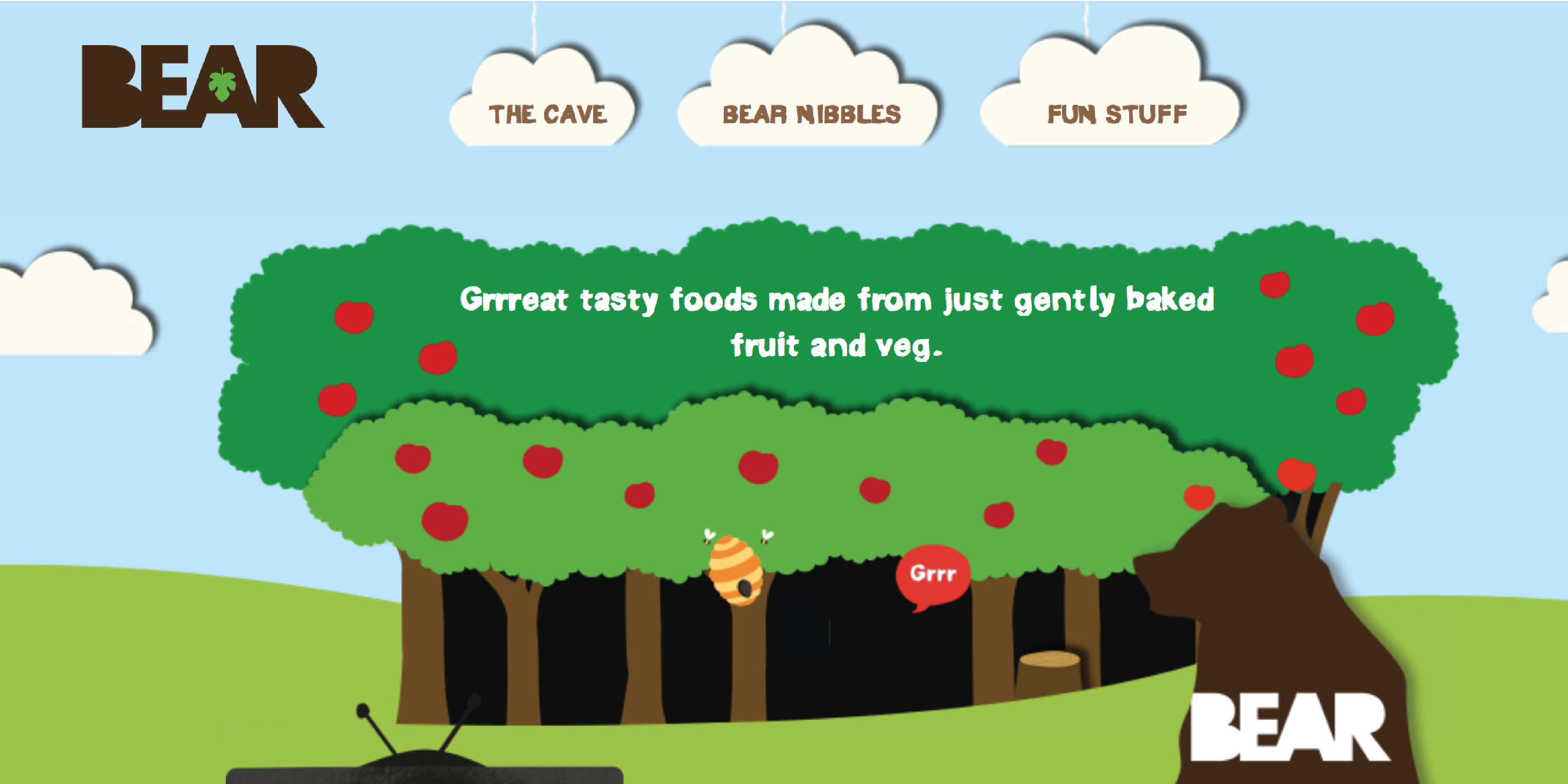
A distinctive personality is one of the most powerful assets a brand can have. In day to day life, human personality is a mechanism to help us navigate the many people we meet and decide who we will spend more time with. Personality attracts, creates rapport and builds lasting bonds. A brand’s tone of voice plays a key role. The Bear Nibbles brand exudes a cute and fun tone of voice at each moment. Even the boring functional information gives you a smile; for example, their website’s navigation menu consist of cloud cutouts and fun terms like “The Cave.”
6. A strong conscience
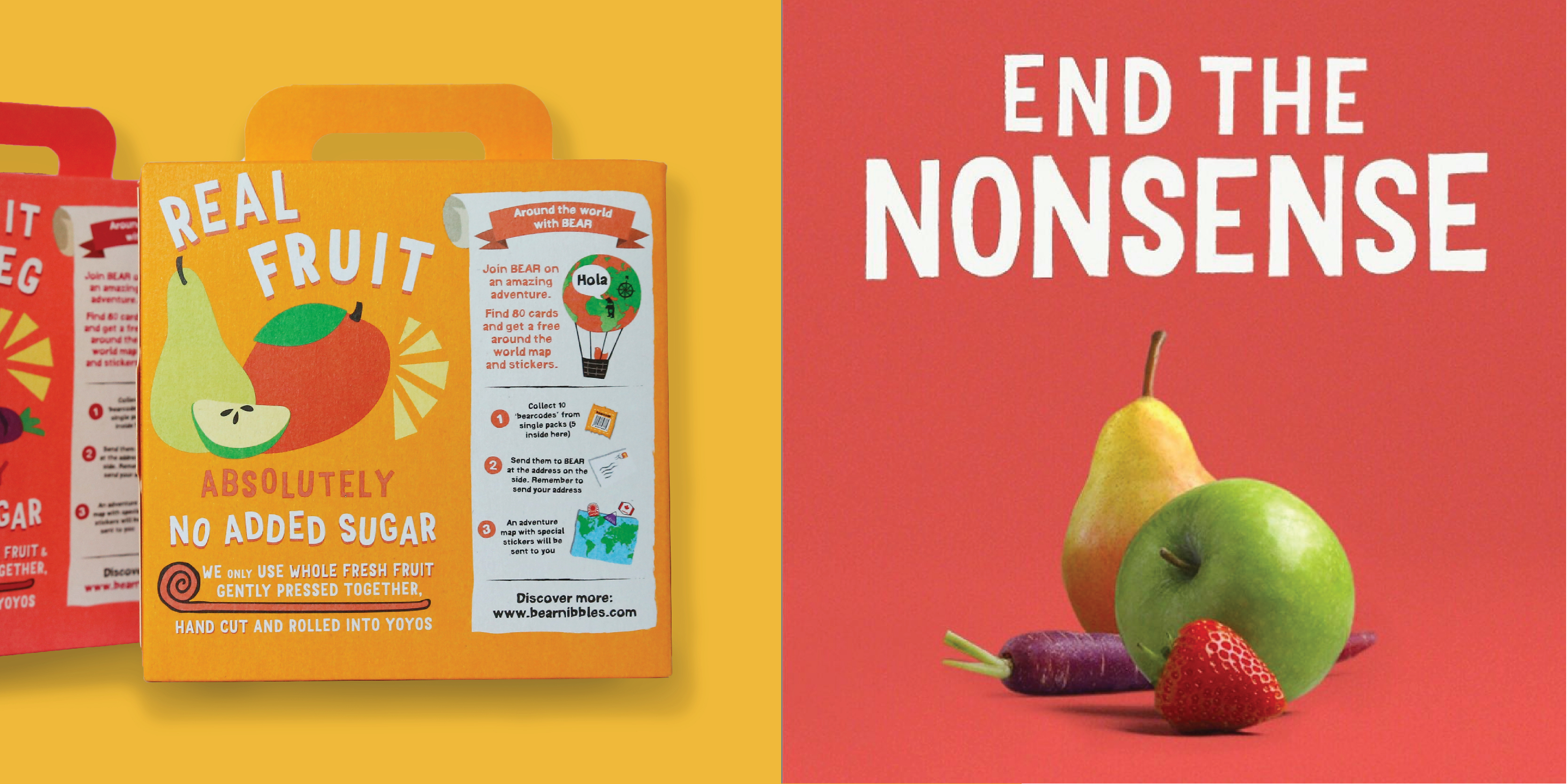
(Image source: Nat Sutton)
As you would expect from a brand focused on ‘returning to nature’, environmental impact is at the heart. The boxes are both fully recyclable and use FSC Certified or recycled board for all outer cases. They are also compostable – low migration (water-based) ink is printed on the boxes which means that the packaging is safe to compost as no nasties (grrr!) will seep into the ground from the ink.
In conclusion
Congrats to Hayley and the Bear Nibbles crew for the inspiration behind an amazing brand. We wish you the greatest success!
Want to find out if your FMCG brand has the right ingredients for success? Utilise our Brand Benchmarking tool.
