Bad Habit
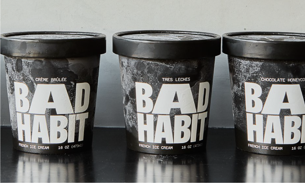
Bad Habit Ice Cream embodies a disruptive approach leveraging a fun concept to stand out. The typography infuses the packaging with a unique character, creating a playful and engaging experience for consumers.
It’s simplicity and minimalistic design further emphasises its adult-oriented appeal, setting it apart as a guilt-free indulgence.
With 81% of consumers express a preference for brands employing humour, the packaging of Bad Habit captures attention while also establishing resonance with its designated audience, thereby fostering consumer selection and allegiance.
Sweet Deliverance
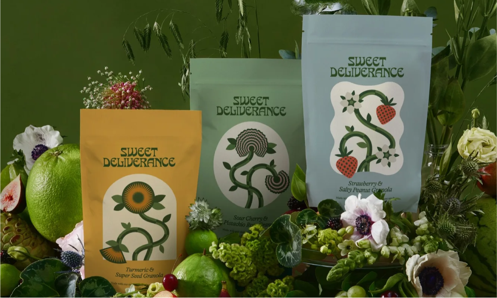
Sweet Deliverance’s packaging has a charming retro aesthetic, drawing the eye with its quirky typeface. The playful yet nostalgic logo appeals to a younger market while tapping into the current nostalgia trend. Complemented by natural colours, the packaging elevates the brand’s claims of using natural ingredients and offering nutrient-rich products.
The graphic style illustrations strike a perfect balance between retro colours and contemporary styling, incorporating intricate details that captivate the consumer’s imagination.
Made Good
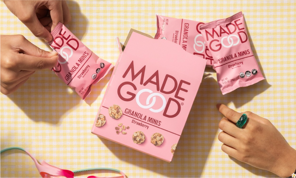
Made Good’s packaging embodies its ethos, marrying natural aesthetics with health-conscious messaging. Through earthy tones and organic imagery, it crafts a natural space that resonates with consumers seeking wholesome options.
The brand’s commitment to being good for you is evident, with clear nutritional information and certifications emphasising its health benefits.
By showcasing its delicious offerings and prominently featuring key claims and benefits on the side of the packaging, Made Good ensures that its proposition—embedded within its very name—is unmistakably communicated to consumers.
Crucially, the packaging’s transparent display of ingredients in easily visible underscoring the brand’s integrity, fostering trust and loyalty among shoppers.
Bear’s Fruit
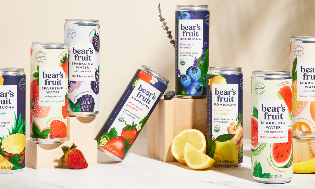
Bears Fruit’s packaging is a feast for the eyes, boasting big hero watercolour illustrations that scream freshness. Across the range, these illustrations deliver instant appetite appeal and flavour recognition, enticing consumers to indulge in the goodness within.
The bright colour packs add a sense of flavour and convey a feeling of vibrancy, while pastel tones subtly hint at the natural ingredients within. The packaging’s strong centre panel serves as a focal point, effectively communicating essential product details such as variant name, logo, and product type clearly, ensuring easy identification and understanding for shoppers.
Bears Fruit’s lowercase logo and friendly serif font contribute to its down-to-earth feel, steering clear of overly premium or ‘sports active’ aesthetics often seen in the category.
The brand’s tone of voice is seamlessly integrated into the packaging with phrases like ‘no weird stuff,’ reinforcing its commitment to simplicity and natural goodness, a message that resonates both on and off the pack.
The Good Crisp Company
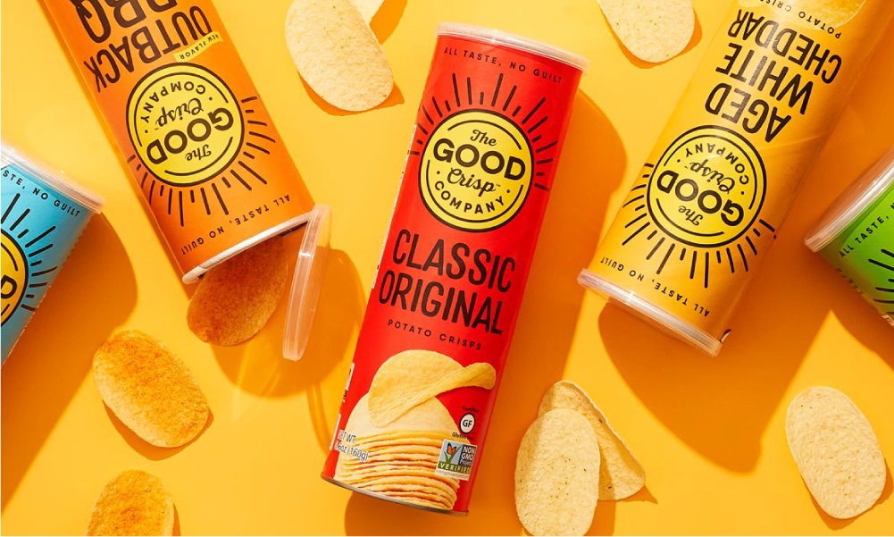
Good Crisp’s packaging stands out with its bold use of primary colors that flood the packs, creating a visually striking presence on the shelf. The design embraces a simple and clean layout, prioritising essentials like the large logo, variant name, and captivating hero photography.
Each pack’s photography skillfully showcases the unique and ownable shape and size of the product, particularly in its pack format, enhancing its appeal to consumers. The hand-drawn, crafted typeface lends an authentic and ‘real’ feel to the packaging, conveying a message of naturalness.
Notably, the logo’s sun emerges as a powerful icon on the pack, fostering strong brand recognition on the shelf. With its black outline and primary colors, the logo strikes a balance between playfulness and quality, appealing to consumers of all ages without compromising on perceived value.
The Ugly Co
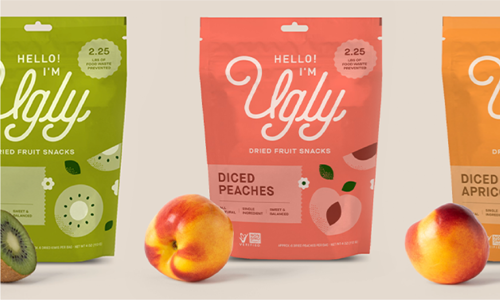
The Ugly Co’s packaging bursts with brightness, fun, and quirkiness, offering a fresh take on showcasing their flavours with vibrant, lickable-coloured packs. The brand name itself is a playful and memorable addition, bringing a smile to consumers’ minds once they grasp the proposition. While the website communicates the brand’s essence more strongly and quickly than the packs, the logo’s cursive typeface adds to the feminine appeal of the packaging.
Modern and flat illustrations adorn the packs, though incorporating a window to showcase the dried product or providing some indication of product expectation would enhance the packaging’s ability to convey flavor. Despite this, The Ugly Co’s packaging remains distinctive and engaging, inviting consumers to embrace its playful spirit and delicious offerings.
Semaine
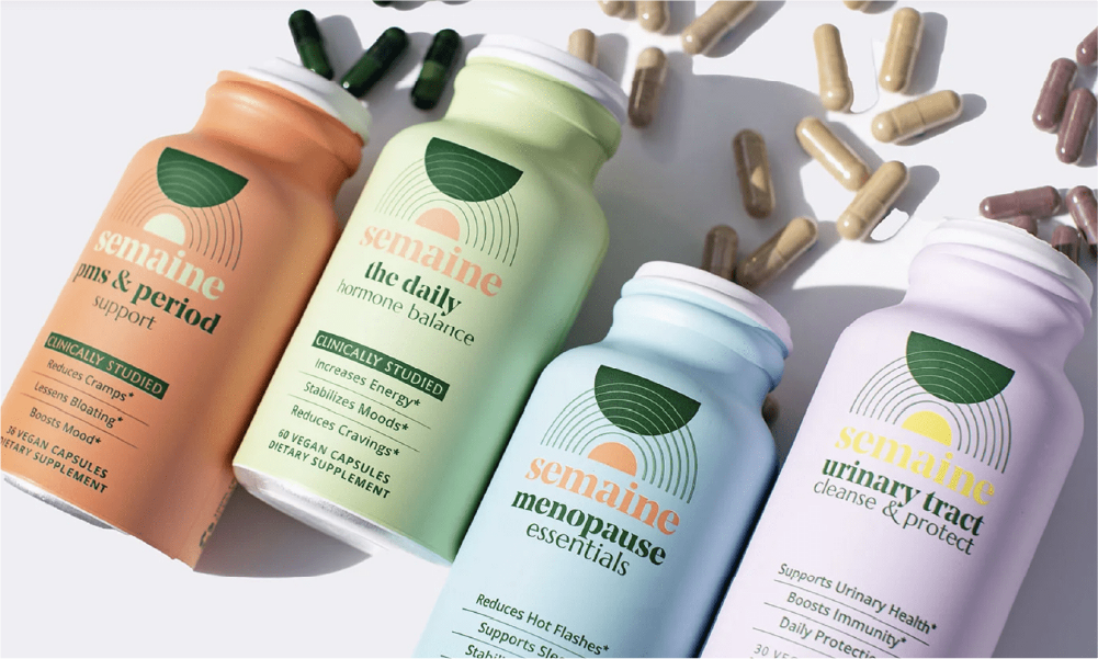
Semaine Health’s packaging incorporates a harmonious blend of nature and science, creating a sense of calm and authenticity. The natural colors evoke a modern aesthetic, while the simple and clinical layout exudes functionality and scientific credibility. The wellness-centered logo features elegant line work and utilizes the brand’s signature dark green color, which is carried through to the lid for a cohesive look.
With a modern serif font presented in lowercase, the packaging achieves a natural and approachable feel, further enhancing its appeal to consumers seeking a holistic approach to health and wellness.
You Need This
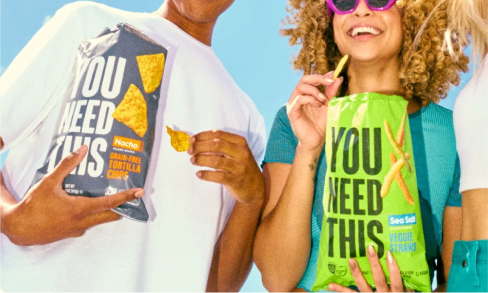
You Need This’ packaging boldly asserts itself with real stand-out power, disrupting the norm with its loud and vibrant presence on the shelf. Its strong engagement stems from a dynamic personality infused into every element, from the choice of bright, eye-catching colours to the big, heroic title.
The packaging’s conversational style speaks directly to the consumer, fostering a modern connection that exudes attitude and confidence. By addressing the consumer directly and adopting a very modern approach, You Need This doesn’t just sit on the shelf; it demands attention and commands a response.
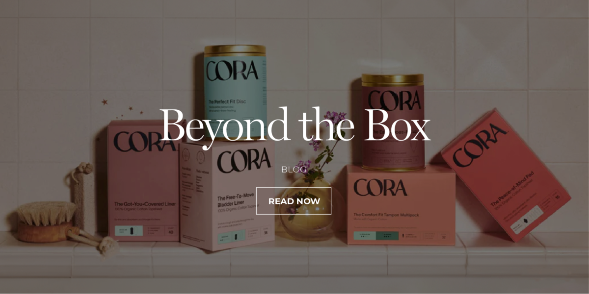
Cora
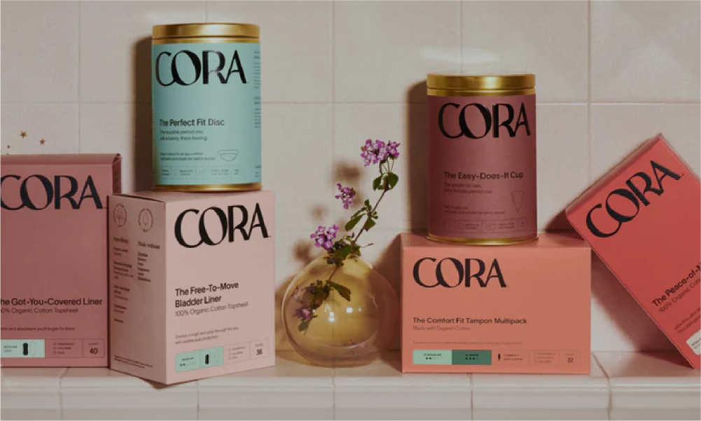
Cora’s packaging embodies a revolutionary approach to period solutions, offering products that prioritise environmental sustainability, body wellness in style, and individuality. With a commitment to providing premium quality without compromising on harmful additives, Cora’s modern period products exude a sense of uniqueness tailored to each user.
The suite of modern packaging is a beautiful fusion of femininity and strength. A bold logo and clear messaging communicate product benefits and navigation with confidence, while feminine typography and a kind, softer tone of voice create a sense of comfort and understanding. This balance ensures that Cora’s packaging speaks directly to its target audience, resonating with their desires for both efficacy and care.
NEED HELP?
If you need help creating a brand that pushes creative boundaries and inspires change, we’d like to offer you a complimentary strategy call with our Managing Director and Head of Strategy, Grant Davidson. Having nearly 30 years of industry experience working with groundbreaking brands, Grant has the experience and knowledge necessary to identify your core brand strategy and communicate it effectively.