An impactful landing page, succinct content and a persuasive call-to-action are essential to building a successful website but surprisingly, these are often overlooked. These work together to form a solid base for your Conversion Rate Optimisation (CRO) strategy. A well-defined and simple start to executing your CRO strategy will increase the rate at which visitors to your site make a desired action.

1. Agile and Responsive Design
Our lifestyle is pervaded by portable screens. Mobile phones and tablets have become a technology of necessity in the way we consume content on the move. A website that seamlessly adapts to both desktop and mobile devices is an expected standard by consumers. A study by eMarketer reveals that more than 55% of respondents in the US stated that they will not purchase from brands whose mobile website experience was poor.
With increasing traffic coming from mobile devices, a website that hasn’t been optimised for mobile will lead to potential customers abandoning the website, impacting conversion rates and detracting from the perception of your business. Ensuring that your website has been designed for both desktop and mobile users’ needs is valuable to increasing your conversion rate.

2. Clear Value Proposition
New visitors to your website may have little to no knowledge of your brand. When the first landing page appears, it is important to communicate, as succinctly as possible, your single value proposition as a business. Visitors should be able to understand who you are, what you do and how your products or services can help benefit their specific need. A clear, focused proposition is key– anything extra will only dilute and clutter the communication of your offering. Visitors will more likely engage with a website that has one clear hero message on the landing page with a simple design than a website that attempts to detail every feature through a complex design. Simplicity achieves impact while complexity deters attention.
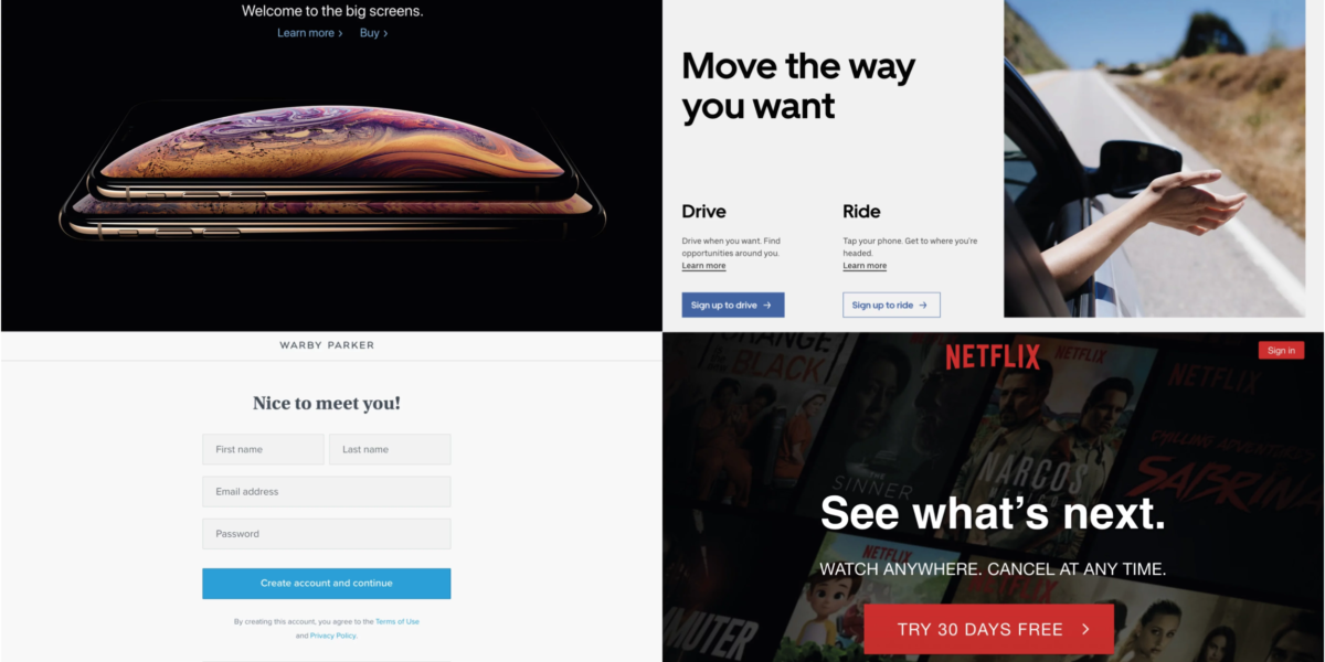
For example, Hulu’s website features the prominent headline, “Hello, welcome to great TV”, an emotional proposition that grabs attention while also communicating the product offering.

3. Simple Forms
No one enjoys spending time filling out forms and paperwork in the real world. This is no different in the digital medium where attention spans are even shorter. Keeping your website form simple is important to retaining your audience and ensuring a hassle-free user experience. Here are a few key points to consider when designing a form:
- Only include form fields that are necessary. Avoid lengthening the form with fields that are not relevant or essential. This will only clutter the form and detract from the user experience.
- Use predictive text to help users complete the form. Information such as locations and addresses can be auto-filled, reducing the burden on visitors to continually type.
- Provide clear and prompt error messages if a field is missed or filled incorrectly. Visual cues such as an exclamation mark or red instructional text will help users see the error and let them know what needs to be done to fix it.
- Align your form fields vertically in a one-column layout, rather than arranging form fields horizontally in multiple columns. More effort is required to scan the form horizontally than to simply move vertically from one field to the next.
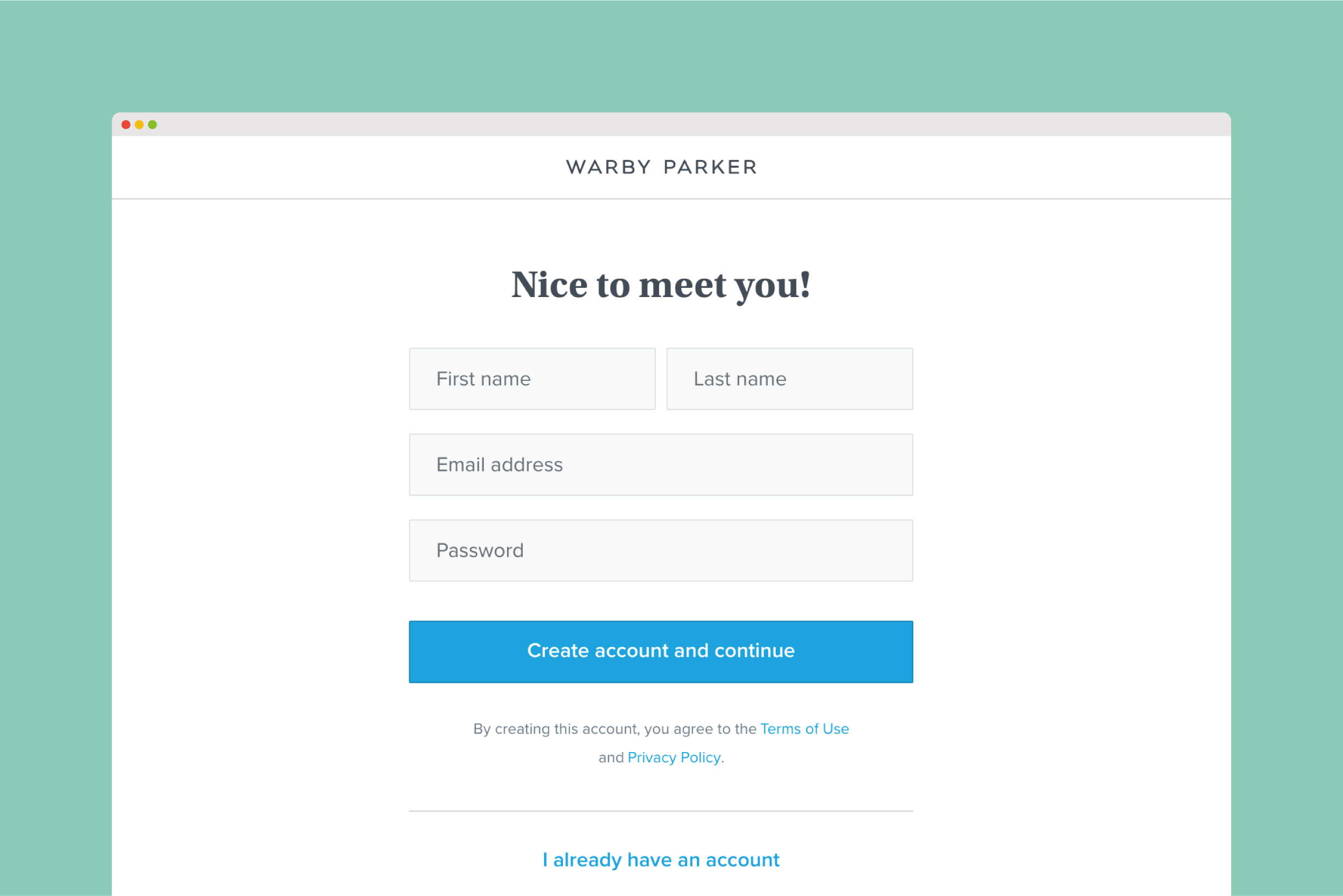
Warby Parker’s website is a good example of a well-designed form. Their checkout process uses vertically-aligned forms, with clear and concise error messages for specific errors (for example, no e-mail address vs. an inadequately formatted e-mail address). The form also uses details from prior field entries to auto-fill other fields.

4. Effective Call-to-Action
One of the most critical elements affecting the CRO of a website is an effective call-to-action. A clear call-to-action guides your users along a path to purchase. Websites that do not have a call-to-action or have a generic call-to-action can alienate visitors who are not sure what to expect. It may miscommunicate your brand and leave visitors thinking your business and its offering are not what they are looking for. Using a call-to-action that is simple, specific and easy to locate will improve the experience of your website and build a stronger message that communicates the core offering of your business.
For example, Netflix keeps a succinct but effective call-to-action, with a stand-out red button communicating the offer to join free for one month. The call-to-action is complemented by the reassurance that users can terminate their subscription at any time, alleviating any anxiety regarding commitment.

5. Website Speed
Though more of a technical component than a design consideration, website speed is another variable that can reduce conversion rates. Website speed is ranked the second most critical attribute of website performance by visitors, followed by its ease of navigation. Users will not wait for websites with slow loading times. Having a fast, nimble website will make the website experience more pleasurable and encourage visitors to browse the website for longer. Ensuring short loading times can be as simple as reducing the size of the image files or reducing the amount of content on a landing page.
Wrapping Up
Concentrating on boosting your CRO is the best long-term investment to improve your brand’s success on the digital stage. Although minor, these five changes covered above can make a big difference to how visitors interact with your website and how your brand, product or service is perceived.
Like to know more about CRO? Want to improve your website’s online user experience? Request your complimentary competitive website analysis below.


