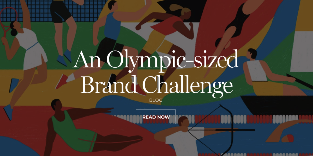
The answer to this complex challenge lies in a cautious, clever, and skilful approach. Because a project that the entire planet will see, must be executed with the utmost precision and expertise.
Every four years, the world holds the Olympic Games. While the look and feel undergo slight iterations for new locations, the decision was made that the identity should evolve for the Paris Games.
If the Olympic flame is to have a future, it must be fuelled by the youngest, most tech-savvy audience yet.
 Credit: International Olympic Committee
Let’s consider the challenges.
- The Olympic brand imagery has been around since 1913. So, there’s an enormous investment in heritage.
- Any material needs to be understood in all languages, cultures, and countries. It must inspire but not offend.
- The Olympic collateral list is enormous. The identity must work for everything from stamps to stadiums, structures, stations, staff, etc.
- It is owned by the hearts and minds of the world’s population.
- The Olympic Committee ferociously protects the use of Olympic logos.
- There is, literally, nowhere to hide. It will not fade away in the annals of history.
- It must work on new tech and any emerging on the horizon.
- It must engage emotionally and deeply in less time than ever before.
History will show the Olympic rings were ahead of their time.
Credit: International Olympic Committee
- They were inclusive before inclusiveness was a mandatory human resources check box. Interconnected rings in different colours symbolize unity, equality, and fairness.
- Before minimalism became a trend, the Olympic rings already embodied it. In an era of crests and intricate illustrations, the rings stood out with their bold simplicity and clear intent, a design principle we still adhere to. They were easily understood, a metaphor for engagement, and translated into any culture.
- They were graphic and uncluttered.
- The colours are varied, flexible, popular, prominent and timeless.
So, what has the Canadian design agency tasked with this challenge come up with and why?
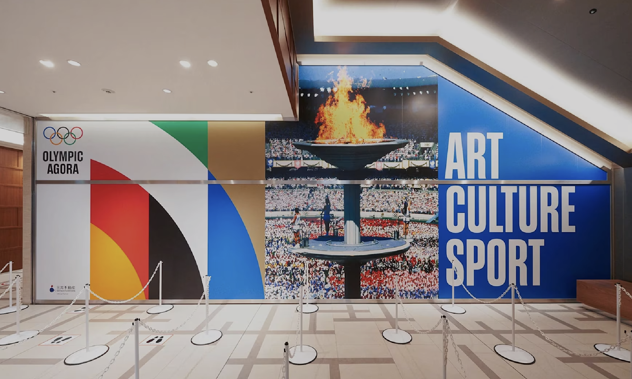
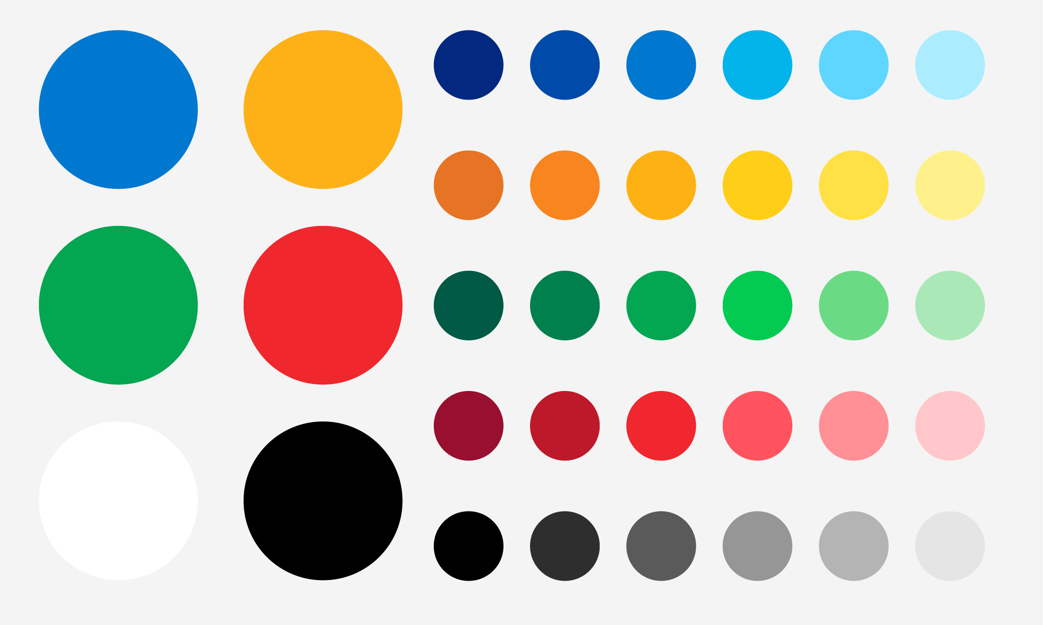
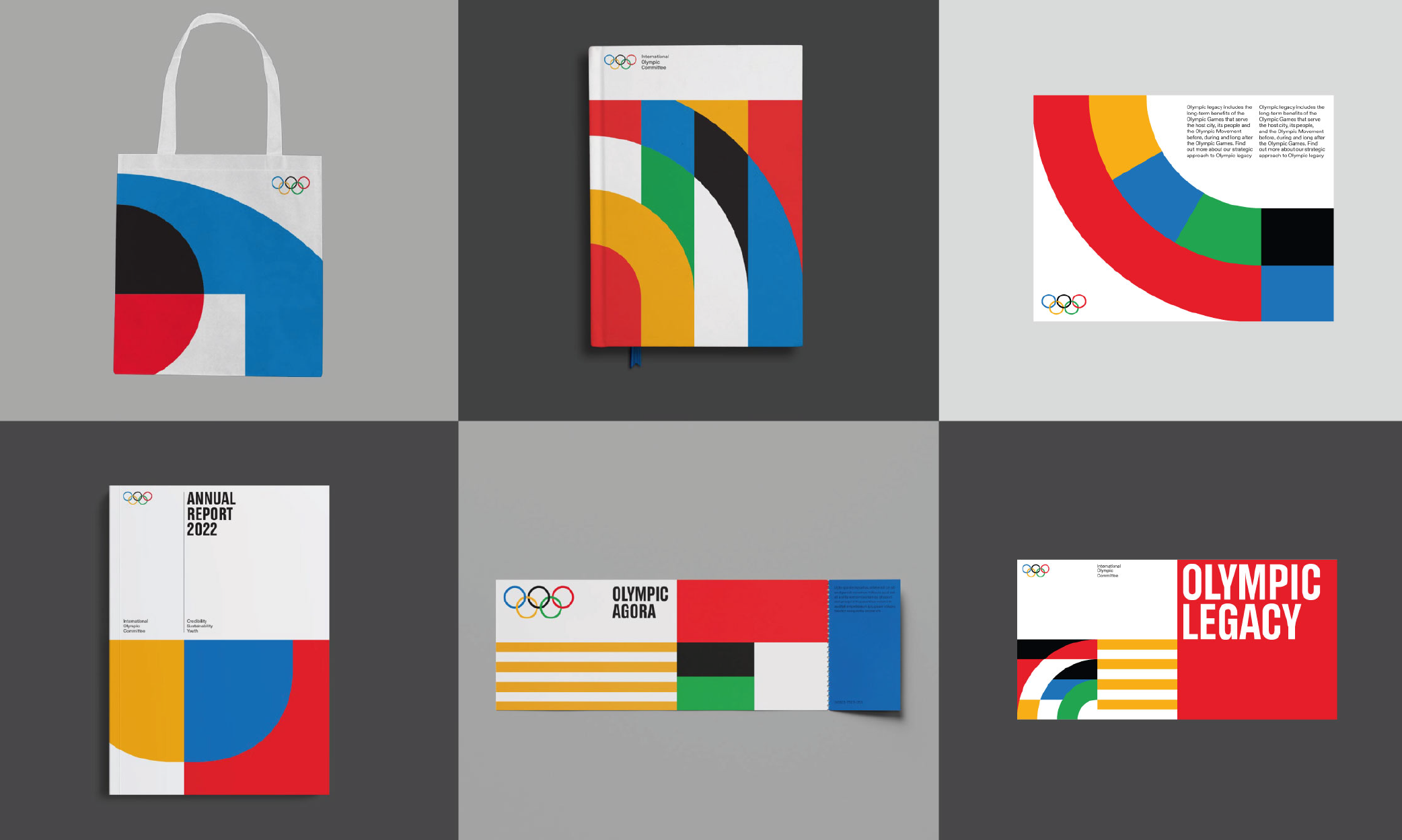
Extending the colour pallet without reinventing it.
Credit: International Olympic Committee
You don’t have to throw out the colour baby with the new media bathwater.
Rather than completely reinvent the wheel, the agency extended the pallet to use shades of the primary colours.
So, consistency – the secret sauce of all significant brand identities – remains intact regardless of medium.
Vibrant illustrations.
Credit: International Olympic Committee
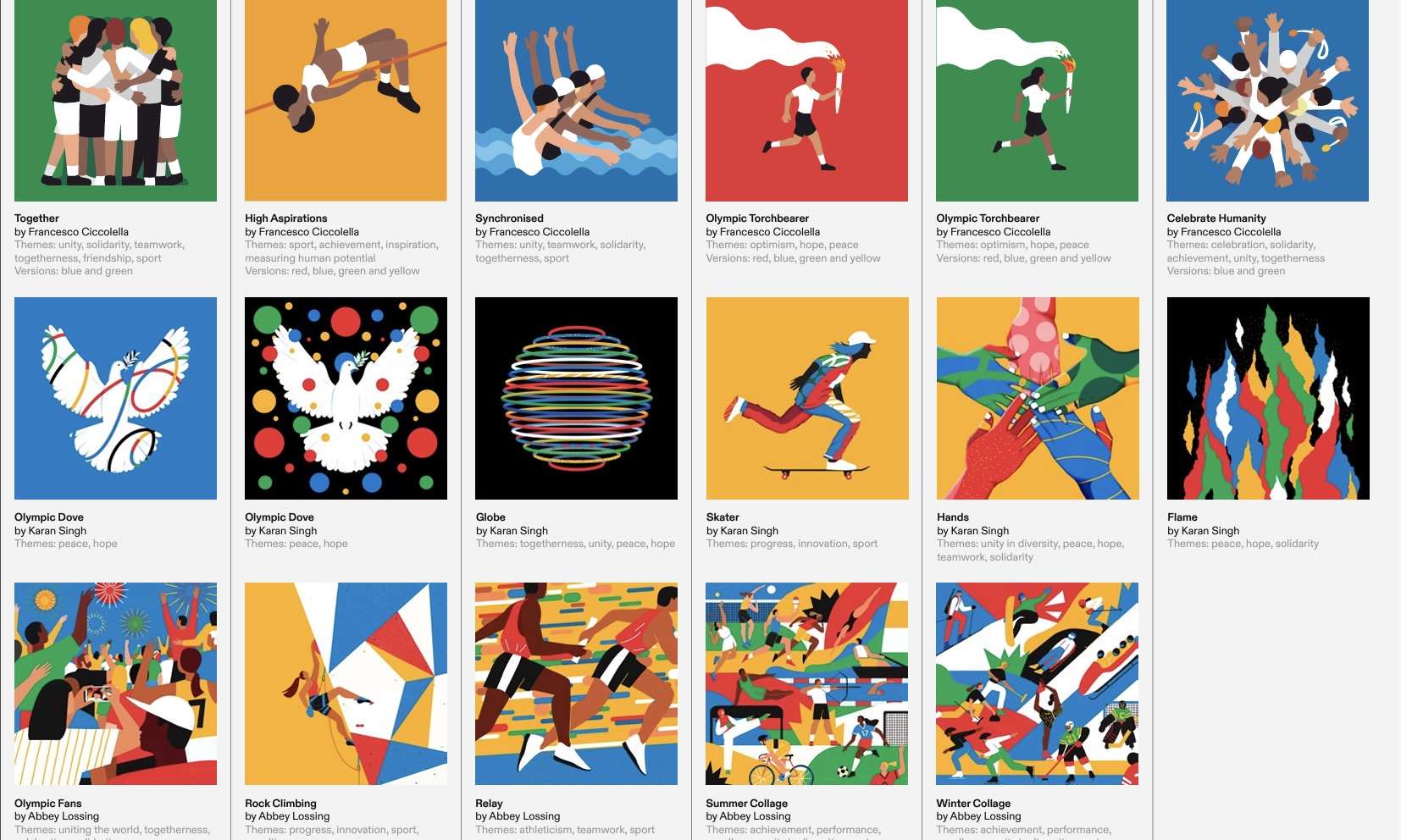
With around 7,000 languages worldwide, strong, memorable and message-carrying graphics are essential.
The design company engaged three international designers to create 17 illustrations in styles ranging from graphic to illustrative.
The key to the success of these illustrations lies in the designers’ attention to detail. They have managed to infuse energy, community, and hope without resorting to cliches. The inclusion of varying ethnicities and subtle elements like a mobile phone are significant steps into the present for such an age-old movement.
The images and the three custom typefaces are designed to communicate the Olympic brand’s hopeful, universal, inclusive, vibrant, and progressive qualities.
The graphics also work particularly well on social media platforms. They are designed to scale and stand out on small devices.
The guidelines are tight.
Credit: International Olympic Committee
Parameters are your best friend when you have a massive audience and many news and media outlets. The Olympic Committee is like Fort Knox in terms of using their IP. You can only use the word Olympic in advertising if you are a sponsor. Want to encourage people to buy a new TV for the event? You’ll be saying, ‘Get a new TV for Paris 2024,’ you will only mention the Olympics in the body copy if you’re an official, paid-up sponsor. It’s the same for their new brand guidelines.
It’s the only way to guarantee they speak with one voice anywhere and everywhere. This means every message builds on the ones before it. Great, purposeful, and tight guidelines make visual brands tick.
When three pieces of communication are designed to fit together, their combined impact is far more significant than 300 randomly designed pieces. This power of cohesion is a testament to the effectiveness of the Olympic Committee’s brand guidelines.
If you would like to see what we can do for the evolution of your brand, please feel free to contact us. We’re excited to see what we can build together.