We are wired for images.
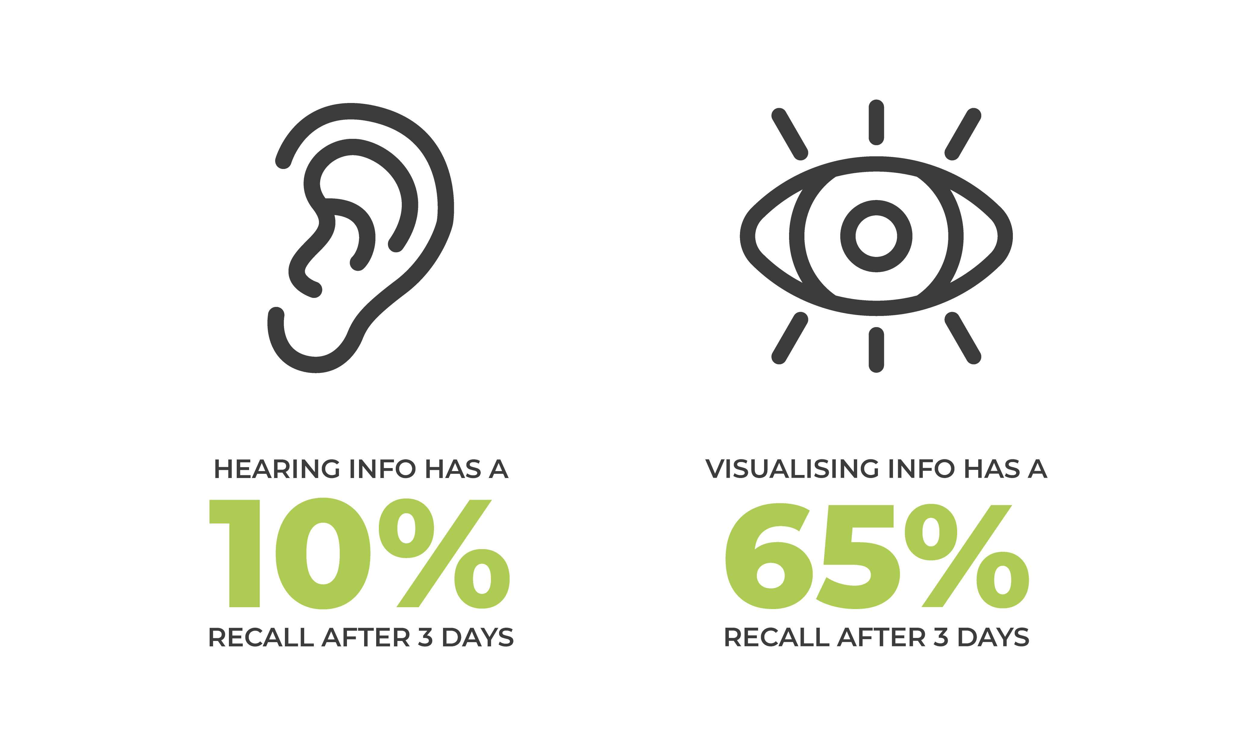
At the core of visual engagement lies the phenomenon of cognitive processing, during which our brain rapidly deciphers and interprets visual stimuli. Research in cognitive psychology has revealed our brains are innately wired to prioritise visual information, processing images an incredible 60,000 times faster than text.
This neurological predisposition underscores the profound impact that visuals can have on capturing our attention in the first place and enabling us to facilitate retention of the visuals’ embedded information.
In other words, the right visuals make information infinitely more memorable. Something referred to as the ‘Pictorial Superiority Effect’ (Journal of Experimental Psychology: Human Learning & Memory, 1976).
So, what does that mean for brand communications?
Like any great tool, visuals work best when they are in the proper context. It’s kind of like horses for courses. But there are times when they don’t work. That can be for a range of reasons, many of which you’ll understand better by the end of this article.
The best way to understand this, before you or we put pen to paper or image to screen, is to ask ourselves the biggest question of all. Is utilising a visual the best way to communicate what we’re trying to say? It might seem like a counterintuitive approach, but the best strategic brand builders will approach any design challenge with this blunt question.
It’s because it forces us to be clear and aligned about why we’re doing what we’re doing – knowing that understanding why ensures a faster and more productive journey to what and how.
Deliberating before prompts critical thinking and ensures clarity and purpose in the design process.
Consider this question: ‘What do I want to achieve from this design?’ Your answer may be – the simplification of a complex message.
Or, it may be – to stand out in an overly cluttered and highly competitive landscape.
Perhaps it’s to build on your emotional connection with your audience.

Or you want to embed your customers in the story that sits as the heart and soul of your business. Because you know they are more than a demographic. They are your community.
There are many more reasons you may have. Some are downright practical, like a space that’s big enough for design but too small for the copy. Or esoteric, like conveying a powerful message words alone cannot do.
The secret is to think and then rethink until you have distilled the aim of your communication into the absolute, single-minded core principle of the piece.
It’s the briefest brief of all. And the most important.
What else is essential to consider?
Let’s say you have four things to put on a page: a box, a spreadsheet, or a billboard. Regardless of the medium, your considerations should be the same. That’s because of the way our brains work.
Consider the Gestalt theory, which is a way of understanding how our minds organise what we see into meaningful patterns, instead of just seeing individual parts, our brain groups things together based on similarities, proximity, and other factors.
For example, when we look at a picture of a tree, we don’t see it as a collection of leaves, branches, and bark; we see it as a whole tree. This theory helps explain why we perceive specific visual arrangements as more cohesive and harmonious, even when they’re made up of different elements.
By applying principles such as proximity, similarity, and closure, we create visuals that are aesthetically pleasing, inherently meaningful, and easy to comprehend.
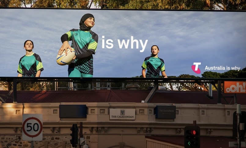
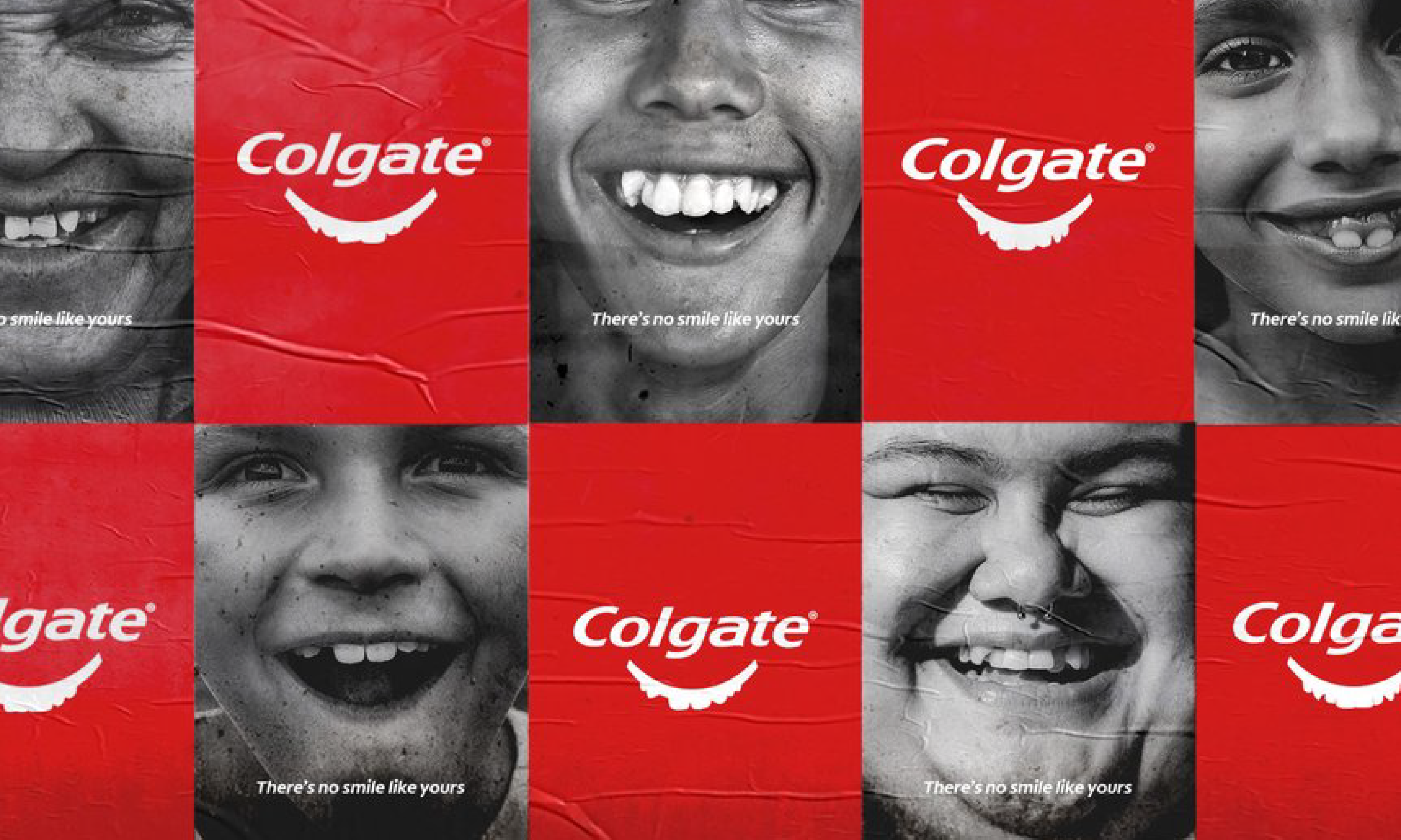
So, hierarchy of information is important. The following is a simple but effective visual.
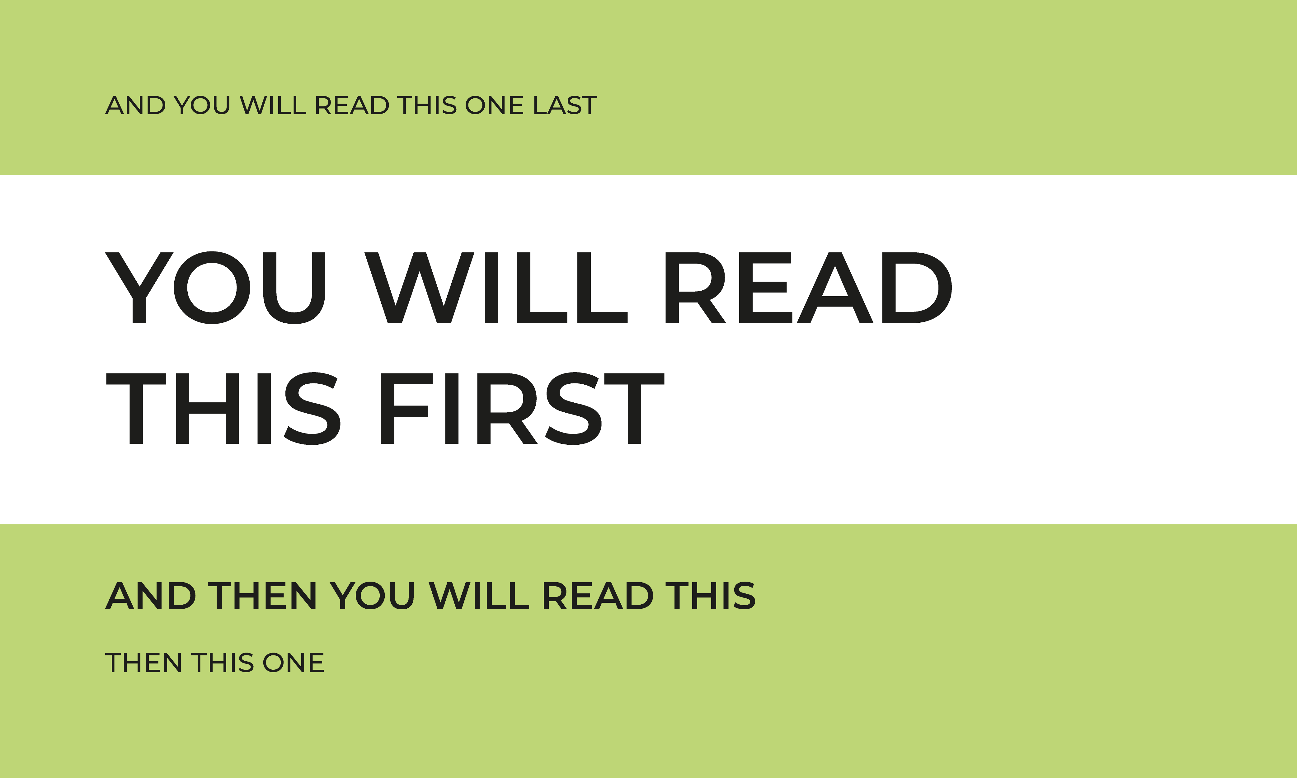
So, the hierarchy of information is important.
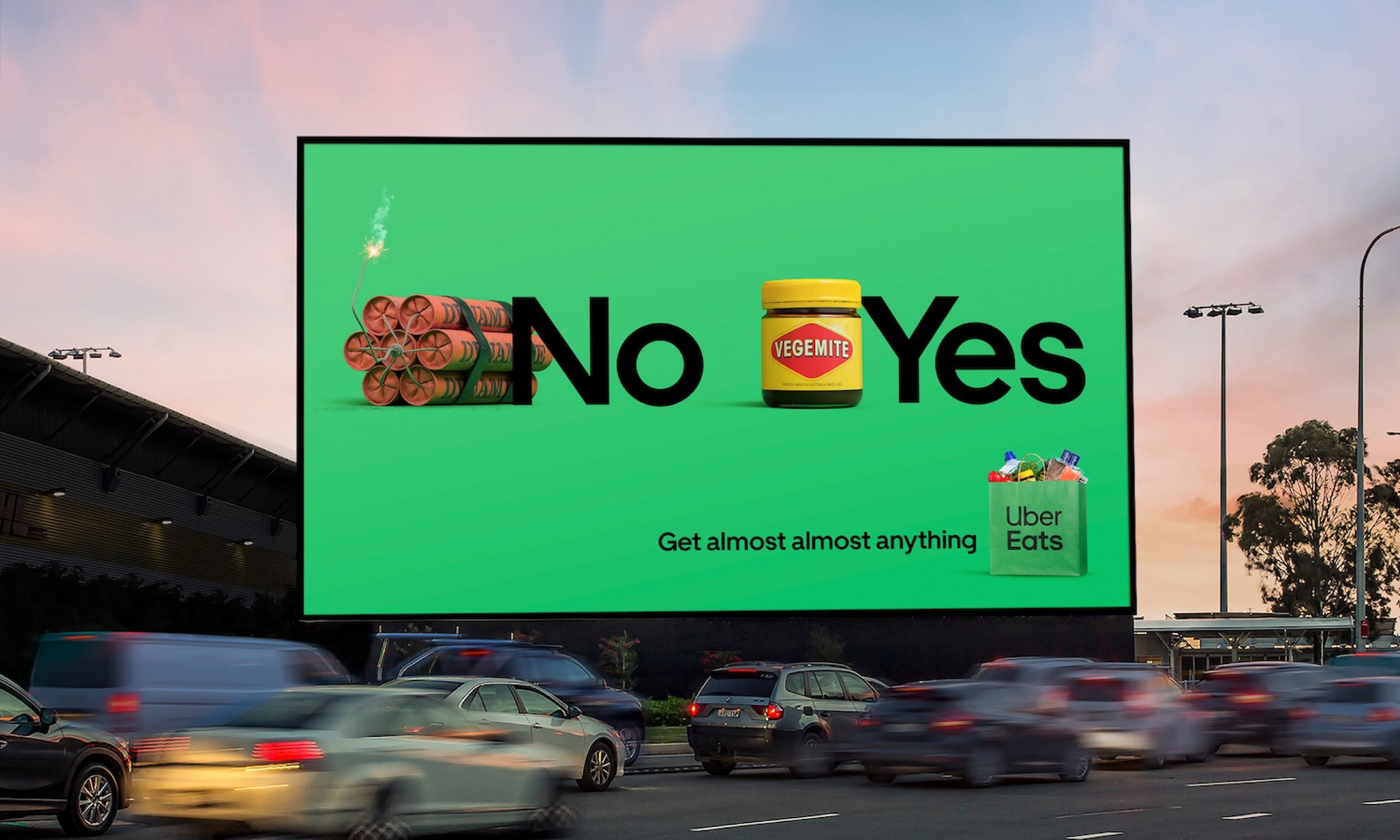
Colour matters.
Or lack thereof.
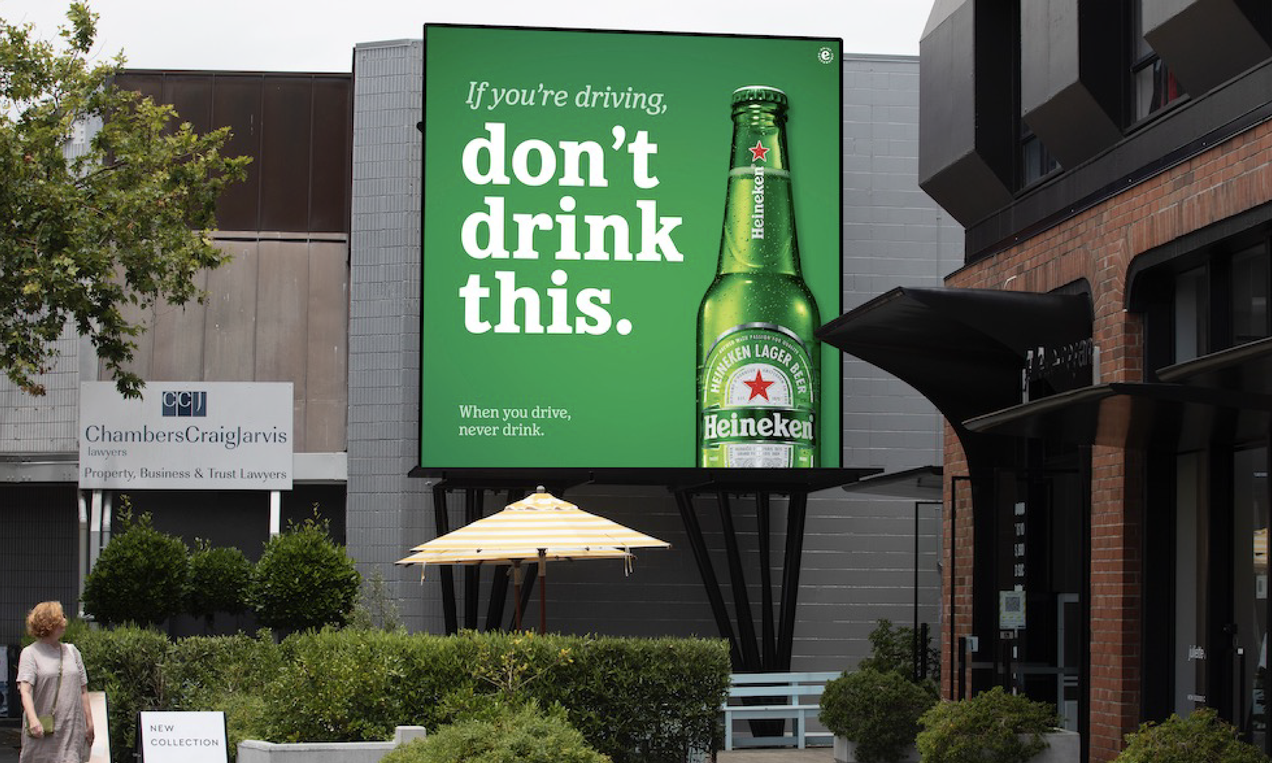
Colour psychology plays a significant role in shaping perceptions and evoking emotions. Different colours elicit different psychological responses, so selecting the right colour palette is crucial in conveying the desired message and mood. Whether it’s using bold and vibrant hues to convey energy and excitement or soft and muted tones to evoke tranquillity and sophistication, strategic colour choices can elevate the effectiveness of visual communication.
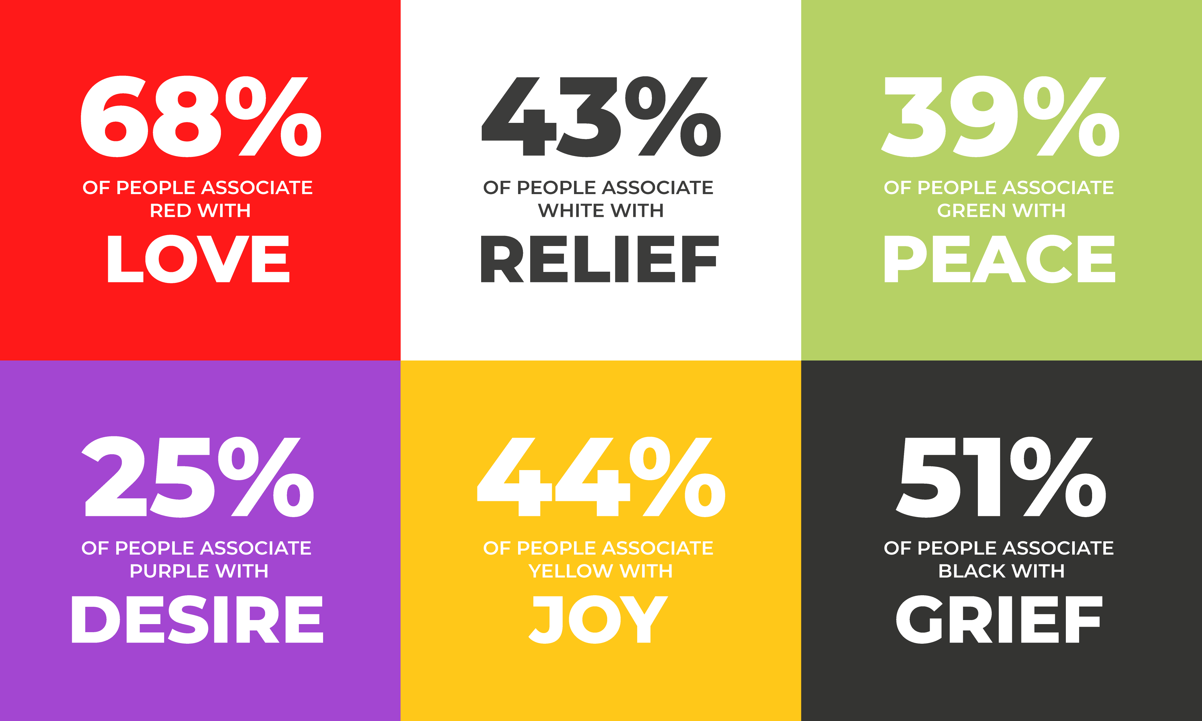
Then there are times when using very limited or no colour works brilliantly. Sometimes, just one ‘spot’ colour can draw attention to a critical point better than a rainbow of hues can do. And for standout appeal, black and white on an otherwise colourful shelf can be mesmerising.
Time considerations.
We don’t mean giving the designer enough time to create (although that is important). We mean giving the audience enough time to compute what we’re saying.
Nothing we do can make seconds or minutes last longer. However, we can make them more impactful by taking into consideration how much time our audience has to spend and wants to spend with us.
Which is not the same as how much time we want them to spend with us.
Those in the advertising industry have long preached that customers have no more than 3 seconds to read a billboard. Numerous research studies have used everything from eye-tracking technology to dwell time analytics to MRIs to try to understand how long we spend scanning information. There are as many estimates as there are products, but they all have one thing in common.
It’s short. Frighteningly short.
And it’s getting shorter because the list of things to distract us is getting longer.
So, don’t expect to be able to read War and Peace by someone who is rushing to the train in the morning.
Weirdly, this is good news.
That doesn’t mean we give up. It means we work harder. People will always search for meaning. We’re hard wired for it. They’re just being more engaged in what they engage in. Which is why getting it right has never been more important.
In fact, rather than bemoan the ‘bad news’ that there’s more competition for eyeballs, we have the opportunity to celebrate and act on the good news – which is that since the pandemic 79% of people are more likely to engage with brands that show they have purpose beyond just making product (Deloitte), 91% of people are more likely to shop with brands that provide relevant offers and recommendations (Accenture) and 65% of people are drawn to brands that show empathy, compassion and understanding (Forrester).
The opportunity is there for those who get it right.
NEED HELP?
If you need help creating a brand that pushes creative boundaries and inspires change, we’d like to offer you a complimentary strategy call with our Managing Director and Head of Strategy, Grant Davidson. Having nearly 30 years of industry experience working with groundbreaking brands, Grant has the experience and knowledge necessary to identify your core brand strategy and communicate it effectively.